A long way to heaven: A Baptist church in Hackney, east London, has broken with the archetypes of church design to place community facilities, a cafe, creche and offices at the congregational heart of the building - prayers go on up on the third floor
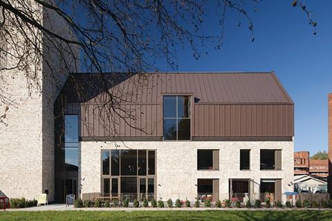
Inevitably, when we think of religious and particularly church buildings in the UK today our minds will hark back to historic buildings of the medieval, classical or, most likely, the Victorian age. Yet, while the overwhelming majority of UK churches are indeed historic buildings, new church architecture still represents a dynamic sector of British design and one that, due to the growth of new Christian denominations such as Pentecostal and congregationally-based churches, could well be on the rise.
While one of London’s newest churches follows a more traditional liturgy, its architecture is a powerful example of how contemporary design can still make a thriving and imaginative contribution to an ancient building typology.
Frampton Park Baptist Church sits in the middle of the sprawling 1930s Frampton Park council housing estate in Hackney, east London.
The church has been designed by Matthew Lloyd Architects, veteran of a number of church refurbishment schemes such as last year’s celebrated St Mary of Eton development in neighbouring Hackney Wick. Equally, at Frampton Park the barn-like zinc roof and sculpted, minimalist form identify the building as being firmly of the contemporary design stable. But it is not just the finished architectural product that renders this building an interesting essay in religious reinvention but also the radical programme and function of its internal spaces.
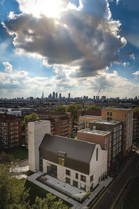
This is a church that also includes extensive community facilities, a cafe, crèche, offices, a youth club and studio. Perhaps most radically and in a notable sign of the tide of regeneration or gentrification that has beset this particular part of London, the church development also includes 47 private new flats arranged in three residential blocks built on church land behind the new building.
The homes have been designed by the same architect with the intention of forming an aesthetically cohesive whole with the new church building. Both parts of the £12m development have been built by Telford Homes as client under a design-and-build contract with the church opening last autumn and the flats set to complete this spring. Income from the housing – which is priced at £685,000 or more for a three-bedroom apartment – will be used to sustain and expand the church’s extensive outreach programmes within the surrounding estate and beyond.
Many new churches provide community spaces but few do so within a new rather than a refurbished building and with an accompanying residential scheme of this scale. Therefore with its arresting combination of spiritual and temporal enrichment, Frampton Park fully embraces modernity in function as well as form by exposing the commercial realities that many churches must face in order to survive.
Functionality
The new church replaces a 1950s church building that staff enthusiastically describe as “defensive, uninviting and decrepit”. Although the former building occupied a much larger footprint than its replacement, it was single-storey and therefore highly inefficient. By consolidating a multi-functional, three-storey church building on the same site, the new development is a much more efficient use of land and also provides space for the critical inclusion of housing blocks to the rear.
As Matthew Lloyd partner Claire Warnock explains, the design concept for the new church was in many ways a direct response to the problems faced by its predecessor. “Transparency was absolutely central to the design. The church also didn’t want an imposing, hierarchical building in the manner of a traditional church; it had to be open and welcoming to all and with a strong emphasis on community engagement.”
This conceptual requirement also had repercussions on the functionality of the church too, as Warnock continues. “The church was very keen to have a more usable building than before with a wide range of different functions. Although the new building has a smaller floor area than its predecessor, it offers far greater multi-functionality and efficiency.”
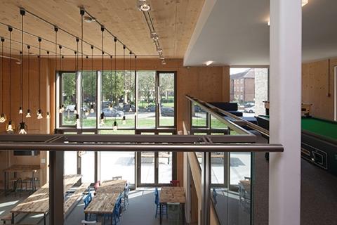
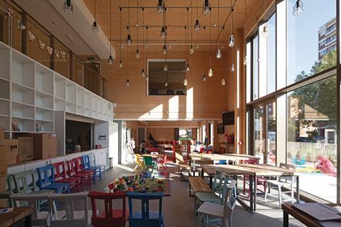
These twin design ambitions of functionality and transparency are immediately evident on entering. The visitor is not met with imposing nave or narthex of traditional church design, but a lofty two-storey entrance lobby and immediate visual connections to much of the interior.
An adjacent entrance offers a welcome that traditional church design might have once viewed as even more spatially and spiritually intrusive: a cafe. The cafe entrance is via a large glass opening directly visible from the street which in turn leads to a creche.
Warnock says: “It was essential to have these welcoming amenities as the first elements the public sees and interacts with when entering or simply looking at the church. Particularly because of this church’s location in the middle of housing estate, it couldn’t afford to appear detached or elitist, that wouldn’t work. It had to find a means of appearing relevant and accessible to its local community.”
Consequently, the first two storeys of the building are also occupied by related community facilities such as offices, youth club, studio, project rooms and kitchen. These, and a staircase, are either clustered around the double-height lobby or arranged along a side corridor that opens on to it.
All of which might lead one to wonder where the principal church space might be and how (or even if) it is permitted to maintain spatial supremacy over an entrance foyer which in many ways is conspicuously configured as the congregational heart of the building.
Prayer space
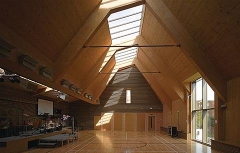
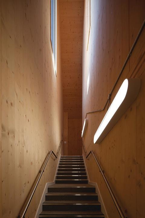
The answer is to be found in the third and uppermost floor of the building, which is almost entirely occupied by the main prayer space. This is a lofty pitched-roof volume clad entirely in glulam and cross-laminated timber asymmetrically appended with a smaller secondary aisle, with a raised stage and a lower roof pitch. Daylight is admitted throguh two flanks of skylights cut into the apex of the main roof and the side pitch of the aisle.
But even in this most spiritually significant room the building’s multifunctional aspirations are on display in the sports pitch markings on the floor, the musical instruments positioned on the stage and the fact that aisle and hall can be subdivided into two separate rooms. In fact the only physical reminder of the space’s religious role is the aluminium cross subtly formed by the mullions within the single large street-facing window cut into the wall.
While this space might not resemble a traditional church to many, it is a direct architectural manifestation of the Baptist ministry, which places a great emphasis on the congregational and musical aspects of church liturgy and shies away from the patriarchal doctrines of more traditional denominations.
Yes, the presence of a painted sports pitch on the floor might dilute its spiritual power for non-congregational observers. But the crisp detailing of the space, its barn-like rustic aspect and the shadows and textures created by the fall of vaulted daylight onto its honed wood surfaces all speak of a quiet, naturalistic simplicity that resonates both with the informality of Baptist ministry and an architecture committed to intimacy and transparency.
The cross-laminated timber visible in this space is replicated almost entirely across the full building interior. Its use presented challenges for the design team, some of which Warnock recounts as the “tiny tolerances and the need to have virtually all the engineering done before construction”. But it also had clear advantages which came in the form of speed of construction, the inherent efficiencies of prefabrication and the robustness of internal finishes; something which Warnock points out would prove particularly useful on the extensive accommodation allocated to children and young people.
Brickwork
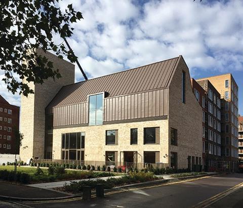
But of course, as with all buildings, it is the exterior and not the interior that most people will get to see and which is therefore crucial in the church and design team’s ambitious programme of reinvention. Warnock points out that the concept was essentially a “contemporary barn” and the analogy is certainly a strong one.
The building is entirely clad in a pale, textured brickwork, its luscious, chalky hue providing an exhilarating visual contrast to the sea of municipal red brick that surrounds it. But the contrast is not as decadent as one might think, as Warnock explains. “Yes, we wanted the building to stand out. But there are elements of details, dressings and bandings on the surrounding flat blocks that are of a similar colour.”
But the form of the building has no precedent among the rectilinear blocks that surround it. The walls of the lower two storeys give way to a hulking pitched roof, picked out in an earthy brown zinc subtly mimicked by the aluminium frames of the orthogonally arranged windows below.
But most dramatic of all is the soaring tower affixed to the southern end of the building, the project’s sole concession to the formal volumetric hierarchies of traditional church design. This brickwork shaft’s muscular proportions and sheer windowless surfaces speak of a rugged utilitarian power. But even this statement is tempered with the cross beautifully etched into the tower’s corner by a patterned patchwork of recessed bricks.
With its striking hue, streamlined simplicity and powerful massing the church’s virile exterior provides a more memorable impact than its restrained, if earnest, interiors. It also provides a clever contemporary update to the ubiquitous tower and nave arrangement we associate so strongly with older churches.
The associated residential blocks are more rational and less adventurous, but their elevations have clearly been as carefully programmed. Three further shades of brickwork are used for each of the three blocks, each shade a variation of the reddish brown visible on the surrounding estate.
In contrast to the horizontal proportions of the estate, here, verticality is introduced in the strident arrangement of window bays and the form of each individual block, which Warnock describes as “bookends”. Additionally, each window is surrounded by a white projecting frame, a textural nod to the rendered dressings evident on the estate, as are the Flemish bonds subtly woven onto the ground floor. There is no social housing here but given the thousands of council homes on the surrounding estate, both planners and design team conceded that there did not need to be.
The new church is the star of the show here.
But for all Frampton Park’s genuine revisionist instincts, it represents the same canny use of architecture as theological branding that has been embedded into church civic tradition for 2,000 years.
Project Team
Architect Matthew Lloyd
Main contractor Telford Homes
Structural engineer RCA Structures
Structural engineer Price and Myers
M&E engineer Mendick Waring
Quantity surveyor Telford Homes
Cross-laminated timber supplier KLH UK









No comments yet