Building’s architecture critic Ike Ijeh is beguiled by the work of the youngest architect yet to win the annual commission
Architectural timepieces have a long and beguiling history. From the oculus possibly cut into the dome of Rome’s Parthenon to act as a giant sundial, to the domed observatories whose telescopes have been pointing at the stars for thousands of years, architects – like all of us – have always been fascinated by time and space.
Which is why Mexican architect Frida Escobedo’s decision to conceive this year’s Serpentine Pavilion as a compass informed by these twin existential concepts follows a time-honoured, if challenging, form of philosophical and artistic enquiry.
For Escobedo, the unique nature of the Serpentine Pavilion programme, now in its 19th year, is what first captivated her. “I was intrigued by the dual nature and split condition of the pavilion commission, its spatial qualities and its temporality,” she explains.
“First, you have a very site-specific structure built in the centre of this beautiful park. But it is a structure that only inhabits the park for four months after which it is relocated to a new site. Our discussion became one of how to resolve these conflicting roles.”
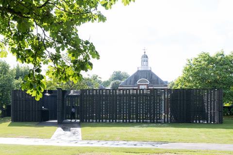
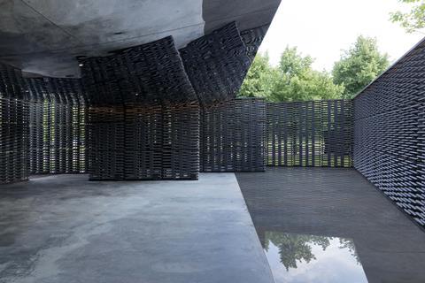
The solution was to design a pavilion whose ephemeral nature is expressed and embraced by architectural references to the core time and space concept. Time is evident in the pavilion’s plan and location. Two rectangular volumes are positioned at an angle from each other, the first outer volume orthogonally aligned to the adjacent Serpentine Gallery and the second volume set askew from its outer shell and aligned to the meridian line at Greenwich. This is a north-south axis which, in effect, sets the time for the entire world and which allows the pavilion to assume the neat covert role of architectural compass.
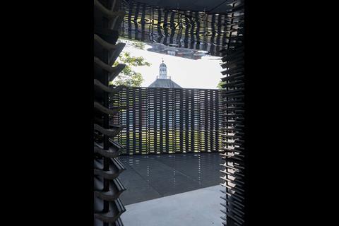
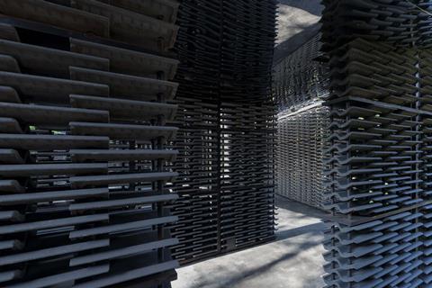
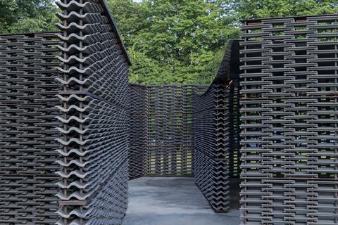
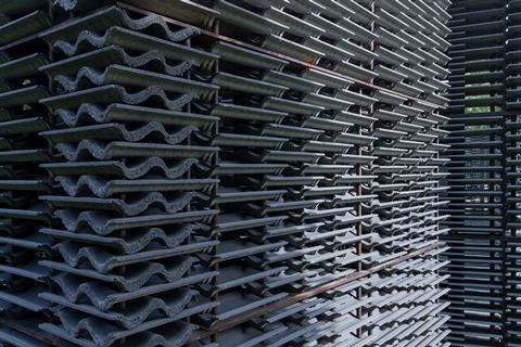
Duality of space is also apparent in this arrangement. The interior volume is treated as a courtyard set beneath a mirrored canopy and framed by the pavilion’s lattice walls of cusped cement roof tiles. The arrangement is inspired by a “celosia” a traditional breeze wall that, like the internal courtyard, is a common feature of domestic Mexican architecture. The exterior volume, while maintaining the lattice skin, sets a starker, less intimate tone with its dark stone tiles contrasting violently with the verdant greens and blues of the rolling Hyde Park landscape.

Escobedo speaks passionately about how the pavilion reflects the “duality of how we experience time”, an externalised focus regulated by clocks and the meridian and a more internalised understanding defined by our own personal contemplations, mood and experiences.
While any architectural discourse on qualities as philosophically indeterminate as time and space runs the serious risk of veering into Bernard Tschumi-grade unintelligibility and pretentiousness, the pavilion does a good job of reflecting the duality that Escobedo has identified as its conceptual driver. This is particularly the case on the interior which carves an appropriately calm and contemplative sanctuary in contrast to its more rugged and defensive skin.
Escobedo talks of her walls as being “a woven tapestry of concrete” and, improbable as it may sound, she does a commendable job elevating the most prosaic of construction materials – the humble British roof tile – into a dynamic perforated screen that enlivens a solemn inner void by encasing it with thousands of miniaturised postcard-views of the park beyond.
The inner space itself is bolstered by the pavilion’s masterstroke, a shallow pool of water that fills the triangular void created by the rotation between the two misaligned rectangular volumes that form the pavilion’s plan. Not only does this offer a natural sense of intimacy and enclosure to the courtyard, but it conspires with the reflective ceiling to transform images of the park greenery outside into a compelling inner monologue of warped visual snapshots.
Inevitably, the time and space concept is likely to be lost on the majority of those who will explore the pavilion this summer. Visitors seem to be coming in ever bigger numbers, with Bjarke Ingels’ 2016 pavilion now identified as the most-visited architecture and design exhibition in the world that year.
Perhaps a more relatable conceptual label by which to grasp the meaning of the 2018 pavilion might be the simpler idea of a split personality. For, with its inner chamber vs exterior shell, orthogonal volume vs rotated volume, permanence vs temporality and even in its British roof tiles vs Mexican courtyard, this contradictory constructed compass presents an intriguing architectural vignette of the quizzical conflicts and rivalries that do not just inhabit space and time but exist in us all.
Postscript
The 2018 Serpentine Pavilion opens to the public on Friday.












No comments yet