Building reports mixed reactions from occupants and doubts about the building’s future prospects in a piece published shortly after the opening of the Richard Rogers-designed landmark
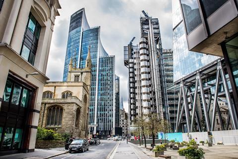
The Lloyd’s building has surprisingly few imitators, given its fame. Although widely considered among the most important architectural designs of the 20th century, its inside-out approach never really took off. Completed by Bovis in spring 1986, it was designed by Richard Rogers as the follow-up to his previous experiment in the Bowellist style, the Pompidou Centre, which had opened in Paris nine years earlier.

Both buildings had quickly encountered problems due to the then-revolutionary approach of maximising indoor space by moving all services to the outside, where they were exposed to the elements. As a result, the maintenance costs of the Lloyd’s building have proved to be so high that the insurance giant threatened to quit the site altogther in 2014. Meanwhile, potential remedies have been complicated by its grade I listing in 2011, when it was the UK’s youngest building to receive the honour.
As the article below shows, issues with the building were evident within weeks of its opening. A piece published in Building in June 1986 reported how parts had already fallen off, while one passerby presciently speculated about the issues which its owners would most likely face within a few years.
However the article also accurately predicted the building’s enduring popularity, comparing it to the Pompidou, which had been fondly adopted by the Parisians “even though its appendages may have rusted”.
Gossip from the coffee house
The Lloyd’s building, arguably London’s most spectacular since the Second World War, has been in operation for nearly a month. Martin Spring samples reactions of the tenants, who find it a far cry from its coffee house origins.
One significant achievement of the ultra-modern Lloyd’s building is already indisputable. It has evaporated the great British indifference to architecture.
Nobody is at a loss to express his or her opinion. It is a building that has launched a thousand metaphors: oil rig, supermarket, multi-storey carpark, oversized hot house, giant meccano set, even coffee percolater (a sad end to an institution that started life as a coffee house).
Still, the chemical reaction between a blatantly modern work of architecture and the denizens of one of the City’s most venerable institutions is perhaps less explosive than one might expect. Many underwriters are surprisingly willing to accept the architects’ aesthetic principle of enhanced Functionalism.
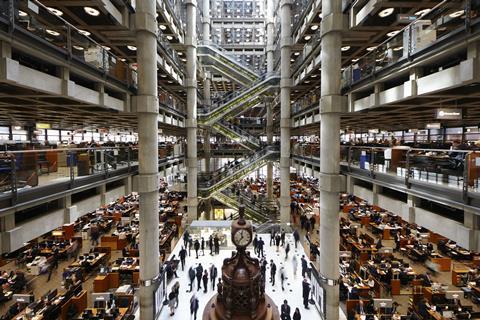
But they point to design weaknesses such as the monotony of the black ceiling light fittings and obscured glazing panels surrounding the underwriting room. “Too bland, too dark and too grey,” is a typical and by no means unjustified reaction. “Spartan” is the epithet used by another jobber, pointing to the lack of visual relief through the glazing panels. The lighting, over which an inordinate amount of expertise has been expended, is criticised as harsh, especially under the lower headroom of the galleries.
However, the uniform, mechanical grid of The Room is effective in absorbing, while not overwhelming, the clutter of jobbers’ desks and the density of people at work. The grid is set off by the mesmerising movement of people and also by hi-tech gadgetry such as electronic data screens and the escalators that are the centrepiece of the interiors. The moving mechanics of the escalator are exposed below and picked out in yellow.
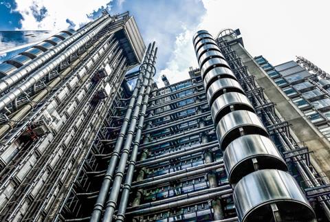
The aesthetics of the exterior works on a different, though related, principle. It makes absolutely no concessions to surrounding buildings, which are in any case a hotch-potch. Though utterly true to its Functionalist pedigree, it is very much a prima donna of a building, full of virtuoso flurries of technical gadgetry - stainless steel toilet pods, spiral staircases, wall-climber lifts, roof-top cranes and the ubiquitous exposed ductwork. These elements counterpoint each other in an absorbing display of high-level sculpture.
If Roger’s Pompidou Centre in Paris is anything to go by, maintenance will lag painfully behind the inevitable deterioration and build-up of dirt
At ground level, the gadgetry is reduced to a human scale. A series of interpenetrating stairways and canopies have been executed in marble, stainless steel and glass, like exquisitely detailed industrial design products that are strung together to form a delicate filigree work at street level.
The £163m building gives ample vent to architect Richard Rogers’ 1960s-vintage passion for flexibility. He designed The Room as the largest rectangular form that could be fitted on the site, with the irregular residues of the plot being given over to services, toilets, stairs and lifts.
In addition, upper floors which overlook the main floor can operate either as open dealing floors or enclosed offices. To date three of these upper floors have been given over to dealing, and further floors are likely to be converted in the foreseeable future.
The delicacy of the building is a favourite topic among passers-by: “Of course in a few years’ time you can imagine the problems they’ll have”. Despite the plethora of cleaning gantries the guts of the building that have been prefabricated and draped over the exterior amount to an immense liability. If Roger’s Pompidou Centre in Paris is anything to go by, maintenance will lag painfully behind the inevitable deterioration and build-up of dirt.
More sinisterly, even since the building was occupied, a number of prefabricated components, including glazed panels, have come loose from their finely moulded fixings and come crashing to the ground. Even in some of the less delicate dismissals of the building, it is obvious that its users have taken it to heart in a remarkable manner. Adverse reactions come mainly from the older generation, but one middle-aged underwriter adds: “That building was criticised, too, at first. It was called the Lyons Corner House.”
The Pompidou Centre is probably a fair model for London’s new addition. Even though its appendages may have rusted, Pompidou has been fondly adopted by Parisians as a social hub and landmark of the city.
More from the archives:
>> Nelson’s Column runs out of money, 1843-44
>> The clearance of London’s worst slum, 1843-46
>> The construction of the Palace of Westminster, 1847
>> Benjamin Disraeli’s proposal to hang architects, 1847
>> The Crystal Palace’s leaking roof, 1851
>> Cleaning up the Great Stink, 1858
>> Setbacks on the world’s first underground railway, 1860
>> The opening of Clifton Suspension Bridge, 1864
>> Replacing Old Smithfield Market, 1864-68
>> Alternative designs for Manchester Town Hall, 1868
>> The construction of the Forth Bridge, 1873-90
>> The demolition of Northumberland House, 1874
>> Dodging falling bricks at the Natural History Museum construction site, 1876
>> An alternative proposal for Tower Bridge, 1878
>> The Tay Bridge disaster, 1879
>> Building in Bombay, 1879 - 1892
>> Cologne Cathedral’s topping out ceremony, 1880
>> Britain’s dim view of the Eiffel Tower, 1886-89
>> First proposals for the Glasgow Subway, 1887
>> The construction of Westminster Cathedral, 1895-1902
>> Westminster’s unbuilt gothic skyscraper 1904
>> The great San Francisco earthquake, 1906
>> The construction of New York’s Woolworth Building, 1911-13
>> The First World War breaks out, 1914
>> The Great War drags on, 1915-16
>> London’s first air raids, 1918
>> The Chrysler Building and the Empire State Building, 1930
>> The Daily Express Building, 1932
>> Outbreak of the Second World War, 1939
>> Britain celebrates victory in Europe, 1945
>> How buildings were affected by the atomic bombs dropped on Japan, 1946
>> Rebuilding the House of Commons chamber, 1945
>> Planning the postwar New Towns, 1945-46
>> The Festival of Britain, 1951
>> The world’s first nuclear power station, 1956-57
>> Building covers the 1964 election
>> Liverpool Metropolitan Cathedral, 1967






No comments yet