Nottingham Trent University architecture and architecture technology students on two schemes by Zaha Hadid Architects
About the scheme:
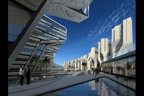
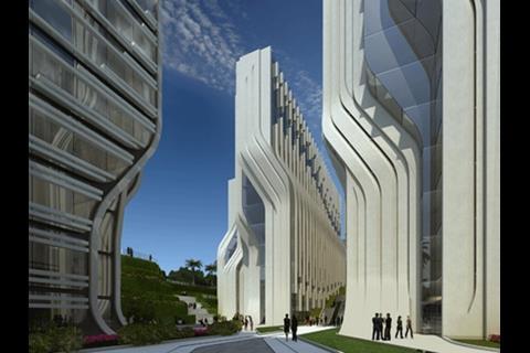
Stone Towers These are images of Stone Towers, designed by Zaha Hadid Architects. The towers for client the Rooya Group are located in the Stone Park district of Cairo and provide office and retail space for a rapidly expanding city.
The 525,000m² development includes a five-star business hotel with serviced apartments, retail with food and beverage facilities as well as sunken landscaped gardens and a plaza called ’the delta’. Ancient Egyptian stonework incorporates a vast array of patterns and textures that, when illuminated by Cairo’s intense sunlight, creates animated displays of light and shadow.
Hadid said she has always been fascinated by the mathematics and arts of the Arab world. “In our office we have always researched the formal concepts of geometry, which relates a great deal to the region’s art traditions and sciences in terms of algebra, geometry and mathematics.”
She noted with a large-scale project like this, care had to be taken “to balance a necessary requirement for repetitive elements whilst avoiding an uncompromising repetition of static building masses”.
James Decent verdict
The visuals don’t show the truth with this one, or so it appears. The dramatic perepectives fit magicly with Hadid’s architypal shapes and forms, intensifying the power of the geometry. I can’t help but want to view the building spun ninty degrees anti-clockwise so we can see the entire length of the elevation, not looking down the buildings, and then we would get a better understanding of ‘uncompromising repetition of static building masses’.
If we look down between the waving towers, I can imagine that the complexity of structure to give a canyon-like experience. Hadid’s power would certainly grab you with this.
The visuals give us an impression of shelf ends, similar to the experience of walking down the corridor of a vast library archive, a mixture or anticipation and intimidation. The deep blue sky crisply cutting round the outlines, sun and shadow working the geometry into a sharp bar-coded frenzy of lines.
You have to look - be pulled into it like an intrigued child. All very well on a sunny day but I want to see this in the sticky, overcast humid Egyptian heat, the stone work merging into the tones of the sky, the towers struggling to breathe.
Dino Labatte’s verdict
Zaha’s new publication of the Stone Towers, Egypt, certainly lives up to its name. The stone structures reach for the sky showing great mass, but are considerably out of proportion as they tower over each other. The futuristic proposal shows no function as there is little form of life in regard to fenestration in the proposal.
Solar shading between the buildings has clearly been considered due to the Egyptian climate, which will create a cooler atmosphere for users.
As with any of Hadid’s tall proposals, the icon is king, the statement, everything. And this is no exception.
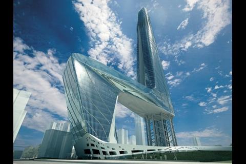
About the scheme: Transit centre This is an image of a previously unpublished proposal for a 101-storey transit centre in Surfer’s Paradise in Queensland, Australia, designed by Zaha Hadid in collaboration with Patrik Schumacher.
The as-yet-unbuilt structure is featured in The Complete Zaha Hadid, a retrospective of the architect’s work.
James Decent verdict Conveniently the surrounding existing buildings are made a faint blue, the sky vivid and dramatic.
The stage is set to sell us the high-gloss, high-powered impression of true ‘skyscraper drama’.
They’ve got the angle on the perspective to perfection once again - minimal impression of mass and height, the viewer can’t distinguish between horizontal and vertical.
The form lunges up and out like a lusting wave. There are obvious phallic connotations with most tall buildings, however this screams it with a capital P.
It follows the angular contours that embody all of Hadid’s buildings.
However, I feel that the power of her forms do not work well on this scale.
The facades do not appear to carry the overall spatial forms of the building into any interesting detail or conclusion.
There is a vague attempt the include curves on the facades but this becomes lost in the overall impression.
As with any of Hadid’s tall proposals, the icon is king, the statement, everything. And this is no exception.
Dino Labatte’s verdict This is definitely one of my favorites from Zaha.
The building has been carefully designed to give the feeling of suspension using a variety of materials. The ultra-modern design shows flow and fluidity reaching to the sky with over 100 floors.
From the rendered image present the scale and mass appear out of proportion to adjacent buildings showing a greater sense of height which has been clearly designed with little consideration to the site.
The transit centre looks excellent, but the buildability of the scheme is questionable.
Zaha is yet to let us down with her artistic and fluid work, but her sustainable principles for the transit centre need questioning due to the extensive amounts of glazing.
Postscript
Dino Labatte is studying architectural technology and James Decent is an architecture student at Nottingham Trent University. Both students are in their last year at the college.
Do you want to join our 'First Impressions' panel? Then email Nargess on nargess.shahmanesh@ubmc.om.
Sign up for the student and careers newsletters at Building.
For the latest jobs in construction and for tips on how to find a job visit Building's job site.


