Students from Nottingham Trent University comment on Norwegian architect Snøhetta’s national opera and ballet centre in Oslo
About the scheme
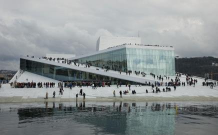
This is Norwegian architect Snøhetta’s national opera and ballet centre in Oslo which has won the prestigious bienially Mies van der Rohe Award. It is the largest cultural centre to be built in Norway in modern history. Its sloping roof meets the water’s edge, and visitors are allowed to walk freely over the building. Open, surprising and fun, the building has already become a landmark in the Norwegian capital.
James Decent’s verdict
The floating visual appearance of the building works consistently with the water, which naturally creates a loose site boundary that is carried into the architecture.
The peeling contours of the roof walkways create an interesting new dimension to the way public buildings can be used and experienced. Where the roofs meet the glass facades, a rectanguar mass is formed that appears to be sunk into the ground, giving the impression that the building goes deeper into the bank than we can see.
There is a visual link straight through to the theatre itself with the glass façade. It is effortless to read the building, a simple idea of form and use that translates easily. There could be a complex working of the landscaping, forcing the idea onto us, drawing the person up onto the roof, extended routes that follow and disperse out from the slops to the water, carved into the gound - sounds all to familiar doesn’t it?
However, as we can see it does the opposite. People are not patronised. There is a sense of freedom here, people can explore and appreciate a public space at their own convenience, a luxury that is not always established in the modern built environment.
Dino Labatte’s verdict
The national opera and ballet centre in Oslo is a simple but affective piece of good architecture. Straight lines and sharp edges have been emphasized in the design using similar materials and colours to its landscape. White paving has been carried up and over the building to create the roof platform. This merges the building into the ground towards the water giving a sense of subtlety reducing the visual impact from the water.
The technique also gives the feeling that the building is submerged beneath the ground and water level. Large amounts of glazing have been used which contrasts the mass expansion of white; this increases the visual appearance of the building whilst providing natural lighting and a sense of modernism.
The national opera centre from the image above is definitely an example of architecture where form follows function. But will the architectural style of straight and sharp edges stand the test of time?
Postscript
Dino Labatte is studying architectural technology and James Decent is an architecture student at Nottingham Trent University. Both students are in their last year at the college.
Would you like to be part of the graduate First Impressions panel? Then email Nargess at nargess.shahmanesh@ubm.com.
Sign up to receive the Student Newsletter at Building.









No comments yet