Postgraduate architecture student from the Royal College of Art comments on five schemes
SANAA’s proposal for the Serpentine summer pavilion
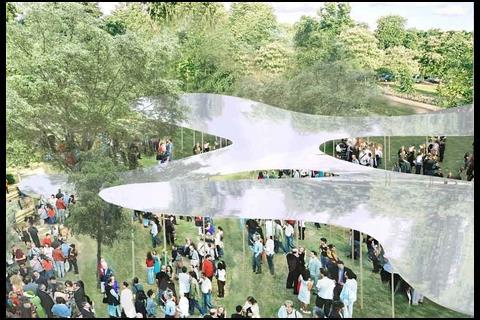
About the scheme: This is Japanese architect SANAA’s plan for a “floating aluminium” summer pavilion for the Serpentine gallery in London’s Hyde Park.
The design is a flowing aluminium structure that wraps around the trees in the park, and is supported by delicate columns.
Tom Greenall’s verdict: The release of SANAA’s design for this year’s Serpentine pavilion seems to have been met – initially - with a slight air of disappointment. Neither as substantial as Gehry’s 2008 pavilion; as structurally innovative as Ito’s of 2002, or as seemingly permanent as Niemeyer’s of 2003, the simple renderings provided by SANAA lack a sense of the subtle play of light and perception so characteristic of their work.
In this case, however, it is the description of their intention, rather than their images, which evoke the ethereal atmosphere that has helped them to define a new architectural language in recent years.
True to form, the office whose typically ephemeral style makes them so suited to the design of a temporary pavilion, has achieved something original. Unlike previous incarnations, this years pavilion will not be restricted to the patch of grass immediately adjacent to the gallery, but will instead embrace the surrounding parkland, “reaching for the sky in places, while dropping almost to the ground in others”.
The use of both translucent and reflective materials will undoubtedly ensure that it sits seamlessly within the natural environment, marrying aesthetic simplicity and technical complexity to guarantee that it will be prettier than all that have gone before it.
Herzog & de Meuron’s extension to the Tate Modern
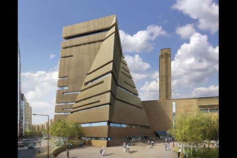
About the scheme: This is Herzog & de Meuron’s extension to the Tate Modern in London.
The government’s design watchdog Cabe has called the pyramidoid building a “first-rate addition to London’s contemporary architecture”.
TA’s verdict: Since the publication of the very first images of Herzog and de Meuron’s proposed extension to the Tate Modern, I have been inclined to wonder whether this is not just a case of the emperor and his new clothes.
H&dM’s museum design credentials are unquestionable, but this scheme still appears to hide awkwardly behind the great hulk of the Tate’s turbine hall. Despite this, the UK’s notorious planning system seems to have had little complaint.
That said, the most recent iteration on the original stack of glass boxes does seem slightly more resolved, and although ambiguous, the palette of materials now responds more specifically to the existing building.
In addition, it is reported that the green credentials have also improved, with waste heat from a nearby substation providing most of the building’s requirements.
Zaha’s design for North Quay Tower development in Dublin
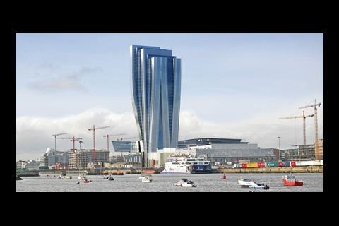
About the scheme: These are the latest designs for Zaha Hadid Architects’ proposed North Quay Tower development in Dublin.
The tower will be the entrance into Dublin from the River Liffey.
TA’s verdict: After losing out to Norman Foster in the competition to design the U2 Tower in Dublin, it appears that Zaha’s design may still be built – but on the other side of the river.
Called the North Wall, the (more than slightly reminiscent) scheme will stand next to the O2 concert venue and replaces existing plans for an underwhelming seven-story glass block, adding to the redefinition of this part of the city as a growing business district.
From the images available, the project seems to follow through some of the themes that are currently recurring at Hadid’s practice, most notably fluid elegance and understated complexity, but maybe less successfully than some of her previous forays.
Not renowned in the field of tall building design, the top heavy appearance makes this attempt look dumpy, whilst the low-rise wing that cantilevers out into thin-air seems to jar with the dogma established by the verticality of the towering elements.
However, if this building falls fate to the same financial pressures as Foster’s neighbouring proposal, then we may never get to find out.
Design Act’s proposal for the Singapore pavilion
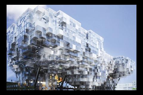
About the scheme: The image above is of the design from Singapore-based firm Design Act which missed out in the competition for the Singapore pavilion at the 2010 World Expo in Shanghai.
The design included 3,866 cubes of varying levels of transparency and eight “chambers of experience”.
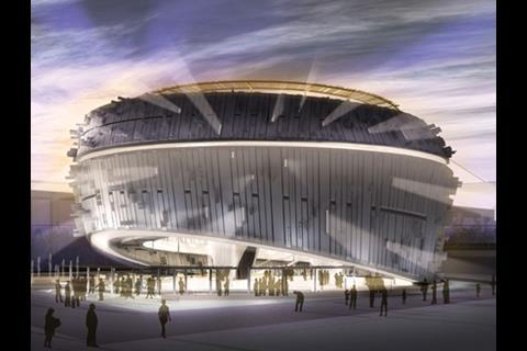
The scheme was beaten by Kay Ngee Tan Architects’ Urban Symphony (image bellow).
The winning scheme will be built out of aluminium and steel and includes a roof-top garden.
TA’s verdict: Entitled “My dream, our vision”, Design Act’s competition entry for the Singapore pavilion at the 2010 World Expo exploits the potential of conceptual design, especially compared to Kay Ngee Tan Architects’ more sensitive winning proposal.
With an eye to the future, the use of permutated cubes to create a dynamic and sculptural ‘cloud’ has afforded a series of compelling images – befitting a building that seeks to celebrate Singapore’s future aspirations - but one feels the ultimate resolution would inevitably highlight the limitations of current constructional possibility.
The concept of a World Expo is in itself an idea more suited to a period of financial excess. Perhaps then, it is appropriate that the winning proposal is one that wears its environmental consciousness proudly. Given its temporary lifespan, concerns over sustainability take on a particularly relevant meaning.
Wilkinson Eyre’s “Peace Bridge”
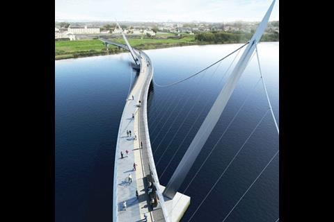
About the scheme: This is an image of Wilkinson Eyre’s competition winning design for “Peace Bridge” in Derry, Northern Ireland.
The £13.3m footbridge, due to complete in 2010, is the third to cross the River Foyle.
TA’s verdict: On first impression, Wilkinson Eyre appears to have been successful in creating a new bridge that will enhance rather than detract from the surrounding context.
The rendering seems to describe an elegant structure with a series of curved spans that will enhance the experience of crossing the river. However, whilst a bridge can be judged on its architectural or structural merit alone, more often than not there is a more fundamental, social function at the heart of its inception.
This appears to be the case with the new Peace bridge across the River Foyle, which has been described as the biggest single regeneration project in Derry City since the Foyle Bridge over thirty years ago.
By unifying the two historically segregated parts of the city, the bridge will connect the main central area of the city on the west bank with a proposed mixed-use development on the site of a disused army barracks on the east bank.
The scheme also seeks to tackle the problems of separated communities by creating genuine shared space, and transforming existing contested space.
The Local Authority should, therefore, be applauded for recognising the importance of such large-scale infrastructural improvements, investment in which will ensure that the accompanying mixed-use developments are not token gestures of regeneration, but are schemes that have a real opportunity to succeed.
Postscript
Tom Greenall is a second year architecture student at the Royal College of Art in London.
Would you like to be part of the graduate First Impressions panel? Then email Nargess at nargess.shahmanesh@ubm.com.
Sign up to receive the Student Newsletter at Building.









No comments yet