Another ’First Impression’ panellist, this time Adam Smith postgraduate architecture student from the Royal College of Art comments on six schemes
Will Alsop’s newspaper stand in Spinningfields development in Manchester
About the scheme: This is Will Alsop’s design for a newspaper stand in Allied London’s £1.5bn Spinningfields development in Manchester. Designed to look like an open newspaper, Alsop’s design lends a touch of the surreal to the corporate surroundings of the city’s newest business district. The architect will work with structural engineer Atelier One and project manager Drivers Jonas to build the kiosk in Hardman Square, the scheme’s main business plaza.
Adam Smith’s verdict: This humorous design is accompanied in the masterplan by several other Alsop designs including a fruit stand and flower stand. Alsop has clearly seized the opportunity that a small building or pavilion provides to be adventurous and whimsical.
The literal symbolism of the design has some resonance with the work of Robert Venturi and Denise Scott-Scott Brown. Some critics may ‘read’ the result as kitsch but I think that the broader audience will appreciate it as a clear departure from the steel glass and timber boxes we see in most mixed use schemes.
HOK Sport’s design for Mexican football stadium
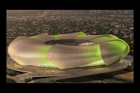
About the scheme: This is HOK Sport’s concept design for an 80,000-seat football and athletics stadium in Monterrey, Mexico. The design has been inspired by the rehilete, a child’s toy windmill used to celebrate Mexico’s national day. Variable lighting effects will be used to make the eight steel-mesh ’leaves’ appear to turn like a fan. The steel mesh design was based on the weave of traditional basket making by native Mexicans. The stadium will be built over the dry Santa Catarina river bed, linking the northern and southern parts of the city.
Adam Smith’s verdict: Its location over a dry river bed creating a circular land bridge between two previously separated parts of the city will profoundly alter urban dynamics: but with no experience of the city or drawings available of the street interfaces it is hard to critique how well HOK have handled this.
HOK claim to have designed ‘the most atmospheric football stadium in Latin America’ by providing seating extremely close to the pitch and a 55m cantilevered roof. The façade, inspired by the miniature windmills carried by children during the national festival is iconic and will look spectacular when lit (to give the impression it is spinning). Providing its scale is linked sensitively to the surrounding city by landscaping, it will undoubtedly be a popular new landmark in Monterrey.
Sforza Seilern’s design for a private house in Zimbabwe
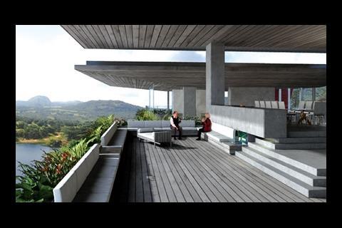
About the scheme: This modernist private house, designed by London architect Sforza Seilern, is being built in the destitute country of Zimbabwe. The client is an Austrian farming couple who say they have fostered good relationships with local people. The house is encircled by window walls shaded by sweeping roof slabs. It is being built by Elevate of Harare, which imports most materials from South Africa. Eckersley O’Callaghan is structural engineer, DSA Engineering the services engineer and Architects Design Group the local architect.
Adam Smith’s verdict: Most contemporary architects dream of the chance to design a house with panoramic views, set on rock, for clients who want something that looks clean and unique.
Sforza Seilern have made the most of such a chance with this striking design with dramatic cantilevers, generously sized living spaces and a layout which responds appropriately to the contours of the surrounding landscape.
The exterior views of the building may not suit all tastes - I personally find its brutal modernism a rather dated aesthetic – but the interior’s relationship with the landscape should be breathtaking and providing the detailing and finishes are completed to the high level the designers hope for it will be an enviable home.
Pohkit Goh’s concept design for a floodproof house
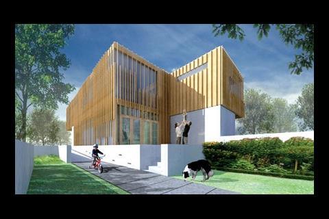
About the scheme: This concept from Edinburgh architect Pohkit Goh was one of the winners in an RIBA/ Norwich Union competition to design floodproof homes for the future.
Adam Smith’s verdict: Pohkit Goh’s concept design is probably well thought out and primarily represents a well accepted ‘floodproofing’ typology: raised landscaping. The other three winners majored on other approaches such as absorbant landscaping, easy-cleanup and floating structures.
In the context of a housing development, the developer is most likely to adopt the most economical option with the best insurability, so Pohkit Goh’s solution could conceivably be the preferred solution. Nevertheless I am uninspired by the design: it seems to be essentially a simple piece of landscaping.
Anyway, are not competitions to design floodproof homes and low energy buildings a little backward? We do not compete to design rainproof roofs or correctly sized rooms so why pretend that energy and flooding are so special?
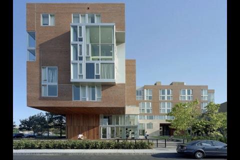
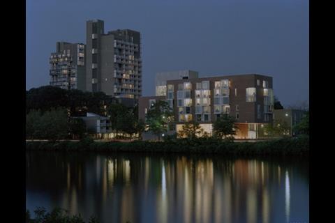
Kyu Sung Woo’s Harvard University student campus
About the scheme: American architect Kyu Sung Woo has designed this campus at Harvard University in Cambridge, Massachusetts. It houses 215 students and includes common and study rooms, a fitness suite and an underground car park. The six-storey building is formed from two rectangular blocks arranged in an L-shape. It is strongly rectilinear in style with projecting bay windows that are subdivided into smaller rectangular elements. The rectangular theme is given added emphasis as one half of the L cantilevers over a much smaller base. The idea is this helps the building fit into its context as it recalls the scale and massing of Harvard’s riverside houses.
Adam Smith’s verdict: This recto-linear brick and wood clad student residence has a deceptively simplistic appearance. On closer inspection, Kyu Sung Woo has achieved some interesting variation in the façade, a subtle approach to materiality and some sincerely intended internal planning.
The scheme has also just been awarded a LEED Gold certificate. Internal images show good use of day lighting and spatial differentiation. The double storey glazed windows at the corners which accommodate study lounges are an attractive feature – as are the glazed corridor ends which meet with views over the Boston River.
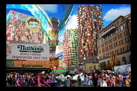
Coney Island: “Imagine Coney”
About the scheme: This is the new concept design for Coney Island in New York. The plans include a variety of indoor and outdoor facilities which can be implemented by summer 2009 and would take advantage of parcels of undeveloped land in Coney Island, much of which is now vacant or operating as street-level parking. The concept is the product of “Imagine Coney”, a call for ideas which involved public input meetings and a design workshop involving architects and economists.
Adam Smith’s verdict: Like some recent competitions in the UK for regeneration of leisure sites (eg Urban Splash – Birnbeck Island and Pier), Imagine Coney has taken the approach of giving the public the opportunity to give their opinions as to what should be put on the site.
A little like a blank canvas and a set of finger paints at a boozy student party, the results are predictable mix of the sincere, the showy and the cynical. The website (imagineconey.com) actually looks like a very successful piece of consultation and has several hundred responses from members of the public. I look forward to seeing how these responses are sifted and realised after the 15 January 2009 deadline.
Postscript
Adam Smith is a first year postgraduate architecture student at the Royal College of Art in London.
Would you like to be part of the graduate First Impressions panel? Then email Nargess at nargess.shahmanesh@ubm.com.
Sign up to receive the Student Newsletter at Building.







No comments yet