Two RCA postgraduate architects share their different verdicts on the British Pavilion at Shanghai Expo for 2010
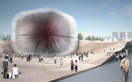
About the scheme: This is an image of Thomas Heatherwick’s British Pavilion for the Shanghai Expo 2010.
The £13m building will be decked in 60,000 acrylic rods.
Thomas Greenall’s verdict:
If the Foreign and Commonwealth Office are to be believed, Heatherwick’s design for the UK’s offering at the 2010 Shanghai Expo will provide: “a dramatic demonstration of creativity and innovation in the UK”. Really? Maybe the FCO had failed to notice, on Heatherwick’s website, a slightly more diminutive version of the same concept in the form of Sitooterie II on Barnards Farm, Essex.
To take a rather pessimistic view of the situation, Heatherwick’s mantra, in this instance, seems not dissimilar to that of the UK’s volume housebuilders - take a design that has worked previously and then replicate it at the next given opportunity. That this is regarded as a demonstration of innovation can only mean that the FCO’s new green agenda places an additional emphasis on reuse and recycling.
This aside, the scheme seems somehow justified by the conviction of the faceted landscape, the folds of which give the impression that the surroundings have been imagined as the recently opened wrappings of a jewel-like sweet. Add to this a rather charming, albeit retrospectively considered, concept will undoubtedly afford a worthy experience for the visitor.
Whether, in fact, the images presented here can ever be translated into a the pavilion that they promise; whether the rather outmoded format of the world exposition has any validity, and whether £13.2m for a temporary building to house seeds can ever be justified in the current economic climate are, in my opinion, yet to be seen.
(Legacy plans for the building include using each of the 60,000 acrylic coffined seeds as an educational tool!)
Ian Douglas-Jones’ verdict: Heatherwick’s playful work pours out from a clearly unique kind of creative genius, where it seems nothing is impossible.
For his latest incarnation sculpture again meets architecture, in which there are gravity defying acts of the sublime.
So sculpture or architecture? Or are they the same? Or a bit of one in with the other… aggghh who cares, it is what it is; beautiful.
If familiar with Heatherwick’s work, you might feel a recollective jolt at the sight of the Proposed British Pavillion, and imagine that his 2003 Sitooterie 2 was set in front of a crazy sci-fi enlarging ray… with a ‘honey I blew up the kid building’ mad scientist experiment.
So sculpture or architecture? Or are they the same? Or a bit of one in with the other… aggghh who cares, it is what it is; beautiful
But wait… If this is to be any bit as good as its younger sibling he can be forgiven, he could be onto something here…
The folded landscape provides ample respect for the spiked urchin object, acting as both event space and perimeter shelter.
As for the urchin itself, If the blurb is true then the 60,000 wind quivering rods will be just mesmerizing.
Ingeniously, the rods allow light to penetrate the equally beguiling interior with dense bursts of light-tipped rods.
Internally there is a curious addition; the largest collection of wild seeds in the world, each seed displayed on the tip of each rod.
This apparently is ‘a unique symbol of the UK’s role in worldwide conservation’, if conservation really is the message then perhaps 60,000 15 foot transparent rods should have been scrapped for something a little more frugal?
Ummm, no. I just can’t help but love it, for what it is!
Form to programme? Meaning? What? The British pavilion is a true tour de force in sculptural possibilities, it doesn’t really matter what’s in it, and I have a sneaking suspicion that not many people will remember it as a symbol to the UK’s World conservation role, but rather for its hypnotic, beauty.
It does however raise the question of the point of these pavilions, does anyone really remember the content?
Or just what it looks like or does… Diller and Scofidios Blur and Jean Nouvels Monolith a case in point.
In a ’my-dad’s-better-then-your-dad’ type competition symptomatic of expos, then the British pavilion should win hands down.
Postscript
Architect Ian Douglas-Jones has just graduated from the Royal College of Art. Read about his degree show in Towards New Capital.
For the latest jobs in architecture visit Building's specialist job site.


No comments yet