The new logo will be available in four colours and has been approved by the International Olympic Committee
The organisers of the 2012 Olympics in London have revealed the new logo and branding for the games.
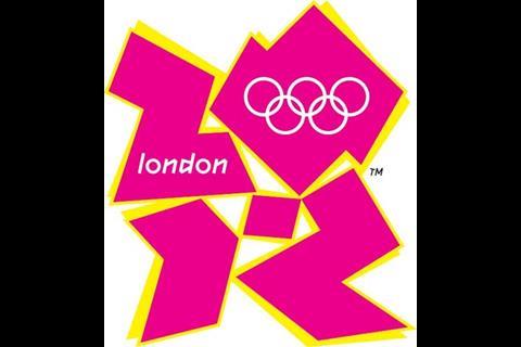
Launched this morning at the Roundhouse in north London, the logo is based on the number 2012 and includes the Olympic Rings as well as the word ‘London’.
The same image, with the Paralympic agitos, symbolises the Paralympic Games.
The logo is available in four colours – blue, green, orange and pink - and has been approved by the International Olympic Committee.
Speaking at the launch this morning , London 2012 Chair Seb Coe said: "London 2012 will be 'Everyone's Games', everyone's 2012. This is the vision at the very heart of our brand.
"It is an invitation to take part and be involved."
The new logo was designed by Wolff Ollins and the design brief was for an emblem that represented the four key aspects of access, participation, stimulation and inspiration. It was described by Coe as “dynamic, modern and flexible”.
It replaces London’s candidate city logo, established in November 2003.







20 Readers' comments