Westfield Stratford City in east London - dead handy for the Olympic park - is Europe’s biggest urban shopping centre, a retail behemoth so large it is really a city within a city with more than 300 shops and 2 million ft2 of retail and leisure space. Ike Ijeh goes wild with the credit card
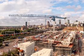
Corporate serendipity doesn’t come much sweeter than at Westfield Stratford City. The giant Australian developer Westfield bought the site, a disused goods yard behind Stratford Regional station, in 2003. At the time of purchase Westfield was a relatively unknown force in the UK and planned to develop the area for retail use in conjunction with government-owned regeneration body London and Continental Railways.
As derelict brownfield sites go, Westfield’s purchase was less glamorous than most. The goods yard had once housed workshops, which busily churned out the kind of forgettable railway accoutrements (ticket stubs and train seats) we all take for granted. It also nestled on the hinterlands of a vast industrial wasteland that blighted some of London’s poorest boroughs. And to top it all, for those unfamiliar with east London, Stratford’s cultural nonentity was such that its biggest claim to fame was its titular similarity to the birthplace of Shakespeare.
And then, overnight in 2005, everything changed. To the surprise of some, London won the bid for the 2012 Olympic Games. The government had selected the wasteland beside Westfield’s site for the Olympic park and the developer suddenly found itself on the edge of Europe’s biggest construction site and in possession of some of the most coveted real estate in the world.
A brand new international station was built serving the UK’s fastest domestic trains and offering a journey time of just seven minutes to central London. Billions of pounds of investment rolled in to fund one of the biggest and quickest regeneration programmes London has ever seen. And most lucratively for Westfield, at least in the short term, was the fact that the entrance route from Stratford station to the Olympic park cut right through their site. In a poetically anglicised, consumerist interpretation of Olympian progress, this now means that up to 70% of the estimated 10 million ticket holders attending next year’s Games will first have to pass through a shopping centre.
Even without such cosmic commercial providence, the £1.45bn Westfield Stratford City represents an extraordinary milestone in London’s development history. Depending on your recreational proclivities, the scheme will provide a pulsating rendition of either heaven or hell. With more than 300 shops and a vast 2 million ft2 of retail and leisure, the scheme supersedes Westfield’s other behemoth in west London as the largest urban shopping centre in Europe.
It also contains 1.1 million ft2 of office space, the UK’s largest casino, three hotels, over 50 restaurants, 5,000 parking spaces, its own bus station and a 17-screen 3D cinema capable of screening films on request. Westfield has also forensically identified a catchment area of 4.1 million residents stretching as far as Hertfordshire and Sussex. But if German rail operator Deutsche Bahn gets its way courtesy of Stratford International station, this will extend - surreally - as far afield as Munich and Berlin.
The 100-acre wider Stratford City masterplan also envisages an additional 1 million ft2 of retail, 5 million ft2 of offices and 16,000 homes. Such is the scale of urban expansion that London will have its first new postcode since the creation of Thamesmead in the sixties, E20. So Westfield Stratford City is not just a shopping centre; it is city engineering on a monumental scale and the starting pistol for the creation of a brand new London neighbourhood.
The main entrance to the development is up a sweeping flank of steps from Stratford station and via a massive Corten bridge that spans adjacent railway lines. Conceptually, the bridge embodies several architectural features present throughout the entire development.
It symbolises Westfield’s connection to the existing town centre and public transport infrastructure. Its gritty, rough-hewn surfaces and sophisticated installation technique also recall the pioneering engineering spirit that once helped forge the industrial heritage of the site.
But it is its scale that provides the biggest clue as to what lies ahead. With its over-sized sections and chunky balusters, the bridge casts a curiously clumsy and almost cartoonish aspect, substantial but crude. It is a telling metaphor for the design of the entire scheme. For it is the varying successes and failures of the approach to scale adopted throughout this vast development that is the defining element of its architectural character.
Complex
The shopping complex itself is split into two sections, the mall and the “street”. Both begin at the end of the town centre link bridge and eventually converge once again at Chestnut Plaza, a piazza at the far end of the site that faces directly onto the Olympic park opposite. In an exhilarating masterplanning gesture, Chestnut Plaza is aligned to fall on the axis that leads directly to the entrance of Zaha Hadid’s aquatics centre. As with Brent Cross and Westfield London at Shepherd’s Bush, the shopping centre is bookended by two anchor retailers at either end, Marks & Spencer on the Stratford entrance side, John Lewis on the Olympic park side.
However, one of the biggest surprises of Westfield Stratford City and one of the key differences with Westfield London is the amount of outside space provided. Seventy-five per cent of shops are contained within the mall but 25% face onto the plaza and the “street”. The result is a refreshingly urbane development, one which the owners accurately describe as a “city within a city”. These animated public spaces (accessible 24 hours a day) form a cosmopolitan alternative to the hermetically sealed retail box doggedly espoused by most shopping centres. They also afford Stratford City innovative hybrid status between the traditional British high street and the American shopping mall.
From the “street” one of the key visual characteristics of Stratford City is immediately apparent: the sheer variety of building volumes, types and facades. From the entrance, the scale of Westfield is instantly overwhelming. This is an enormous development and mix of uses, and the clever use of outside space merely increases the allusion to metropolitan scale.
To humanise such a massive building, it is broken down into smaller, individual segments, each with its own semi-autonomous design style. Keith Whitmore, Westfield’s design and construction director, describes the design approach as introducing “a series of different buildings each with their own design, facades and finishes as you would find in the heart of a city [to ensure] that the visitor is not overwhelmed by the scale.” This ingrained multiplicity is underlined by Stratford City’s huge multidisciplinary design team which includes Westfield’s 40 in-house architects and a number of outside practices.
The result is a kaleidoscopic architectural orgy of competing colours, shapes, materials and style. The standalone M&S store by Angus Pond Architects is a staggered, angular stack of embossed concrete panels, brass trim and multi-coloured enamel-backed glass. Crispin Wride’s John Lewis is a conventional stone-clad block intermittently relieved by protruding prows of patterned glazing. Fletcher Priest’s office block is a slinky, reflective glass cube with horizontal steel channels and razor-sharp edges. And everything in between, including the car park’s distinctive projecting rotunda, is clad in a tectonic riot of copper shingle, black glass, gold trims, bronze fascias, stone panels, steel diagrids and perforated metal meshes.
The willingness to recreate the mix and diversity of a typical urban townscape is praiseworthy, as is the concept of fragmenting the scale of an otherwise totalitarian mega-block into smaller constituent parts. But Stratford’s City’s problem is that the manner in which this is achieved lacks visual subtlety and co-ordination. It does not help that much of the cladding appears cheap and crass, particularly on the hotel blocks. That much of this was implemented under the gaze of Westfield’s design review panel (which included architectural luminaries such as Frank Duffy and Paul Finch) is mystifying.
There is a fine line between contrast and confusion but Stratford’s City’s morass of forms and materials is too chaotic and uncontrolled to provide the overriding architectural integrity that would unify the development without homogenising it. Externally, the only exception is the public spaces, which are the glue that just about holds the scheme together. But much of the remainder constitutes contrived pic’n’mix architecture of titanic proportions and harbours all the cosmetic artifice and hedonistic gratuity of a theme park.
Things are more convincing internally. Stratford City introduces two new concepts to UK retailing: “progressive comparison shopping” and a prioritised top floor. The former is a zoning methodology that locates retailers selling similar types of product together. The latter involves placing the most important trading floor at the top rather than the bottom. Most UK shopping centres have their principal floor at ground level and locate progressively less coveted brands or amenities the higher you go up the building. Stratford City reverses this arrangement, thus ensuring optimised pedestrian flow throughout all its three levels.
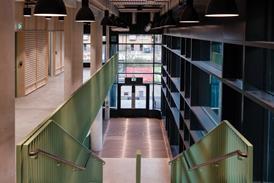
Throughout, the interiors are largely characterised by sleek, glossy indulgence with quality fixtures and finishes interspersed with dynamic artificial lighting. The multi-level restaurant court in particular has a decadent, club-like feel, with strip-lighting embedded into its forest of slender, varnished wood veneer columns.
Floors are often finished in dark, honed stone slabs, allegedly selected to celebrate the “hard-edged urban spirit” of east London. A constant invigorating feature is the panorama of spectacular views out over the Olympic park available from upper levels.
But the principal glory of Westfield Stratford City is the curved, triple-height arcade that forms the centrepiece of the mall. This grand, cavernous chamber is column-free, top-lit and flooded with daylight, an aspect that, prior to Westfield London and Bluewater at least, was relatively rare in UK shopping centres. Like the remainder of Westfield, it is also conceived on an enormous scale.
Stratford City’s vertical hierarchy dictates that the arcade’s top level is the loftiest, and its proximity to the continuous glazed roof brings with it an incredible sense of openness and space. One unwelcome irritant at this level is the imposing presence of a continuous curved bulkhead overhead whose louvers and white metal fascia add a bland, utilitarian quality to the space. But the reassuring rhythm of the graceful arc not only allows uninterrupted sightlines of every shopfront, but is also quietly reminiscent of one its great 19th-century retail predecessors, Nash’s famous Quadrant at Regent Street.
There is absolutely no doubt that Westfield Stratford City will enrage purists, of architectural persuasions or otherwise. Some will dismiss its brash finishes and gaudy facades as no more than gross architectural bling. Others still will cast it as a corpulent citadel to consumerism that is further evidence of advancing moral decrepitude. Some may even compare it, with some validity it must be said, to another narcissistic pleasure-ground of dubious artistic integrity, Las Vegas.
But whether there is truth in any of this or not, does any of it really matter? Much of Stratford City may indeed be gauche, coarse and haphazard but millions of shoppers will inevitably flock to it and their pilgrimage will be blissfully unperturbed by awkward cladding details or incoherent massing. What they will notice, however, is the phenomenal march of regeneration through what was once one of London’s most deprived areas and the positive contribution it will make to local character and civic spirit. And even the most cynical observer cannot fail to be moved by the sheer heroic scale and ambition of the project. Or deny the fact that it offers an incredible leisure experience.
What has been achieved in the space of just four years at Stratford is what would ordinarily have taken a generation to accomplish. Stratford City therefore stands as one of the most powerful symbols of the extraordinary visionary momentum and regeneration impetus an Olympic Games can ignite. It is this and not clumsy design or critical indignation, that will prove to be Westfield Stratford City’s greatest legacy.
Project Team
client/developer/contractor: Westfield
architect (main centre and offices): Westfield / Fletcher Priest
architect (M&S): APA
architect (John Lewis): Crispin Wride
architect (hotels): Rab Bennetts / HKR
landscape architect: Applied Landscaping
all engineering/services: Westfield
No comments yet