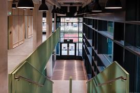
Part of downtown Los Angeles’ booming regeneration, the £117m redevelopment known as The Bloc is the largest scheme to tap into the city’s newfound want for mixed-use spaces

LA 5

Source: Carlos Hernandez

The Bloc: Colonnades will encircle a new sunken square

The largest single, mixed-use commercial redevelopment project in the city of Los Angeles is about to complete next month. The Bloc is a landmark £117m, 170,000m² regeneration project right in the heart of LA’s downtown district. On the face of it, other than its enormous scale, this type of commercial development appears fairly conventional. It contains a 485-room luxury hotel, a 70,000m², 32-storey high-end office tower and 37,000m² of retail and leisure space offering all the shops, bars, restaurants and cinema screens that one might naturally expect on any similar British development of this nature.

But two important aspects elevate the Bloc to a ground-breaking level of significance: context and construction. Downtown LA is undergoing a resurgent boom. Fifteen years ago the centre of the city was avowedly monocultural with an uncompromising and almost unilateral emphasis on office accommodation and little regard for providing the non-commercial social and leisure amenities that invigorate urban life.

Today, downtown is undergoing a transformation. Commerce has been partially displaced by the thousands of new residents that have moved into the district. In their wake, the bars, shops and restaurants and even craft breweries that were once scarce here have poured in, creating a vibrant and mixed urban community that appeals directly to residents and visitors as well as workers.

The Bloc is the largest single development to date that seeks to both reflect and accelerate this trend and therefore represents a major chapter in the story of downtown’s ongoing reinvention. It has been designed by Long Beach architects Studio One Eleven for prolific LA commercial developer The Ratkovich Company. Webcor Builders, a California-based construction company, is the main contractor.

The Bloc is also significant in construction terms. Before redevelopment began the building comprised three principal connected elements, the 32-storey office tower, the 24-storey hotel tower and, separating them, a three-storey shopping centre known as Macy’s Plaza.

LA 7

Source: Carlos Hernandez

The Bloc: Trusses in the basement of the former Macy’s store being dismantled

Together, all three elements occupied a full city block. The complex was designed in 1973 by Charles Luckman, a high-profile modernist American architect whose design for the horrendous replacement Penn Station in New York provides a chilling clue as to why aghast Angelenos quickly named his LA hotel, office and retail complex “the Fortress”.
“It was from a completely different era,” explains Studio One Eleven senior associate Marcus Luciani. “Apart from the entrances, at ground level there was virtually no street interaction and it presented this intimidating series of high, blank brick walls to the surrounding streetscape.

“The shopping centre was pretty much the same, inward looking and highly defensive and a symbol of a time when LA’s crime and social problems meant that commercial owners wanted to shut the city out rather than invite it in.”

Symbol

Therefore, in construction terms, the redevelopment solution is relatively simple but hugely symbolic. The hotel and office towers have been retained but extensively refurbished. But the physical and conceptual heart of the project lies in the former Macy’s Plaza. This has been demolished, heralded by the much publicised and locally cathartic dismantling of its roof this summer.

A sprawling new public space replaces the plaza and provides integrated lobby entrances to the office block as well as a host of retail and recreational amenities. These have been carefully inserted into the lower three floors of the office and hotel blocks on either side of the new public space, slotting neatly within the bays of the towers’ retained steel frames.

LA 6

The new development will feature a terraced and partially sunken public square

Luciani says the principle is based on a pattern of redevelopment that has been taking place across California. “We call it de-malling here, turning inside shopping malls into outside shopping malls in order to take advantage of the great weather and activate local streets.”

Significantly, the new public space has been arranged across multiple levels with its principal expanse formed at lower ground level but surrounded by a series of encircling, colonnaded terraces above. The main lower expanse provides direct access from the street via a series of steps and escalators. This lower level is important because it provides direct access to the nearby 7th Street metro station.

This is an enormously significant move. While we may take the principle of integrated public transport for granted in the UK (in theory at least, if not always in practice) there is profound notional severance between public transport and commercial development in LA.

LA 4

Source: Carlos Hernandez

The Sheraton Hotel on the site has been extensively refurbished with new interiors and a new roof terrace

Incredibly, the Bloc will be the first private commercial development in the metro’s 25-year history to provide dedicated and direct access to the system, a move that powerfully symbolises its openness to LA’s emerging street culture and public realm, and one which Luciani states was “one of the easiest things on the entire project to do”. Within LA, The Ratkovich Company’s chief executive Clare De Briere also describes the public transport integration as “a real game-changer for the profile of the whole development”.

In keeping with the principle of accessibility established by the metro link, the new square also instigates a new series of pedestrian street-level cross connections from one side of the block to the other, again another relatively novel concept within LA’s dense urban grid. Additionally, Luciani revels in the “found spaces” they were able to locate within the site, a process prompted by an innovative reorganisation of accommodation hierarchy within the site in order to maximise commercial profit.

“During the feasibility stages we noticed that the Macy’s department store barely used their third floor for anything other than storage. As a result of new integrated storage, service and retail areas they’ve been able to utilise in the basement, a new nine-screen cinema has moved into their former third floor. This is a big example of similar scenarios we found across the site, underused spaces where some clever reordering has been able to realise new activity and commercial space.”

Strategy

The structural strategy for the construction has been relatively straightforward. Large voids have been punched into ground floor and basement slabs to accommodate the new public space which has required additional reinforcement of surrounding structure to ensure stability.

LA

Before – The office tower during construction / After – The same view showing new square and colonnaded base to office tower

As the original steel frame and fabric remains in fairly good structural condition, wherever possible the design team has strived to retain as much of it as possible, with the exception of course of the Macy Plaza roof which, luckily, was structurally independent. However, as with any refurbishment project, Luciani points out that there were surprises including structural slabs that “varied up to three inches across relatively small expanses.”

He also identifies phasing as one of the biggest challenges. “Both the hotel and offices remained fully operational throughout construction. Moreover, we had to hold a big summer social function for investors in the refurbished hotel ballroom during construction, so to a degree that dictated which parts of project were complete first and where we could locate temporary access routes. There’s also a US post office on the site; legally they have to remain open so access to that also had to be maintained throughout construction.”

LA

Before – The entrance of Macy’s Plaza on 7th Street / After – Macy’s Plaza demolished during construction

But, as Luciani happily explains, fortunately there was one key advantage to replacing an indoor shopping centre with an outdoor square. “The ductwork for mechanical systems was incredibly convoluted, poking through walls and slabs like Swiss cheese. But as most of it was for air conditioning and ventilation for the mall, we were able to remove a huge chunk of it.”

Seminal

Both Luciani and De Briere cite New York’s seminal Rockefeller Centre as a conceptual precedent for the Bloc, an ambitious comparison but a thoroughly justified one. In their acute concentration of urban space and activity, both schemes celebrate their respective cities with a dynamically expressive approach to architecture and public realm that is inclusive, accessible and crucially from a development point of view, commercially lucrative.

Arguably, the Bloc’s achievement is to offer an even more pressing regeneration milestone as it strives so forcefully to reverse the former decline of its environs and galvanise further their current resurgence. This is a point which De Briere is keen to emphasise. “To put it simply, LA’s downtown was dying and the Bloc site reflected that. There was no activity on the surrounding streets and it was impermeable and inaccessible. By essentially turning a full city block inside out, we’ve made it part of its context and reconnected it to the city.”

LA 9

Visualisation showing new active street frontages

Of course, rightly, the Bloc is finely attuned to the form, character and culture of LA and seeks to respond to context as much as it strives to forge it. But the development’s nuanced application of established design principles also suggests an intriguing and reassuring universal truth. Whatever or wherever the site, the core ingredients of urban regeneration and good design - connectivity, accessibility, activity, diversity and innovation - tend to remain the same.

Project Team
Developer:
The Ratkovich Company
Architect: Studio One Eleven
Main contractor: Webcor Builders
Structural engineer: Nabih Youssef Associates
Landscape architect: EPT Design
Office interiors: Rapt Studio
Hotel interiors: McCartan

Q&A with Andy Meyers, CEO of Shangri-La Industries & strategic partner to Bloc main contractor Webcor Builders

Q: What were the main technical challenges of the construction?
A: On any rehab project, especially one where you have a hotel, retail centre and office building, there are always a number of challenges. On the Bloc the MEPs have required the largest amount of co-ordination and technical skill. Since the project does have such large spaces and we took a once closed-in retail centre and made it open air and activated new deck levels, it just increased the already complicated nature of the job.

Q: Were there any structural features of the retained original building that made construction or demolition more difficult?
A: There was nothing that was really
out of the ordinary. The structure was built very well originally so it didn’t require as much seismic strengthening as we initially thought when we first walked the job in the very beginning.
We have altered the structure quite a bit, cutting in much larger openings and also adding and raising very large sections of certain floors.

Q: Where structural slabs or walls are being removed, how is localised structure being remedially reinforced?
A: Usually using temporary engineered shoring while the final and permanent elements are put into place.

Q: Was the removed Macy’s roof an independent structural element or did it have an impact on stability or loading of the surrounding retained structural frames?
A: It was an independent structure. The only temporary shoring that needed to take place was between the trusses that we removed. The building itself did not require any structural reinforcement during that time as it was originally built independently and then at the end the roof structure was added.