Architects working on the £8m refurbishment of York Art Gallery have peeled away decades of callously inappropriate interventions to unlock a wonderland of architectural secrets
Τo a child, the concept of secrecy is a magical construct filled with intrigue, mystery and adventure. Secrecy is vigorously enthused into the stories and games that enchant us in our youth and it is only when we grow older and our imaginations contract that it becomes something to fear rather than favour.
And in architecture, it is the buildings that keep secrets that are sometimes the best. York Art Gallery was once one of these and its own secret, as vividly described by York Museums Trust chief executive Janet Barnes, has formed the conceptual basis for the extensive £8m renewal and refurbishment project that has now been completed. “There was a narrow corridor that led from one of the upper galleries,” whispers Barnes conspiratorially. “It had a concealed door and when you opened this door, you were suddenly met with the most incredibly elaborate Victorian ceiling, soaring over a void between the roof and the ceiling below. I would love seeing the surprise on people’s faces when I showed it to them; it was our very own secret gallery.”
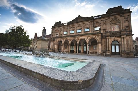
This gallery has now been unlocked courtesy of a competition-winning scheme designed by a joint venture between two architects, Ushida Findlay and conservationists Simpson & Brown. Their proposals beat off stiff competition from a renowned shortlist containing Rick Mather Architects and 2015 Stirling Prize nominees MUMA. Tragically, co-designer Kathryn Findlay died before the building was complete so in many ways, the gallery’s rebirth now stands as a poignant final built legacy to her life and work.
York Art Gallery itself, which was closed for almost two years during the refurbishment, is one of England’s most important regional galleries and contains an impressive collection of both contemporary and classical artwork and paintings. It also contains the world largest collection of British studio ceramics.
The gallery overlooks Exhibition Square right in the centre of historic York and while its Victorian front facade is a ponderous and unduly blank affair, it occupies an enviable position beside the ancient city walls and overlooked by the towers of the magnificent York Minster nearby. But of course, like many old civic buildings, York Art Gallery was built for a different purpose to the one it serves today and the incremental nature of its evolution is central to why its “secret gallery” became secret in the first place.
History
It was completed in 1879 by architect Edward Taylor to host the second Yorkshire Fine Art and Industrial Exhibition, inspired by the Great Exhibition in London of 1851. Today’s gallery building was only a small part of the original building; behind it once stood a huge timber-frame hall that housed the main exhibition space. Even though this hall was intended to be temporary, after the exhibition it was retained and was converted for various uses, including the former York School of Art. In 1892 the front building was elevated to the role it still serves today, City Art Gallery.
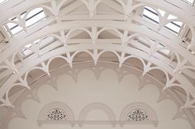
Unfortunately the rear hall was destroyed during the Second World War leaving the front building as the sole gallery premises. The front gallery building had a hall of its own at its centre, smaller in size than its bombed-out equivalent to the rear but more elaborately decorated with sprung ornamental arched trusses spanning a soaring barrel-vaulted roof.
However, the destruction caused by the war sparked a long post-war period of insensitive, piecemeal additions and alterations to the remaining building that gravely damaged both its built fabric and historic integrity. A poorly built and incongruously functionalist 1950s wing was slapped on to the back to conceal the internal walls left exposed by the destroyed rear hall.
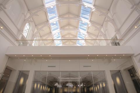
And in the 1970s the remaining hall was savagely subdivided by a series of screens and partitions, the most damaging of which was a false ceiling erected at first floor slab level which halved the height of this lofty space and effectively covered its intricate vaulted roof from view for the next 40 years to all except an awestruck Barnes and her smuggled guests.
Concept
The concept behind the gallery’s restoration has been a simple one: to unlock the secret spaces that previous inappropriate redevelopment had created. As the front facade of the grade II-listed building has been left untouched, this mandate starts in the entrance lobby. This was once a cluttered space incongruously crammed with shops and a cafe.
But the relocation of York’s city archives, which previously occupied the north wing of the ground floor, has allowed the cafe to be relocated to the former archives reading room to the side of the lobby. This in turn has enabled the lobby to become a clear open space and a fitting entrance to the gallery for the first time in decades.
And it is here where the theme of uncovered secrets makes its first appearance. The original chequerboard-tiled floor, previously obscured by ungainly vinyl covering, has been restored and exposed. And two glorious granite columns and capitals which form a screen that separates the lobby from the main hall have been liberated from the crude plasterboard housing into which they were inexplicably boxed in the 1970s and are now on resplendent full display.
Beyond the lobby we look upwards to catch our first tantalising glimpse of the ornamental roof that had been hidden from view for decades. But first there are three new galleries on the ground floor to navigate, two on either side of the main hall and a central gallery directly ahead in the main hall itself concealed behind a glass screen.
Because this central gallery is pushed back from the front edge of the hall, it wisely permits the brief, double height void which allows views to be drawn upwards and daylight to pour downwards.
After much agonising debate between client and architects, the decision was made to retain the vertical subdivision in the main hall and keep the ground floor as separate gallery space. “The rational move was to create more usable space,” says Barnes, “to demonstrate the public benefit of the restoration works.” Accordingly, gallery space has been increased by 65%.
But there was another important reason too, as Simpson & Brown project architect Tom Van Hoffelen explains. “We liked the idea of a mezzanine with the new gallery above, and we felt that the benefit of this new raised gallery with its newly exposed ceiling would far outweigh any drawbacks in maintaining the subdivision below.”
Secret gallery
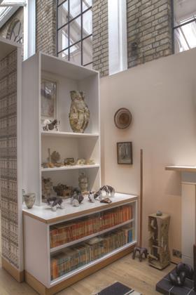
And this raised gallery space is indeed the centrepiece of the project. Reached via a sumptuously restored stone staircase to the side of the lobby, this gallery space occupies the lofty upper level volume underneath the gloriously restored Victorian ceiling. Flooded with daylight from slanted skylights above and with its walls crammed bazaar-like with its ceramic exhibits bejewelled in glass cases, there is a celestial otherworldliness about the space that makes it impossible to conceive how it could have been callously hidden from view for so long.
The entire room, both ceiling and walls, has been painted in two shades of white and while this familiar monochrome gallery palette uniformly applied on to a Victorian interior might have jarred, Van Hoffelen explains that it was derived from curatorial as well as architectural decisions. “We wanted simple, modelled surfaces of glass and white mixing with shadows. Colour would have been too dominant and decorative, the white background is not only good for the exhibits but it enables the room itself to appear sculptural.”
In many ways this room summarises the entire project. The Victorians may have conceived and left it as an ornamental showcase but it has now been embalmed in conformist white that mirrors the unassuming and understated approach the design has adopted. “Functionality was the key,” says Van Hoffelen, “we wanted to make things usable and we wanted to avoid flashy new elements and overt statements.” This they have certainly achieved to the extent that their interventions are marked by a passivity that almost renders them invisible. Those who like their architecture virile and red-blooded might be underwhelmed, but the project still represents a studious, if quiet, resolve to stitch a broken and fragmented building back together.
Exterior
Other key internal interventions on the first floor are another ceramics gallery inserted into a space formerly occupied by a pitched roof to the south of the hall and the refurbishment of the rear 1950s brickwork extension block to house a shop, studio and lift. The shop leads out on to a broad balcony terrace which provides generous views out across newly landscaped gardens that are to replace the site of the main hall bombed in the war.
Suspended stairs lead down into the garden with both stairs and terrace forming an expansive timber structure whose rather clunky articulation seems at odds with the more discreet touches inside. More successful is the tall brick parapet wall that wraps around the top of the 1950s block to conceal new plant. With its intermittently projecting bricks, it reads like a decorative embroidered trim whose studded surface apes the decorative ceramics inside.
A new landscaped alleyway also snakes along the north side of the gallery from the gardens to Exhibition Square at the front of the building. With the kind of linguistic contortionism that could only be attempted in Yorkshire, twisting, hidden alleyways like this, of which there are several in York, are known as “snickelways”.
This one will now be open to the public and offers a starkly utilitarian, back-of-house view of the gallery whose walls here reveal the hectic series of patches, add-ons and repairs that indicate the physical changes the gallery has undergone over time.
With some grammatical licence, Simpson & Brown partner Andy Davey refers to this as an “haphazardry of materials” that characterises the building. “York is a city of dead ends,” proffers Barnes, as a metaphor for the series of abutments and transitions that define the gallery’s side and rear walls.
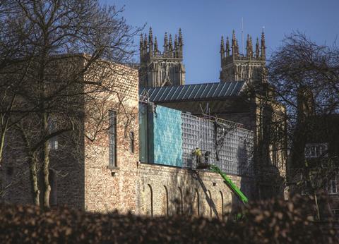
Both these themes inform the gallery’s final architectural flourish, an extraordinary attic level that runs along the gallery’s south side clad entirely in tessellated hexagonal glazed ceramic tiles that softly undulate from shades of blue to green. Set loudly against the warm yellow brickwork of the building this comes as something of a shock after the monochrome rigour of the central hall.
After the studious restraint elsewhere, such belated raucousness might be seen as a piece of cheap and desperate exhibitionism. Not so here. First, the pattern is based on a historic paving pattern that is again found on several of York’s snickelways. But even more vividly, like a key glinting amidst a pile of padlocks, it offers a knowing wink towards the decorative secrets that lie within.
Project Team
Client York Museums Trust
Architect Ushida Findlay Simpson & Brown
Main contractor Simpson of York
Structural/Mechanical engineer Arup
QS Aecom
Project manager Appleyard & Trew






No comments yet