Cartwright Pickard’s considered, pragmatic design has allowed Wakefield’s council offices to come in at under half the price of some other recent civic buildings. Could this be a template for more hubristic architects to follow, asks Ike Ijeh

wakefield

wakefield

With the UK having officially slid back into recession and the age of austerity biting hard, the pressure to keep building costs down has rarely been greater. And with its fiscal responsibility to the taxpayer now under more scrutiny than ever before, it is particularly incumbent on the public sector to deliver cost-effective and economically sustainable buildings. Against this straitened financial backdrop, Wakefield’s £19m civic offices by Cartwright Pickard Architects could well set a positive example to local authorities, architects and developers across the land.

Delivered to shell-and-core Category-A specification at a cost of just £1,032/m2, the 14,771m2 offices cost considerably less to build than recent comparable civic headquarters of only a slightly bigger size. The £38m Birmingham council offices and Greenwich council’s £57m civic offices in south-east London both opened last year, but respectively incurred build costs that were almost double and triple those of Wakefield. Moreover, although some privately deride “cost-effective” as a charitable pseudonym for “low quality”, Wakefield proves that the two need not be synonymous. While the building is a far cry from the flash, showy “starchitecture” that normally grabs the headlines, it is a considered, pragmatic and efficient piece of design that solidly satisfies its brief and animates its urban context.

So how is all this achieved on such a tight budget? Cartwright Pickard project director Andrew May describes the building as a “kit of parts”. While the project made use of some prefabricated elements, the term also refers to the modular, streamlined approach to design and construction employed throughout and the small set of standardised details and materials specified. In so doing, the building resembles a compact and highly customised building prototype as much as it does a work of architecture.

We only used a few window types and used a very small palette of carefully selected robust and hard-wearing materials

Andrew May, Cartwright Pickard

The procurement route chosen was a bespoke form of design-and-build contract which, as May explains, “gave the contractor room to utilise the supply chain and market knowledge to offer specification alternatives in order to achieve best value”. In turn, the client - English Cities Fund on behalf of Wakefield council - was able to maintain overall design control via a “specific set of performance and quality standards laid out in the employer’s requirements”.

May identifies the building’s “simple, rectilinear form” as a major contributor to its cost-effectiveness. The offices are essentially a five-storey cube on one side which the rising ground level gradually reduces to four storeys on the other side. The block is entirely clad in three randomly arranged shades of terracotta rainscreen cladding tiles. Their sandy colour and modulated pattern is a contemporary response to the tone and texture of the ornate Victorian County Hall opposite, as well as much of Wakefield’s rich 19th century civic building stock, some of which is visible nearby.

Up to five rigidly rectilinear standard window types are randomly repeated across all four facades, each one set within a bronzed anodised aluminium frame. Their deep reveals are faced in brightly coloured strips of glazed terracotta, the changing colours of which are designed to evoke the polymorphic mutability of the stained glass windows within the County Hall.

The entire block is surmounted by strongly projecting eaves, anodised as per the windows and once again indebted to the historic precedent of a strong, continuous roofline present in many of Wakefield’s older buildings.

The only significant variation between each of the four facades is the double-storey entrance recess cut into two of them. May describes the block as a “transitional building with no front or back - each elevation is more or less equal and largely free of needless quirks or variations”. This provides an important clue as to the streamlined economic principles that drive the building’s exterior.

“We only used a few window types and used a very small palette of carefully selected robust and hard-wearing through-coloured materials,” adds May. “This enabled us to take advantage of economies of scale with regard to detailing, quantities and manufacture, which helped us to deliver a cost-effective and visually consistent exterior that remained faithful to local historic context but was also crisp and modern.”

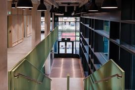
The same prudent philosophy continues internally. Each entrance leads to a short lobby at either end of the building which eventually converge on a full atrium crowned by rooftop glazing. A museum, library, cafe and council one-stop stop are destined for the lower storeys while open-plan offices are located above. The atrium is overlooked by oak-slatted balconies and features several expanses of exposed fair-faced concrete.

Again, the overriding visual theme is simplicity, with clear, uncluttered spaces, easy orientation, generous daylighting and multiple framed views out over the city all acting as spatial metaphors for the civic ideals of openness and accessibility. While fixtures and finishes are generally plain and workmanlike, the interiors are nevertheless trim, spacious andefficiently organised.

Structural columns along the edge of the concrete frame, for instance, are concealed within the thick 450mm depth of the external wall, allowing a continuous, streamlined internal finish whose deep, timber-trimmed reveals help provide visual solidity and solar shading.

Two compact and efficient cores stand out as further evidence of cost-effective design. Space within these has been exhaustively optimised and the use of exposed concrete concentrated in both locations to reduce fit-out costs. Impressively, the result was that sufficient funds became available for the specification of more expensive glass lifts, which glide up and down the atrium, adding a touch of sleek decadence to the stoicism evident elsewhere.

The overriding visual theme is simplicity, with clear, uncluttered spaces, easy orientation, generous daylighting and multiple framed views out over the city

Offsite prefabrication of centralised service “rafts” within office areas also helped to keep build costs down. These rafts contain chilled beams, lighting units and acoustic absorption panels and were pre-assembled in sections and then easily installed on site, saving time and money. The exposed concrete ceilings from which they hang also provided a high thermal mass, which in turn reduced expenditure on mechanically cooling the building.

Finally, May identifies an open-plan and flexible layout as one of the biggest assets in delivering Wakefield’s cost efficiencies. The 18m floorplate around the atrium and cores is logically divided into a standard 6m commercial grid layout. Much of this space is predominantly open-plan with clusters of cellular offices occasionally built into the corners. Beyond this, the use and layout of the spaces are neither fixed nor predetermined.

“There is an in-built degree of flexibility that allows for future adaptability, which should in turn ensure longevity and long-term cost-effectiveness,” says May.
“The nature of the workplace is changing - we’ve given the users room to manoeuvre and evolve over time.”

The emphasis on standardisation and efficiency employed at Wakefield’s civic offices is not only testament to the pragmatic rigour of Cartwright Pickard’s signature designapproach, but to a streamlined and repetitive means of production that has long been employed in other industries. The car industry, for instance, has long benefited from the efficiencies that mass customisation and modular manufacturing methods deliver.

Architecture has been more resistant, largely due to hubris and a perceived loss of quality. To extend the motoring metaphor, Wakefield’s civic office is no Ferrari and is unlikely to inspire either awe or adulation. But it is a solid, serious and sensible piece of design that has been delivered economically and with its very own sober brand of quality. In these troubled economic times, it sets a precedent which many would do well to follow.

PROJECT TEAM

client English Cities Fund / Wakefield council

architect Cartwright Pickard

main contractor Morgan Sindall

structural engineer Buro Happold

landscape architect Estell Warren


Topics