The new University of the Arts campus exudes creativity. Ike Ijeh visits the recently converted King’s Cross Granary to find a building that melds old and new, industry and art and provides a home for the next generation of designers
For decades, the area behind London’s King’s Cross station has been a vast, industrial wasteland of abandoned warehouses and derelict infrastructure. Hidden from view and the consciousness of most Londoners by an untidy ring of gasworks, railway sidings and security fencing, the district’s vacuous anonymity was all the more surprising for the fact that it boasted phenomenal transport links and occupied what was arguably the last major tract of undeveloped land in central London. The remedy for this urban blight is finally taking shape as King’s Cross Central, one of the biggest regeneration projects in Europe. And now the first, and one of the most critical, elements of architecture within the development has opened: the new home of Central Saint Martins College of Art and Design.
The Granary building to the north of the station has been converted by Stanton Williams (also architect of King’s Cross Square) into the new home of Central Saint Martins, now part of the University of the Arts London. The £145m project represents the consolidation of Central Saint Martins’ central London properties, formerly at Soho and Holborn, into a single 5,000-student and staff campus.
Within the context of king’s cross the granary provides an enticing first glimpse of the kind of character and quality the whole development may assume when finally complete
Within the context of King’s Cross the Granary provides an enticing first glimpse of the kind of character and quality the whole development may assume when finally complete. With regards to conservation it offers a strategy for integrating new and old that skilfully combines historic sensitivity with a virile contemporary spirit. And in design terms, it provides a compelling realisation of architecture’s role as a passive social mediator within a creative and teaching environment.
The original Granary was completed in 1852 by Lewis Cubitt, younger brother of prolific 19th century master-contractor and builder of Belgravia Thomas Cubitt. It was built to store grain delivered from wheat fields in Lincolnshire and to also manage the transfer of grain from train wagons onto canal boats for onward delivery to bakeries across London. Accordingly, the main Granary block is flanked by two parallel 180m long transit sheds into which the trains would drive. Giant turntables were also located on the ground floor to enable the carriages to be reversed and dispatched back up north.
The Granary building itself is a magnificent piece of Victorian industrial architecture. Six storeys of solid, robust brickwork are sparsely relieved by alternating bays of punched windows and colossal full-height shafts topped by projecting architraves and volutes. The whole composition broods with the functional utilitarianism and raw monumentality that Victorian industrial architecture was so adept at combining, elements equally evoked by King’s Cross station itself. These historic design qualities, as well as the Granary’s former industrial role, act as the core inspiration for many of the building’s new insertions.
Stanton Williams’ intervention can essentially be split into three parts. The first involves the refurbishment of the Granary building and its conversion into new library, gallery and reception spaces for the college.
The mouth of the street, with its giant, suspended panels of extruded concrete framing double-height sheets of glass even appears to resemble a huge industrial component frozen in mid-assembly
The second sees the renovation of the former railway sheds that flank the building on either side. Retail and leisure units will be inserted into the western shed in future phases. The eastern shed has been transformed into outside workshops and a sculpture gallery. It is surmounted by the original pitched-roof metal canopy into which glazing has been inserted on the north-facing pitches and photovoltaic cells on the south-facing ones. The cells will eventually power the fountains in the new Granary Square, which is nearing completion, adjacent to the entrance in front of the Granary building.
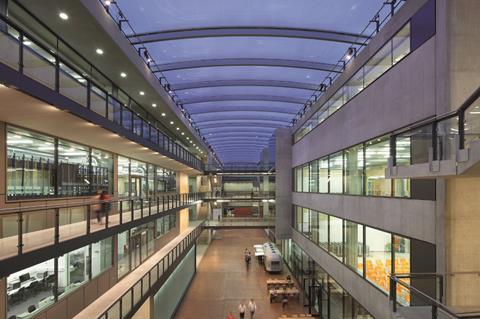
The third element of the scheme is the largest, the new four-storey building that fills the centre of the U-shaped plan formed by the Granary and its flanking sheds. This contains the bulk of the college’s new accommodation and is largely sliced in two by a full-height atrium known as “the Street”.
Although all three components exhibit very different architectural identities, one overriding theme links them all together and emerges as the central design narrative of the entire development: a confident but sensitive interface between new and old architecture. The best way to describe exactly how this is realised is by reference to what is, in design terms at least, probably the most important space in the college: the vast covered courtyard right at the heart of the scheme.
In circulation terms, this enormous rectangular space, 180 x 100m, acts as the hub of the complex, with all three main components feeding into it. One side is filled by the rear wall of the Granary building, the opposite one is formed by the mouth of the Street and the two flanking sides lead into the former transit sheds. Above the sheds a fully-glazed, triple height opening enables daylight to pour into the courtyard and a huge overhead bulkhead ceiling is perforated with three giant circular rooflights.
The success of this stunning chamber is due to the synthesis between past and present that is evident throughout the entire scheme. The monumental scale of the courtyard and the Street evokes the physical grandeur of the original Granary. Its robust, industrial sparseness is also reinterpreted by the raw, toughened surfaces of the courtyard’s uncluttered stone floor and the finely honed in-situ cast concrete panels of the new wing. The mouth of the Street, with its giant, suspended panels of extruded concrete framing double-height sheets of glass, even appears to resemble a huge industrial component frozen in mid-assembly.
Elsewhere in the courtyard, side-hung glass lift shafts cut directly into the brickwork recall both the vertical steel thrust of the hoists that once filled the Granary and the narrow, full-height openings of the front elevation. Whitewashed bricks, the discoloured imprint left on the walls by long removed roof sheds, the rails in the transit shed floor and even numbers painted onto the brick walls have also been left in place.
Within the old Granary itself, a new lightwell unveils a soaring vertical view towards one of the remaining original roof-hoists and the cast iron columns and beams are painted in the same shade of red as selected structural components within the new block. All this is no mere exercise in sympathetic conservation design. It is a nuanced balancing act between old and new that skilfully fuses subtle restraint with dramatic intervention. The result is engrossing.
As so much of the new building is wrapped between existing wings, only two locations offer external elevations: the rear facade and a sumptuous decked roof terrace offering spectacular views over London. The rear facade, faced in concrete and embellished with panels of full-height glazing comprised of wired translucent glass, offers dramatic massing and tension in the shape of a precipitous 8m cantilever containing a full fly tower for the performance theatre within.
The roof elevations are split into a noble sequence of three projecting concrete cubic pavilions whose formal symmetry, rhythm and proportions verges on the classical. Both areas reveal the same industrial rawness that characterises internal parts of the building. They also display the cool, angular geometry and poised understatement that is such a familiar feature of Stanton Williams’ architecture.
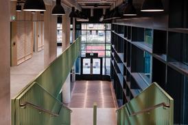
The Street runs through the main wing and is conceived as the social heart of the college. Topped by a continuous curved ETFE roof, straddled by wide bridges and circulation cores and directly overlooked by inner teaching rooms via several glazed punched openings, the space is conceived as one of theatre and collaboration. A continuous lighting gantry is installed under the roof to enable it to be transformed into a performance stage as required and ground floor openings are large enough to admit even a vehicle if necessary.
The idea of performance is also evident in the courtyard where triple-height white rendered walls can have films of images projected onto them. Also, rails behind the courtyard’s several glazed openings enable students to hang installations and thereby harness their creativity constantly to adjust the nature of the space.
These themes of flexibility and interaction are major concepts within the new building. As Paul Williams of Stanton Williams explains: “The Street is a social space to enable students on different courses to interact with each other and see each other. The architecture throughout the building provides a flexible framework that can adapt and evolve over time.” Phil Crew, Central Saint Martins project director, concurs: “This isn’t a finished building, it will morph as the college’s needs change and adapt.”
Architecturally, the evidence of this approach is present in the informal arrangement of teaching areas that enable all manner of functions and activities to take place within. It is also revealed in the fluid spatial character of circulation areas, such as the wide bridges across the Street, which alternately promote movement and contemplation.
The walls of most classrooms are faced with plywood boards, which again encourage students constantly to change their environment by adding or removing installations, presentations and colour. A unique set of personalised spatial identities already inhabits several areas, such as a textile workshop where the typically restrained backdrop enables rows of wonderfully intricate loom machines to take centre stage.
Ironically, it is perhaps the Street itself that channels this sense of informal intimacy least effectively. Despite its carpet of quarter-sawn oak flooring blocks, its uniformity and grid-like, rectilinear form lacks the textured warmth of the courtyard and occasionally resembles a corporate atrium or medical research laboratory.
The most enthusiastic endorsement of the innate adaptability of the new college can be found in more prosaic quarters. On a recent sunny day, rumours circulated of sunbathing students spotted on the uppermost level of the Street, a rogue towel strung across a nearby railing. While this kind of sartorial offence may well be frowned upon by officialdom, it is perhaps a telling sign that the architects have indeed created an informal environment that can be adapted to respond to the creative (or recreational) instincts of its users. As with the interface with the historic fabric, this is an ambition that requires a subtle balance between engagement and restraint, confidence and humility. It is always a difficult balance to strike, but the new Central Saint Martins has pitched it just about right.
PROJECT TEAM
Client University of the Arts London
Site developer Argent
Architect Stanton Williams
Main contractor Bam
Structural engineer Scott Wilson
Services engineer Atelier 10
Acoustic engineer Sandy Brown Associates
Quantity surveyor Davis Langdon
Landscape architects Townsend
Pringle Brandon Interior designer
Overbury Fit-out contractor








No comments yet