Urban Splash’s refurb of a listed sixties council estate is turning one of the republic of South Yorkshire’s biggest problems into an aspirational address
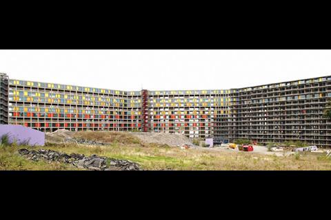
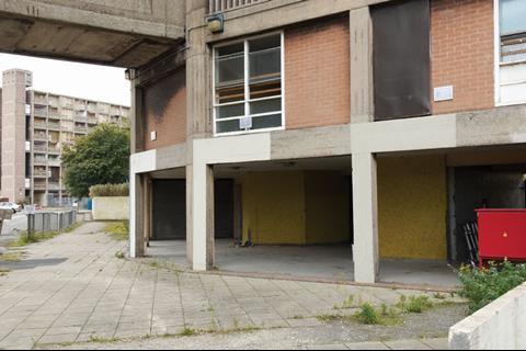
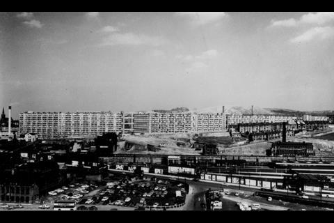
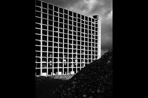
High over Sheffield, a welcome splash of colour is spreading slowly from the grey northern skies towards the south. Since 1961, Sheffield residents have lived under the shadow of the blank facades of Park Hill, an enormous council estate that looms from its vantage point on one of the city’s many hills. In recent years “estate” has become a byword for deprivation, crime and drug problems. But this Le Corbusier-inspired development was radical in its day, and to the horror of many of the city’s residents, in 1998 English Heritage gave it a grade II* listing. This meant Sheffield was stuck with it forever. But a knight in shining armour arrived in the form of Urban Splash, the developer that specialises in turning down-at-heel buildings into bijou flats.
The cladding has nearly been completed on the first phase of the development, giving the city its first taste of how the revitalised estate is going to look. It might seem nice and colourful from the bottom of the hill but how has Urban Splash reconciled all that is wrong with sixties council housing with a grade II* listing to create flats that people actually want to buy in a depressed housing market?
The bargain
Why has the developer taken on such an apparently risky project? The financial pain of rescuing the building may have been eased slightly by grants, but Urban Splash will end up fronting the lion’s share of the cost (see page 54). “We really like the building as do many other people, including former residents,” says Tom Lawrence, Urban Splash’s development manager for the job. “The building has strong points in terms of its location and connectivity to the city. It was well designed and the flats are generously sized so will appeal in this market. Plus it’s a chance to own an iconic piece of history.” Unfortunately years of neglect meant that this iconic piece of history was in pretty bad shape; in fact, it had been badly built to start with. “If anyone tells you they built things better in the olden days, they’re lying,” says Lawrence wryly. Here the usual listed building rule of preserving as much as possible wasn’t going to work. The structure had to be stripped back to its bare bones, a job made more difficult because the flimsy concrete frame couldn’t take the weight of demolition plant, so work was done by hand.
Poor condition aside, there was another reason for nearly starting afresh. Developer, architect and planners all agreed the building needed to look conspicuously transformed. “Park Hill had sat on the hillside, grey and light-sapping, and the planners and developer wanted something that literally and metaphorically demonstrated the change, explains David Bickle, the director of architect Hawkins\Brown that has been looking after the job. “EH recognised that for Park Hill to succeed it had to get away from the image of sixties council housing.”
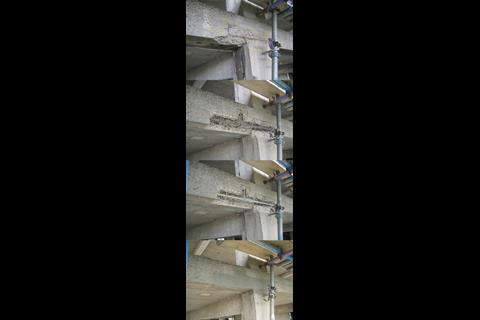
The colourful cladding is the most obvious manifestation of the transformation but first there was the great concrete frame problem. Not enough concrete covered the reinforcement, so it had corroded, causing the concrete to spall off. The first of the redeveloping work’s four phases is a large, 13-storey block divided into three long angled flanks. This needed 5,500 individual concrete repairs to the frame, a time-consuming task that has taken over a year. “At times people began to question whether we were actually doing anything to the building, but 5,500 concrete repairs is really slow and painstaking work,” says Lawrence.
Repairs were done by marking out a section around each damaged area and neatly cutting this out with high-pressure water jets.
The exposed rebar was treated with an anti-carbonation coating then covered with repair mortar. The original shuttering marks were recreated but the repairs stood like a sore thumb, which Lawrence says might have put potential buyers off. But English Heritage and the architect wanted the repairs to be visible. “There was much debate about the repairs,” says Bickle. “We were keen for the frame to look like a well-worn pair of jeans but the client didn’t like the idea of the purchasers being able to see all the work that had been done.”
The answer has been to apply a semi-opaque colourwash over the exposed, blast-cleaned areas of the frame to blend them in. After much colour mixing, testing and debate, a formulation was found that conforms to the “squint test” - the building is still recognisable as Park Hill if you look at it with your eyes half closed. This keeps everyone happy as from a distance of 30m or more the frame appears in perfect condition but the repairs are visible close up.
Bands from Sheffield
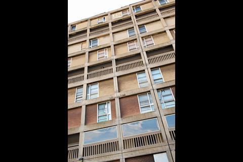
With the frame sorted, the next big debate focused on the cladding. Originally, each panel of the frame grid was infilled with brick and a window. Lawrence says retaining these would have scuppered the commercial viability of the whole development. What’s more, bringing the single skin brickwork up to modern thermal standards would have been difficult, and the glazed area takes up just one-third of each panel, making the flats dark and dingy. The other key issue was that retaining the drab brickwork would hinder the building’s transformation.
“It would still look the same,” says Lawrence.
There was one facade treatment that had to be retained. Close inspection reveals the brickwork is arranged in three subtly coloured horizontal bands - beige, ochre and plum. Each layer spans three floors which correspond to one access deck - the famous “streets in the sky”. But nobody knows why the brickwork was arranged like this. “People have said it was to stop pattern staining from the smog, or bricks were used as a reminder of the original streets which were knocked down. But I don’t think there is anything poetic about it. Brick was just cheap and effective,” says Bickle.
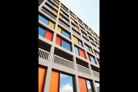
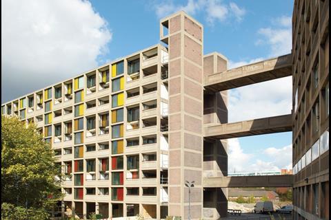
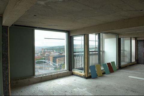
The first improvement was to bump up the glazed area to two-thirds of each panel to get more light into the flats. The new windows are single-glazed units rather than the fussy, multi-paned originals. But the really dramatic change is the vividly coloured panels. “We wanted the facade to have a lustre but one that also wasn’t stable,” says Bickle. He says the panels should look different depending on the light, angle and distance from which they are seen. A huge number of materials were considered. “What material didn’t we look at?” quips Gregg Moss, associate at Hawkins\Brown. “We looked at timber, glazed panels, zinc, painted glass …”
Research threw up an anodised aluminium process that hadn’t been used in the UK before. “Normal anodising gives you dark greys and bronzes but not colour,” says Moss. “We found a process used on the Continent that locks a dye into the anodising process.” Accelerated ageing tests showed the panels wouldn’t lose their lustre in the UK climate.
A range of coloured panels was made and according to Bickle there was a “memorable day” when everyone involved in the project, from the planners to English Heritage, assembled to choose the colours. These are strikingly different from the dull brickwork and transform the building.
To finish off the exterior, the original concrete balustrades to the balconies that were beyond repair have been replaced.
The castle on a hill
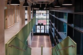
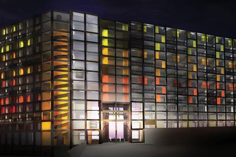
With the exterior sorted, attention is now turning to the interiors. One change is to create a bigger entrance. “When you used to arrive at Park Hill you were greeted by what felt like a fortress,” says Lawrence. “The issue for us was how to make it feel more accessible.” The new entrance will be a big section, four storeys high and four bays wide, cut through the block. This will take residents into a spacious entrance with new lifts off each side and a striking helical escape stair.
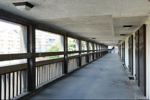
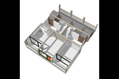
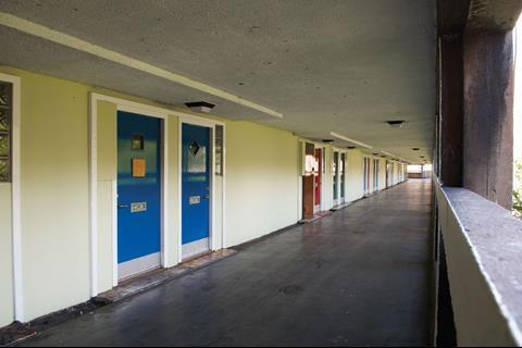
The flats will be arranged in clusters of four, much like the original. Residents will enter from the deck and either go straight into their apartment or up or down internal stairs to the floors above and below. One criticism of the original scheme was a lack of windows overlooking the decks, which compromised security. Also, the doors to the flats were set into the walls in groups of four which made the decks feel long and unrelenting, failings that are acknowledged by one of the original architects, Ivor Smith. The reason for this arrangement was lack of space. The solution is to narrow the access decks, which were designed to accommodate milk floats as well as people. This creates room for an entrance area to the one-bedroom flats and windows out onto the deck. In addition, the doors are now arranged so two out of each cluster of four are perpendicular to the deck, helping to break it up visually.
Lawrence says that by next spring the entrance area will be finished and potential purchasers will be able to view a completed flat cluster. So far, the development looks promising. The exterior is modern, colourful and crisp and the flats should be spacious with superb views over Sheffield. “I think we’ve got a product here that people want,” says Lawrence. “A lot of people will come out of curiosity but once people see the location, then the entrance and the lifts and see how big the flats are, I think they will want to buy into it.”
Why Park Hill was given a Grade II* listing
Park Hill might look like thousands of other run down local authority flats but in 1961 it was radically modern. It replaced rows of dilapidated, back-to-back terraced housing and tenements with shiny new flats complete with indoor toilets and central heating powered by a site wide CHP system. Architects Ivor Smith and Jack Lynn were inspired by Le Corbusier’s Unité d’ Habitation which resulted in innovations including the “streets in the sky” - wide access decks that were intended to replicate the community feel of streets on the ground. When it was completed, Park Hill housed a community of 2,500 people.
At first the project was a great success. People loved the flats so much that many people lived there for years, ensuring a sense of continuity and community. But in the eighties the steel industry declined and there was less money around. A more transient population meant people cared less about their surroundings, the council had less money for maintenance and crime, and vandalism soared. The estate became a byword for all that was wrong with sixties local authority housing and many people prayed the council would knock it down.
Instead, in 1998 English Heritage honoured the building with a grade II* listing, making it the largest listed building in Europe.
What is the new Park Hill going to look like?
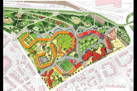
The new Park Hill will include 974 apartments of which 200 are earmarked for social housing and 40 for shared ownership. The development will include a mix of one, two and three-bedroom flats. A key aspect of the scheme is making it appealing to private buyers. The flats were built in clusters that respond to the local topography. The roofline is constant, which means the blocks are just four storeys at the higher southern end but 13 storeys high at the lower northern side. The high blocks feature open shared spaces but the short ones are more intimate. Urban Splash see the taller blocks as having a more city living feel with communal landscaping whereas the low rise blocks will feel more suburban - the smaller external spaces will be divided up into gardens for residents.
Many changes are intended to make the scheme feel less like a fortress. A four-storey high area is being cut out of the first phase to open the building up. Currently the sloping site is divided into terraces with retaining walls, but Urban Splash wants to sweep these away so the site slopes gently and removes the barrier-like feeling created by the walls.
Internally, the raised walkways will only be accessible by residents, making the development more secure, and Urban Splash will probably limit access to each deck to the residents living in that particular area.
How the finances stack up
Making Park Hill work financially has been a challenge. A key element is public sector funding. The Homes and Communities Agency (HCA) has awarded it £24.8m of which £14.8m is gap funding - the rest will go towards the social housing, which will be managed by registered social landlord, Great Places. Transform South Yorkshire, the housing market renewal agency, is contributing £13.5m and English Heritage has chipped in £500,000 towards the concrete repairs.
This might not seem like much of a dent in the £146m total cost of the scheme but it has been important to keeping the whole project moving. In late 2008, the scheme was in danger of stalling because of the effects of the downturn, so the HCA agreed to bring forward funding earmarked for later phases to help it continue. This means the public sector funding element makes up a large part of the first stage of the scheme.
Urban Splash has nine and a half years from the date work started to complete the scheme. The middle part of Park Hill is now empty, but council tenants occupy the south end. Currently only the first phase is being developed and Urban Splash will wait until market conditions improve before starting on later phases.









No comments yet