The much-delayed Elizabeth line opens to passengers today. From the contextual to the finely detailed, its stations are an eclectic and ultimately uplifting addition to the capital’s ever expanding transport network, writes Ben Flatman

Queen opening Elizabeth line

Source: Crossrail / Flickr

Queen Elizabeth II with the Duke of Wessex officially opens the Elizabeth line on May 17

Architecture is a drawn-out business at the best of times, but anyone who has worked on transport infrastructure knows that it often pushes project timelines to the extreme. Large railway projects can consume entire careers.

As Grimshaw partner Neill McClements talks me through the line-wide design approach for the new Elizabeth line, which opens to the public today, he notes that “it’s quite a unique experience designing for such a long construction programme”. He uses the lighting as a case in point.

“The technology was evolving as we designed. When we started this project, TfL were insistent it would be fluorescent tube lighting throughout and we were trying to convince them that LEDs were the future.” Thankfully, there isn’t a fluorescent tube in sight as we walk along a beautifully lit platform at the new Farringdon station.

Paddington

Seeing the Elizabeth line through to completion has been a major commitment for those who have been there from start to finish. Frustration over the delays has only been heightened for the architects involved by the fact that several of the stations were finished years ago.

Some have been fully or partially in use, while others had been sitting empty, in quiet anticipation of a day that at times seemed destined to never arrive.

When I descend the escalators into the depths of Hawkins Brown’s new Tottenham Court Road station, just days before its official opening, my first impressions of the architecture are overwhelmed by the astringent whiff of citrus cleaning products. Deep cleans are underway on all the stations, in preparation for the opening, and years of accumulated dust are harder to shift than expected.

But then the sheer size of everything kicks in. The Elizabeth line is a massively scaled-up version of the Underground. The high-ceilinged foot tunnels and sparse advertising are reminiscent of the grand metro systems of the former communist bloc. Everything feels more generous.

Tottenham Court Road

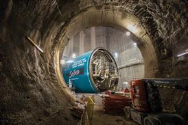
The platforms are 240m long, compared with 100m on the Tube. Tunnels extend seemingly into infinity. Stripped of clutter, the systemised glass-fibre reinforced concrete (GRC) wall panels, and subtle up-lighting, create a calm but also slightly unsettling atmosphere.

There is a Kubrickesque quality to these subterranean spaces. Devoid of people, the station is disconcertingly quiet. The only sound is the gentle swooshing of opening and closing doors as trains glide past on their final test runs.

The Elizabeth line will inevitably be compared to the Jubilee line extension (JLE). Despite much of the new line being on a bigger scale than the regular Tube network – bigger tunnels, longer platforms – there is still arguably nothing to quite match the cathedral-like grandeur of Foster’s Canary Wharf JLE station, or the piranesian gloom of Hopkins at Westminster.

Perhaps the Elizabeth line does not have quite the same big moments as its predecessor, but it still has its own charms. Julian Robinson, head of architecture for the entire Elizabeth line project and a former member of Roland Paoletti’s JLE team, tells me how the use of the common design elements developed by Grimshaw and Maynard (a wayfinding consultancy) is strongest within central London, especially within the foot tunnels and platforms.

But, as people move towards the escalators and ticket halls, the individual architectural teams have been encouraged to develop distinct design treatments that respond more to the local context.

Robinson tells me that his priorities for the line were to “think big but focus on integration, coordination and the details, and give the designers space to do their job”. This attention to detail is evident across the 10 brand new stations that stretch from Paddington to Abbey Wood. Also clearly on view is the distinct design approach of each architect.

The 10 stations divide into three distinct groups. Five of them – Bond Street, Tottenham Court Road, Farringdon, Liverpool Street and Whitechapel – are tunnel stations. These are the stations where Grimshaw’s line-wide design approach has been used most extensively below ground. However, as these stations transition from platform level to the escalators and ticket hall, the architecture of each project develops a distinct character of its own.

Grimshaw’s remit was to develop a family of finishes and components that help to bring a common thread across the different station environments

Paddington, Canary Wharf and Woolwich are all “box stations”, dug down from ground level. Here the Grimshaw approach is less evident (mainly restricted to the platform edge screens) and the station architects have been able to design everything from the platforms up. Custom House and Abbey Wood are surface-level stations, with a totally different character again.

One of the most successful aspects of the new central London stations is undoubtedly the “modal identity” developed by Grimshaw and Maynard. McClements explains how Grimshaw’s remit “was to develop a family of finishes and components that help to bring a common thread across the different station environments”.

Grimshaw and Maynard used full-scale mock-ups of the station tunnels and platforms to refine their designs. Julian Maynard describes how these massive prototypes created “an environment people can actually engage with, talk about and view at real scale”.

>> Also read: What I learnt from overseeing work on the Elizabeth line

>> Also read: The scheme now approaching the finish Crossrail: all aboard the Elizabeth line 

This in turn enabled the design team to consult meaningfully “with passengers, TfL and the contractors who would build it”. Together, Grimshaw and Maynard have introduced a number of innovations that transform the passenger experience.

On the platforms, there is now total separation between passengers and moving trains. While the JLE brought protective platform-edge screens to the London Underground, they stopped short of the tunnel roof. The new Elizabeth line platform screens, engineered by Atkins, run the full height of the platform and integrate ventilation, lighting and digital advertising screens. This has significant acoustic benefits.

Air quality is also significantly improved, thanks to air extraction taking place from the track level beneath the platform edge.

The Grimshaw design makes extensive use of sprayed concrete in the platform level concourses and side tunnels. This approach, combined with use of latex moulds to cast the GRC panels, has enabled multidirectional curved forms.

Now, where foot tunnels meet, the corner junctions are curve both vertically and horizontally. This allows for improved sight lines, reducing the chance of collisions and adding to a feeling of spaciousness.

Another key feature of the Grimshaw and Maynard system are the distinctive new totems. These act as sign boards and wayfinders, but also house up-lighting, speakers, emergency lighting and tape barriers, freeing the walls of fixtures and fittings.

Liverpool Street

This decluttering extends to the platforms, which are very much stripped back to the essentials. The focus is almost entirely on wayfinding. Legible London maps, a common sight on the streets of central London, now make their first appearance at platform level.

This is one of a number of innovations that will help travellers to quickly locate themselves in relation to the surface. As McClements points out, “this is essential when the platforms are 240m long and choosing the wrong exit could take you to a completely different part of the city”.

There has been an almost obsessive commitment to stripping back the design solution. McClements and Robinson explain to me how the services are all hidden yet placed where they can be easily reached and maintained.

The GRC panels have a small hole in their centre so a camera can be inserted to inspect the condition of the structural concrete behind without removing the panels. And the lighting on the escalators is concealed in the central “escalator deck” rather than on the ceilings, removing the need for disruptive scaffolding when carrying out maintenance.

The attention to detail extends to the way in which the lighting varies within different areas of the foot tunnels. McClements explains to me how, on the main platform level concourse, very soft up-lighting is intended to “allow passengers to calmly make decisions around wayfinding”. Once the passenger has decided on their direction of travel, the side tunnels leading to the platforms then have brighter and cooler overhead lighting, identifying these as “fast spaces” for decisive movement.

On the platform, the lux levels are lower intensity again. Lighting comes from the top of the platform edge screen and is reflected off the GRC panels, the colour and content of which was chosen specifically to create the best lighting conditions for careful consideration of the wall hung maps and directional signage.

The GRC panels were another area where Grimshaw was pushing at the boundaries of the UK construction industry. “We had to get a GRC specialist talking to a formwork contractor who did CNC to develop the solution,” says McClements.

The result is an elegant and cost-effective panel system that doubles as an acoustic baffle and that should require minimal maintenance.

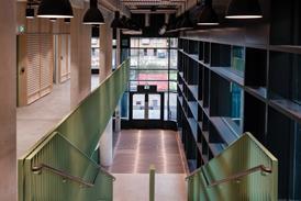
Although Grimshaw and Maynard have provided a core set of common components that recur to varying degrees across the stations, there is still a significant amount of variation in design approach and response to context, particularly at the ticket hall levels.

The objective was to move London forward in its transport architecture and to leave a civic legacy for the next 120 years

Julian Robinson, head of architecture, Elizabeth line project

Part of the fun of exploring this gigantic new railway is going to be spotting the transitions between the areas of greater conformity, the more idiosyncratic ticket halls and the other stations where the design-wide approach is only occasionally referenced.

At Tottenham Court Road, for instance, Hawkins Brown have designed the east and west ticket halls using one underlying design concept. But by having a different colour palette in each space, they have summoned up very different moods.

The eastern hall, at the top of Charing Cross Road, has light finishes and a “busy” feel. But, at the more intimate western hall, at the top of Dean Street, the materials shift to black reconstituted stone and glass.

“We wanted the ticket hall to reflect some of the nocturnal venues within Soho – the theatres, clubs and bars,” says station architect Harbinder Birdi.

The Elizabeth line is also going to have a massive urban impact. Much of the economic and social benefit of the project derives from how the architects have used the stations to resolve other tensions around their sites and add value.

Although we usually describe them as points of connection, stations and railway infrastructure are actually very often barriers to movement. In recent years there has been an increasing move towards recognising the importance of station concourses as pedestrian routes in their own right – providing a connection for people who might only need to cross the site.

This is perhaps the most successful dimension of the Whitechapel Station, where BDP’s Peter Jenkins explains to me how the practice has used the “station bridge” concourse to reconnect Whitechapel Road to the quieter back streets that lie to the north of the existing overground station.

There are also some interesting and sensitive accommodations with historic contexts along the line. At Paddington for example, Weston Williamson have approached their design as a response to Brunel’s station.

Station architect Rob Naybour describes Paddington as a “a great interior with no external presence”. Naybour therefore saw the project as a “huge opportunity to try and solve some of these problems” by bringing greater legibility to the wider station.

Weston Williamson’s biggest intervention is the way they have made a virtue of the huge station box to build a visual and urban connection with the western side of the existing station building. Taxis have been moved to the north-east of Paddington and the new Elizabeth line station is open to the air, with views up from platform level to Brunel’s station and the sky above.

A massive glass canopy sits over the escalators, which is open on all sides, giving the whole station a proximity to the outdoors. It is one of the more dramatic moments along the Elizabeth line and also creates one of the most self-consciously civic interventions within the wider urban context.

Custom House

In contrast, Allies and Morrison have produced a characteristically understated station at Custom House. It is a narrow sliver of a site, and the architecture is bold in its simplicity.

It picks up on an 18-degree difference between the angle of the track to the adjacent street line, and then twists all of the elements of the building to align them with this. Columns, platforms sections and the elegant platform canopy are consequently all rhomboids. It is an unshowy but effective response to an unpromising site.

There will be legitimate criticisms raised that perhaps the Elizabeth line did not set its architectural aspirations quite high enough. Design contracts were awarded on a framework basis to lead engineers, with the architects on all the stations acting as subconsultants.

When I ask about the procurement model, Rob Naybour of Weston Williamson notes that “in the UK we’ve arrived at this way of doing things where the client likes to have one point of contact for the design contract. I’ve worked in other countries where the client likes to be more involved in managing those consultant interfaces and it still works. There are other ways of doing these things”.

After all the years of waiting, the thing that many of the architects seem most excited about is seeing how the public will use their stations. Neill Clements tells me: “The one thing I just can’t wait to see is the space come alive with people”.

I ask Julian Robinson what objectives he set himself when he took on the Elizabeth line job. “The objective was to move London forward in its transport architecture” he says, “and to leave a civic legacy for the next 120 years.”

Given the way in which the architects were appointed and the huge constraints that exist around almost any underground rail project, the Elizabeth line’s finely detailed and richly layered architecture is a testament to all the design teams involved. It is also generous, carefully considered public architecture, of which we see too little.

Who built and designed the Elizabeth line?

Paddington

Architect: Weston Williamson

Contractor: Costain Skanska JV

Bond Street 

Architect: John McAslan & Partners

Contractor: Costain Skanska JV (original), Crossrail Ltd/Engie) as main contractor (2020 onwards)

Tottenham Court Road

Architect: Hawkins & Brown

Contractor: Laing O’Rourke

Farringdon

Architect: Soji Abass

Contractor: Bam Nuttall, Ferrovial and Kier JV

Liverpool Street

Architect: Wilkinson Eyre

Contractor: Laing O’Rourke

Whitechapel

Architect: BDP

Contractor: Balfour Beatty, Morgan Sindall, Vinci Construction JV

Canary Wharf

Architect: Adamson-Associates

Contractor: Canary Wharf Contractors

Custom House

Architect: Allies and Morrison

Contractor: Laing O’Rourke

Woolwich

Architect: Weston Williamson

Contractor: Balfour Beatty and Berkeley Homes

Abbey Wood

Architect: Fereday-Pollard

Contractor: Balfour Beatty