Breaking the stereotype of multistorey car parks as concrete monstrosities, Wilkinson Eyre’s latest project is as visually exciting as it is functionally efficient.
How to civilise that most yobbishly inarticulate of town centre buildings, the multistorey car park? Ideally, bring in a celeb architect, like double-Stirling prize winner Wilkinson Eyre Architects. But as that firm is presently working on many exciting projects, from the twin towers of Guangzhou in south-east China to a double-barrelled arena in Liverpool, would it look twice at a car park?
The surprising answer is yes, of course. Alongside its constant throughput of iconic buildings, Wilkinson Eyre has tackled no fewer than four multistorey car parks in England, from Exeter and Bristol to Liverpool. The latest to be completed is part of developer Grosvenor’s high-profile Paradise Street retail development in Liverpool city centre, not far from that arena. This, and the adjoining bus station, which is also designed by Wilkinson Eyre, are the first elements of a £900m development. They originally stood nearby, but have been relocated to make way for the retail moneyspinners planned by Grosvenor.
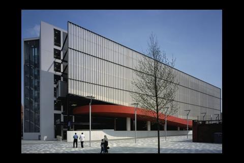
The £9.6m, 22,675m2 building displays Wilkinson Eyre’s award-winning combination of functionalism and flair. It conforms to the building type by being a basic six-storey box, but out of it bursts a sculptural series of swooping, curving, sloping ramps faced in silvery stainless steel. In the words of Keith Brownlie, Wilkinson Eyre’s director, the ramps amount to “a rococo moment in a modernist piece”.
The brief drawn up for the car park by Grosvenor and its innovative European operator Q-Park, Passenger Transport Executive was for car parking spaces above a taxi rank and a bus parking area to serve the bus station. The straightforward and spatially efficient solution would have been to fill the entire polygonal site with a car park. Instead, the architect opted for the conventional rectangular plan with 579 parking spaces arranged along either side of a race-track circuit.
We are celebrating the one thing a car park has – the animation of cars driving up from floor to floor and back down again
Keith Brownlie, Wilkinson Eyre
This solution raises the building by one storey but gives it a purer rectilinear profile. The leftover space at the ground level is used as the turning circle for buses.
So far, the building was shaping up to be just another depressingly lifeless multistorey car park, fronted by repetitive horizontal banding or masquerading as an office building with its eyes poked out. The big difference in Wilkinson Eyre’s approach was how it treated the vertical circulation system of ramps.
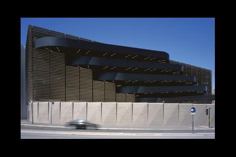
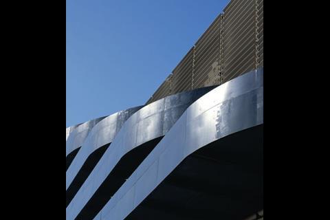
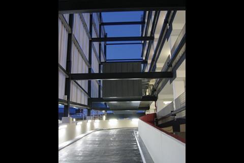
“We are celebrating the one thing a car park has – the animation of cars driving up from floor to floor and back down again,” says Brownlie. Rather than losing themselves in the building, the ramps pop out and in both sides of the structure on every floor. Their sloping curvaceous shapes, faced in stainless steel and highlighted with fluorescent strip lights in the ceiling, are a sculptural foil to the flat facades behind.
The ramps are fully exposed only on the east side of the building, where they contrast with the louvred screen wall behind and are jazzed up further by being stepped up and sideways on each floor.
The ramps’ curvaceous shapes, faced in stainless steel and highlighted with fluorescent strip lights, are a sculptural foil to the flat facades behind
On the west side is a regional police headquarters which, worried about criminal espionage, demanded a privacy screen beyond the ramps. Even so, the west side reveals a special double-sized ramp, which combines up and down carriageways and rises to the double-storey height of the first floor to clear the double-decker buses below. Twice as wide and twice as high as the other ramps, this bulges out further in a vivid vermillion that contrasts with the neutral, translucent polycarbonate panels of the privacy screen above.
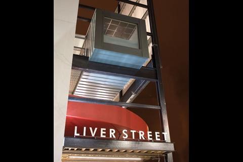
Two other elements will be neatly plugged into the finished building. One is the control and ticket office, which is a rectangular zinc-clad pod suspended in the 7m gap between the main building and the freestanding privacy screen. The outer end of the pod is fully glazed and frames a refreshing view of the Chevasse Park – the main green space of the whole Paradise Street development.
The other plug-in will be a £2m footbridge spanning 60m to a John Lewis store, presently under construction. What rankled the architect was that the footbridge had to be set at a slight angle to the rectilinear geometry of the main building, but it partly compensated for this by kinking the bridge so that its central section is aligned to the axis of the main building.
The final element of the scheme is the boundary wall. This had to follow the curved outline of the site, and the architect opted for brick in sympathy with the elaborate red-brick buildings of the conservation area it faces. But here again the obvious solution of a curved brick wall would have conflicted with the building’s geometry. So Wilkinson Eyre came up with a sequence of rectangular panels. They hug the boundary line at ground level, but each is articulated by a slight diagonal fold that sets up a rhythm of wedge-shaped grooves at the top.
At Paradise Street, Wilkinson Eyre has given clarity, legibility and usability to a habitually brutish and disorientating building type. With its openly expressed ramps it has animated a previously lifeless form. It is an object lesson step in taming the car in high-density inner-city regeneration.
How it stands up
The structural frame for the rectilinear building is not as regular as it looks. It is complicated by a double-decker bus layover on the ground floor, which required the 15.4 × 7.5m structural grid on the upper floors to be doubled up to a 15 × 15m grid on the ground floor. This led to a transfer structure between the two grids, and involved a complex hybrid structure of precast concrete, post-tensioned insitu concrete and steel bars.
The upper floors comprise precast concrete floor slabs spanning 7.5m, supported on post-tensioned in-situ concrete beams spanning 15.4m between concrete columns. For the transfer structure, the concrete beams were given extra post-tensioning by exposed steel bars running at right angles. Finally, precast concrete walls to the lift and stair cores provide lateral stability.
Key points
Downloads
Site plan
Other, Size 0 kbExpanded 3D diagram
Other, Size 0 kb
Postscript
More on Wilkinson Eyre projects, click here









No comments yet