3D Reid’s beehive-inspired HQ for the Co-op in Manchester is not simply another new office block with a slightly unusual form. It is the top BREEAM-rated office in the UK and might just have redefined the corporate atrium

Co-op Manchester

‘Isn’t all this a bit fancy for the Co-op?” So spoke a Cabe commissioner during a planning-stage design review for the group’s new Manchester headquarters. The quip probably says more about Cabe than it does about the retail collective founded in nearby Rochdale in 1844 and now the world’s largest co-operative consumer organisation. But it is useful nonetheless for highlighting how the Co-op’s new building both challenges popular perceptions of the brand and projects the principles on which that brand is based.

Sustainability, for example - a cornerstone of the Co-op’s commercial ethics - has been energetically embedded into the architecture of the new building in a way that extends far beyond the shallow compliance that is still the mark of much environmental design. A slew of energy-efficient features, ranging from a trio of giant earth tubes to a ventilated double-skin glass facade, has helped the Co-op achieve the highest BREEAM “Outstanding” score of any UK office.

It is this enlightened environmental philosophy, combined with a distinctive architectural form that cleverly reinterprets the British architectural tradition of commercial symbolism, that identifies the Co-op HQ as a significant milestone in the evolution of the office workplace.

Co-op Manchester

The ‘honeycomb’ atrium extends the full height of the building

A rich heritage

The £100m building has been designed by 3DReid and is the first and anchor phase of a wider 4 million ft2 redevelopment of Co-op owned land. The masterplan’s title, NoMa - like the short-lived and egregiously abbreviated NoHo development in London’s Fitzrovia - indicates its position on the northern rim of Manchester city centre.

When the building officially opens as One Angel Square next year, its 500,000ft2 will provide a single base for the organisation’s 3,500 office employees for the first time. Currently, staff are disparately housed in an eight-building campus located opposite the new building. Despite being severed from each other by a sprawling, soon to be narrowed, four-lane dual carriageway, this listed cluster of buildings formed the conceptual starting point for the new HQ’s design.

The most prominent building on the original campus is the 25-storey, 118m-high CIS Tower, Manchester’s second tallest building and briefly the UK’s tallest when it was completed in 1962. While this dour, angular slab now appears to be yet another example of insensitive sixties urbanism, when it was conceived its clean lines and simple geometries were proudly affiliated with the chic international style perpetuated by the likes of Mies van der Rohe.

Equally, the earlier Co-op HQ next to the CIS Tower is a virtuoso study in the layered horizontality and dramatic massing of thirties Dutch Dudok-style modernism. For a former 19th-century slum neighbourhood once dubbed by Friedrich Engels as “hell on earth”, this represents a remarkable architectural heritage.

But, as 3DReid divisional director Mike Hitchmough explains, it is one that did not arise by accident. “Historically, the Co-op has always wanted its buildings to be the best possible examples of the architectural style of the day and for them to make a positive civic contribution to an area that has known difficult times in the past. The new HQ is merely the latest chapter in this long, ongoing sequence.”

However, while the new and old buildings may be historically linked by civic altruism and architectural prestige, aesthetically the new building is a radical breach with the past. A first glance reveals a modern glazed three-sided double skin office that curves gently outwards before the upper third is sharply thrust backwards like a diagonally sliced egg.

“The ribbed, weaved basket quality to the outer skin is partially inspired by the striped vertical and horizontal banding and modulation on the facade of the CIS Tower,” he says. But the overriding visual analogy is a corporate one. “The Co-op symbol is a beehive and this is the main inspiration for the building’s exterior form.”

Co-op Manchester

The building has been ‘future-proofed’ against forecasted 2050 UK temperatures, which anticipate a 3%-5% increase in summer temperatures and a 30% reduction in winter temperature

Enter the beehive

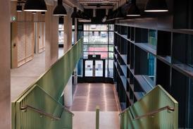
This beehive concept, with its intrinsic premise of strength in numbers, is also intended as a physical representation of the Co-op’s values, and is strongly evident within the building’s interior. After passing through the main entrance, the visitor is plunged into a soaring atrium that extends the full height of the building. The cellular structure of the white-painted concrete columns and balconies that enclose the atrium on all sides, as well as its hexagonal shape, immediately recalls the honeycomb aesthetic first suggested by the exterior.

Most impressive of all is the enormous amount of natural daylight present. Light not only pours in through the glass “eyelid” ceiling but over the balconies themselves. This is because, with the exception of the three cores on alternate sides of the atrium, (accentuated by oak rather than white balconies), every balcony fronts onto entirely open-plan offices on the lower nine floors, allowing light from the external wall to permeate into the heart of the building.

Co-op Manchester

“No desk is situated more than 7m from a window,” says Hitchmough, “and the light levels within the area are so high - sometimes higher than average Manchester daylight levels - that the balcony edges constitute a window. Also, although most architects like exposed concrete, most people don’t. So we painted the concrete white, which not only softens the character of the space but enables the artificial lighting’s lux levels to be reduced from 550 to 300, representing a significant cost and energy saving. Finally, the white surfaces create something of a blank canvas which the workers will be able to personalise over time to evolve the identity of their workplace.”

Atriums are the ubiquitous and frequently insipid corporate insignia of every large modern office. But this one is a stirring and emphatic metaphor for the democratic, collaborative principles that drive the Co-op’s corporate ideology.

This cavernous central volume is afforded spatial and social primacy at every possible instance. The restaurant on the 12th floor looks down on it. Meeting rooms face onto it. The stepped terraces clustered around the staggered rooftop prow radiate from it. It provides myriad oblique and direct views into workspaces from virtually every corner of the building. Critically, it also preserves panoramic views through the building out towards the city - Hitchmough points out that the height of office cabinets and even the balcony baluster profiles were determined so as to not impede workers’ views even when sitting at desks. It is the atrium where the Co-op plans to hold its AGMs.

Environmentally, it even acts as a giant extract for displacement air that moves up the building.

The office spaces themselves continue the atrium’s theme of transparent equanimity by being as open and uncluttered as possible. Structurally this meant expansive column-free spans of up to 16.5m and Hitchmough clearly revelled in the liberation of dealing with clients who insisted on a structural frame that actually necessitated fewer rather than more columns. Double-height open “winter gardens” are also cut into the floorplate on alternate floors on the opposite side of the core from the atrium.

Hitchmough adds that the building’s core, ceiling and window configurations have been designed to accommodate future floorplate subdivision if necessary. “Obviously there’s a level of freedom and certainty present when designing for an owner-occupier that doesn’t apply to speculative development. But the building still represents a significant commercial investment for the Co-op, which they may one day wish to sell and occupy as tenants. The challenge was to make the building bespoke but not too bespoke.”

Co-op Manchester

But does it work?

Hitchmough summarises his practice’s design approach to the Co-op as one marked by flexibility, resilience and sustainability. “There’s no such thing as timeless architecture,” he maintains. “But this building is not a fashion statement, it’s an investment. By using a sober palette
of external materials - bronze, glass and concrete - we’re hopefully creating a building that’s both memorable and enduring.”

The Co-op HQ certainly represents a dynamic and expressive projection of the organisation’s principles, enriching the architectural heritage it established on the same site generations ago. It also marks a spirited extension of the once great British civic tradition - most evident in the ornate 19th-century mercantile palaces of cities like Manchester, London and Leeds – of buildings that form a carefully scripted symbolic representation of the corporate ideology of their owners.

Furthermore, for all the deference to its predecessor across the road, this is clearly a defiant piece of object architecture; it is designed to soar in isolation rather than to merge into context, and can trace a lineage from such projects as Ralph Erskine’s Hammersmith Ark and Norman Foster’s Greater London Building.

Although this autonomous approach and the figurative literalism of the design may both have been grounds for criticism, the building is ultimately redeemed and given character by the strength of its aesthetic, environmental and civic convictions, both inside and out. While
its swirling facade and playful rooftop massing make exciting contributions to the city’s streetscape and skyline, the exterior is still controlled enough to comprise a discernible top, middle and bottom, making a potentially chaotic composition comprehensible. As with the “ziggurat” rooftop terraces and the chasm-like atrium, this is a key example of how the building essentially packages radical gestures in a human and empathetic way.

For some, including perhaps our aforementioned Cabe commissioner, the Co-op is considered a rather boring brand, a safe pair of hands. Well, what may have been dismissed as prudish before our current economic maelstrom is increasingly valued as prudent. And now the Co-op’s new HQ is a perfect metaphor for the progressive reinvention on which the brand was founded.

Co-op Manchester

SUSTAINABLE TECHNOLOGY

3DReid divisional director Mike Hitchmough summarises the approach to sustainability at the Co-op, the UK’s highest rated BREEAM “Outstanding” offices (94.32%), as “pragmatic innovation”.

“It’s not about environmental ‘add-ons’ like wind turbines and solar panels. Sustainability here is a truly integrated part of the building and is also in line with the Co-op’s ethical corporate approach. It’s not about eco-bling,” he says.

The building has been designed to actually become more efficient as temperature rises. This resilience is achieved through an array of energy efficient features.

Fifty thousand litres of fresh air are sucked into the building every second via the three giant earth tubes poking up above the ground in the building’s landscaped forecourt. A stack system then distributes the air through the building via displacement vents, absorption into the thermal mass of the concrete and vertical extraction through the atrium. As the air below the ground retains a fairly stable temperature of about 12°C throughout the year, the amount of energy required to temper it to comfortable levels is also minimised.

The building’s double skin facade also acts as a duvet that insulates the building in the winter and facilitates ventilation in the summer. The gap between the single-glazed outer skin and the weatherproofed inner skin is open at the bottom but vented by louvers at the top. Solar control is also achieved by solar coating to the glass and the ingenious modulation of blade depths to the bronze mullions on the inner face of the outer skin. The depths are determined by the mullion’s position in relation to the building’s orientation, which essentially enables them to act like blinds that minimise solar glare when necessary.

That said, as Hitchmough wryly points out that “Manchester gets such little sunlight that the building is deliberately tilted to face southwards to grab as much energy as possible”. This is principally achieved through a heat recovery system in the atrium.

Other energy efficient measures include locally sourced materials (except for the bronze cladding), low-energy LED lighting in the atrium and a cogeneration CHP biofuel boiler running on waste cooking oil and rapeseed grown on the Co-op’s own farms. The waste heat from the boiler provides cooling via absorption chillers and chilled beams.

But Hitchmough is keen to stress that the building’s sustainability agenda has not just been delivered by features but by the attitude
of the clients. On the external outer skin, they paid an additional £120,000 for a bronze anodised rather than powder-coated finish as this came with a lifetime guarantee that would reduce maintenance costs.

Furthermore, their insistence on such a high degree of internal flexibility will ensure the building’s adaptability for future uses, delivering a more sustainable long-term structure.

PROJECT TEAM

client The Co-operative Group
architect 3DReid
contractor Bam
project manager Gardiner & Theobald
quantity surveyor Gardiner & Theobald
structural engineer Buro Happold
M&E engineer Buro Happold

Rating systems - time to review & rationalise

Ecobuild the future logo

James Parker, senior research engineer at BISRA, Louise Ellison, head of sustainability at Quintain and Robin Nicholson, senior partner at Cullinan Studio discuss the future of rating systems for sustainable buildings on Tuesday 5 March 2013 at 14.30

To register for Ecobuild go to www.ecobuild.co.uk/register