Christian Portzamparc’s Musée Hergé pays homage to the life and work of the creator of Tintin and is almost as much fun
Picture the scene. A nine-year-old guiltily hides his copy of Tintin in Tibet in a battered choir folder to read during evensong. The nightly tedium of prayers and preaching fades away for as long as the boy is absorbed in the world of the tuft-haired reporter and his white fox terrier. Twenty years later, that nine-year-old – now, like Tintin, a reporter – is on a train to the outskirts of Brussels to once more immerse himself in the world of Hergé at a new museum devoted to his work. To say Tintin was an influence on my choice of career would be an understatement. The only differences between us now are the dog and the plus-fours.
What most people do not realise is there was more to Hergé than simply the 24 Tintin books. Hergé was the originator of what animators term the “ligne claire” – or the clear line technique, a style of animation that uses thick strong lines of uniform importance. It is a simple language of drawing that exchanges depth and shading for a network of vivid colours and dark lines. It is a language that architect Christian Portzamparc has used to write the story of the artist in a building of fluent, simple beauty.
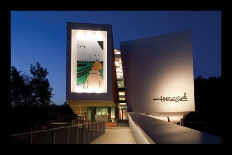
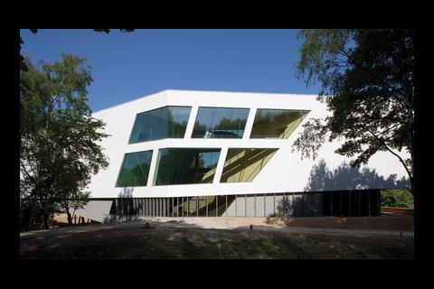
It’s clear from the very first glimpse of Portzamparc’s Musée Hergé that the subject’s art is the chief inspiration behind the design. It is a portal of clear lines emerging from a forest in a satellite town of Brussels. Portzamparc, the first French winner of the Pritzker architecture prize in 1994, is probably known best for his Cité de la Musique in Paris but has also built extensively in America – the LVMH Tower on East 57th Street in Manhattan, for instance. If you can characterise his style, it is that of instilling the ordinary with something different. So the otherwise straightforward Cité de la Musique is topped with a broadly undulating roof, and the LVMH Tower is made up of unfolding, jewel-like layers that mimic the skyscrapers around it.
The Hergé museum follows this pattern. Situated in the town of Louvain-la-Neuve in central Belgium, the 3,600m2 museum sits on the edge of the pedestrianised town centre, to which it is connected by a long wooden walkway. Why build this €20m (£17m) building here, 30km away from Hergé’s home city of Brussels? According to Marcel Wilmet, a director of Hergé’s legacy company Moulinsart, it was an emotional decision on behalf of Fanny Rodwell, the artist’s second wife and the client for the building. “Plans for this museum have been around for 10 years, but Mrs Rodwell could not find the site that was right,” he explains. “She wanted a lot of green surrounding it, so a city was not appropriate. Then she was introduced to this place, the little wood, and she was in love already. It was a question of the heart, and not the mind.”
Portzamparc describes the museum as a “ship, washed up on the shore of the town” and the impression of strolling up the walkways is like walking along a jetty – appropriate for a building that celebrates a man who introduced the possibility of overseas travel to a generation of children.
I wanted the objects inside to appear like a collection of things you might find in a comic book, like something which is not quite real
Christian Portzamparc
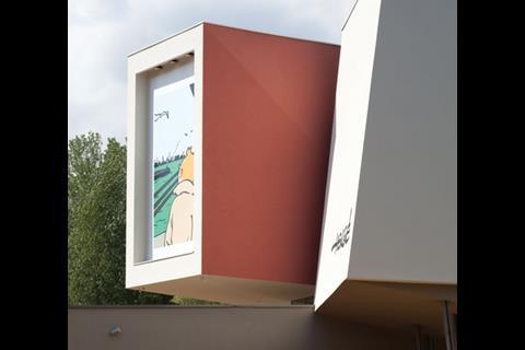
Broadly boat-shaped, the building’s facade is split into two halves – “cracked on the rocks”, is how Portzamparc extends his shipwreck metaphor – as you approach from the town. On one side, an image of the artist’s most famous creation looking out to sea; on the other is the artist’s signature. It’s a distinct way of reminding the visitor that Hergé (born Georges Remi in 1907) had a life separate from his most famous creation – a fact the museum addresses by giving space to his early career as a graphic designer.
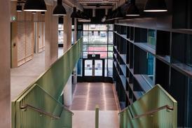
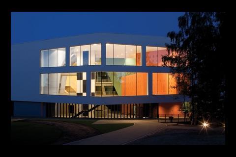
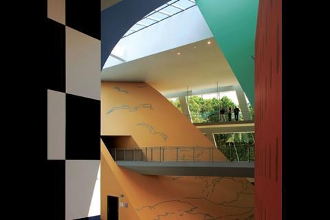
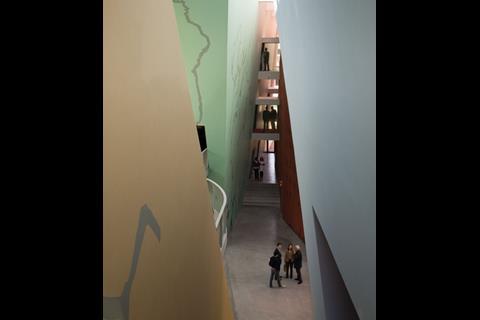
The first surprise is that the entrance is not at this cracked end, but around the side through a rather less dramatic glass door. Portzamparc has not made orientation of the building simple. The main interior space is a large, light-filled, four-storey atrium. The architect’s conceit has been to place the museum’s exhibits in four pastel-shaded four-storey “volumes”, or columns separated by undulating walkways at three levels.
Despite its complex, cracked boat-like shape, the building has a fairly simple concrete structure, built on a slab that cantilevers over a road underneath. Each of the four volumes is made from sculptured concrete but the exterior is a white render. Portzamparc admits this was to bring down costs, but says it makes the building seem like it is wrapped in clean, white paper “ready to be drawn on”. The glass panels had to be imported from Italy as they were too large and oddly shaped to be sourced from a conventional glazier.
If there were any doubt that the design of this museum would be a haven for Tintin obsessives, it is dispelled in the central space. One dark red column, broadly rectangular, takes its inspiration from the skyscrapers in Tintin in America (1932); another is sand-coloured and shaped like a mound – representative of the backgrounds in King Ottokar’s Sceptre (1939), with sea birds stencilled on the side. A third is aquamarine, shaped like an upside-down trapezoid and takes its colour from the sea in the Crab with the Golden Claws (1941). A fourth, sky-blue column has no markings, but arches over in a broad curve to meet a fifth column, containing the building’s lift. This is patterned in black and white checks, similar to, but not the same as, the rocket from Explorers on the Moon (1954). “I wanted this to be a space where you permit your imagination to breathe,” says Portzamparc. “I was thinking of Alice in Wonderland: you wonder if you are big or small … perhaps you feel like you are a character in a comic.”
Even the rectangular windows pay tribute to his medium, framing the views outside like comic book panels. Portzamparc says these panels are as much for people outside as inside. “I wanted the objects to appear like a collection of things you might find in a comic book, like something which is not quite real,” he says. But Rodwell was adamant that the building design should not address Hergé’s work too literally. It was she, for example, who wanted the checked colours of the lift column to be in black rather than the red familiar from the books. Portzamparc says he gave the black checks a blue tint to make it even less literal. “It has a feel of the rocket without actually being one,” he says.
It is a sort of magic, to create a world through such simple drawings. How do you do that with a building, to create something that is flat and yet has depth?
Christian Portzamparc
The second surprise is the journey through the building. Contrary to the orientation of most museums, you begin your journey by taking a lift to the third floor and the first of eight elegantly decorated spaces. Because each of the columns is built in a fluid, irregular shape, the interior spaces are not box-shaped rooms. As a result, the designers have had to be creative in the presentation of the drawings, artefacts and models that tell the story of Hergé’s life. Many of the pictures hang from the ceiling rather than from the walls, and the action of each room takes place in the centre rather than the perimeter. The larger exhibits – a lifesize shark-shaped submarine, for example, used to promote the animated film of Red Rackham’s Treasure – stand alone in the middle of the room, and original drawings are presented in standalone cabinets or on display stands.
Occasionally there is an architecturally interesting intervention, such as a circular room entirely wallpapered with the front covers of the Tintin books, a red-curtained cinema, and a two-storey chandelier decorated with the faces of Hergé’s characters. Mainly, though, it is a series of relatively straightforward educational spaces. The interiors are painted mostly in dark colours and are underlit. The museum’s curators say this is so as not to damage the original drawings that make up the bulk of the exhibits, but it can give the impression of wandering through a library. As a series of easily legible spaces, however, it is as clearly laid-out as one of Hergé’s books. You move from one box to another as if in a comic strip.
The architect says the impression should be that you are seeing the building in two dimensions rather than three, as you might with the “ligne claire” technique. “It is a sort of magic, to create a world through such simple drawings,” he says. “How do you do that with a building, to create something that is flat and yet has depth?” The answer is in the simple shapes and broad, unbroken surfaces of Portzamparc’s volumes and facade. It masterfully gives the impression of Hergé’s art without actually copying it.
The Museé Hergé is, without doubt, a polished and ingenious building that inspires open-mouthed, head-back gawping. On the day I visited, it was nearly empty, but with Steven Spielberg’s live action version of Tintin set to hit cinemas in 2010, I suspect Louvain-la-Neuve will soon be a key destination on European tourist itineraries.
If there is a criticism of this involving building, it is that it takes too great pains to be subtle with its abstract curves and gentle pastels. Writing as a lifelong Tintin enthusiast, I have always found the pleasure of this artist’s work in his bright colours and detailed panoramas. Pick up Tintin and the Picaros (1976), the final completed book of the series, and look at the depictions of the carnival in the fictional South American town of San Theodoros. A riot of colour and intricate detail, these frames illustrate the boldness and fun that makes Hergé’s books a joy to return to. Perhaps there could have been more of that unrestrained joy in the design, or at least the decoration, of this building. But this was never intended to be Parc Asterix, the French theme park dedicated to Tintin’s Gallic equivalent. Instead, it is a sophisticated and refined homage to the creator and his work. Verdict: formidable.














No comments yet