There’s no room for slackers at Sunderland university’s dazzling new student union, which packs its impressively generous spaces with sports halls and exercise areas. You can’t even get a pint around here
The contents of the average student union building can be predicted fairly easily: a few bars and games rooms, a refectory, a big space for bands and discos, rooms for student societies and a snack shop. This is the sort of stuff students like and factor in when filling in their UCAS form. So it’s a brave college that chucks this model out of the window and builds a student union that doesn’t even have a bar.
Yet this is exactly what Sunderland university has done. It’s a particularly adventurous move considering Sunderland is hardly known as a happening, throbbing metropolis with a premier league university. But Sunderland sees its new FaulknerBrowns-designed CityScape facility as a big draw in the battle for the hearts and minds of potential new students. The university clearly regards modern students as a serious bunch because instead of beer, crisps and slot machines, Cityscape majors on sporting facilities, with a fitness suite and a large sports hall.
The sports hall doubles up as a big events venue and there is space for seminars and exhibitions. In a nod to a traditional union there is also a dining and breakout area and a separate cafe. It’s an eclectic mix not found in other university buildings. So has Sunderland found a winning new formula for attracting students or is it a gamble too far?
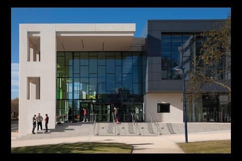
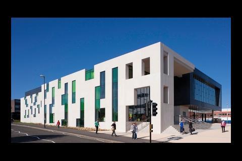
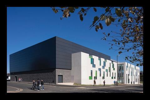
First impressions are good. The main facade is built from white concrete that could pass as stone, with crystals that glisten in the golden autumn sun. The crisp, white facade is broken up by distinctive rectilinear cutouts arranged in a variety of ways, which creates a random-looking pattern reminiscent of a child’s shape sorter.
Green glass panels are recessed into the cutouts, which gives the facade a three-dimensional solidity. The cutouts wrap around the roof, which breaks up the roofline and adds to the substantial nature of the facade. The glass is coloured in various shades of green which provides a strong contrast with the white facade without making it appear overly fussy. At the entrance end of the building the facade continues beyond the door, minus the glass, to create a portico. You go up a flight of stairs to the entrance, which gives the building a sense of presence and is a thoroughly modern interpretation of entering a classical civic building.
Sporting life
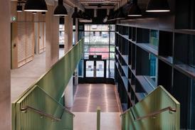
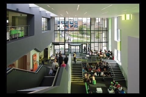
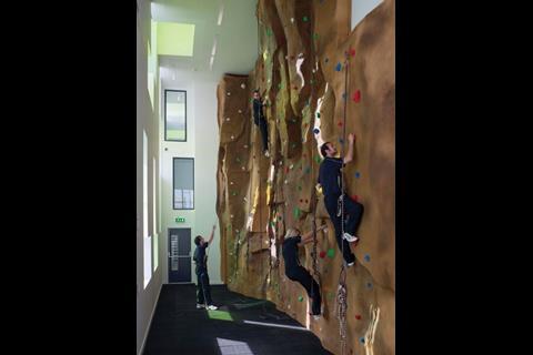
The impression that this is a cut above the average university building continues inside. You are greeted by a generous, triple-height space which is a surprise because the building looks relatively low externally as the ground slopes upwards from the entrance. This space has been carved out of the ground to give additional height. There is a dining area here – the green-tinged light streaming through the coloured glass actually looks normal because a powerful lime green has been used for the chairs. The first clue that this is not a student union building in a party frock but a serious sports facility, too, is provided by a glimpse of a climbing wall on the first floor.
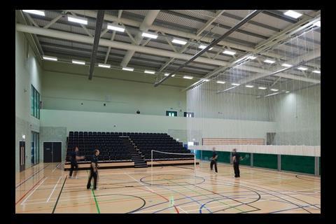
There is a cafe on the first floor, too, and a room badged as “multi-purpose space” which is used for activities such as judo, dance and aerobics. Beyond this is a second Tardis-like experience as you are confronted with a massive, 900m2 sports hall, 11m high and 33m wide. This features seating that can be pulled out from wall recesses to transform it into an events space. Continue up the stairs to the second floor and there is a reception desk looking after a big fitness suite stuffed with the usual running and cross-training machines and changing rooms.
There are good commercial reasons why the building has been configured this way. Andrew Kane, the partner at FaulknerBrowns Architects who designed the building, explains that most university buildings sit empty for long periods because they are only used for 30 weeks a year and only periodically so even then.
“Utilisation is a key thing in universities,” he explains. “Getting high utilisation levels is the holy grail of the university sector.”
FaulknerBrowns has masterplanned the whole site, which is gradually being redeveloped and updated. Kane explains that eight key objectives were identified by the university, including a central social space, a dining facility and sports and fitness facilities usable by both staff and students. Combining this in one building is a step closer to the elusive holy grail of getting as much use as possible out of a space.
“I don’t like the phrase ‘sweating the assets’ but this is about getting the maximum benefit from what is provided,”says Kane, adding that this building will be open all year from 7am to 11pm. The only reason the building doesn’t have a bar is because the campus is in the middle of town, with a multitude of cheap pubs nearby.
FaulknerBrowns has packaged up these disparate elements remarkably well. By tucking the fitness suite reception out of sight on the second floor, it feels like a standard, albeit smart, student eatery at ground-floor level. A space to the right of the entrance is used for non sporting events such as exhibitions and meetings, and fits within the ethos of a standard student union. The climbing wall is slightly at odds with this scene but functions as a taster of what’s up the stairs and is more fun element than bizarre clash.
Posh variant
The really clever packaging takes place externally. The fitness suite reads as a distinct element – it takes the form of a protruding rectangular box to the right of the entrance and is clad with dark grey composite sandwich panels with a large, letterbox-shaped area of glazing. A visual link is provided by the rectilinear form of the white concrete panels and because the same glazing is used for the fitness suite as the entrance area.
The dark cladding provides an attractive contrast to the white concrete and helps break up the bulk of the building. The sandwich panels are a posh variant of the product used to clad big sheds, and according to Kane this is the first time these have been used in the UK. The panels are the Hoesch range from ThyssenKrupp and feature crisp, vertical and horizontal joints, unlike its industrial park cousins. “We wanted the cladding to look good but economical to keep within the budget,” says Kane.
Let down by the carpet
The massive sports hall is tucked diagonally opposite the entrance behind the fitness suite where it is less visible from the road and entrance. It has the same cladding as the fitness suite but the lower third is clad with split-face Forticrete blocks set back from the panels above. They but the change in texture softens the bulk of the sports hall.
There are a few minor gripes. The design means the cheap-looking, industrial-quality carpet really stands out, and Kane tuts at the proliferation of free-standing vending machines in the kitchen area. But Ivan Whitfield, director of sport for Sunderland University, is delighted with his new multi-purpose building.
“Some of the university community were sceptical about whether it would work but it has proved very popular,” he beams, adding that 1,400 students and 100 staff have joined the fitness suite.
He is particularly pleased the BBC has chosen to present the North East Sports Awards from the sports hall rather than the usual Sunderland Aquatic Centre. “It’s the first time it’s been held in a university building,” he says.
Sunderland’s gamble seems to have paid off and could be a model for a new generation of student union buildings.
Project team
Client University of Sunderland
Architect FaulknerBrowns Architects
Contractor Morgan Ashurst
Structural engineer Buro Happold
Services engineer Atkins, Emcor
QS Todd Milburn Partnership
Client project manager Elliott Dent
Making Cityscape distinctive
The facade is the most complex area of the building – the planners wanted it to be distinctive because the building previously on the site was a well-known landmark with concrete flying buttresses and large concrete bas relief tiles.
The response was the random-looking arrangement of slots cut out of the facade and infilled with coloured glass. As FaulknerBrowns did not want it to be obvious where the supporting columns were in the facade, engineer Buro Happold came up with a complex steel space frame that could transfer the loads to the ground. But because this was going to require vast amounts of expensive steel, FaulknerBrowns tweaked the position of the cut out sections of the facade.
“We adjusted the position of the blocks very slightly to create load paths running from the roof to the ground,” says project engineer Iain Bramble. This created areas of solid facade 200mm wide spanning the full height of the building. “This significantly cut down on the amount of steelwork needed, which dramatically reduced cost,” says Bramble.
Colleague Kane says the university questioned the amount of money being spent on the facade but when he was able to demonstrate that the building was not costing any more than other university buildings, it agreed to the idea.
The total project value was £11.5m, with the construction cost weighing in at £8.4m. This works out at £2,200 per m2.
The glass is five shades of one green hue. “We did look at lots of different colours but it was beginning to look rather ecclesiastical so we went for one colour as it gives the building a stronger identity,” explains Bramble.
A coloured interlayer from Vanceeva is used for the laminated glass. The white precast concrete panels were made by Trent and contain a mica aggregate which makes it sparkle in the sun.











No comments yet