Art meets industry in David Chipperfield’s Hepworth Wakefield gallery, reflecting two facets of its Yorkshire location’s heritage. But is this work of art devoid of humanity?
Wakefield in West Yorkshire is undergoing something of a cultural renaissance and major projects by big-name architects are leading the way. Sarah Wiggleworth’s Sandal Magna Community Primary School opened last year. David Adjaye has completed Wakefield market hall. Construction has begun on Cartwright Pickard’s Wakefield civic offices. And perhaps most anticipated of all, David Chipperfield’s long-awaited £35m Hepworth Wakefield gallery is now complete and set to open tomorrow (Saturday). Hot on the heels of Chipperfield’s Turner Contemporary, which opened in Margate last month, it offers a relatively rare British example of the kind of cultural project that has brought Chipperfield such critical notoriety abroad.
Although popular perceptions of Wakefield may often revolve around its strong industrial heritage, less well known is its impressive artistic pedigree. It was the birthplace of Barbara Hepworth, the world-renowned modernist sculptress after whom the gallery has been named and whose works form a major part of its permanent exhibits. However, several other prolific British artists, including Walter Sickert, Anthony Caro, Ben Nicholson, LS Lowry, David Hockney and Henry Moore were all born in the vicinity. The Hepworth Wakefield represents a major step in a wider civic strategy to market this remarkable cultural legacy. At 5,000m2 it is also the UK’s largest purpose-built gallery in 50 years.
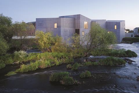
The Hepworth sits just outside Wakefield city centre on the banks of the River Calder. It is surrounded by an eclectic mix of urban residue including fine Victorian warehouses, a motorway slip-road bridge, low-rise light industrial buildings and an exquisite medieval chapel. From the start Chipperfield identified the site as “very exposed and three dimensional, without a back but with fronts all around.”
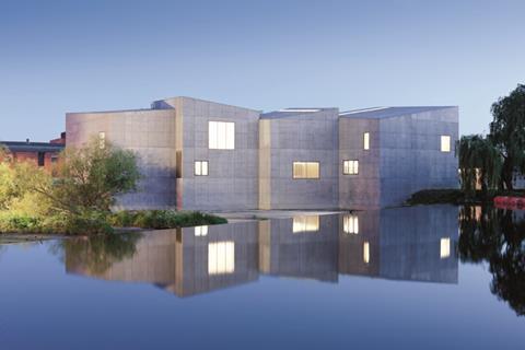
When approaching the Hepworth from the new Chipperfield-designed footbridge that spans the Calder and links the gallery with the city centre (a key regeneration driver), the multifaceted nature of both site and building becomes instantly clear. The Hepworth does not sit beside the river but rises dramatically from it on the entrance side, with water from the weir directly opposite crashing against its outer walls. It forms a memorable first impression. Also, not only does this configuration recall the dockside setting of many local warehouses, it enables the Hepworth itself to act as a flood barrier.
The building comprises 10 double-height trapezoidal concrete blocks each with independently inclined mono-pitched roofs. With the exception of a few flush windows, the blocks are predominantly solid. Their load-bearing facades are formed by in-situ cast concrete, pigmented to create a mid-grey colour that, from close proximity at least, reveals a smoothly finished yet remarkably rich, almost fabric-like texture.
This rigorously volumetric composition certainly satisfies the architectural vision of a building that is capable of relating to all its sides equally. The facades also celebrate the sparse utilitarianism commonly associated with the industrial architecture that forms such a key component of local heritage. The Hepworth’s minimalist sculptural form is also unmistakably of the work of both Chipperfield and Hepworth herself. The dynamic roofscape, with its energised ripple of slopes and angles, or what Chipperfield refers to as “volumetric manipulation”, merges seamlessly with the pitched roofs that form the surrounding urban skyline.
And yet, with its monolithic form, grey tones and austere finish, the Hepworth cuts a bleak and dispassionate figure, particularly when viewed from a distance. The honed, sculpted quality of its concrete finish is undeniable, but this is only visible from close up. From afar the grey surfaces morph into a dour palette that generates an unsettlingly militaristic and defensive quality, like a series of mechanised bunkers designed to exclude, rather than embrace, the public.
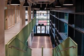
Internally, the theme of cold, clinical precision continues but it is implemented more successfully than on the exterior. Although finishes are not extravagant and occasionally teeter on the brink of sterile severity, they are stylishly assembled and create a world of sleek, linear decorum. The reception and staircase, for instance, are partially panelled in grey MDF. But the quality is such that the panels almost resemble Corian and contrast decadently with the white walls that surround them.
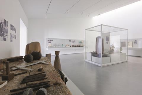
The first floor galleries are enriched by a series of spatial and lighting decisions. No two gallery spaces are identical; each one has a unique shape, height and scale that provide a strong sense of character to individual spaces. With their dramatically swooping mono-pitch ceilings, they also reveal the extent to which the shape of the building is directly determined by the interiors.
The enfilade, “doorway vista”, arrangement of the 19th century museum is rejected in favour of a staggered route that forces the visitor constantly and intuitively to search out the entry to the next gallery. The exhibits become a natural part of the route through the building and cleverly intrude upon circulation as well as contemplation.
The artificial lighting of the galleries is complemented by subtly diffused, background daylight from narrow, full-width slits in the roof. This provides atmosphere rather than illumination and creates a distinctly church-like, ethereal feel.
Daylight is also admitted through large, carefully located, floor-level windows. These are some of the gallery’s best features. Not only do they frame generous views of local landmarks (particularly the foaming weir below) but they also create a strong and important visual connection between the visitors, exhibits, galleries and the city outside. Crucially, they also allow tantalising glimpses of some of the sculptures on display from the outside of the building - one of the exterior’s few humanising concessions.
Chipperfield has made his name by creating sleek, sculptural architecture forged from simplicity but harbouring soul. It is perhaps this vital, latter aspect that is missing from the Hepworth. Its sculptural form is certainly well assembled and the galleries are vibrant, charismatic spaces that serve their treasured artefacts well. But the exterior lacks the empathy and humanity to elevate it from being anything greater than an inanimate - if impeccably well crafted - object.
PROJECT TEAM
Architect: David Chipperfield Architects
Client: Wakefield council
Main contractor: Laing O’Rourke
Project manager: Turner & Townsend
Structural and services engineer: Ramboll UK
Quantity surveyor: Turner & Townsend
Landscape architect: Gross Max









No comments yet