Rivington Street Studio’s flamboyant design for York St John University’s new quadrangle in England’s most complete medieval city provoked predictable outrage. Now that it’s built, its youthful verve frees it from the heritage vice
A £15m university quadrangle is creating quite a stir just outside the stone city walls of England’s most complete medieval city.
Finished last month, the four wings of York St John University bound the perimeter of a lopsidedly square site, with a compact courtyard at its heart. But this is anything but a regular university quad. As you walk around De Grey Court, as it is known, it unfolds through a profusion of ages, styles, forms and materials. This startling design, by Rivington Street Studio of London, provoked outrage among local amenity societies and residents at planning stage, not least because the site is in a conservation area. But will the sheer verve of the end product be enough to win over the critics?
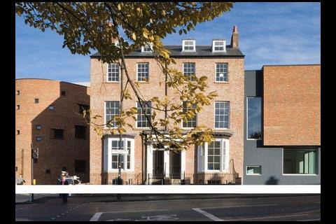
The starting point and anchor for the whole scheme is a pair of listed Georgian terrace houses, which take pride of place at a major T-junction. To the left, a narrow alleyway leads into the central courtyard. Then, just beyond the alleyway, the scene changes dramatically. Here a massive four-storey wing in red brick bends round the street corner in a bold curve, then sweeps inward slightly before finishing with another curve at the other end.
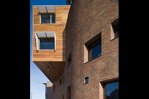
This new neighbour to the Georgian houses could hardly be less decorously classical in style. It’s a raw bastion of a building, constructed out of a glowing, roughly textured red brick that was handmade locally. Rising sheer from pavement to coping, it is pock-marked with a loose scattering of small square windows, many of them set in splayed reveals that display the thickness of the wall. Although the bulging brick wall pays homage to York’s medieval heritage, such faultlessly contemporary detailing avoids any hint of pastiche.
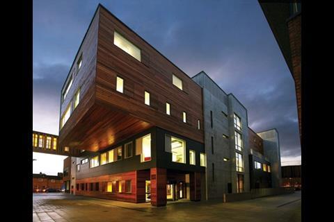
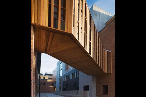
The next abrupt gear change takes place at the northern end of the wall. Here, a sharp-edged, rectilinear box, clad in natural larch boarding, crashes through the softly curving wall at an acute angle. This is one end of an oblong four-storey block that divides the central courtyard from a pedestrian alley. Overhead, a pedestrian bridge in glass and timber spans the alley obliquely to link the new complex to the university’s existing building, which was completed just four years ago. Then at the opposite end of this four-storey wing, its top half crashes out once again, this time with a gravity-defying 6m cantilever over a second pedestrian alleyway.
The complex then drops down to a three-storey wing, the gable end of which adjoins the Georgian houses. This end of the wing a plain but carefully proportioned modern facade with a square expanse of handmade brickwork.
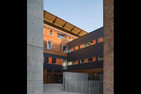
Venturing into the courtyard at the heart of the quadrangle, the scene changes again. Here, all three new wings, including the massive brick bastion, are faced in lightweight cladding. This comprises a contrasting combination of natural timber boarding and Eternit fibre-cement panelling, whose artificial nature has been played up in bright orange window shutters.
The courtyard has the comfortable feel of an enclosed sun trap, while still being connected via the curving brick wall to the city. It cries out to be used as an outside extension to the teaching spaces, or even better, as a restaurant. Sadly, it serves as little more than a slightly barren forecourt to the quadrangle’s reception in the block at the rear.
From the reception, internal corridors and stairs lead to more than 100 teaching spaces and staff offices that make up the complex, which is mostly occupied by the faculty of health studies.
The larger teaching spaces, including a raked 140-seat lecture theatre, are contained within the deep-plan wing with the curvy brick wall. The masonry of the wall is openly expressed in these teaching spaces, though in cost-saving Fletton bricks rather than the deluxe handmade ones in the street facade.
So what are we to make of this strange pot-pourri of divergent ages, styles, forms and materials? As the amenity societies vociferously maintain (see box), it is not the most finely resolved piece of heritage-linked urban design. In a collision of the old and the new, the Georgian houses have been framed between a bulging, bulbous wing on one side and a sub-Mondrian composition of square panels and windows on the other.
Then there is the mix of building shapes and styles, where the wavy brick wing with its medieval overtones has been spliced into the blatantly modern oblong block with its fiercely protruding gable ends. Not least there is the profusion of ancient and modern material: handmade bricks, natural timber boarding, tropical hardwood panels, painted render, fibre-cement panels in charcoal grey and vivid orange, and even fairfaced concrete. To add to the confusion, the existing university buildings along two sides are in a jarring corporate style of mauve-coloured brickwork and smoke-tinted glazing.
In short, the architecture of De Grey Court is baffling in its complexity. Yet it has a strong character that shines through all this. For a start, the detailing is neat, robust and apparently durable, in spite of being carried out through a design-and-build contract. All the windows, for instance, are set in slender frames with no fussy dividing bars or mullions. This was achieved by drawing natural ventilation through adjoining obscure shutters (they are the vivid orange panels).
More than that, the dynamic sculptural forms, unexpected juxtapositions of shapes, materials and vivid colours all bristle with youthful verve and energy. Just the thing for a university campus.
In a collision of the old and the new, the Georgian houses have been framed between a bulging, bulbous wing on one side and a sub-Mondrian composition of square panels and windows on the other
As for the pair of two houses, they hardly rank as the most elegant piece of Georgiana in Britain, and in any case their original function sits incongruously in a university campus. They do at least connect the site to York’s two millenniums of architectural heritage. But rather than setting the tone for the whole scheme, they are eclipsed by the new architecture erected around them.
Here, then, is an urban infill scheme that succeeds in breaking the grip of heritage. That it has taken place in Britain’s foremost medieval city only adds to this bold achievement.
How ‘A cheap and nasty eyesore’ got planning approval

“It would look in place in Stalinist Russia but alongside listed buildings and on the edge of a conservation area, it is a cheap and nasty eyesore.” So wrote an unnamed resident in response to Rivington Street Studio’s planning application for De Grey Court.
Little wonder, then, that Charles Thomson, Rivington Street’s senior director, faced an uphill battle to gain planning approval. Not only was his design overtly contemporary in style, but it also embraced a pair of listed Georgian houses, was a few yards from the ancient city wall, and took its place in England’s most complete medieval city.
The local resident was not alone in his outrage. Several choice phrases of objectors can be gleaned from the city council’s website: “The long unbroken flat roof is oppressive,” English Heritage “The worst features of London’s South Bank Brutalism of the 1960s,” Guildhall Planning Panel “Inappropriate, too big, dominating, overbearing and monolithic,” Conservation Area Advisory Panel “Totally alien to the grain and historic character of York,” York Civic Trust.
In the face of such an onslaught, and with what he calls “the unfaltering support” of the university estates director, Colin Parkin, Thomson stood his ground on the overall shape and character of the design. But with the encouragement of York city planners, he conceded a few key amendments. Foremost of these was to replace exposed concrete with warm red handmade brick for the wavy wall fronting Clarence Street. Other changes included lowering the dominant four-storey block by 1.7m and capping it with a distinctive roofline of projecting, upward-tilting eaves.
The amended scheme was supported by council planning officials and, despite a divided planning committee, gained approval at its first submission in October 2006. “It was a fraught process, but it made the end product better,” says Thomson.
Project team
Client York St John University
Architect Rivington Street Studio
Project manager GVA Grimley
Quantity surveyor Gleeds
Structural engineer Robinson Consulting
Services engineer Faber Maunsell
Landscape architect Whitelaw & Turkington
Design-and-build contractor Morgan Ashurst
Postscript
Photographs by Sarah Blee and Richard Bird
Original print headline: New York New York








2 Readers' comments