The office space behind the modest Georgian facade of 11-12 St James’s Square would presently cost you £140 for every square foot you rent.
The reason is partly the location – between Piccadilly and Pall Mall – but partly the way it has been transformed from a dark and dated clutch of flats and houses into a desirable corporate headquarters.
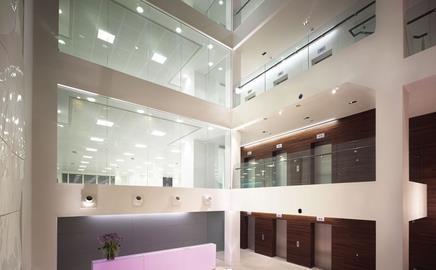
The main intervention was to insert a seven-storey atrium to provide a striking reception area, but many of the smaller specification decisions were also vital in creating a sense of prestige. Here Morey Smith, the architect and interior designer for the refurbishment, tells us about the most important of them.
Fabric upholstered panels to wall behind reception: Nuance Titanium from interior designer Mary Fox Linton.
This is a fantastic vinyl fabric with a real metallic sheen. It changes from blue-grey to purple to bronze as you move around the space. It is great for wall finishes, as it is much more resilient and “wipe clean” than fabric, but not nearly as expensive as leather. It works beautifully in the period part of the building, alongside the muted paint colours and limestone floor. This material does need to be fire-treated before being used in a wall-mounted application.
Burned oak timber flooring and cladding: character grade 180mm wide engineered boards from Victorian Woodworks, with oil finish.
This timber, although not actually reclaimed, has a wonderful depth of colour and range of tones, owing to the kiln firing process the manufacturer uses. Wide boards were chosen to work with the scale and grandeur of the period rooms. Thinner 50mm strips were used horizontally to clad the lift wall of the atrium on the ground and first-floor levels.
Back-lit glass reception desk
The desk design is completely bespoke and was produced for us by fit-out specialist James Johnson. The desk itself is made up from silicone-bonded, low-iron glass that was sand-blasted and then lined with an opal acrylic diffuser. This was then back-lit by colour-changing LEDs. The lights can be controlled by a remote control, which means you can change the feel of the space according to mood or function. The same design was used for the light reveals on the walk from the period building to the new atrium, highlighting the transition from old to new.
Bespoke handles to glazed entrance doors
We designed a bespoke leather pull handle for the glazed entrance doors, to give visitors a feel for how special the building is immediately upon entering. The leather is a metallic hide from Edelman Leather, chosen to work with the vinyl wall panels beyond. This is fitted to a padded insert within a bespoke stainless steel casing.
Specifier 11 January 2008
- 1
- 2
- 3
- 4
- 5
 Currently reading
Morey Smith architects: Give it the works
- 6
- 7
- 8
- 9










No comments yet