Rogers Stirk Harbour + Partners has designed the first Maggie’s Centre in England and, thanks to its dramatic oversailing canopy roof, it provides both seclusion and a bold statement to the outside world. Stephen Kennett reports
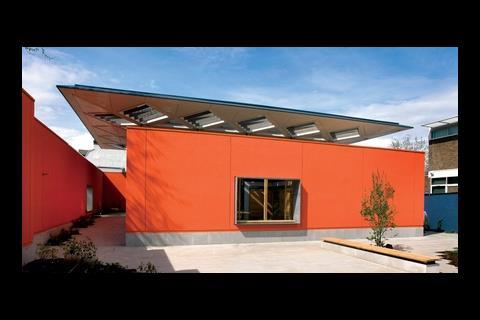
Surrounding a building with a 4m-high wall might sound like a recipe for austerity, especially when the building in question is a walk-in cancer care centre. Yet the £3.5m Maggie’s Centre recently opened in Hammersmith, London, overcomes the potential for gloom with a dramatic, oversailing canopy roof, which serves to block out the surrounding buildings while providing a welcoming atmosphere and a space filled with daylight.
The main problem for the first Maggie’s Centre to be built in England was the site, says Will Wilmshurst, architect with Rogers Stirk Harbour + Partners: “It was incredibly difficult for what we were trying to achieve.”
Maggie’s Centres are for those affected by cancer, whether sufferers or friends or family members, and provide a place they can go to find support. The ideal, Wilmshurst says, was “to create this little oasis away from the hospital that was tranquil and somewhere you could relax”. What the architects had to work with was a site sandwiched between a noisy road and the looming bulk of the Charing Cross hospital.
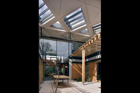
The design that evolved to overcome these circumstances comprises a blank rendered wall and a large canopy roof that cocoon the centre. From the inside of the building the roof serves to obscure the view of the Charing Cross hospital but where it oversails the building line it is punctuated with voids that allow light into the garden courtyards below.
The general principle of the design was to create a roof that appeared as a single element that hovered above the building and which ran seamlessly from the inside to the outside. “You can see the underside of the roof effectively floating above the wall,” says Wilmshurst. “But you also see this warm heart to the building, so it is still inviting.”
The task of converting the concept into reality fell to SAS International, which has been responsible for the design and manufacture of the bespoke metal soffit linings that are suspended beneath the roof, as well as the skylights and the bullnose features around the canopy’s perimeter.
According to Richard White, design manager for SAS International, the brief from the architects was clear. “They were looking for the detail and precision that you would get from a metal ceiling but they wanted that carried through to the exterior, and that was the key to the whole thing.”
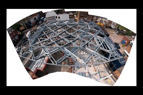
The roof itself is built around a diagrid of steel I-beams. Their crisscross design is highlighted by channels inset into the underside of the roof, and this crisscrossing also generated the pattern of triangular panels used to underclad the entire roof. The undercladding consists of around 240 triangular aluminium panels that are installed to follow the geometry of the roof.
Because of the complexity of the roof’s geometry, SAS built a virtual 3D model of the inverted hipped roof using Autodesk Inventor. The information gleaned from this was later used directly in the factory-made process for stamping out the panels. To ensure the required tolerances, SAS decided that everything would be manufactured and there would be no site-measured panels, says White. This approach also helped solve the puzzle of how to make sure the panels would align neatly along the hip lines of the roof.
Arup had already designed the primary steelwork when SAS came on board; SAS then created a layout for the purlins and other secondary steelwork. This gave the fixing points for the individual panels, which were then attached to the steelwork using adjustable L-brackets. These were aligned using lasers, effectively deskilling the panel installation. The panels were then mounted to the brackets using self-drilling fixings.
Various thicknesses of aluminium were examined at the design stage in order to assess how they would resist any wind loading. In the end, 2mm thick panels were used throughout. “It wasn’t worth having different panel thicknesses inside and out,” says White. The edges of the panels were folded with what White calls a “negative” bend, which means that the panel is always in tension and so minimises any deflection.
A further element of the project brief was that there should be no flashings to the roof.
SAS took responsibility for the single-ply roofing membrane that has gone on the roof’s top surface. “We wanted to make sure the interfaces between the membrane and metal were going to work,” said White.
SAS’s approach was found to be most challenging at the skylights. These were punched through the overhanging section of the roof but the process was made more complex because the roof’s upper surface is not parallel to the soffit underneath. White says: “We had to create a trapezoidal tapering detail where the membrane folds down into the lightwell and attaches to the aluminium cladding around the inside of the rooflight.” Anodised aluminium blades were fixed into the lightwells to provide solar shading.
Wilmshurst is pleased with the result: “From the outside the roof is a major feature of the building but when you’re inside it feels very personal, which was what we were trying to achieve – cutting off the views of the hospital but allowing light to pour in.”
Downloads
Section
Other, Size 0 kb
Topics
Specifier 6 June 2008
Specifier 6 June 2008
- 1
- 2
- 3
- 4
- 5
- 6
- 7
- 8
- 9
- 10
 Currently
reading
Maggie's Centre in London by Rogers Stirk Harbour + Partners
- 12









1 Readers' comment