Surface Architects’ conversion of Birkbeck College’s film and media research centre is a complex sculpture that breaks down distinctions between walls, floors and ceilings, opening it up to all manner of interpretations. Martin Spring makes one or two
The art history department of Birkbeck College occupies a depressingly dreary conversion of a fine early Victorian terrace in London’s Bloombury – a claustrophobic maze of fire lobbies, narrow staircases, fluorescent lights and self-closing grey doors. But open one of these doors and suddenly you find yourself in a double-height space that is radiant in daylight cascading down though large skylights.
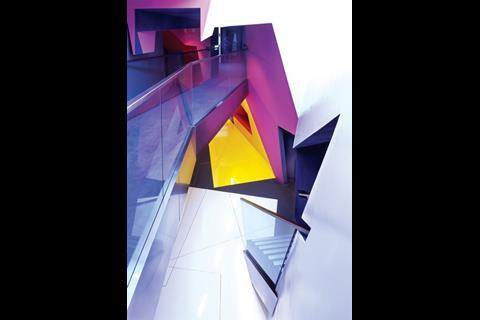
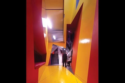
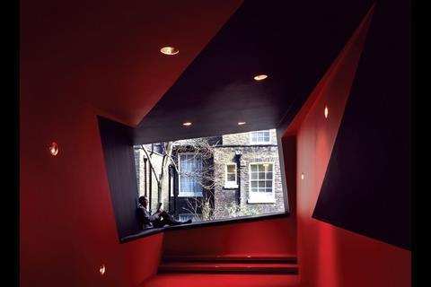
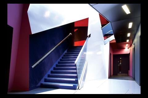
Walls, floors and ceilings are all vividly coloured in crimson, white, yellow, blue and black. They are arranged in a kaleidoscope of sloping, angular surfaces that in places form sharp edges and jagged points that protrude into the space. On one side, two narrow voids drop down to a basement floor with more of the same vibrant kaleidoscopic effects. On the other side, a crimson carpeted lobby ends in a huge, tilted, trapezoidal window that frames a view of a frilly golden acacia tree and the rear walls of the neighbouring Regency terrace.
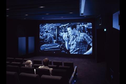
All this colourful spectacle is the home of Birkbeck’s new Centre for Research in Film and Visual Media, which has an 80-seat cinema as its main facility. The design is by Surface Architects, a young practice with an RIBA award to its name. As its founding partner, Richard Scott, says: “Because this is for the film department, we haven’t just come up with a cinema, we’ve intensified it to dramatic effect.” More than that, Surface Architects latched on to the physics of cinema projection for the design logic behind its jazzy effects.
The cinema auditorium, two seminar rooms, a plant room and the colourful lobbies have all been created within the boxy, two-storey shell of a 1970s rear extension to the terrace. “The auditorium came first,” says Scott. “It’s a simple space that is shaped like a cone that widens out and steps down from the film projector at one end to the screen at the other. Next we designed all the spaces around it.”
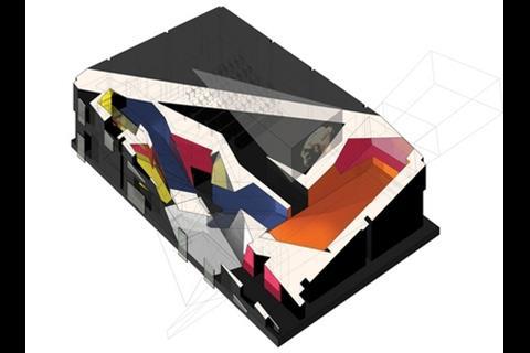
The two seminar rooms and plant room are conventional rectangular spaces below the auditorium. In contrast, the lobbies and break-out spaces on two sides pick up on the cone shape of the auditorium and its film projection and extrapolate it in a complex, animated manner.
“We treated the whole double-height volume like a cutting block,” says Scott. “The original projection cone bounces around inside this solid mass repeatedly and carves out the spaces in different configurations like inside-out sculpture. The residue that is left over forms the solid, angular walls, floors and ceilings that bound these spaces.”
The main break-out space lies directly behind the auditorium screen. Although it is rectangular in overall shape, this space is bounded by flat black panels that are inset into the red wall and ceiling so that they form a cone shape focused on the trapezoidal picture window with its view of the tree and rear walls. “In the midst of this abstract world of forms, colours, lighting and textures, this view crashes through the rear wall and brings you back into the real city,” says Scott.
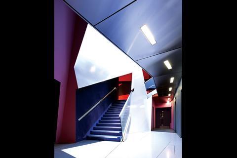
Added to this complex spatial sculpture is a stimulating progression of colours, finishes and acoustic effects, with no distinction between walls, floors and ceilings. The interiors of the three adjoining Regency terrace houses have been painted sober grey to represent original black-and-white cinema. The auditorium interior is literally a black box with sound-deadening finishes in black fabric to all surfaces. The open staircase and minor lobbies are finished in a shaggy navy-blue velour that retains the imprints of whatever rubs against it. The progression culminates in the two main double-height lobby and reak-out spaces, which are finished in an array of hard matt and shiny surfaces in gaudy modern colours that Scott likens to Andy Warhol’s sixties screenprints of Marylin Monroe. “It’s a dramatic transition to the world of Technicolour film,” he says.
The many angular forms are emphasised by sharp arises and by flush surfaces without mouldings, skirtings or window frames. In the double-height lobby, a polished stainless steel handrail slopes up the open staircase and along the upper-level balcony and bridge. It is recessed into the walls rather than being fixed flush, and instead of ending at a fixed point, it simply disappears into the wall.
A more mellow and sociable touch has been added to the severe break-out spaces in the form of three large leather cushions. They have been laid as window seats below the large rear window and two internal openings.
It has to be said that Surface Architects’ projection cone theory behind its vivid angular composition is not self-evident. On the other hand, it does permit endless interpretations – it evokes, for instance, the 1920s German expressionist film The Cabinet of Dr Caligari – and these are welcomed by the architect. Indeed, the department head, Professor Ian Christie, responded so warmly to the architects’ creative explorations that he dug out an old documentary film of Cubist paintings carried out by the Bloomsbury artist, Duncan Black, while he lived in these same terrace houses in the 1930s with the sisters Vanessa Bell and Virginia Woolf. “His paintings matched our vision of daylighting and forms exactly,” says Scott proudly.
See it in 3D!
The £1.35m refurbishment of Birkbeck College’s Centre for Research in Film and Visual Media was dominated by the fearsomely complex 3D geometry of the angular, sloping panels to walls, floors and ceilings. As Sean Wells, project manager for main contractor Vivid Interiors, puts it: “By far the biggest challenge was communicating the design’s drawings to the subcontractors.”
In Surface Architects’ design, the angular panels were arranged in a co-ordinated, interlocking series, with the logic carried through to the precise detailing. One practical consequence was that the architect was able to break down the overall composition of 3D geometry into manageable work packages by mapping it on to a grid. The result was unfolded 2D drawings that were given to each trade contractor along with visualisations of the finished space.
Another consequence was that all the co-ordinates for partitions, floors and ceilings could be traced back to a single setting-out point in the basement. But to set out th exact locations of all the panels and their end points throughout the extension, Wells and his site manager used string.
The internal sloping, angular partitions and ceilings are all made of 78mm cross-laminated timber panels, a sort of jumbo-sized structural plywood. Manufacturer KLH cut the panels to precise shapes at its plant in Austria using a CAM process.
As for the structural frame of the extension, this was conceived as part of a more ambitious plan to rebuild all the 1970s two-storey rear extensions as five-storey extensions. Douglas Pow, director of structural engineer Techniker, explains that the studios were configured as an egg in the box of the 1970s external walls and roof. This allowed them to stay standing while the shell is demolished and rebuilt. The new two-storey internal structure is made up of steel beams and columns and a composite metal-deck floor at first-floor level.
Project team
Client Birkbeck College, University of London
Architect Surface Architects
Structural engineer Techniker
Services engineer Freeman Beesley
QS Jackson Coles
Main contractor Vivid Interiors
Downloads
Ground floor plan
Other, Size 0 kb
Postscript
Images of other new projects can be viewed at www.building.co.uk/gallery









No comments yet