Google’s recently completed Bay View campus in Silicon Valley opened to staff last week. Tom Lowe spoke to Heatherwick group leader Eliot Postma about how the concept was developed
“Excitement” was the overriding feeling when taking on the job to design Google’s first purpose-built headquarters in Mountain View, California. Heatherwick architect Eliot Postma, the studio’s lead on the project, could be forgiven for having felt some pressure, too.
The newly completed office complex, designed by a partnership between Heatherwick and BIG, is no normal commercial scheme. Google is arguably the planet’s most important company and its ideas, both corporate and philosophical, influence businesses, governments and people across the world.
Designing its head office is effectively making a statement about what the future of work will look like.
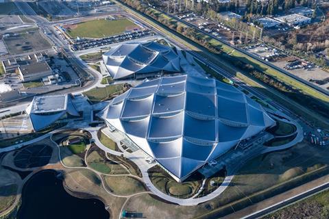
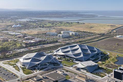
Opened last week, the 42-acre Bay View campus includes two cavernous office buildings, a 1,000-person event centre, short-term accommodation for 240 staff and 20 acres of open space. A second site about 500m away, Charleston East, includes an even larger Heatherwick and BIG-designed office building which is still under construction.
The design challenge for the two sites, Postma says, was an “extraordinary opportunity”. For an architect like Heatherwick, it seems like Google was a dream client.
“They’re craving to question, to experiment,” Postma says. “It’s pretty intoxicating, being around that environment. It was just a really exciting period to get to work with a client with that level of ambition – to really question what workplace is and what workplace could be.”

That feels more relevant now than maybe at any other time in Google’s existence. Building Design’s interview with Postma, held over Zoom, was a reminder of how much the assumptions of normal working culture have changed during the covid-19 pandemic.
Businesses across the world, which have been rethinking how they work, will pay attention to what Google has done with its new headquarters.
>> Also read: Google pays 1bn for Renzo Piano’s Central St Giles offices
>> Also read: Heatherwick receives another seven-figure dividend as profit slips
Many will have an expectation of what the new offices will look like. Mentioning Silicon Valley, where they are located, conjures up images of turtleneck-wearing staff sitting on beanbags in open-plan spaces floored with astroturf. This was not the brief, Postma says.
“There were very few conversations about beanbags and table-tennis tables,” he insists, when asked about the project’s early conceptual stages. Instead, the teams were told to park all of their assumptions about office space.
“There was the opportunity with them to really start from a blank sheet of paper, and reimagine what workspace could be.”
It was about creating a space which would unlock the imaginations of those working within, Postma says, and become “like temples to an organisation’s values and culture. And it feels like an awful lot of workspaces around the world don’t aspire to that”.
More specifically, Google wanted buildings which were vast but also allowed small teams to find places where they felt a “sense of ownership and belonging”. The design challenge, Postma says, was to “connect 3,000 people in one building, but also to create the appropriate space for a four-person team”.
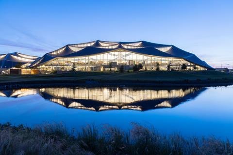
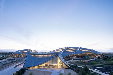
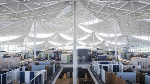
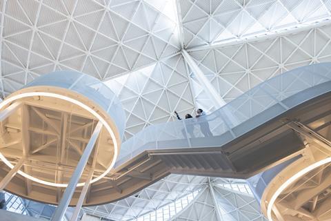
The resulting concept, used for the three largest buildings across the two sites, is a giant overarching canopy covering a two-storey “village” of workspaces. The idea is that the “shell” of the building is structurally independent from the interior, allowing Google to rejig the offices to fit whatever requirements they might have in future.
“When we started, we really didn’t know what Google were going to be or need to be in 10 years’ time,” Postma says, adding that the aim was to “design a space that was flexible enough to accommodate that change of an organisation, and essentially could create space that could keep up”.
With the pandemic striking halfway through the scheme’s construction phase, that flexibility showed its worth sooner than expected. Heatherwick and BIG sat down with Google during the first lockdown to discuss what working would look like after covid.
Postma says the team gave a presentation with the message: “don’t panic, we’ve designed for this”. The idea of the buildings was that they would be able to ”evolve as the changing workplace needs and pressures of Google evolve”.
So some modifications to the interior were made including the balance between open and enclosed spaces and entry pathways – “nuts and bolts stuff”, Postma says.
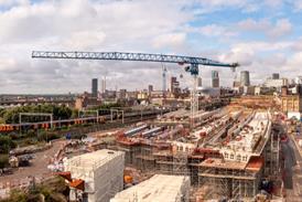
Reconfigurations were also made at Google’s huge London office, which is currently being built in King’s Cross by Lendlease. Heatherwick and BIG were appointed to the project following their work on drawing up concepts for the Bay Area campus.
So how did the partnership between the three firms come about? The story starts in 2014, when Google approached architects and designers looking for ideas for a major new office campus.
Up to that point, the company had inhabited and refurbished many existing buildings but had never built their own ground-up office from scratch. Some starts had been made in the past with different architects, but they “hadn’t quite found the right solution”, Postma says.
So Larry Page, the co-founder of Google and controlling shareholder of its parent company, Alphabet - and currently the seventh wealthiest person in the world - stepped in to look for designers. Around 10 practices were asked to submit a 10-minute video outlining their design philosophy and how they would approach an office project for a company like Google. After watching these back, Page and his team found that Heatherwick and BIG’s pitches stood out and decided to throw the two studios together.
>> Also read: Heatherwick unveils tree of trees sculpture for Queen’s jubilee weekend
>> Also read: Heatherwick unveils designs for tropical opera house in China
It was a “marriage of sorts”, Postma says. The two teams, which at first consisted of around six people each, worked together on masterplanning and “big picture” thinking about the principles of the scheme. “The agreement from the outset was, if this is going to be a success, we need to be like a complete 50/50 design partnership,” Postma says.
“And so that’s the way we ran it right from day one.” The teams ran a workshop model with Heatherwick staff being sent off on trips to BIG’s New York office, and vice versa, and sometimes both teams travelling together to the Mountain View site in California.
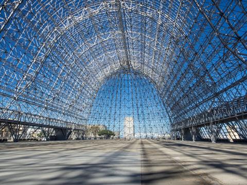
It was on the first of these trips to Silicon Valley that the concept for the project first started to take shape. Google took Postma, Heatherwick founder Thomas Heatherwick and the rest of the visiting teams to a NASA airfield which neighbours the Bay View site. On it is Hangar One, an airship hangar built in 1933 which is the third-largest in the world.
Its cladding had been removed for a refurbishment, and sunlight was pouring through the “cathedral-like” structure, Postma says. “We were kind of standing there looking at one another and saying, this is kind of what Google needs.”
The teams settled on the idea of a hangar-like envelope “under which the workspace and the life of Google could be defined, but separately from that kind of environmental enclosure and could continue to evolve”.
Once the direction of travel was decided, the teams expanded, eventually reaching about 30 people for each practice working on the project. Parts of the site were split up into packages, with Heatherwick taking on the canopy and the building site for one project and BIG taking the interior.
On another project, BIG took the site and canopy and Heatherwick did the interior. Any ongoing design issues were mutually discussed and agreed.
One key objective was to create buildings that were as sustainable as possible. The canopies are covered in solar panels, which supply 40% of each building’s energy. Shaped like dragon scales, they will be kept in working order via a series of walkways built onto the roof which allow access to maintenance staff.
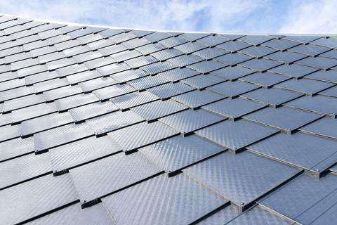
The curved roof sections, described by Postma as “scallops”, are designed to drain rainwater down to the next section until it reaches a gutter which surrounds the perimeter, where the water is funnelled into the buildings’ corners. From here, it gets moved into underground storage tanks and goes into a recycling system which uses ponds in the grounds surrounding the campus to filter it.
The result is that the buildings are net water positive, which is an achievement in California, a state which suffers from chronic water shortages.
Water usage is also reduced by a huge system of ground source heat pumps, the largest in North America. This removes the need for cooling towers, which use an enormous amount of water to cool the air which gets circulated around the complex, meaning that the water consumption needed to cool the buildings is reduced by around 90%.
The canopy has also been designed to balance trade-offs between light and heat to keep down energy usage. The buildings notably lack skylights, which would allow too much California sun to beam in and increase the burden on cooling systems. Instead, each “scallop” frames a huge curved window which lets in enough light to minimise the amount of electric lighting required without heating the building up.
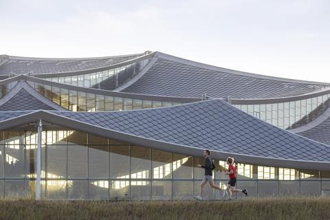
These windows are rotationally symmetrical, meaning that there is always a view outside from wherever you are in the building. “Within a very large floorplate like this that was something that was really important,” Postma says. “Wherever you are, being able to know whether it’s day or night, to sync up with your circadian rhythms, and get a sense of being connected to the outside world”.
The levels inside are also stepped, allowing a line of sight to the windows and a “visual connection to the landscape beyond” even if stood in the centre of the building, Postma says.
This landscape is not necessarily as inspiring as you might hope. While a coastal wetland habitat lies north of the campus, its south is flanked by a large carpark, its east by a cluster of large industrial sheds belonging to NASA, and its west by a canal facing onto office blocks.
Approaching the campus, a staff member on their first visit to the office will start by driving through what is essentially a giant industrial park. But the scene becomes more natural as you approach the Bay View campus, Postma says, as the wetland comes into view.
These wetlands are a nesting ground for the Western Burrowing Owl, which, as their names suggest, dig burrows. In 2008 a pair of the birds, which are listed as a species of special concern in California, built their underground nests on a site where Google planned to build a hotel.
Mountain View council, which owned the plot, evicted the owls and later purchased a plot of land on the adjacent wetland for the birds to move into. Not much of the Bay Area’s original habitat remains, but at least the landscape which has been built on the grounds of Google’s new headquarters could provide a much-needed home for the owls.
So what next for Heatherwick? Now the practice has completed a major commercial project, could it become the next Foster & Partners? Would it design big city office towers, government buildings, train stations, or that most controversial of architectural projects, airports?
“Of course,” Postma says. “If it makes the physical world around us better for everyone. Our starting point isn’t the scale or typology. It’s about the problem and whether we can use our design skills and thinking to help people solve it.”
The studio’s future direction, he says, is to “continue to humanise the world around us, continue to deliver on projects that hopefully make cities and urban places more human places to be and fundamentally the more we can do that the better”.









No comments yet