Romford can’t believe its luck. The Essex town’s new hospital is a 939-bed giant with a state-of-the-art cancer centre and a compact four-leaf clover layout that helps staff to save lives.
It’s a monster. The NHS’ latest PFI super-hospital weighs in at 4,511 rooms and contains 939 beds, which is nearly twice as many as the average district general. And all this is fitted into a 96,500m2 building that cost Bovis Lend Lease an economical £211m to build.
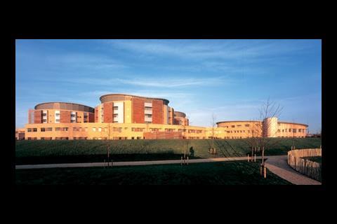
In form, Queen’s hospital Romford is less alienating than the NHS’ usual facility. Four circular towers, arranged in a clover-leaf formation, rise four storeys above a two-storey podium that curves inwards to the main entrance. This makes it a welcome sculptural landmark amid the architectural flotsam and jetsam that has collected along the eastern fringes of London. And given that modern hospitals tend towards amorphous conglomerations of boxes, the architect’s achievement is all the more remarkable.
Nor was the designer making a superficial architectural statement – the four drums are the product of the hospital’s compact internal layout. According to Jonathan Bailey, founder of the hospital’s Anglo-American architect Jonathan Bailey Associates, the main aim of the design was to minimise internal travel distances. “It’s bad use of hospital manpower to get people lost in corridors,” he says.
Michael McGeady, Bailey’s partner, explains how efficiently planned patient flow translates into hospital cost planning. “Some 60% of a hospital’s annual budget goes into staffing and only 12% into building management and maintenance, so if you can make 20% efficiencies in staff performance, this effectively pays for the building. And if you save time in a hospital by saving space, then you can put these savings back into better amenities.”
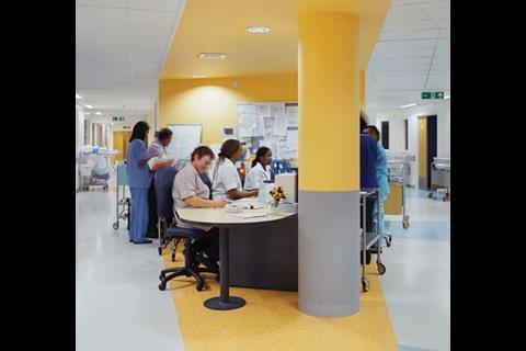
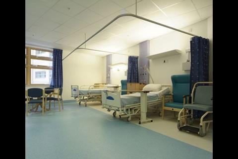
Each drum is 60m in diameter and contains three storeys of multipurpose wards and a top floor of plant rooms. On each floor, two semi-circular wards of 30 beds are separated by a rectangular lightwell. Inside each semi-circular ward, six four-bed rooms are arranged around the curving perimeter walls, and a straight row of six single rooms runs alongside the light well. This leaves an elongated central island containing three nurses’ bases that are open to the corridor encircling them.
The architect found the semi-circular layout offered more advantages than a square, triangular, cruciform or Y-shaped plan.
The benefits include wide observation arcs from the nurses’ bases to the beds through viewing panels in the corridor partitions, and shorter walking distances. The layout also makes efficient use of floor area and gives all bedrooms their own windows.
Short travel distances between departments have also been achieved by stacking them above each other. More radical than that, the hospital’s 17 lifts have been consolidated in a single core in the centre of the clover-leaf formation, from which all accommodation and corridors radiate.
The lift core also incorporates another circulation concept – the segregation of visitors, patients and staff, and servicing. Public lifts are given pride of place at the shorter end of the rectangular core and face a window wall, so when visitors emerge from the lift they are naturally drawn to the daylight and find the ward they are heading for directly off to one side or the other.
Staff, whether alone, with equipment or with patients, have their own lifts out of the way of visitors along the longer sides of the core and connecting to their own corridors.
The distance from the lifts on the ground floor to a bed on an upper-storey ward is just 50m, and it takes 21 seconds to wheel a patient from one to the other. Bailey says this is “unheard of in NHS hospitals”.
Nearly all diagnostic and treatment facilities are on the ground and first floors. Like the upper towers, these are packed close together to shorten travel distances, but do not have a simple layout. In fact, they are vast, nearly windowless labyrinths.
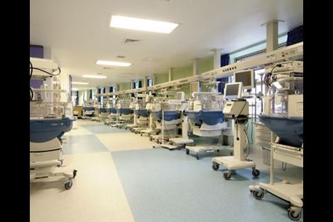
Diagnostics occupy the heart of the ground floor, and are surrounded by the specialist acute departments that rely on them, including critical care, outpatients and A&E. The first floor contains 16 operating theatres along with a maternity and neo-natal units.
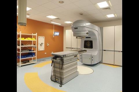
Of the specialist departments on the ground floor, the largest and best equipped is cancer care. It prides itself in a £1m electronic kit of scanners, simulators, four linear accelerators with an accuracy of 1mm and a large chemotherapy room with skylights. It aspires to have a catchment area stretching nearly as far as Cambridge and central London.
There is a 60-bed acute assessment ward on the ground floor that lacks daylight, but Bailey is not concerned: “You can make people feel warm and fuzzy in hospital, and then they die,” he quips. “It comes down to a choice between having a window and saving a life. Short distances and rapid responses save lives.”
Duane Passman, who set up the PFI project on behalf of the hospital’s NHS trust, says: “There is an opinion that you shouldn’t create hospital areas without daylight. But in endoscopy rooms and operating theatres, you have to have artificial light. Provided you have a decent working environment, you can locate these in deeper-plan areas.”
But daylight is vital to staff who spend every day in hospital and is acknowledged as an issue in staff retention. “It’s compact, and there’s a higher level of observation from the nurses point,” says Linda Davies, matron of the acute assessment unit on the ground floor, “but there’s no natural light and ventilation. And the circular layout can be daunting, as you can go around in circles following patients.”
Also, the number of doors needed for fire prevention causes problems. Trish Moncur, a nurse manager in A&E, says: “The architect didn’t think of trolley routes. It’s designed to confuse.”
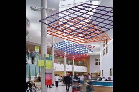
In contrast to all this is the main entrance hall. This is a crescent-shaped, double-storey atrium awash in daylight through a glass roof. With a reception desk at the centre, it is flanked by a restaurant and coffee shop and a blood donor area, and is spacious enough to absorb a multitude of people without feeling crowded. It lives up to Bailey’s description of an area that is “light and welcoming, creating a feel of openness and warmth that communicates wellness”.
An escalator leads to a more relaxed waiting area, complete with a grand piano for anyone to play, donated by Bailey.
The big question in any healthcare building is how it will cope with future changes. With treatment becoming less invasive, healthcare is increasingly given in community hospitals, health centres and at home. So, what is the shelf life of a 939-bed hospital?
Romford’s solution is to become a regional super-centre and the expanded cancer care department already fits the bill. “We have already outlined a programme towards regionalisation,” says Mark Rees, chief executive. “The building is adaptable enough to lend itself to that.”
The building’s adaptability is based on the principle of the loose-fit shell. On the ground floor, imaging facilities encased in concrete walls with steel sheets have softer spaces alongside them. On the upper floors, all the wards are designed to be converted to intensive care units in six weeks.
“If you want an adaptable space, you have to take the worst case scenario – an intensive care unit,” says Bailey. “We increased the size of wards so they can be converted. The PFI allowed us to pay for this with the savings made by decreasing circulation space.”
The hospital’s success will be determined by the efficiency with which it treats its patients. To what extent this will rely on the compact plan will be interesting to see. But in the long term, its success will depend on how adaptable the building is and it seems this has been designed into the structure.
How they did it
The Queen’s Hospital in Romford was a procured as a £261m PFI project that included design, construction and continuing hard and soft facilities management over 36 years. The contract was awarded to Catalyst Healthcare, which is 50% owned by Bovis Lend Lease, 25% by Uberior Infrastructure Investments and 25% by Sodexho Investment Services.
The 96,500m2, 4,511-room hospital was built for £211m, or a far-from-exorbitant £2,250/m2. The 39-month contract involved up to 1,100 people working simultaneously and was completed last October four days early, says Tony Velupillai, Catalyst’s general manager for the hospital. This was despite radical modifications to the design during construction to include an extra 60-bed ward and a coronary care unit. The changes were paid for out of a variation bond set up in the initial contract and entailed a second design team working with the original team.
Sodexho is responsible for hard and soft facilities management through about 450 directly employed staff. As well as building maintenance, this includes managing hospital services, but medical equipment is serviced by Siemens under a separate contract worth £6.5m a year.
Project team
Client Barking, Havering and Redbridge Hospitals NHS Trust
PFI consortium Catalyst Healthcare
Concept architect Jonathan Bailey Associates
Executive architect and structural engineer Building Design Partnership
Services engineer DSSR
Main contractor Bovis Lend Lease
Facilities manager Sodexho
Downloads
Stacking diagram
Other, Size 0 kbCircular ward plan
Other, Size 0 kb
Postscript
This scheme is shortlisted for PFI/PPP project of the year at the Building awards. To find out more or buy tickets, see www.building.co.uk/buildingawards










No comments yet