Cullinan Studio’s prefabricated school in Swindon extracts spatial and architectural delight from a lean, compact template and answers today’s challenge of how we can build more schools for less money, while maintaining design quality
Ever since the landmark James Review of 2011 officially signalled the end of the Building Schools for the Future era and ushered in a new, leaner approach to UK schools construction, many architects and contractors have offered various construction solutions that all aim, or at least claim, to achieve the same thing: reducing costs while maintaining design quality.
The government’s response to the James Review was largely predictable, every sinew of the Priority School Building Programme (PSBP) is the conceptual antithesis of Building Schools for the Future (BSF) and while it certainly adheres to the reduced costs segment of that mantra, it has a questionable reputation, for some at least, when it comes to the design integrity part. While its alleged flaws are strongly disputed by its supporters, its dependence on its strict baseline designs and regimented layouts has irked many who accuse it of promoting architecture that blithely institutionalises banality and rote.
The construction industry’s response to the new low costs/high quality agenda has been rather more varied. We have seen pod solutions, shed solutions, standardised solutions, customised solutions, kit solutions, modular solutions, fixed-price solutions, off-the-shelf solutions, concrete panel solutions, even a solution based on reconstituted site huts. What the post-James Review education construction sector lacks in BSF-style funding it certainly makes up for in imagination.
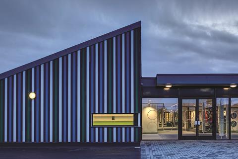
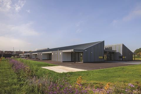
And now there is an innovative new system to add to this list. Holy Cross School is a £3.6m (excluding fees) two-form entry primary school in Swindon designed by Cullinan Studio. At first glance Holy Cross appears to be conventional: it is a single-storey building with classrooms, circulation, a hall, kitchen, staff room, medical offices - in short, all the things you would expect to find in any normal primary school.
But there is one key difference: Holy Cross is a pre-fabricated “flat-pack” school. Moreover, its timber frame took just three weeks to erect, the full building was completed in only 43 weeks and the school was built at an impressively cost-effective price of £1,425/m², excluding fees, fixtures and landscaping.
“It’s our response to PSBP and the James Review,” explains Cullinan partner Kristina Roszynski. “Of course we understand the need to cut costs in order to address the schools shortage but in design terms we believe we can do better.”
Cullinan Studio has a long pedigree of work within the education sector and Holy Cross is based on a non-site specific prototype for a flat-pack, pre-fabricated, timber-frame primary school the practice first developed in 2012 in the wake of the James Review’s publication.
“Originally, we were actually appointed by Holy Cross School to prepare a feasibility study for a new sixth form,” recalls practice partner and project architect Alex Abbey, “but when they then asked us to do the same for their primary school, we were able to present our prototype as one of those, ‘here’s one we made earlier’ moments.”
So, now with site and prototype in place, the final piece of the jigsaw was a partner. Many of the standardised schools solutions have seen architects developing solutions with a contractor and the same is the case here. Here, the partner comes in the form of Stewart Milne, an independent housebuilder which has built up a prodigious subsidiary arm as a timber systems manufacturer.
Construction
Abbey identifies the core goals of the prototype as being threefold. “First, we wanted something that could be built quickly, second it had to meet required regulations for environmental aspects like daylighting and insulation. And third, it had to be based on a kit that could be replicated on various different sites.”
Prefabrication quickly emerged as the most obvious means of achieving this trio of objectives with the flat-pack solution also chosen for the advantages it offered with regard to speed, efficiency and site delivery. So how does the flat-pack system work? The timber panels from which the school is constructed were assembled in Stewart Milne’s factory in Oxford before being delivered to site stacked on the back of a lorry. They arrived as structurally stiff cassettes and were fabricated using either timber I-joists or standard studs, depending on their individual performance requirements.
Each wall cassette was built around studs measuring either 89mm or 140mm thickness and with 9mm of oriented strand board (OSB) to one side. The other side was left open in order for insulation and services to be installed on site before being closed with plasterboard layers to meet relevant thermal and insulation requirements. Roof cassettes were assembled in the same way but were built around 300mm to 450mm I-studs with the roof being supported by glulam beams.
The design team also identifies the use of low-weight carbon sequestered timber as another of the system’s key environmental advantages. Originally, the prototype was designed to sit on raft deck foundations but as built at Holy Cross, a floating concrete slab was specified which permitted the installation of underfloor heating.
Concept
The design concept for the school layout at Holy Cross is as innovative as its flat-pack construction technique. What makes it cleverer is that it is a design response directly framed by an emerging regulatory environment for school buildings which many consider to be restrictive, as Roszynski explains. “The real challenge for school design today is to provide high-quality spaces when space standards have been pushed down to the absolute minimum. This has been particularly the case with corridors which have become tighter and tighter.”
Practice partner Robin Nicholson chimes in in support. “Most bullying in schools occurs in the corridors. What’s crazy is that making the corridors smaller is going to make that situation worse.”
So the concept essentially turns the idea of a “corridor” on its head, as Abbey reveals. “The principle is based on minimising circulation space but turning all of that circulation space into teaching space too.”
Roszynski elaborates. “BB99 [Building Bulletin 99, the government framework for school design] provides lots of options for class sizes. So our solution was to go for classrooms at the lower end of the size scale, approximately 35m², in order to maximise the size of the corridor. So while circulation per se is minimised, the corridor is enlarged and becomes a communal as well as circulatory space. The concept is not so much based on reducing space, but rebalancing where you put it.”
Design
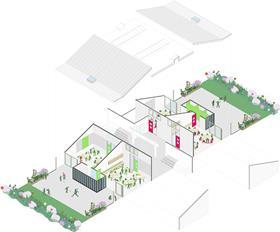
The design consequences of this decision are clear in both plan and section. The school is based on simple section which places the widened corridor at the centre of the building flanked by mono-pitched classrooms on either side. The height of the pitch is raised above that of the corridor “spine” to accommodate ` windows which admit high-level light into the classrooms.
The same rational simplicity is evident in the plans. The building is strictly orthogonal with rooms arranged on either side of the spine. Classrooms are paired and for the bulk of the building they are arranged into clusters of four on either side of the spine and the hall expressed as a “jumbo classroom”.
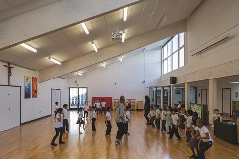
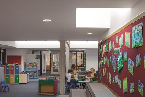
The spine is convincingly treated as a teaching as well as circulation space by being broken down into smaller hubs at the core of each classroom cluster and fitted with bench seating and aligned with skylights above. “While these spaces can be used for conventional teaching” explains Abbey, “these kind of in-between spaces are really useful to provide difference and personality in a school. They also encourage children to find their own space to occupy and inhabit.”
Unusually perhaps, toilets are located away from the circulation spine in small “pods” shared by a pair of classrooms and dotted along the outer edge of the plan opposite the circulation spine. While some schools prefer to have toilets in central banks, the staff at Holy Cross opted for the outer arrangement for reasons of safety and observation, toilets are accessed directly from classrooms rather than from a corridor. This is an important point for the design team and one they maintain proves the prototype can be adapted to accommodate specific client needs.
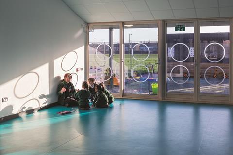
As well as toilets, each pair of classrooms also shares an external garden. This is partially sheltered by a canopy that extends down from the sloping roof pitch in order to provide a sense of enclosure and, crucially, offer shade and solar protection for the large, full-height glazing panels allocated to each classroom.
“The connection between inside and outside is very important, particularly in primary schools,” explains Roszynski. “We were determined to ensure that in each classroom there were not only large windows but that the teaching space extended to clearly defined external space.”
Environmentally, the school relies heavily on natural ventilation with all clerestory windows and circulation skylights configured as openable vents. The envelope is also well insulated which, along with the extensive canopy shading, enables the school to suffice with what Abbey terms as “very small plant”. These aspects also compel Abbey to speculate that it would be “relatively easy to upgrade the concept to Passivhaus”.
Assessment
The ingenious flat-pack construction method employed at Holy Cross is undoubtedly a pioneering construction solution but what is most endearing about the school is not the intricacy of its assembly but the simplicity of its design. Overt aesthetic simplicity in architecture, particularly within the cash-strapped education sector, can sometimes be misconstrued as a cynical abdication of design, cost-cutting masquerading as concept.
But that is certainly not the case here and what impresses most about Holy Cross are the genuine moments of spatial and architectural delight that have been extracted from a lean, compact and efficient template.
Many of these moments are subtle. The alignment of classroom entrance doors with the glazed classroom openings to plunge external views deep into the plan and central corridor. The clerestory windows through which shafts of light pool celestially on to classroom floors and under whose rays and in a poetic demonstration of the “inhabited spaces” Abbey referred to, encourage children to gather and play. The simple sculptural geometry of the exterior which, despite sporting the striped “beach hut” motif, which might not be to everyone’s liking, displays cool, confident massing and grooved, articulated surfaces that offer genuine rhythm and depth.
All these aspects reflect the careful thought and consideration that has been lavished on the design and demonstrate conclusively, for those still in need of convincing, that the quality of architecture is not determined by the size of the budget.
And the budget too is significant. £1,425/m² is a competitive cost ratio and despite the use of glulam coming at a cost premium, the design team insist that it was the “prefabricated manufacture, the minimisation of circulation and the development of a highly compact and efficient plan” that enabled costs to be kept down.
Of course the success of the prototype will depend on the ease with which it can be replicated on other sites; the design team envisage it “slotting into the urban fabric”. But on this question too they are confident, as Abbey explains. “The fixed elements are the section, profile and the regulatory requirements pertaining to aspects like acoustics and insulation that the design must adhere.
“But beyond that practically anything can be changed to adapt to site context, Holy Cross uses cement board cladding but multiple alternatives could be specified instead. The classroom is the basic module but bigger classroom options could be accommodated. The plan can also be twisted in to an ‘L’ shape perhaps with the corridor acting as the hinge. And we’re exploring stepped or even two-storey options to enable the school to fit on to tighter urban sites.”
Holy Cross can be summarised as a simple, innovative and pragmatic design response to the basic contemporary challenge of how we build more schools for less money. For Cullinan Studio, it is also grounded in the current political backdrop that defines the schools construction sector.
“There was a lot wrong with BSF but when it was withdrawn we lost a lot of good stuff too,” says Roszynski. “There’s a real fear now that we’re building a generation of secondary schools in particular with narrow corridors and poor circulation, which are going to require a lot of mechanical ventilation to work.
“Holy Cross counters this by presenting a model that offers natural ventilation but, even more importantly, doesn’t impose a rigid set of predetermined spaces but offers the school a clear choice between different types of spaces.”
After all the ideological acrimony over the scrapping of BSF, after all the government reviews, industry debates, legislative overhauls, supply chain innovations and optimised delivery frameworks, it would be truly ironic if humble and eminently pragmatic Holy Cross shows that school design has returned to two timeless, cost-neutral truths: simplicity and choice.
Project Team
Structural client Diocese of Clifton
Architect Cullinan Studio
Main contractor Beard Construction Swindon
Structural engineer Smith & Wallwork
M&E engineer Cundall
Landscape architect DesignWild
Timber supplier Stewart Milne







No comments yet