Hopkins’ Olympic velodrome is the first 2012 venue to reach the finish line and the result is a dynamic statement of simplicity and elegance
The opening ceremony of the London 2012 Olympics may still be 18 months away, but 2011 is the year when the architectural competition begins. Over the next few months, construction will complete on the various venues within the Olympic site and they will start hosting test events in preparation for next summer’s games. This milestone will provide a long-awaited opportunity to view and compare the buildings as finished products for the first time. And, with its formal opening this month, Hopkins Architects’ velodrome has left the starting blocks early by grabbing the coveted top-spot of being the first venue to finish.
Nicknamed the “Pringle”, the velodrome is a superbly engineered and elegant 6,000 capacity arena that will host Olympic cycling events. It forms the core of an extensive velopark
that will include several outdoor circuits, including a 6.5km off-road mountain bike trail and a BMX course. The distinctive double-curved roof that earned the velodrome its nickname symbolises the structural ingenuity evident throughout the building.
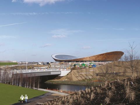
But it is not just its dynamic engineering that impresses. Splendidly isolated in the north of the Olympic park and looming dramatically over the nearby A12, the velodrome’s more remote location, away from the cluster of venues in the south of the park, enables it to cast a commanding urban presence. It was able to gain considerable benefit from having its post-Games function decided early and comprehensively integrated into its design - in marked contrast to the as yet undecided long-term fate of the Olympic stadium. It is also the result of an extensive collaborative construction and consultation process that even included input from British Olympic cycling gold medallist Chris Hoy.
Less is more
Yet, despite all these worthy credits, it is the design that remains the constant star. The building is one of consummate, streamlined clarity throughout, an incredibly fluent volumetric composition that wields its immense power through simplicity of form and efficiency of structure. Less is more is a term that could easily have been coined for it; the velodrome’s unpretentious pragmatism could not be further from the contorted complexity of Beijing’s Olympic stadium. It is therefore an apt emblem for a Games intent on delivering a sustainable legacy through efficient, rather than extravagant, design.
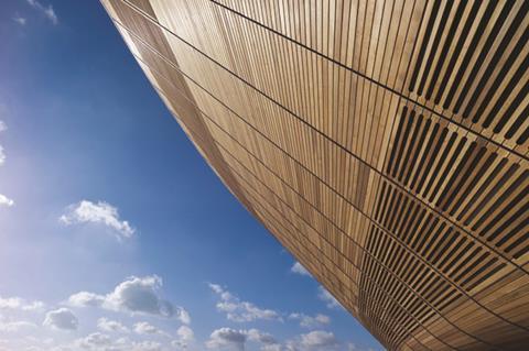
In plan and section, the velodrome appears to be a breathtakingly simple building. Externally it is articulated as a structure with only two primary levels, concourse and roof. The concourse is treated to an almost continuous single-storey strip of full-height glazing. Above this rises the distinctive roof, which, from the outside at least, appears deceptively unsupported and therefore seems to float over its slender glazed plinth. The surreal effect is compounded when the concourse is lit internally at night.
On plan the velodrome has a central, 250m-long cycling track with seating wrapped tightly around its edge. The overall building therefore assumes the same oval shape as the track. Mike Taylor, senior partner at Hopkins Architects, explains the design concept: “We took the seating bowl and shrink-wrapped the building around it with the sight-lines you need to see the track.” Appropriately, Richard Arnold, Olympic Delivery Authority (ODA) project manager for the site, relates this arrangement to the Tour de France: “lean, honed and with no fat”.
This hermetically efficient principle is also responsible for the velodrome’s distinctive elevational profile as well as its plan. Its dynamically inclined roof is a consequence of the building envelope following the splayed banks of seating within. The seating rises on either side of the arena, giving the roof its striking double-prow silhouette.
Engineering solutions
Structurally, this unique form is a result of an ingeniously lightweight and efficient engineering solution. The roof itself is a megastructure of cable-netting strung between a steel outer ring beam. Arnold likens the design to that of a tennis racket. The inclined profile of the roof caused by its double curve enables each end to pull away from the other, keeping the structure in constant tension. The voids between the net are filled with prefabricated timber cassettes clad in standing seam sheeting, several of which are replaced with strip roof-lighting to flood the interior with natural light.
The rigorous structural efficiency of the roof design draws intriguing comparisons with another notorious Olympic venue, Zaha Hadid’s aquatics centre. With a length of 130m, the velodrome’s roof is just slightly shorter than the longest span of the aquatics centre. Yet the aquatics centre’s roof is supported by 3,000 tonnes of steel, exactly
30 times more than the velodrome’s. Arnold is reluctant to draw triumphant comparisons. “The aquatics centre is a completely different kind of building and had its own design and construction approach,” he says. However, the velodrome team are proud to point out their frugal use of steel helps enable their venue to be the most sustainable on the Olympic site.
The crowning glory
In visual as well as engineering terms, the velodrome’s roof is its crowning glory. The key to its success lies in its simple design in response to the form and function of its interior space. Its curved shape is directly generated from that of the running track inside. And the western red cedar timber in which its inclined profile is clad was also partially selected to reflect the wood surface of the same internal running track.
The result is a stunningly graceful concave lid that instantly captures the dynamism and motion of the act of cycling itself. Its sweeping curves and natural surfaces evoke a voluptuous, sculptural elegance. And yet its irresistibly dramatic form appears forceful and energetic, like a solitary frozen wave primed to engulf the flat landscape all around it.
The cycle track
The interior is conceived as a modern gladiatorial arena with the cycling track wrapped around a sunken central podium. During events this is where activities such as warm-ups and medal presentations will take place but it is still the cycling track that quite literally takes centre stage. Its sinuous form thrusts a kinetic energy across the entire main arena, particularly at the ends where it inclines to 47 degrees. With its Siberian softwood pine surface harking back to the timber clad exterior, it is a fitting, yet functional, climax to the process of anticipation started by the first glimpse of the swerving roof.
The seating is split into two sections by the continuous concourse level: the lower section has a capacity of 2,500 and the upper seats 3,500. Cleverly, this enables the upper level to be easily closed off when necessary for post-Games usage.
As the lower level is wrapped tightly round the cycling track, it is reduced to only a couple of rows of seating when the track inclines sharply at each end. This small detail however, allows for continuous seating around the full length of the track. This was a key recommendation from Chris Hoy who identified the disconcerting loss of spectator atmosphere that cyclists experience when they pass the ends of the track, where the incline normally prevents the installation of seating.
An iconic building?
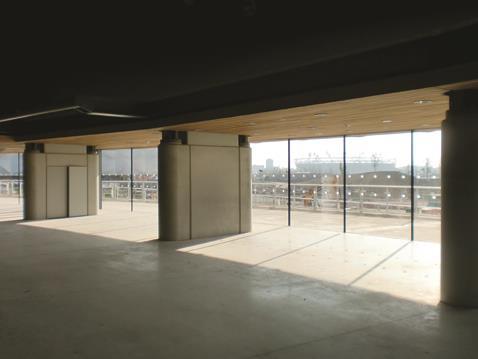
Unlike most velodromes, the London 2012 venue is flooded with natural light. This is admitted from the roof strip-lighting and the full-height glazing around the concourse level. Crucially, the concourse level permits views out towards the velopark, a key design requirement aimed at anchoring the venue to outdoor events even when none are taking place internally. The natural light enhances the sense of spaciousness and scale that characterises the interior.
Equally, the crisp detailing on the cable-net and timber roof soffit and the honed concrete finishes throughout maintain the theme of compact simplicity initiated by the exterior. By stripping all its elements down to their barest essentials, the velodrome ensures that the drama of its interior is chiefly driven by the core spatial ingredients of materials, light and scale.
Peter King, British Cycling’s executive director, summarised his organisation’s aspirations for the velodrome at the start of the project: “We don’t want an iconic building. We want it to be suited to cyclists as a priority.” The irony is that an iconic building is exactly what King has got. It is iconic not because of any contrived architectural gimmickry but because it is a dynamic statement of simplicity and efficiency whose whole is greater than the sum of its understated parts. Also, by identifying the cycling track as the design anchor of the scheme, the velodrome’s form becomes an energised projection of its function - a physical as well as symbolic representation of the sport it was built to serve.
The velodrome’s completion is symptomatic of an Olympic park that, after years in captivity, is itching to be finally revealed to the outside world. As well as construction drawing to a close on the main venues, the intricately manicured landscaping along the River Lea is now taking shape as is the unmistakable red exoskeleton of Anish Kapoor’s controversial Orbit sculpture. In their own way, both are indications of how the London 2012 bid never set out to match the architectural spectacle of Beijing. Only Zaha Hadid’s aquatics centre was envisaged as carrying architectural star quality.
And yet the aquatics centre is a far cry from the sumptuous swooping canopy that helped London win its bid. Even if our cycling medals haul isn’t as impressive as last time around, don’t be surprised if the modest velodrome steals the show.
Coming first: How it was built on time, by Thomas Lane
The beautifully elegant and efficient velodrome has emerged from the shadows to become the project that will probably define London 2012. But back in 2007 before work started on the Olympic park things looked very different. The industry was enjoying bulging order books and the Wembley debacle was still playing out. Not many contractors wanted to risk being associated with another high-profile sporting disaster.
Contractor ISG decided it wanted to take the risk and go for an Olympic project. It had worked on the National Tennis Centre with architect Hopkins and also had experience with engineer Expedition and services engineer BDSP. This team had already won the design competition and the velodrome was the right size for a contractor like ISG.
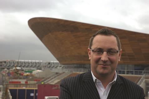
The design team originally wanted to go for a cablenet roof structure but by the time ISG came on board this had been dropped in favour of a more conventional steel structure as this was cheaper. But the team had wanted early involvement with the contractor and this is exactly what they got from ISG’s project director Dean Goodliffe (pictured below), who stepped back from his senior management role to run a project again. Hopkin’s Mike Taylor and Expedition’s Chris Wise had extolled the virtues of a cablenet roof structure. “A steel structure had challenges of its own and was going to be high risk,” says Goodliffe.
“When you sit with two industry leaders and hear them saying they believed it was worth looking at then it was a no brainer for me.” Goodliffe ordered a comprehensive review of the roof structure options which included the steel structure, glulam beams and the cablenet.
The team presented its findings to the ODA, which revealed the cablenet was the way to go. It was safer than other options because it would be assembled on the ground, it scored highly on sustainability and it saved six months on the programme. Overall it was also cheaper. “From our point of view it wasn’t a difficult decision to make,” says Arnold.
But going for the cablenet was going to delay the project. “By reverting to cable we had virtually deleted all the work that had been done on the steel roof,” says Goodliffe. It also meant the foundation design needed redoing as the cablenet imposed different stresses on the ground from the steel roof. Originally the team wanted to start work on 7 February 2009 but this now looked impossible. The easy option was to redo the design and start in the summer of 2009 but that would have meant the velodrome would not have been finished until summer 2011.
But Goodliffe was determined to deliver the velodrome early, his only concession being to shift the start date back two weeks. The challenge was the cablenet which needed a 44 week lead in time. It also had be fully designed as each cable is precut to a tolerance of +/-2mm. Goodliffe says there were a lot of sleepness nights for the team from September 2008 as they worked up the cablenet design. The cablenet installation was scheduled to start on 4 January 2010 which also proved a tough date to hit. “There were some tough times with the weather, working 24 hours a day and at weekends,” says Goodliffe.
The cablenet went in as planned and was completed by 20 March 2010. The team had devised prefabricated roof cassettes which were fitted between the cables and sat on specially designed nodes on the cable junctions. With the roof on, work could start on the timber track and the internal fit-out could progress.
Now the building is finished Goodliffe will go back to his senior management role again. But will he miss being in charge of a project? “I wish it was still going on as it is quite an emotional thing and I made some amazing friends here,” he says. “I’ll never have the chance to build a velodrome again.”
Legacy plans: what will happen after the Games
A key ingredient of the velodrome’s success was the logistical advantage gained by having its post-Games legacy secured right from the start of the project. After London 2012, ownership of the venue will pass from LOCOG (the London Organising Committee of the Olympic and Paralympic Games) to the LVRPA (Lee Valley Regional Park Authority) which will maintain it as a permanent cycling venue. Consequently its post-Games usage will require no modifications whatsoever to the building fabric after the Games have finished. Significantly, the LVRPA will run the venue at a commercial loss. Nevertheless these will invariably be outweighed in the long-term by the enormous benefit of the Games delivering a venue which has a sustainable future and whose legacy as both a world-class sporting arena and a permanent local amenity has already been secured.
Moreover, it gave the design team the confidence and foresight required to ensure that the design satisfied both Games and legacy requirements. This is infinitely preferable to the significantly more expensive and less efficient option of adapting the venue for another use and operator after the Games - a fate to be suffered by the Olympic stadium and to a lesser degree, the aquatics centre.
According to Richard Arnold, Olympic Delivery Authority project manager for the site, the early identification of a future use was key to the velodrome’s success. “It enabled us to adopt an integrated approach,” he explains. “We were able to establish a coherent long-term business plan and gain input from both operators.” This flexibility is a constant feature of the design, even down to the changing rooms.
So as to ensure that mud from the outdoor tracks doesn’t access the indoor track, which must be kept clean and dry at all times, changing rooms have independent entrances from both tracks which can be locked as necessary.








No comments yet