Yet venture into and up the 41-storey office tower, and there's something disconcertingly similar to the 1970s NatWest Tower, now known as Tower 42, which resides close by. On a typical office floor, you find yourself in a drum-shaped column-free space that is encircled by perimeter glazing and which has much of the interior taken up by a core of lifts, service risers and structural supports.
Being a Foster and Partners creation, there are, of course, several twists. The circular floors are larger than in Tower 42 and range from 26.5 m in diameter near the pinnacle to 56.5 m nearly half way up, where the bulges is greatest. The columns and glazing mullions encircling it are not vertical but form a diagonal grid. The curving perimeter wall slopes slightly outwards or inwards depending on how high up the building you are. And six sizable triangular holes have been chomped out of the edge of each floor plate, although within the glazed envelope.
It is these triangular holes that are the key to the building's interior. They have a radical effect on the building's geometry, increase daylight penetration and improve the way the internal space is used. And perhaps most importantly, they channel fresh air from the openable windows through the office areas.
On each floor, the triangular holes help transform what is a large amorphous drum-shaped space into six distinct office spaces of manageable size and shape. As Robert Harrison, associate partner at Foster, explains, each office space is more or less rectangular in shape and of constant 16.5 m width, though its depth varies from 6 m on a narrow upper floor to 15 m on a bulging middle floor. Each space can accommodate a self-sufficient group of 30 staff.
The six triangular holes link up with the holes on the floors directly below and above, although they are separated on every sixth floor by a fire-compartment floor to form a network of six-storey mini-atriums all round the building perimeter. And because structural columns at the perimeter are arranged on a diagonal grid, the holes do not line up vertically but are displaced sideways by a constant 5° on each floor so that they step up the building like spiral staircases or helter-skelters.
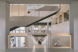
The six-storey atriums are known as lightwells by the architect, as they are filled with daylight and penetrate deep into the building. On each floor, they are open to the office space along one side and lined with a clear-glazed partition along the other. For an office worker sitting at a desk deep inside the building, the effect is like being surrounded by external glazed walls on three sides. In floors two to 15, which have been fitted out as the reinsurance company's London head office by the interior design division of TP Bennett, the open edges of the six lightwells on each floor have been designated as break-out spaces or balconies. Here office workers can recharge their batteries, assisted by an exhilarating sense of spiralling space and daylight. And as a unique bonus in a high-rise building, they are offered views down through lower floors of the lightwell and its glazed wall to street level, making a reassuring visual connection with the surrounding city.
The one missed opportunity in these spiral lightwells is that they have not turned out to be "gardens in the sky", as Foster had intended. Instead TP Bennett has created office interiors that have a neat, clean-cut character that matches Swiss Re's ethos, with the carpeted base of each lightwell serving as an informal meeting area for staff. Yet if the lightwells had been allowed to fulfill their role as spiralling wintergardens with lush semi-tropical greenery and hanging gardens draped over the balconies, they would have enlivened the otherwise rather bland interiors. They would also advertise the building's green credentials, not just to occupants but to all Londoners glimpsing the building from outside.
As you'd guess, the interiors are most spectacular at the topmost pinnacle, 41 storeys above the ground. Far from reserving the top of the tower for an opulent boardroom for City fat cats, Swiss Re took the egalitarian approach of designating it as an everyday restaurant and bar for all staff. Foster responded by pinching in the top of the tower to a narrow point. If this suggests a cramped attic chamber, however, the reality is just the opposite: it is a huge, lofty dome, uncluttered by internal walls or columns – breathtakingly exhilarating. And as the dome is fully glazed, the heavy diagonal frame having been discarded up here, the interior is radiant with daylight and offers a mesmerising panorama all around greater London and the green hills beyond.
As for the building's external appearance, it contrasts markedly with the Lloyd's Building, which stands just a stone's throw away, and which was designed by Norman Foster's former partner, Richard Rogers. Whereas the Lloyd's Building is a frenetic melange of projecting lifts, ducts and structural columns, the Swiss Re tower is graced by the purest building form in the City. That is partly because the circular geometry is absolutely regular from the pavement to the uppermost peak, and partly because the entire building is sheathed in a sheer glass skin with no projections, other than the opening windows. The curving shape also reduces reflections, increases transparency and makes the huge form appear slender. The paradoxical result is that whereas the tower has such an iconic curvaceous shape when seen from afar, its smooth form presents an undemonstrative backdrop to the older, more elaborate stone buildings that cluster around its base.
The bulging form brings another double benefit. By gradually expanding after it it was built, it adds floorspace without interfering with its neighbours. And by tucking inwards towards ground level, it creates a generous public plaza in front the building, which flows into the existing plaza around the Commercial Union Tower just over the road.
Again in contrast to the adventure playground of recesses, ramps and basement niches around the Lloyd's Building, the Swiss Re cylinder rises cleanly out of the pavement. The only external modelling is created by a recessed main entrance, where the diagonal structural columns are expressed as a large star-shaped sculpture rising up in front of it.
The towering presence and unmistakable curvilinear form of the Swiss Re skyscraper at last puts the stamp of Britain's most successful architect on the nucleus of Britain's business world. The tower's distinctive form, clean lines and low energy consumption also set a suitably high standard for other office developers and architects to emulate.
How low energy costs shaped the building
Low energy consumption is much more than a feelgood added extra to the Swiss Re’s London head office: an “environmentally progressive building” was a central part of the client’s brief. As Andrew Green, the building’s property services director explains, “Swiss Re takes the environment very seriously: it’s quite engrained in its corporate culture.”What Swiss Re has ended up with is a 41-storey tower in which energy consumption and carbon emissions are half that of a conventional building. More radically, it should use natural ventilation through opening windows for up to 40% of the year. In a word, it is London’s first green skyscraper.
Slashing energy consumption by half has involved much more than increasing thermal insulation. It has literally shaped the whole building inside and out. Fosters’ associate director, Robert Harrison, explains: “We looked at aerodynamic forms that would induce natural ventilation across the office floors. An aircraft wing is the most efficient aerodynamic shape, and we rationalised it in the round to come up with the ovoid or cigar shape.”
Moulding the building into its complex double-curving aerodynamic form was only feasible using advanced computer modelling pioneered by NASA for its space probes and later used for Formula 1 racing cars. Environmental modelling was carried out by services engineer Hilson Moran Partnership using cutting-edge fluid and thermal dynamics programmes.
As described by Matthew Kitson, who heads Hilson Moran’s environmental modelling division, the cylindrical tower assists natural ventilation in ways that conventional rectilinear buildings could not. “In winds, more air flows round the side of a cylinder than around a rectangle,” he says. “As it does so, it picks up speed and creates higher negative air pressures at the sides and back. This means that the pressure differential between the front and back of the building is increased, and this in turn sucks air through the building more effectively.”
The cylindrical form also improves environmental conditions outside the building. “In a flat-fronted building, two-thirds of the wind is directed down towards the pavement, where it buffets passers-by. A cylindrical building avoids this by letting the wind flow smoothly round either side of it.”
Internally, the six lightwells on each floor also play key roles in the natural ventilation. They are located alongside the opening windows and act as a buffer zone to collect the fresh air and control its speed and temperature as it flows on through the occupied offices spaces.
Windows up to the 32nd floor will open to admit natural ventilation when the external temperature is above 20°C and wind-speeds below 10 mph. It will nearly always be combined to some extent with mechanical air-conditioning. This is controlled by a sophisticated building management system that balances external conditions with internal requirements.
Although the air-conditioning system was specified for maximum output in the worst weather conditions, it also incorporates several energy-saving devices. Six fan-coil units are housed on each floor, and they draw fresh air and discharge exhausted air through inconspicuous vents at each floor level. This dispenses with bulky central ductwork rising up through the full height of the building and powerful energy-guzzling fans. Heat recovery units reclaim heat from the used air before it is discharged. And boilers are housed in a separate building, dispensing with the need for flues in the tower.
The lack of central plant combined with the sensitive building management system brings one more cost-saving benefit. To assist out-of-hours visitors, one-sixth of one floor area can be fully serviced and made comfortable while the rest of the building is shut down.
Downloads
Office areas diagram
Other, Size 0 kb
Credits
Developer and owner-occupier Swiss Re Architect Foster and Partners Structural engineer Arup Services engineer Hilson Moran Partnership Urban design consultant The Richard Coleman Consultancy Fit-out designer for Swiss Re offices Bennett Interior Design Project manager RWG Associates Construction manager Kontor GTCM Cost consultant Gardiner & Theobald Main contractor Skanska








No comments yet