West London’s BECAD hospital takes traditional healthcare and repackages it into one seamless facility that offers more patients better services for a fraction of the usual effort, space and cost … Martin Spring explains how it was done
The Central Middlesex Hospital in west London was the NHS trust that brought us the walk-through ACAD centre – such a delightful building that it graced the cover of Tony Blair’s Better Public Buildings campaign brochure in 2000. Now it has developed the BECAD centre next door, which applies the same approach to an acute hospital.
The BECAD – Brent Emergency Care And Diagnostic – centre has the acute NHS trust and the local primary care trust as joint clients. Like the ACAD – the Ambulatory Care And Diagnostic – centre, BECAD was designed by Avanti Architects, but this time working with HLM Architects as part of a £135m PFI project, which was delivered by Bouygues and became operational in May.
Patients arriving at the newly rebuilt hospital are not confronted by the usual oppressive, impersonal, artificially lit labyrinth. Instead they are welcomed to a three-storey crescent-shaped building faced in blue-and-white tiles and with delicate rooftop canopies floating overhead. After a few steps, the blue tiles give way to a window wall that offers views of a stylish cafe.
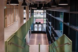
A bank of clear-glazed doors delivers the patients into an airy atrium that rises to three storeys in height and is flooded by daylight through a window wall on their right. Walking past the cafe, patients arrive at a blond-timber reception desk, which is conveniently placed at the crossroads between the two generous circulation spines, one of which is a double-decker with an open staircase rising up to the third floor on one side. Around the intersection, the atrium widens to accommodate all the patients, visitors and staff passing through with plenty of room to spare.

Rethinking healthcare
The building is refreshingly attractive, particularly for a PFI hospital. But it is much more than that. Long before any bids were invited from the construction industry, a team of medical and development staff from both clients rethought the entire process of providing healthcare. This was then developed through extensive community consultation before being distilled into a brief for the construction team.
The design had to address two main concerns. The first was the need to tailor the service provided to the particular needs of the surrounding population. Many patients were from immigrant communities who were not used to the bureaucratic GP referral system. Instead, they often turned up at the hospital in need of immediate attention. The other driver was the conventional management objective of making more efficient use of the hospital’s resources, above all the time of professional medical staff whose working week was restricted by the European Working Time Directive.
The combined effect of these outward and inward-looking ambitions has been to streamline the patient’s route through the hospital. If the objective is no more than common sense, it is the means of achieving it that is so revolutionary. For a start, in-patient and outpatient healthcare for medical and surgical specialisms have been merged into eight super-teams, each bringing together expert medical practitioners from the acute trust and the primary care trust. The integrated teams were intended to bypass the protracted system of batting referrals back and forth between hospital, community health centres and GPs, and instead offer patients a seamless service from acute in-patient treatment to after-care in the community.
The next restructuring has been to split the accident and emergency department into separate treatment centres. Minor ailments are treated on the spot by nurses and GPs, and the assessment centre for serious accidents and emergencies has been linked to all critical care services to form a comprehensive acute centre of 100 beds.

A healing city
The development team has responded in several ways to the restructured healthcare service, as well as to the site, to create what it fondly calls “the healing city”. The biggest change is to have shrunk the hospital in size, from 600 in-patient beds to 214. This reflects the more efficient production line, in which the integration of acute and primary services combined with less invasive surgery techniques allow more patients to be treated as outpatients.
The new hospital occupies just part of its predecessor’s site, with the rest to be given over to other uses, such as nurses’ accommodation. This being the case, the entire hospital has been compacted into a single three-storey megastructure, except for the facilities management wing at one end. The megastructure is intersected in both directions by the two patient-friendly circulation spines, which overlook six courtyards lying alongside them. The arrangement around courtyards is similar in format to the NHS’ nucleus hospitals of the 1970s and brings daylight and visual relief into the depths of the hospital. Even so, the density of development has shrunk four of the courtyards to little more than lightwells. Efficient use of the tight site has also entailed moving staff car parking into the hospital’s basement.
As for the radical restructuring of departments, the main impact on internal layout has been to lose the standard, all-purpose outpatients department, which Avanti director Claudia Bloom dismisses as a “no man’s land that nobody owns and nobody cares for”. Instead the eight superteams take outpatients in their respective bases, which are spread around all three storeys of the building. They go forth from these bases to visit in-patients in the wards.
Another unusual move has been to put all four operating theatres on the first floor. “This has helped free up the ground floor for public areas, accident and emergency, the large acute centre and other departments for unstable patients.”
An architectural innovation was to concentrate staff bases for each of the new departments into several “pods” distributed around the building. Perhaps inspired by Will Alsop’s trademark, they take the distinctive form of oval cylinders that are faced in brightly painted render or varnished timber boarding and jut into the lightwells.
Taken as a whole, the hospital interiors have a pleasant character, with the high points being the generous, light-filled circulation spines and the works of art. It has to be said, though, that BECAD is not as radiant and uplifting as its ACAD neighbour. No doubt this is partly because much more has been packed on to a constricted site. One or two of the larger clinical areas do not escape a claustrophobic feel.
In addition, inspired architectural design has been blunted by the contractor-led PFI process in some areas. Materials are on the whole plain, workaday and hard-wearing, mainly consisting of plastered walls, with some circulation areas picked out in bright colours. But ubiquitous suspended ceilings of standard composite-fibre panels revert to the depressingly institutional mode of hospitals in the immediate post-war period.

The exterior is fairly bland with rendered and tiled surfaces in beige and brown and punched-through windows. However, the crescent-shaped front of the building faces a new oval piazza that is due to be completed next March. The square comprises a central island of trees, a drop-off point for buses and cars and a long looping canopy that guides visitors to the hospital’s main entrance.
It is located off the main road and, in combination with BECAD’s curving facade and delicate rooftop canopies, should give an attractive civic presence appropriate to the district’s prime centre of public health.
It also transplants a much-needed urban heart in the no-man’s land of windowless distribution sheds, supermarkets, fast roads and mini-roundabouts that is Park Royal. The other side of the square is earmarked for related follow-on developments such as a medical technology centre and key-worker housing for nurses. As Bloom puts it: “A large hospital like this ought to be an agent of regeneration in economic, urban and design terms.”
In more than one sense, the Central Middlesex Hospital succeeds in bringing back healthcare to the community it is supposed to serve. Its streamlined services that operate at acute and community levels effectively reaches out to local people and pulls them in when they need medical help. So, too, does the new building, with its curved frontage, attractively landscaped piazza and welcoming, easy-to-follow internal streets.
On balance then, CABE and the NHS Confederation of NHS trusts are probably correct in holding it up as a model for a generation of efficient, patient-friendly smaller hospitals.
Key points
- Revolutionary integration of acute and primary health services carried out before PFI bids invited
- All-purpose outpatients department abolished in favour of eight specialist departments serving in-patients and outpatients
- Compact acute hospital is made accessible to patients by a central atrium and wide spine malls
- Curving front and landscaped piazza give the hospital an attractive civic presence
Downloads
Ground floor plan
Other, Size 0 kbSketch showing how hospital and future developments fit together
Other, Size 0 kb










No comments yet