With its dazzling state-of-the-art light shows, Foster + Partners’ £125m concert arena on the Clyde could well become the main event itself
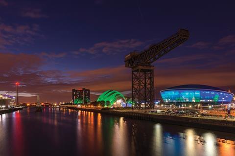
Sixteen years ago Foster + Partners helped redefine modern Glasgow’s popular image with the opening of the Clyde Auditorium, known as the Armadillo. The distinctive telescopic clamshell structure is a conference venue and has become one of the city’s most recognisable contemporary buildings.
Designed as part of the SECC (Scottish Exhibition and Conference Centre) complex, the venue’s prominent location on the banks of the River Clyde also symbolised the wave of post-industrial regeneration taking place along the city’s once neglected waterfront. This is a programme reiterated by David Chipperfield’s 2004 BBC Scotland HQ directly opposite the SECC site and Zaha Hadid’s 2011 Museum of Transport less than a mile down river.
And now, Foster has returned to the same site and built a major SECC addition for the same client and with the same main contractor (Lend Lease). The SSE (Scottish & Southern Energy) Hydro is a £125m concert venue that opened this week. With a capacity of 12,000 seating and 13,000 standing, it is the biggest performance arena the practice has ever designed and it becomes Scotland’s largest music venue. It is also one of the biggest arenas in the UK after the likes of London’s O2.
But it bears one major difference with the O2 and scores of other large-scale music venues across the country. Although the Hydro has been built to be a flexible venue and will host showcase sports events at next year’s Glasgow Commonwealth Games, this is essentially an arena designed to host music. This is in contrast to bigger venues such as sports arenas or exhibition centres often being temporarily retro-fitted to host music events.
Music in fact forms the central design concept for the building. Architecturally, the Hydro rejects the typical “black box” performance venue arrangement in two key ways. First, rather than being rectilinear, it is shaped like a skewered, inclined dome, a form derived from internal sightline and massing conditions and one that subsequently informed all manner of structural and geometric characteristics of the building.
And secondly and more radically, the building sports an entirely ETFE facade and forms one of the largest examples of ETFE being used as a wall cladding structure rather than a roofing material to date. Crucially, with regard to the music-inspired concept, at night this enables the external envelope of the Hydro to morph into a giant, multi-coloured, illuminated screen displaying dazzling light shows.
The Hydro therefore marks an interesting footnote in the centuries-old debate as to whether the architecture of entertainment venues is designed to host performances or actively become part of them. It also contains an ambitious structure that has been specifically engineered to maximise the internal visitor experience.
And finally, it provides an insight into the evolutionary design process of a single architectural practice that has the opportunity to revisit a successful scheme several years after its completion and respond to the same site with the same client and contractor team but with an entirely different brief.
Amphitheatre
According to Foster + Partners’ partner Ben Scott, the design of the Hydro began with the architects asking themselves a very simple question: “What is the most important thing about a music venue?” The answer came back twofold: “The visitor experience and ensuring that everybody is able to see the stage.” These simple tenets went on to inform the entire design process that produced the building.
“The first thing we decided was that from a sightlines perspective the building had to be round,” explains Scott. “Furthermore, to ensure that everybody has a view of the stage, we pushed the stage back and placed more seating at the front than at the sides.”
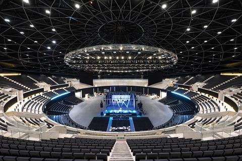
This crucial decision had an enormous impact on the form and massing of the Hydro as built. On plan, the auditorium adopts a vaguely lopsided horseshoe format not entirely dissimilar to an amphitheatre. Although curved, seating is significantly weighted directly in front of the stage rather than behind it or to the sides to draw the audience closer to the stage. This arrangement ensures that there are no “bad” seats in the house.
Additionally, in section, this arrangement has created a seating bowl that rises as it moves away from the stage which in turn has produced a domed rotunda whose facade tilts upwards from 15m high at one end to 33m at the other.
This also helped address key massing and orientation concerns, as Scott explains. “It’s a circular building but the building and the site are bounded on one side by a motorway and the River Clyde on the other. We clearly wanted the river side to be the front of the building so the stage end is by the motorway and the dome inclines upwards as it moves away so the highest point of the building directly faces the river.”
This arrangement also enabled a clear division of land usage on the site around the Hydro. Exactly half of the site from the centreline of the dome to the motorway boundary is occupied by a service yard from where trucks can drive directly onto the stage. The other half is assigned to public realm. Much of this area directly surrounding the venue has already been landscaped. The remaining slither of land between here and the river will be landscaped under a wider masterplan for the entire site enacted after next year’s Commonwealth Games.
Structure
The Hydro is essentially a concrete-framed bowl with outwardly splayed external walls supporting an inclined saucer dome 45m high. Its primary structure is formed by a web of concrete fins radially splayed from the centre of the dome along the building perimeter. These fins provide the primary load-bearing elements of the structure and adopt a scale to match, stretching from 15m to 33m high and varying in thickness from 400 to 600mm. Scott also points out that as the circular, inclined geometry of the building dictates that there are “so few clear vertical load paths”, the fins are heavily reinforced.
A series of inclined concrete columns are interspersed between the fins and these support a sloping steel ring beam at the base of the domed roof. The design team cites the 1,400 tonne, 120m span steel roof as one of the largest free-spanning roof structures in Europe. The shallow dome that comprises it is formed from a diagrid, latticed spaceframe clad with tapered, lightweight Kalzip panels perforated on their underside for acoustic performance. Hanging down from the roof inside the arena is a gigantic 260 tonne lighting rig, stepped and tilted to accommodate the incline of the building structure.
Despite what one might expect from its outwardly leaning walls, it is actually the ground floor of the Hydro that contains most floor area. This is because accommodation is concealed beneath an undulating concrete plinth that hovers around the base of the structure like a giant windswept skirt.
The surface of the plinth is planted from a grassy bank that helps the venue merge into the landscape. But crucially from a circulation perspective, it also provides foyer and entrance areas at the base of the building spread along the public realm half of the rotunda.
Facade
But inevitably, for many Glaswegians, the star attraction of the Hydro will be its illuminated technicolour facade. The external walls of the venue are entirely clad in translucent, air-filled ETFE cushions. Unlike much of the geometry throughout the building, the ETFE panels are arranged orthogonally in horizontal rows to evoke the impression of the building being “wrapped”. Deployment of ETFE on a facade of this scale is relatively rare but Scott identifies five key reasons for this decision.
“ETFE is efficient, lightweight, can accommodate long spans, is translucent so can admit natural light during the day and can also display coloured wash lighting and projections at night.” And it is indeed at night when the facade, and the Hydro itself for that matter, comes alive. The facade can be backlit by an infinite sequence of colours and light to form a visual display reminiscent of the graphic equalisers that once were the essential adornment of hi-fi stereos.
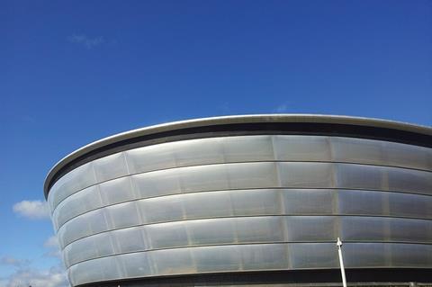
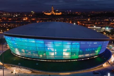
It is this musical analogy that helped generate this unique design feature, as Scott explains. “Rather than just having the black box buried deep inside the building as with several concert venues, we thought it would be more fun to let the building be part of the performance. Its glowing, pulsing skin is essentially representing the music being played inside.”
The conceptual origins of the facade also recall discussions Scott had with the client over the extent to which the diagrid roof should be expressed internally. “Obviously the client wanted all the attention within the auditorium to be focused on the artist and the stage. But we wanted something to engage people’s interest once they had sat down and before the performance had begun. So rather than camouflaging it in black, we subtly expressed the diagrid structure of the roof by painting the steel lattice in a mid-grey. It’s a balance between the architecture and the performance.”
There are obvious parallels between the Hydro’s facade and that of Herzog and de Meuron’s celebrated Allianz Arena in Munich. There, another ETFE envelope can also be illuminated by a cacophony of colours.
But there is one key difference. At Allianz it is the facade alone that is illuminated. At Hydro, it is actually the foyer spaces within the building that are ablaze with colour; the lights are merely visible externally due to its translucent skin.
The fact that the facade is representing the spatial characteristics of its interior rather than merely hosting a digital display lends further integrity to its design. One hopes that the Allianz Arena’s alarming reputation for distracting drivers and causing accidents on a nearby autobahn will not be replicated on the A814 Expressway that zooms past the Hydro.
Experience
While not quite Garnier’s resplendent lobbies, the foyers inside the Hydro are indeed spacious, lofty affairs with the exposed honed concrete fins providing a raw and robust character. This hardness is tempered by the bulbous skin of the ETFE facade bathing the interiors in an extraordinary amount of natural light and permitting fine views over the Clyde.
The foyers are curved around the semi-circular rim of the public realm half of the auditorium and are split over two levels. The upper provides access to the venue’s 11 VIP suites and two multi-function rooms and the lower is lined by retail concessions opposite the auditorium entrances. In so doing it recalls the configuration of Foster’s Wembley stadium where vast, sweeping circulation lobbies separate the terraces from refreshment amenities.
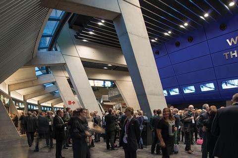
The comparison with Wembley is interesting. As at Wembley and for that matter all Foster buildings, all elements of the Hydro’s design - from the to the spatial division between retail and auditoriums to the grid-like articulation of its ETFE facade - are regimented by a ruthless systematic precision that, on Foster’s best work, such as Canary Wharf Station and the British Museum Great Court, ingeniously extracts the inspirational from the rational.
But on lesser buildings this same clinical efficiency can also lead to accusations of soullessness and sterility, rather like the solution to a complex mathematical equation that reveals an algorithmic beauty to mathematicians but is merely a bunch of numbers on a blackboard to everyone else. Some levy this accusation of soullessness at Wembley. With its abstract facade, sparse concrete interiors and blank, drum-like profile could this same allegation be directed towards the Hydro?
Happily, no. Because the Hydro is ultimately saved by the manner in which it priorities user experience and anchors the design concept around it. From the subtly expressed colour of the diagrid roof in the auditorium to of course its dazzling, technicolour facade, the Hydro is obsessed with commissioning an architectural support-act every bit as energetic, entertaining and expressive as the musical spectacles soon to be hosted on its stage.
Project Team
client Scottish Exhibition & Conference Centre Ltd
architect Foster + Partners
main contractor Lend Lease
project manager Turner & Townsend
structural/M&E engineer Arup
quantity surveyor Gardiner & Theobald
Source
This article was originally published under the headline ‘Hydro power’









No comments yet