Putting a cladding system on a shape as eccentric as the Pinnacle tower is hard enough. But how do you give it openable windows as well? Stephen Kennett found out
Anyone working in a stuffy office will have felt a longing to be able to fling the windows open on a sunny day. But what do you do when your office is 288m off the ground? Although open windows at that height may sound like a frightening prospect to some, to others a bit of natural ventilation can be invigorating and, of course, it can reduce the need for energy-intensive air-conditioning.
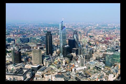
That is an idea that the designers behind the 62-storey Pinnacle, which will be the tallest office building in western Europe if it survives the credit crunch, have been grappling with. And they think they have found a solution that will offer tenants the option of natural ventilation for at least half of the year. The secret to their solution is an innovative cavity facade that has also helped overcome the conundrum of how to cloak such an unusually shaped building.
The challenge
The challenge with the Pinnacle is that its footprint is a combination of straight lines, gentle curves and tight corners and its elevation is a mix of vertical and raked facades. Karen Cook, associate with architect Kohn Pedersen Fox (KPF), says when they drew the first cladding drawings, with the mullions tapering from bottom to top, every piece of glass came out a different size – all 8,000 of them. The cost of that was prohibitive, but the discovery also highlighted another complication. The client wanted a 1.5m planning grid to give tenants the option of fitting cellular offices, which meant window mullions at 1.5m intervals. But with each floor perimeter being slightly shorter the further up the building you go, the evenly spaced mullions progressively moved off grid. “It breaks a cardinal rule,” says Robert Peebles, a senior associate at KPF. “We would have ended up with a building that looked fractured and bitty.”
The architects, and the environmental engineers were coming to the conclusion that a twin facade with vertical internal glazing and a flexible outer cloak might be the solution. “The client wanted an environmentally progressive building,” says Nigel Clark of Hilson Moran, which also worked on the neighbouring Gherkin, another building that offers tenants natural ventilation. At the pre-planning stage, Clark began looking at how the building would be affected by solar gains. This was in 2004, before the update to Part L of the Building Regulations. “We predicted what we thought the likely changes to Part L would be and then looked at a number of different facade types,” says Clark.
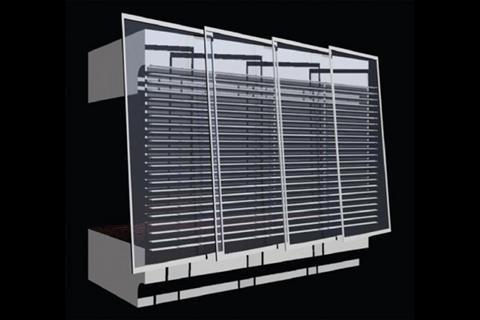
Only one type complied with their needs: an externally ventilated facade, where the outer skin is disconnected from the inside and full height Venetian blinds in the gap control solar gains. “What it did was enable us to have clear glass as opposed to glass with a solar thermal coating, so the daylighting was increased,” says Clark. This was important, as with a light transmittance of more than 60%, it would cut the amount of artificial lighting needed, which normally accounts for 20-22% of an office’s energy use.
The double skin also opened up the opportunity to ventilate the offices naturally. “The basic shape works well with the wind directions, so it became apparent that there might be the opportunity for mixed mode – sealed at peak winter and summer months when it is air-conditioned, and naturally ventilated in the mid seasons,” says Clark.
However, the two main problems with naturally ventilating tall buildings are that the wind speed may be so high it causes discomfort to occupants or else it simply skirts around the building rather than entering. “The outer skin needs to act as a restrictor. Once the wind is past it you have control and it’s within limits that you can deal with,” says Clark. The idea was that the external panels would angle and overlap, but with enough of a gap to allow air to ventilate into the cavity and then into the building.
But would it work?
Hilson Moran ran a computational fluid dynamic analysis on the design. What it found was that for floors 11 downwards, natural ventilation would not work because of the effect that the surrounding buildings had on the air flow and also because of noise and pollution. At the very top of the building as well, the floors would need to be sealed as the wind velocities become too high, owing to the wind being accelerated by the building’s profile. It did, however, show that mixed-mode ventilation would work for most of the middle floors. Here the plan was to give tenants the option of introducing fresh air onto individual floors through opening windows set into the inner skin.
Although the overall strategy had been shown to work, there was an even bigger challenge facing the architects and engineers: how to design the facade so that it could actually be built. The main issue was with the outer layer. “We wanted this outside skin to put a harmonising veil over the whole building that would look smooth,” says Peebles. The solution they found was to use 6,500 identically sized rectangular panels that would be angled and overlapped.
This was no mean feat. Peebles says: “You couldn’t have drawn it. I don’t think many people thought it was possible. I’m not sure I did.” The chief difficulty came in trying to apply a rationalised kit of components to cloak the curving shape. The design team turned to parametric modelling. “We needed to overlap the panels, which means each relates to four others, and moving any one has a knock-on effect. We had to find a way in which the panels in the model could relate to one another,” says Peebles.
Questions and answers
In order to make the model work, the parameters that define how each panel interacts with its neighbours had to be carefully set. There were a huge number of questions that needed to be answered. What size inlet will be needed on the sides and bottom of the overlapping panels? How big should the outlet be at the top? What size perforations are needed in the supporting side rails? To what degree should the inner doors open? Clark explains that the biggest concern was that the velocity of the air coming onto the floors would be too high, causing discomfort to occupants near the perimeter; on the other hand it could fail to penetrate to the inner areas of the floor.
Answering these questions required a massive CFD model to be built, of the size and complexity normally used by Formula One teams to develop the aerodynamics of their cars. Studies were carried out for a range of scenarios with differing external wind speeds and directions as well as that of a hot, still day to make sure the cavity would vent and temperatures would not build up and re-radiate into the space. “Glass is susceptible to heat and we didn’t want to have to specify heat-strengthened glass,” adds Peebles. These studies gave the team the optimal dimensions, and once they were established the parameters could be fed into the parametric model to define exactly how the outer skin could be built.
So, what next? Despite the credit crunch the line is that the Pinnacle is still going ahead. Piling has now started on site and if everything goes to plan, western Europe’s tallest – and naturally ventilated – office will be ready for occupation in 2012.
How we got there
It took a whole year to come up with the shape and look of the Pinnacle. Karen Cook, principal architect with Kohn Pedersen Fox explains how the design developed.
How did you decide on the height of the tower?
There’s no zoning plan in London so every time you start designing a tall building it’s a completely new discussion. However, the City was looking to create a cluster of tall buildings that are all close together. Our scheme fits into that spot.
Where did the shape come from?
When designing a tall building in London you tend to think about it from the point of view of the location, as opposed to designing the perfect building and setting it in place. For example, it was important that you should be able to see a bit of the Gherkin and the other buildings behind from certain places.
Basically, we started with a form and kept cutting it until you could see what you wanted to see. The facade was then wrapped around it like a cloak to make it coherent. The spiral tries to reflect and represent the height of the different buildings around it and through that turning movement tie them all together.
How did the site affect the design?
Although the Pinnacle might not be as tall as some buildings in Asia or the Middle East, it is tall for its proportions. Arup, which was the structural engineer, proposed using diagonal bracing but we didn’t want to follow the same concept used on the Gherkin and the Leadenhall Building – we didn’t want to be a third copy cat. The client also didn’t want any views to be blocked by the bracing.
Analysing the building, Arup found that they could start taking out some of the bracing that wasn’t working very hard. So together we came up with an apparently random pattern that was driven by where the braces were working hardest. We liked it because it reinforces the informal appearance of the building.
Downloads
Attaching the facade
Other, Size 0 kb
Specifier 07 November 2008
- 1
- 2
- 3
 Currently reading
Dressing the pinnacle
- 4
- 5
- 6
- 7
- 8
- 9









No comments yet