Arup Associates’ Coventry University Engineering and Computing Building boasts a cryogenic magnet, air traffic control suite and Harrier jump jet
Today the university sector is a competitive business. Whereas students of the past may have been happy with a grant and a desk, those of today are far more discerning customers. The simple fact is that students now have to pay, or at least agree to pay in the future, for the privilege attending university. Which means that universities can no longer simply rely on prestige and vocation to fill their lecture halls, they must essentially bid against each other by offering a tempting package of inducements to lure potential students away from their competitors. And increasingly, architecture is becoming one of the most visible and effective weapons in their arsenal.
Coventry University has long understood the seductive power of buildings to help establish a coveted academic brand. Fourteen years ago, the fortified, staggered turrets of US architect Short & Associates’ seminal Frederick Lanchester library burst onto the city’s skyline and created an irrepressibly distinctive landmark for both city and university. Beside it lies RMJM’s more recent and subdued student car park, a shimmering, reflective cage of curved edges and stainless steel. And now the pair has been joined by an even more audacious building right next door, Arup Associates’ £55m Engineering and Computing Building.
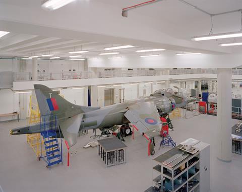
Built by main contractor Vinci and officially opened by Princess Anne last month, the 15,000m² building offers an array of world-class engineering teaching facilities that would have made Brunel, Farraday and Ford seethe with envy. Flight simulators, an air traffic control suite, car engines donated by the local Jaguar plant, Aston Martin chassis, full-scale racing car prototypes, vibrating automotive suspension simulators, a climate control chamber, a full-scale Harrier jump-jet with wind tunnel and one of the largest cryogenic magnets in Europe offer prospective students something akin to sci-fi engineering utopia. “Our aim was to create a state-of-the-art engineering facility for the 21st century,” explains Professor Gerry Ackerman, Coventry University deputy director of estates and property, “in a building that combined the very latest technology and teaching techniques.”
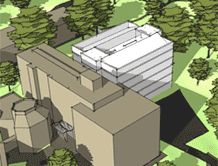
And it is the building itself that provides the strongest example of the technological endeavour that takes place inside. The new block is wrapped around four sides of a sheltered square and is split into two “Ls”. These are linked by a glazed entrance atrium at one corner and separated by a large gap at the opposite corner. The diagonal route between the entrance and the gap falls on a proposed masterplan axis that will eventually link the campus to the city centre. Consequently, this new courtyard and its attendant wings play a key urban role too.
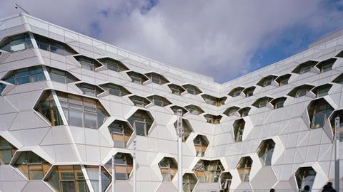
Two sides of the square form the smaller L, which has been configured as the “Nature” block. This four-storey wing faces south and west. But it is the larger, seven-storey L, the “Science” block, that grabs attention. The building is clad in a striking facade comprised of profiled aluminium panels arranged into an interlocking hexagonal pattern. This pattern is occasionally punctured by hexagonal openings shaded by the aluminium hoods. The facades themselves lean inwards and outwards, heightening the warped and abstract aspect that pervades the buildings.
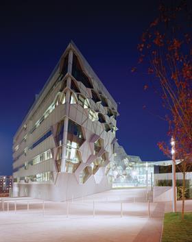
These are hard, defensive and distinctly curious facades that, while not necessarily inviting, are certainly intriguing. Although the architect makes no reference to it, it seems clear that the concept behind its design is that of a circuit board, with its gyrating lines splayed around a web of randomly located nodules, and its obvious significance to the computer-based activities that take place within.
Overall, the effect is rather crude and disorientating and borders on the sinister or surreal, as if multiple eyes are stealthily sheathed under arching aluminium eyebrows monitoring the inhabitants of the enclosed space within. Three-hundred years ago, Wren did something similar at his Fountain Court at Hampton Court Palace, where scores of hooded sash windows are crowded into his elegant Baroque courtyard. But Wren was able to deploy deep colonnades and decorated aedicules to soften the effect; here it is toughened by hard surfaces and angular severity.
A tool for teaching
What the facade may lack in charm it makes up for in technical sophistication. It comprises high performance aluminium rainscreen cladding laid on top of an insulated composite structure and, surprisingly, a glulam timber structural frame. John Micklewright, project manager for Vinci UK, describes the highly complex facade as “by far the most challenging element of the project.”
Initially, the main problem facing the design team was how to create a rigid and efficient frame for the facade when loads were having to pass through timber columns frequently laid diagonally so as to not obtrude on the hexagonal windows. This was made worse by the facades sloping inwards and outwards by as much as 20 degrees. To accommodate this dynamic structure, the glulam columns and nodes were becoming unduly large.
As Micklewright explains, despite the complexity of the problem, the solution turned out to be relatively simple. “We ran the columns down vertically through the window openings when necessary to create continuous load transfer through the mullions. So the frame conforms to a 1.5m or 1.8m structural grid between the columns. But you hardly notice this visually because of the overriding hexagonal geometry of the facades. The facade and the structure are working in different ways.”
Our aim was to create a state-of-the-art engineering facility in a building that combined the very latest technology and teaching techniques
Gerry Ackerman, Coventry University
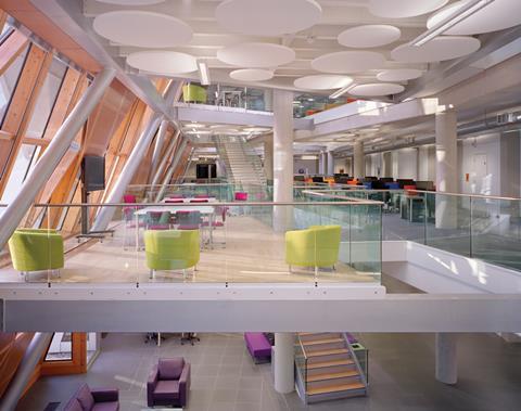
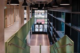
The interior presents a much more amenable face than the facades. A series of sweeping open-plan foyers merge dramatically into one another, each of which is defined by a robust palette of exposed concrete and simple white-painted walls. Staggered openings are cut into floor slabs, creating plunging atriums and overhanging balconies.
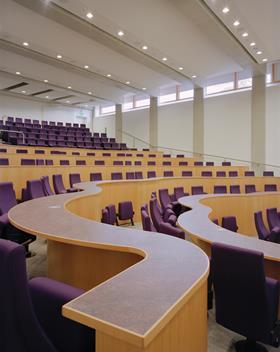
With the foyer spaces that occupy the lower part of the building, it becomes evident that the faculty is divided into two vertical stacks. The lowest one has a combination of open-plan spaces and classrooms and the upper reveals a more intimate, cellular layout of academic and administrative offices. The ethos of a collaborative working environment dominates the lower stack and is enforced by features such as break-out balconies in the foyer or triangular group tables in the classrooms.
The interiors also reveal a duality in the building’s structural frame. On the lower student areas of the faculty a steel frame is used for the large spans and openings required in the multiple foyer spaces. Therefore one of the visual characteristics of these lower floors is the combination of the sweeping steel cross-bracing against the warm natural hue of the perforated glulam panels behind. The frame of the upper floors, however, is cast in in-situ concrete.
Virtually every steel column and beam has been stamped with its structural loading capacity displayed in bright, colourful numbers. “We wanted the building to be the ultimate teaching tool” explains Ackerman and these are just one of a flurry of measures employed to realise this ambition. Most of these involve enabling the building’s impressive array of sustainability measures to be fully on display.
This includes an advanced building management system capable of displaying changeable data such as energy use and localised temperatures on a large screen in the entrance foyer. All plant areas on the roof and in the basement are also accessible to enable the students to observe features such as rooftop solar tubes that heat recirculated water and the wood-pellet fuelled biomass boiler and air-handling plant in the basement.
Throughout the building too, services are exposed in suspending ceiling gantry cages, and rough-hewn concrete walls proudly abut the smooth veneered finish of the glulam inner frame.
“Yes it’s a Category B fit-out” Ackerman says “but we wanted all of those associated gradations, such as the subtle staining and form tie indents on the exposed concrete walls and columns, to be on full display. That way the students can understand how different grades of material perform and use that appreciation to directly inform their work”.
Coventry’s Engineering and University Building may be a curious hybrid of burlesque facades and cavernous interiors. But it more than adequately satisfies its client’s initial brief of providing a stellar teaching environment that enhances the institution’s academic appeal and plays an active role in the education of its students.
PROJECT TEAM
client Coventry University
architect Arup Associates
main contractor Vinci
structural engineer Arup Associates
cost consultant Gardiner & Theobold











No comments yet