Barts Square is a mixed-use development in the City of London that features modern and traditional styles wholly in keeping with surroundings that date back a thousand years. It is almost as if it has always been there
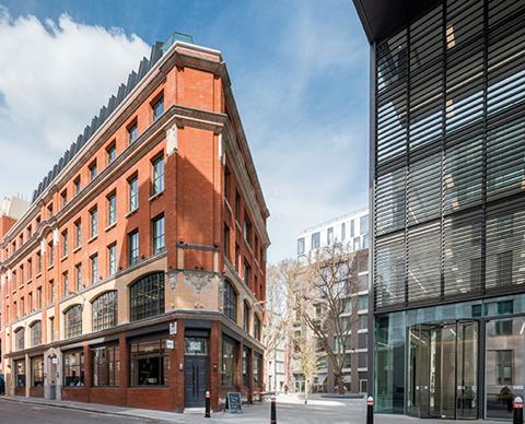
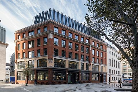
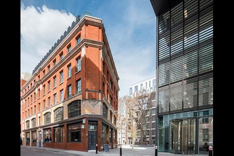
Approach the newly developed Barts Square from the south and the visitor is greeted by a shiny new all-glass office block. This barely merits a second glance given its location in London’s Square Mile, an area choked with all-glass office buildings.
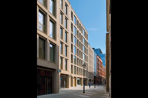
Go around the office building and turn right, and the visitor will find themselves in a modest square among buildings that hark back to an era before the City became a global corporate centre. The office block steps down from 12 to 10 storeys and steps down again via an eight-storey neighbour away from the corporate City to a predominantly low-rise neighbourhood consisting of new, 19th- and 20th-century buildings.
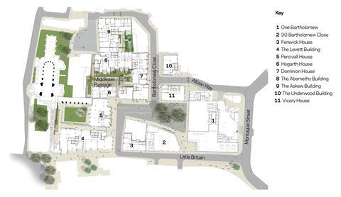
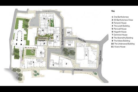
Barts Square is a new, 3.2-acre development sandwiched between Smithfield Market, St Bartholomew’s Hospital and St Bartholomew the Great church, which was founded in 1123. Unusually for the City, it is mixed use, with 22,162m² of office space, 236 apartments occupying almost the same floor area as the offices and 1,962m² of ground-floor retail space.
The big office building, known as One Bartholomew, is the only glassy corporate block in this scheme, and this and two other buildings are the only ones outside the Smithfield conservation area. The rest of the scheme follows the tight urban grain of narrow streets and courtyards of the conservation area and is a blend of old and new but artfully done; the new buildings respect the modest plot widths of this area, historically one of narrow streets and courtyards.
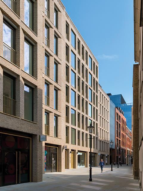
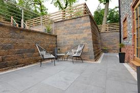
Architecturally the new buildings are a blend of modern and traditional styles. What marks this scheme out is the level of attention paid to the detailing. A lot of time and care has gone into choosing the materials, including the bricks, which are a mix of London stocks, red bricks and an assortment of glazed bricks. The streets and courtyards are paved with honed York stone, limestone has been used to dress window reveals, and the quality of the workmanship is superb.
The overall effect is that the new but traditionally styled buildings are hard to distinguish from the originals, and the modest scale of the modern buildings and regular symmetry of the fenestration means these sit well with their more traditional neighbours. The overall effect is that the scheme looks like it has always been there – the hallmark of success.
The bold modern interventions and avoidance of overblown decorative flourishes ensure that this scheme is no Poundbury on Thames. Developed by Helical, the lead architect and masterplanner was Sheppard Robson with additional variety supplied by Piercy & Co and McCreanor Lavington, which designed the facades of some of the residential blocks. Landscape architect Gross Max was selected for its simple and clean approach to the public realm, and Johnson Naylor is responsible for the residential interiors.
Getting to this point has taken 10 years, with some hiccups along the way, notably contractor Carillion going bust as the first phase neared completion. Helical came across the site by chance in 2009 when it was developing 200 Aldersgate next door. The site was owned by the adjacent St Bartholomew’s Hospital and was a collection of decaying NHS facilities including offices, workshops, nurses’ accommodation and a heart centre. The hospital site was being rationalised and redeveloped, making the buildings on the site redundant.
The minute we saw it we thought it was a great opportunity to develop an undiscovered part of london … we felt a real responsibility to do it justice as it was such a special area
Nikki Dibley, Helical
When Helical visited, it realised that this was a rare development opportunity and had to buy it. “The minute we saw it we thought it was a great opportunity to develop an undiscovered part of London,” explains development executive Nikki Dibley. The unusual nature of the site meant they had to respect the history of the place.
“We felt a real responsibility to do it justice as it was such a special area,” she says. “Also, the opportunity to do a residential scheme of this scale in the City is very rare so we wanted to retain the original architecture and add to it.”
The brief was picked up by Sheppard Robson, which retained the original street layout and feel of the area. “We kept the original plot widths to keep the grain of the architecture and the scale of the buildings,” says Sheppard Robson partner David Taylor. “Everything references the existing styles and materials.”
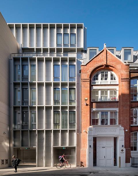
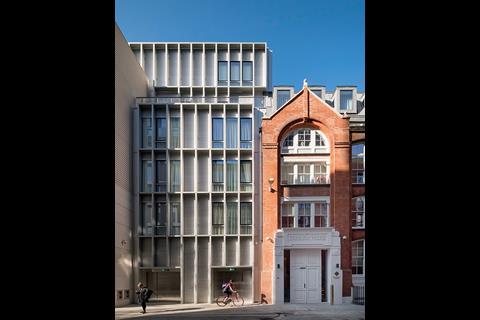
Retaining the character of the intimate urban grain meant building larger blocks behind several of the smaller facades. Dominion House consists of 16 apartments which sit behind three distinctive facades fronting Bartholomew Close, including the red-brick facade of a former school building and two modern neighbours with distinctive metallic facades – one with deeply inset punched windows and the other with the fenestration set behind a rectilinear projecting grid.
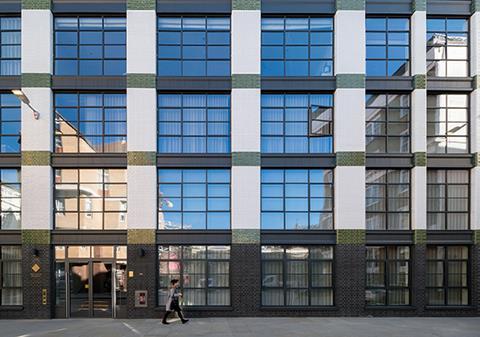
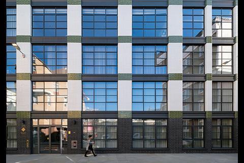
Some of the buildings are larger – the adjacent Askew Building houses 27 apartments in one warehouse-sized block; this building directly references the Crittall windows and glazed green, dark brown and cream brickwork of the one opposite.
Dibley and Taylor emphasise that getting the materials and details right took a lot of time. “We signed off absolutely everything from the bricks down to the fire alarm points,” says Dibley. According to Dibley, Helical’s chief executive, Gerald Kaye, went to site every week for 10 years to “inspect everything”.
The project demonstrates that design and build can deliver high-quality work if the right governance is in place. Sheppard Robson was novated to the contractors but reported back to Helical, which kept a close eye on the detailing with the site teams.
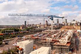
In January 2018 the project suffered a major setback when main contractor Carillion went bust. It was constructing the first phase of residential buildings, which were almost finished, and both of the scheme’s office buildings.
“It was a terrible time for them to go under as the office building was half-built and we were near practical completion on phase one of the residential buildings with residents wanting to move in,” says Dibley. “It was very stressful and cost us a lot of money.” She admits that the extra cost added up to £20m.
Remarkably, Helical managed to get a replacement contractor, McLaren, to take over the residential elements within the space of two weeks. “Although there was a delay, it could have been a lot longer,” says Dibley.
Mace took over One Bartholomew and QOB the second office, 90 Bartholomew Close. Carillion’s specialist contractors were retained by the new contractors which helped with continuity, and the relationship with McLaren proved so successful that it was awarded the second residential phase.
Given the financial hit suffered by Helical, ways had to be found to trim costs. But the second phase had to match the quality of the first as it faces onto the 12th-century church of St Bartholomew the Great at the rear and Little Britain, a busy thoroughfare connecting Smithfield to St Paul’s at the front.
Phase two was all new-build, simplifying delivery. The need to work around existing buildings in phase one made it very complex – there were 49 different types of two-bedroom apartment. This had a knock-on effect on the interiors, including the kitchens, as every one was different. “We had a guy who was just drawing kitchens,” says Taylor. Phase two has just three different kitchen layouts.
A surfeit of electronic gadgetry was all the rage when phase one was being developed, a trend that had passed by the time of phase two, which saved some money. Expensive stainless steel worktops in phase one were switched for cheaper alternatives, and overly complex details including around the ceiling lights were dropped. The brickwork on phase one was constructed traditionally; precast concrete panels with brick slips were used on phase two.
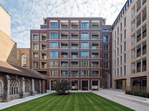
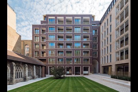
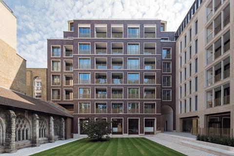
These changes have not impacted on the quality of the scheme, as the second phase looks as good as the first. The two buildings look out onto a grassed courtyard abutting the church.
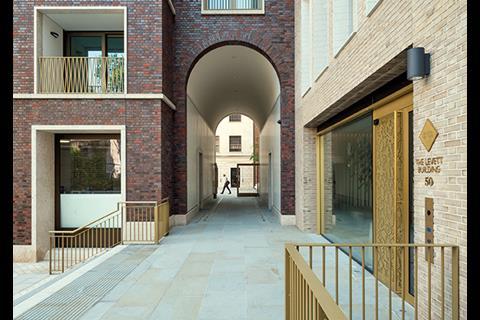
Piercy & Co designed the Levett Building on the long side of the courtyard, with the other side facing onto Little Britain. It is faced in pale brick with tracery carved into the sandstone window reveals, a nod back to the time this was a lace production district.
Percivall House, on the short side of the courtyard, was designed by Maccreanor Lavington. This is given a distinct identity by its dark-red brick facade that references the colour of the bricks used in St Bartholomew the Great’s tower.
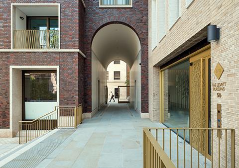
The facade of Percivall House has been given a richness and depth by the variety of colours and quality of the glazing on the brickwork, which varies in colour from bright red to purple, grey and dark brown. An arched passageway, lined with stone-coloured mosaic enlivened with rows of gold, links this part of the scheme to the earlier phases and is in keeping with the intimate nature of the development.
The apartments have nearly all sold and the office space has been let, apart from one floor. Retail leases are slow as it takes a brave person to open a shop or restaurant at the moment, a situation likely to improve when the pandemic passes and people return. And, when they do so, it will be to a different city – with some parts, notably Barts Square, much changed for the better.
Project team
Client Helical
Lead architect and masterplanner Sheppard Robson
Additional facade design Maccreanor Lavington and Piercy & Co (Percivall House, the Levett Building and Abernethy House)
Interior design Johnson Naylor (residential) and ID:SR
Landscape architect Gross Max
Cost consultant Arcadis
Project manager Avison Young
Planning consultant DP9
Structural engineer Waterman Group
M&E engineer Sweco
Contractors:
One Bartholomew Carillion/Mace
Phase one residential Carillion/McLaren
90 Bartholomew Close Carillion/QOB
Phase two McLaren












No comments yet