How phase 1 of a two decade redevelopment has brought back the traditional grain of the streets to London’s deprived Aylesbury Estate
Tony Blair’s first major speech to the nation after winning the 1997 general election was not delivered in parliament or at Downing Street, but in the notorious Aylesbury Estate in Walworth, south-east London. When it was built between 1963 and 1977, the estate was conceived as a shining new urban utopia, based on the heroic post-war ideals of social egalitarianism and the mechanistic functionality espoused by Le Corbusier. Architect Hans Peter Trenton was familiar with the radical pre-war social housing schemes of his native Vienna and combined these precedents with his evident brutalist sympathies to create one of the largest public housing estates in Europe.
Not only did renowned architectural historian Nikolaus Pevsner label it London’s “most ambitious post-war development”, but many of the first residents - newly arrived from slum dwellings or cramped back-to-back terraces - revelled in having hot, running water for the first time. “I thought it was terrific,” recalls early tenant Fred Cook. “In the old house we had an outside toilet - this was like a palace.”
Yet within a few years, the dream had turned into a nightmare. Aylesbury became synonymous with social malignancy on a horrifying scale. Crime, poverty, unemployment, ill health, drug-use and dereliction flourished, with many laying much of the blame firmly at the door of bad design and poor maintenance.
Aylesbury also became a convenient metaphor for urban deprivation at concrete sink estates across the country. The ITV police drama The Bill was frequently filmed on the estate and Channel 4 earned residents’ ire and an indefinite filming ban when they used insalubrious estate footage for one of their “ident” promotional trailers.
It was for all these reasons that within hours of his landslide victory, New Labour spin doctors hastily dispatched Tony Blair here to proclaim social kinship with the estate’s 7,500 “forgotten” residents. So began Aylesbury’s long march to regeneration which, after 15 years and multiple rejected masterplans, has finally borne some fruit.
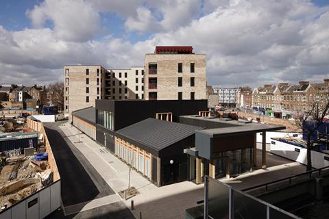
Aylesbury South-West Corner is the first phase of an ambitious 20-year programme to demolish and rebuild the entire estate. Covering a hulking 28.5 acres and originally designed for 10,000 residents, Aylesbury is more than three times bigger than the neighbouring and equally notorious Heygate Estate and about two-and-a-half times the size of the Barbican in the City of London. Incredibly, when construction began it was destined to house almost as many people as the Buckinghamshire town after which it was named. A phased approach to redevelopment was inevitable.
Levitt Bernstein Associates has designed the SW Corner as a £55m, 261-unit development for housing association London & Quadrant. From the submission of its outline masterplan in 2007, the design team’s philosophy has been clear - in the words of associate architect Simon Lea, to “set the tone and quality benchmark on what was to be delivered on the remainder of the estate at later stages and to reintroduce the streets, spaces, squares and scale suppressed by the existing estate”.
The design problems with Aylesbury are painfully clear for all to see. Inhuman scale, dark alleyways, concealed entrances, endless high-level deck access, crumbling concrete, monolithic monotony, ground-level inactivity and an atrocious public realm are just some of the toxic agents that have contributed to its decline.
And yet, as John Lumley, L&Q’s development manager, explains: “Space standards within the flats are actually extremely generous. And despite all the problems, there is an incredibly strong sense of community spirit and pride.”
The latter is principally represented by a highly galvanised and informed community residents’ group who, according to Lea and Lumley, were closely involved at every stage of the development process and even embarked upon fact-finding missions to Holland and Belgium to observe how social housing regeneration is done there. To some extent, it is the strength of this local representation that frustrated earlier attempts to redevelop the estate - stock transfer proposals and masterplans were resoundingly rejected by residents.
This time around, extensive public consultation was held, which included life-size mock-ups of flat layouts so residents could vote for their favourite configuration. This process helped inform the final design of the first phase, which has now been built.
First attempt
The SW Corner comprises six new buildings built over four mini-phases, the last of which is due to complete next summer. The homes are mixed tenure with 48% private, 39% affordable and 13% intermediate.
They are a mix of one, two, three and four-bedroom flats and maisonettes with an emphasis, as the local demographic demands, on larger family units. A 166m2 community centre and a 404m2 ground-floor retail space have also been provided.
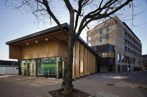
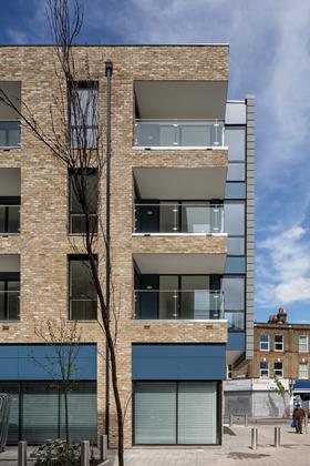
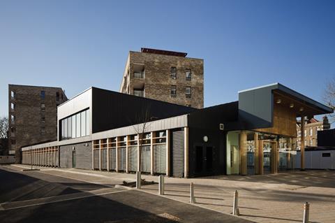
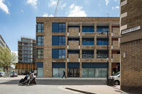
The development is predominantly low-rise, with buildings ranging from two to 10 storeys. Lea describes the design approach as “calm, rational, coherent and robust with a deliberately limited palette of materials”. This comprises brick, zinc and Eternit board with the last two being applied in a variety of colours and configurations.
The blocks are rigorously rectilinear with elevations characterised by deep reveals, clean rooflines, punched openings and recessed external decks. This powerful palette ensures that a reassuring sense of solidity and muscularity predicates throughout the scheme, but it is one that is subtly enlivened by flashes of colour on the zinc and Eternit panels and by a dynamic massing strategy.
Projecting bays and balconies, perforated corners and recessed attic storeys all help dismantle the bulk of the blocks and craft
an infinitely more nuanced and human sense of scale than that of their dystopian sixties’ neighbours. And the choreographed vigour
of the massing is most evident on the charismatic community centre wing, a low-lying but powerful little nib of thrusting volumes and swooping overhangs.
The brickwork throughout the development is exceptional. The Mystique blend used to such winning effect at the celebrated Accordia scheme in Cambridgeshire eight years ago makes a welcome reappearance here. With its quilt-like patchwork of pale and earthy shades, it adds a rich and textured sense of depth to the facades, which recalls the London stock brickwork indigenous to the capital and shames the pallid masonry slabs next door.
Occasionally protruding upwards into openings to form free-standing balusters or perforated to screen bin stores, the finely modulated incisions cut into the blocks’ brick envelopes enable them to appear as if they were almost gouged and carved pumpkin-like out of a single piece of clay.
Reintroducing the street
But the most ambitious aspect of Aylesbury’s rebirth is not the buildings themselves but the spaces around them. As Lea puts it “of course the blocks are important but it’s the squares and public spaces that are the key”. The design team’s core objective was to reintroduce the traditional grain and pattern of the streets obliterated by the sixties estate and this is evident throughout the masterplan. New streets have been woven into the development as well as a new urban square and an interconnected network of private communal courtyards, one of which features an ETFE-covered atrium.
Despite the lower scale of the buildings, they also achieve an impressive density ratio of about 700 rooms per hectare, slightly greater than that of the original estate. This is partially thanks to the absence of tower blocks on the original estate and the vast expanses of abandoned public open space.
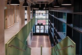
The architecture too responds to this determined public realm emphasis, both physically and psychologically. Lea points out that “internal communal materials are consistent with those outside so that the street comes right up to your front door even right inside the building. This also permits easier maintenance of communal areas.”
Also, like Victorian and Georgian terraces, the architecture does not shy away from repetition. The continuous bays of balconies and openings and the vertical proportions of the facades delicately recall the rhythmic visual cadence that forms the essential background architecture to so many London streets and squares. It also imbues the townscape with a distinctive urban character, distinctive enough to animate the environment but not oppressive enough to fall into the totalitarian trap so venomously enforced by its predecessor.
The mix of uses also sets a key precedent within the arena of estate regeneration. According to Southwark council’s senior design and technical officer Catherine Bates “the presence of retail and the community centre has already created highly successful interface with the residential accommodation.” It also provides essential ground floor activity to the streets and the dual aspect glazing applied to the retail units also fosters a sense of transparency throughout the development that aids security and once again chips away at the sterile mono-functional composition of the original estate.
Internal communal materials are consistent with those outside so that the street comes right up to your front door - even inside
Simon Lea, Levitt Bernstein Associates
Ultimately, the intention is to obliterate entirely all physical and historic reference to the current Aylesbury Estate. “We’re determined to break down the estate concept,” explains Bates, “by the end of the development we no longer want the area to be conceived as a single perceptible entity but feel that it belongs to the city around it.” Lea says that if residents still refer to the development as the Aylesbury Estate as the years progress then “we’ve lost”.
To assist this critical shift in perception and prioritise local history over the ideologically driven imposition of an alien rural idyll that generated the estate’s current title, new streets have been named after the famous London rag-and-bone men that once traded from a nearby site (“Totters” Court) and a local court jester who owned the land in Saxon times, (“Hitard” Court). Bates also confirms that the procurement structure for future development phases will invite other architects to bid for work to achieve the “variety of styles that will counteract the monotony of the current estate”.
The irony of pulling down monolithic sixties estates and replacing them with the streets that once occupied exactly the same sites resonates not only at Aylesbury but at countless other estate regeneration projects across the country. Easy at is to criticise the malicious urban spite that secretes from every inch of Aylesbury and the hopeless diaspora of similar failed public housing projects from the same period, they were conceived with good intentions and sought to create a better future for the poorest in society. Moreover some of the streets they replaced had collapsed into unsanitary slums oppressed by profiteering private landlords and scarred by appalling overcrowding.
But the street as an urban model remains as strong ever and its reintroduction at Aylesbury promises to bolster the strong sense of community that already exists there and enable it to reconnect with the grain and consciousness of the city around it. Although the SW Corner provides only a glimpse of the estate’s future, its restrained and measured architecture conveys a quiet, noble equanimity that breeds the kind of strength and intimacy on which urban character grows. Aylesbury’s long-awaited exorcism is well under way.
ACCOMMODATION STANDARDS
To match the generous space standards of the original estate, Phase 1 rooms have been designed as almost 10% larger than the Parker Morris minimum space standards abolished in 1980. The +10% requirement will be maintained throughout subsequent development phases. Over 80% of the new flats are dual aspect and all balconies are a minimum 1.5m deep with several measuring 6m2 and providing dual access from both a bedroom and living area.
The endless internal communal corridors and elevated walkways that became such crime havens on the current estate have been replaced by short access recessed external decks. In a subtle reinforcement of communal hierarchy and a security aid to visual supervision, these are adjoined by staircase cores that are either left open or partially covered by continuous metal grilles.
A 0.25 parking ratio has been implemented and all flats exhibit high levels of natural ventilation and daylight. Phase 1 also features a biomass boiler and a CHP unit. The deep window reveals help reduce solar gain and its high thermal mass and well insulated envelope help maintain energy efficiency. The development achieved Sustainable Homes Code Level 4 in 2007.
PROJECT TEAM
Clients: London & Quadrant Group and London Borough of Southwark
Architect: Levitt Bernstein Associates
Structural and civil engineer: Conisbee
Services engineer: AJD Building Services Consulting Engineers
Employers agent: PH Warr
Main contractors: Durkan / Galliford Try








No comments yet