The Storyhouse in Chester is a daring construction of opposites, with a theatre, cinema and library brought together in a space that combines new-build and the spirit of the orginal 1930s picture house. Ike Ijeh reports on how the building energetically opens up storytelling to the local community
Everybody knows what a cinema is, what a theatre is and what a library is, but what do you call a new facility that combines all three? Well, in Chester you call it the Storyhouse and according to venue chief executive Andrew Bentley, it provides a “new model of cultural offering that is not only unique in the country but is also a complete reimagining of what we consider a cultural institution to be”.
The £37m Storyhouse project has been designed by Bennetts Associates and officially opened last week after a two-and-a-half year construction programme. The project could be described as two buildings combined into one, with one half conversion and one half new-build. The first half involves the wholesale refurbishment of Chester’s grade II-listed art deco Odeon cinema which dates from 1936 but has lain empty since 2007. The second half involves the demolition of an ungainly 1970s theatre building that is now fully incorporated into the original Odeon cinema.
Chester previously contained neither theatre nor cinema for the past decade, despite the high esteem in which its historic townscape and architectural heritage is held, but now gets the venues combined into one. The city did offer a library in a nearby glass-fronted terracotta Victorian building. But its facilities in the Storyhouse have been significantly upgraded and offer seductive proximity to the new cinema and theatre.
However, at its heart the Storyhouse is not only about internal facilities but is a resolutely civic and outward-facing project too. It is the first phase in a heroic transformation of the city’s Northgate Quarter with the building’s new south elevation acting as the vista terminus for a street that is not yet built. Equally, as the largest public building in Chester, it forms an important civic triumvirate with Chester’s two Victorian grade II*-listed town hall and its medieval grade I-listed cathedral, both to the south.
Arrangement
In section, the building has been treated to a clever arrangement strategy. The auditorium that once occupied the cinema has long been subdivided by the multiplexes that replaced the mass attendances of cinema’s Golden Age. These have been removed and a smaller 100-seater cinema has been placed in the centre of the void at first-floor level. The library has been arranged around it and a bar area has been located below.
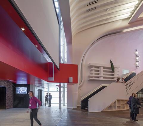
At the far end of the block a new full-height foyer has been created, which straddles and negotiates the junction with the new extended block. The new block primarily contains the main theatre auditorium and a smaller studio theatre which has been placed above it.
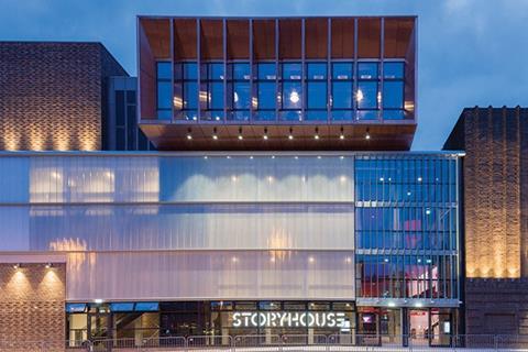
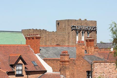
Externally, the art deco half of the building doesn’t look very different to before, other than the brickwork having been cleaned and restored. The entrance remains in the same place and has been reused as the complex’s main entrance, while the former shopfronts next to it have been converted into glass alcoves for the new children’s library built within.
The most significant new addition here is the new entrance canopy, a neat reworking of the original, which was long submerged behind modern Odeon signage. With its metallic soffit and semi-submerged grid of bulbs, it provides an homage to the reflective sheen of art deco.
So, what is important here architecturally is not so much what has been done to the existing architecture but how it informs the architecture of the new elevations that have now been erected behind it. The original cinema was designed by architect Robert Bullivant, who designed several cinemas across Wales and northern England in the same trademark art deco style of swooping verticals and striped horizontal banding witnessed here.
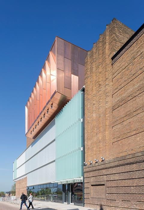
The new block to the rear is wise to heavily borrow from this language. It too offers heavy brick facades starkly broken by streamlined strips of clear or translucent glazing or stitched expanses of quarter lap brick bonding. The glazing helps temper the solidity of the block, as does the animated massing strategy of projecting and retreating planes. Most striking here is the copper box perched on the top of the building, teetering vertiginously out past the glass planes below. Inside is the studio theatre built on top of the main internal theatre space.
Bennett’s project architect Daniel Kew explains the relationship the design sought to establish between new and old. “We wanted the new to work as a companion piece to the old and to reinterpret the volumes, rhythms and proportions present in the existing building. The copper for the studio is also important – that will form the vista stop for the new street, so we wanted some sort of landmark. And in its tone and eventual oxidisation, copper sympathises with the shades and colours of the brickwork found all over Chester.”
The composition is a subtle and masterly exercise in the dynamic differentials that can achieved from clever combinations of mass, material and texture. It certainly plays to the same right-angled simplicity of the original building. But the extraordinary fluidity and diversity of its thrusting planes injects a spirit of energy and motion that gives the sense of a chest of drawers all pulled out at different depths with some of the contents spilling decadently out from each one.
Central to this ruse is its luminous copper crown. While one might wish this was slightly higher than the adjacent brick fly tower in order to highlight its intended townscape prominence and reinforce the staggered planes elsewhere, it still forms a thrilling summit to the building and recalls the metallic glitz and shimmer of the Jazz Age.
All that jazz
Inside, interactions between the new and the old reveal a series of equally electrifying fissures. The cinema is a treated like a jewel box encrusted within the much larger setting of the original auditorium hall. In order to mimic the translucent glazing on the new elevations outside, the cinema is clad in milky glass that can be backlit in an infinite variety of colours. To necessitate this, the steep rake of the original auditorium was removed but its sumptuous ribbed and vaulted 1930s ceiling is displayed for the first time in decades.
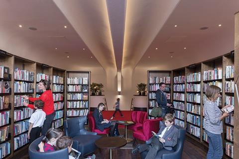
Also underneath this ceiling and straddling three sides of the cinema is the library, spread over two floors. “This is no ordinary library,” explains Bentley. “There are no doors between it and the other facilities and it is open until 11pm.
“You could leave a performance and potentially grab a book. It’s part of the overall strategy of stitching different ways of telling stories together.”
There is an almost thrilling impertinence in seeing a space as traditionally inhibited and enclosed as a library willfully flowing in and out of foyer spaces and greedily encroaching along the edges of more public areas.
But the positioning of the library also reveals the other arguably even more important fissure that runs through the building, relating not just to heritage but to function. The new cinema being placed inside the old one may seem natural enough but it is surrounded by a host of other more improbable juxtapositions. Library versus cinema we have already seen, but there is also library versus bar and perhaps most importantly, cinema versus theatre.
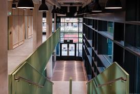
The cinema and theatre stare at each other across the new foyer created at the far end of the original 1930s block. This foyer opens into the new-build block framed by the cinema and bar to the refurbished side and the new theatre to the new-build side. Also straddling each side are two staircases, one leading from the library mezzanine to the ground floor, the other a steel staircase decked in bright red that has been hung from the ceiling.
Like all the best foyers, this one is virtually a stage set in itself. The main players are the twin staircases, the red balconies straddling the steel stair, the diversity of uses, the exposed vaulting of the original auditorium, the brick envelope of the new theatre and the milky veil of the new cinema. All combine to charge the space with an energy as dramatic and theatrical as any of the performances to be hosted within.
The theatre itself is a dynamic construction. In order to achieve full acoustic separation from the other activities that take place in the building, it is formed from a steel frame filled with acoustically resilient construction. Again for acoustic separation purposes, the copper-clad studio theatre above it is structurally independent and is supported by a steel ‘table’ structure that straddles the outside edge of the theatre below.
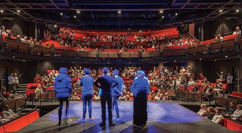
The main theatre space can house 800 people in touring production mode and 500 people in thrust stage mode. For thrust stage mode, a raised platform the height of a full floor is erected in the lower pit. Interestingly, this model pays no attention to the popular trend of creating flexible performance spaces where auditoriums and seating can be speedily reconfigured at the flick of a button. Here, it takes up to a week to switch between modes but as Kew argues, this was central to production and conceptual requirements.

“You often find that the flexibility in these instances isn’t really flexibility, it’s planned compromise. We wanted two specific conditions that met the client’s exact needs,” he says Chief executive Bentley agrees: “We’re a touring company, so the concept of setting up a stage within an existing space, as we do in thrust stage mode, is very natural to us. Equally, we wanted the venue to have the capacity to host larger touring companies – this is central to increasing Chester’s central offer.”
In a way, the slow, meticulous transformation of the theatre from thrust to touring mode is a fitting metaphor for the blurred boundaries that exist across this entire project. Revealing that the theatre has ticket machines rather than a box office, Bentley says: “We’re not interested in barriers, instead we want functions that are completely open to each other and a venue that is completely open to the outside world.”
In doing this, the building inhabits edges and celebrates peripheries. It is does not necessarily find joy in celebrating the differences between elements but in revealing the frictions, immersions and overlaps that exist between the two. This is the core architectural legacy of the Storyhouse.
Bennetts has a long portfolio of theatre design, with an impressive back catalogue that stretches from the Royal Shakespeare Theatre at Stratford to the Old Vic in London. Kew maintains that what links these projects is not so much their theatrical nature but their preoccupation with the core needs and experiences of people. The truth of this sentiment is shown at Storyhouse in the openness and inclusivity of the finished product. But one also can’t help concluding that this is a project that has been galvanised by placing different sets of experiences together and drawing out all the rich colour and drama that such everyday collisions allow.
Project team
Architect Bennetts Associates
Executive architect Ellis Williams
Client Cheshire West/Chester council
Main contractor Kier
Structural engineer WSP
Services engineer Foreman Roberts
Theatre consultant Charcoalblue








No comments yet