Kingston University/Design Museum student gives his first impression direct from Shanghai
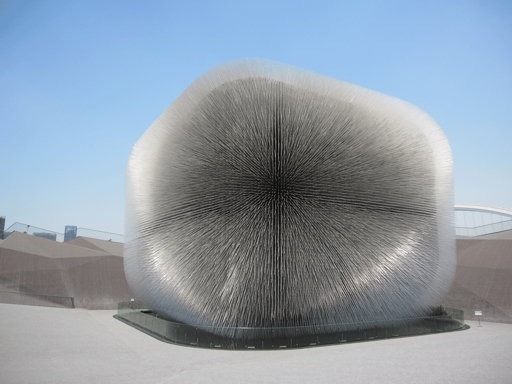
When researching previous World Expos, Thomas Heatherwick Studio discovered that many visitors remembered either the pavilion or the content inside but rarely both. With this in mind the design team, led by lead architect Katerina Dionysopoulou, created a concept whereby the content was the pavilion and vice versa. A courageous approach to the brief set by the British Council and one that has resulted in one of the architectural highlights of the Expo.
The ‘seed cathedral’ responds to the weather, with the 60,000 acrylic rods moving slightly in the breeze that occasionally blows across the Expo site from the Huangpu river. The result is a surreal, slightly hypnotic sight as if the eyes can’t quite believe the spectacle in front of them. Many visitors seem reticent to approach the pavilion too closely except to take a quick photograph, perhaps afraid that the ‘largest hairy building in the world”, in Dionysopoulou’s words will come to life and bite them.
It is undeniably memorable, presents British creativity at its best and most importantly is a relevant consideration of the somewhat prosaic Expo theme of Better City, Better Life
The pavilion is described as a gift from” the UK to the Chinese people, presented on the Expo site amidst an undulating platform that represents the paper it was wrapped in. A nice concept but perhaps one that was determined by the realization that the budget would not permit a larger structure that could cover the 64,500ft2 site. The result is a sparse landscape that does not encourage visitors to linger under the hot Shanghai sun.
Despite this minor criticism, the project is to my mind a success. It is undeniably memorable, presents British creativity at its best and most importantly is a relevant consideration of the somewhat prosaic Expo theme of Better City, Better Life. By reflecting on the role that plants can play in the future to create new innovative and sustainable technologies, the pavilion is an engaging and intelligent concept, somewhat at odds with the bombastic nationalism displayed elsewhere.
This confidence in excluding British cultural stereotypes from both the pavilion design and content inside it should be applauded, but we will have to take the design team’s word for it that the vague outline of a Union Jack visible in the rods is a scientific phenomenon and not intentional.
Pete Collard is completing a masters degree in Curating Contemporary Design at Kingston University London and the Design Museum.
Source
If you would like to take part in our First Impressions email nargess@me.com.






No comments yet