It's arguably the most important detail of any design – yet often completely overlooked. Roderic Bunn challenges engineers to stop invalidating all their hard work by neglecting to specify a user-friendly control panel
User controls are the Cinderella of building services: so vital, so fundamental to the ultimate performance of a building, yet never given enough attention by architects and engineers.
The controls provided to operate lights, blinds, windows and vents are key interfaces between million-pound services and the people who live and work in buildings. Too often, highly complex building services are attached to controls that are poorly designed, poorly labelled, and – increasingly – far too complicated for ordinary souls to operate. It’s as though controls are an afterthought, a chance selection from a parts bin by an installer with no knowledge (or interest) in the building’s design.
So are installers at fault? Well, designers don’t seem to take much care either. Rarely do controls specifications address the usability of controls. And the controls subcontractor or system integrator may simply select controls from a catalogue without much reference to the design intent. Any mismatch won’t be evident until the building is occupied, after which it’s game over – there’s no money or willingness to improve the controls. The hapless occupiers are left to work it out for themselves.
Many control systems in buildings are nowhere near the accepted functionality of a typical car dashboard. Instead, they challenge rather than assist, and confuse rather than inform. For example, something that looks like a familiar toggle light switch may instead be a multifunction, push-button device, where successive pushes deliver different levels and/or patterns of electric light. Persistent pressing may eventually turn off the lights altogether.
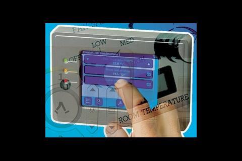
More advanced controls, such as thermostats, imply one function (such as volume control via a dial) while delivering another (altering temperature set-points). This creates potential for confusion and misuse.
Evidence from occupant satisfaction surveys, backed up by energy surveys and data, reveals that the less building occupants are able to influence their environment, the more dissatisfied they become, and the more they are likely to fight the building to get the conditions they want. Facilities managers, who have the unenviable role of balancing system set-points against the needs of staff, can find themselves caught in the middle.
Improving user controls
Designers need to think through the design of user controls far more carefully. After all, user controls are provided for two key reasons:
- To allow users to select the conditions they need – or, more precisely, to avoid conditions they don’t want.
- To help ensure systems operate efficiently, thereby reducing a building’s carbon dioxide emissions rather than contributing to them.
This means far more attention should be paid to controls ergonomics: clarity of purpose, design of switches and buttons that are intuitive to use, clear and explicit labelling (not leaving users to guess), and ease of use.
Just as important, user controls need to indicate that something has happened as a result of a person operating the control – a click or a light, perhaps, or some kind of read-out.
User controls should also be sited at the point of need. These include:
- The entrance to the space. This is a really important place for switching things off. Precise placement is important. For example, if a control is not conveniently and immediately accessible beside the door, it may be overlooked and even get covered up with furniture.
- Near the item being controlled. This is particularly useful for windows, lights and blinds, because it assists an intuitive connection between the user, the controller and the item being controlled.
- At the point of user need. Some users need good local control. For others, it is convenient to adjust environmental conditions without moving from their workstations, such as to cancel glare from a distant window.
Often the action taken by operating a remote control will not be immediately apparent to the user: the controlled device may be completely hidden, perhaps by a fan or an automatically operated window that may not be visible from the point of control. Even where the item is visible there may be a delay while the building’s controls scan the system before it responds to the control. The controller will need to communicate to the user what is happening. Controls suppliers can provide this functionality very easily, using lights or even an LCD display.
Sometimes a device control may need to give advice: for example, in a building with mixed-mode ventilation, to indicate whether or not the user would be well advised to open a window.
Ideally, automatic controls should tell people how long the control intervention will last (particularly important for interval timers), or restore default states when people are absent (for example, using presence detectors).
Standard iconography
Despite the existence of a European standard, BS EN 12098-1:1996, controls companies tend to devise unique icons – a major cause of confusion. This is complicated by the fact that most controls companies are international, with their controls products developed outside the UK.
The Building Controls Industry Association (BCIA) has worked with BSRIA and the Usable Buildings Trust to agree a set of standard, user-friendly icons. These icons fall into two categories: icons that instruct a user to do something (such as turn something on or off) and icons that provide information on system status (such as being in one of two or more modes).
Anecdotal evidence suggests that architects are often guilty of banning annotation from a control device on aesthetic grounds. Engineers need to stop this happening. No icon can ever be truly self-explanatory.
There are two ways to solve this problem. Either the designer’s specification can require the controls supplier to provide annotation, or the control can be designed to accommodate elegant labelling at a later date. Whatever the route, the controls icons must be recorded in the operations and maintenance manual and controls documentation.
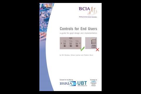
At the very least, the designer can insist that the documentation includes a copy of the standard iconography published in the guide supported by the Carbon Trust, Controls for End-Users – A Guide for Good Design and Implementation.
Moving forward
Perhaps the main obstacle to cost-effective, energy-efficient and sensible user controls is that clients seldom ask for them. They also fail to realise the effort that may be required to deliver a high level of functionality and usability to make controls obvious and intuitive. Consequently, design and building teams are not united in their response to the usability problem, and control suppliers and installers are not geared up to meet their needs.
Considerable attention to detail is required to devise effective and durable controls that will do their job well and reliably. Controls for End-Users addresses ways in which the technology can be suitably configured, designed, annotated and labelled.
But whatever the difficulties, it is essential that designers and the controls industry improve their understanding, strategy and attention to detail so that a new generation of user controls can be created that will offer useful user interaction and information, rather than simply extra gee-whizz features.
Why user controls matter
Control interfaces are where the users meet the technology of a building. The usability of local controls for lights, blinds, heating, ventilation and cooling will largely dictate how well a building performs in terms of:
- User satisfaction. Case studies in non-domestic buildings reveal positive relationships between occupant satisfaction and levels of perceived control.
- Avoiding discomfort. Occupant surveys suggest people prefer conditions that are relatively coarsely controlled, provided that, at the same time, they incorporate control facilities to avoid conditions that are too hot or cold, glary or gloomy, stuffy or draughty.
- Rapid response. The faster a building responds to human needs, the better occupants tend to like it. The response does not have to be perfect, but it must be rapid, detectable and in the right direction.
- Assisting management. It can be more cost-effective for individual users to deal with local problems using local controls than to buy a building management system or require a
facilities manager to intervene. - Energy efficiency. Buildings with good local controls tend to be energy efficient because systems are more likely to operate only when occupants need them.

A carefully designed, high-quality, multiple-purpose controller. However, it lacks any clear labelling or annotation, possibly because the designer believed the iconography was self-explanatory. The three numbered buttons and lamps around the central dial fail to explain what they do. The central button appears to link to an exit strategy, but how does it control the electrical or mechanical systems serving the room?
The three numbered buttons are fixed settings for electric lighting. The indicator lights beside them come on when the settings are engaged.
In spite of such careful design, this switch was still confusing occupiers of a school more than a year after occupation. While this type of layout may eventually become obvious to users, clear explanations for the switches are
desirable.

An unhelpful rotary dial, marked with a circular dimple, connected to a meeting room ventilation system. The black dots on the dial indicate six settings, but what do they govern? Investigation by a BSRIA researcher revealed that adjusting the dial leads immediately to sounds of air movement from a ceiling grille, although it is not clear whether this was supplying or extracting air, or controlling heating and cooling.

These three controllers have icons at the top that suggest they are something to do with windows. Their mounting position is neither close to the items they control nor convenient for the user, but presumably it suited the installer. The users have had to find out what they do and annotate the controllers with a marker pen.
It’s clear that the upper switch of each unit can be clicked to the left or the right to open or close the device, or vice versa. But what about the lower push button? Does it stop the device opening or closing? Is it a one-shot button for rapid opening and/or closing?
Does the upper switch operate something else (such as a blind) when the lower button is pressed? Or is it just a plate to carry the labels for the upper switches?
If the lower switches are blank plates, and the annotation relates to the upper switch, then only one of the icons (velux) provided by the controls manufacturer is related to the image above it.

This device has no labelling or annotation. It looks like an on/off switch but is a push-button for an unidentified system. The switch is for step-less operation, depending on the length of time the switch is depressed.

A well-intentioned but ultimately unsuccessful attempt to provide control of classroom lighting using iconography.
The idea was to associate an icon with a switch in order to save energy by matching the amount of electric lighting with the prevailing levels of daylight in a classroom. Unfortunately, this fails to meet a number of usability criteria.
The iconography is unclear: the far right icon might be thought to represent full sun when actually it represents full electric light. The symbols look as if they relate to the switches directly beneath them, but they don’t. The left-hand switch is a key-operated isolator and the centre one is blank. The user control is a single repeat-push switch on the right. Users have to prod this through its three cycles before they achieve a desired lighting condition. There is no off button.

What can happen when two three-gang generic controllers are placed beside each other with no annotation specific to the devices under control (windows, blinds and rooflights). The building
occupants have had to experiment to associate each controller with its respective device, then use an indelible marker pen to label the controller.
Note the ambient light sensor on the far right control has been covered with sticky tape. This played a role in raising and lowering the blinds, so it is assumed that automatic settings did not suit the needs of the occupant, who worked out how to defeat the system.

An example of a well-designed window and blind controller, installed in a cellular office occupied by a single person. The controller provides manual controls of motorised blinds and windows. User settings can be overridden by the central building management system, for example when it rains, or to facilitate night-time ventilation.
The annotations make clear that the controller operates high-level windows, low-level windows and window blinds. The control buttons at the bottom have arrows to each side to show that pressing them to the left or right will open or close the named device.
Feedback from the system is immediate, courtesy of the four red lights. Despite the close proximity of the user to the blinds, the occupant may need to know at a glance whether there is any additional window adjustment left, which would be helpful when an open window is partially blocked from view by a blind.
End-user requirements
If they are to be operated as intended, control devices designed to suit the needs of the end-user should:
- Be easy to understand and preferably intuitively obvious. If it is necessary to ask for advice or refer to instructions, ideally this should need to happen only once.
- Be easy to use, otherwise people may not exercise control or may choose a more convenient route.
- Work effectively, with sufficient fine control to give the required level of adjustment.
- Give instant, tangible feedback (such as a click) to indicate to the user that the device has operated and that the intended effect has occurred (such as a read-out or an indicator light).
- Not need to be used too often. People do not want relatively trivial decisions and actions constantly intruding on what they are supposed to be doing.
- Not require users to intervene too much. It can be particularly frustrating where an automated system restores a default state too rapidly.
- Be located as close to the point of need as possible. The point of need and the control required may vary with time and user.
For example, office workers may need to adjust things from their workstations but also switch them off at the door. Cleaners and security staff may have completely different requirements.
Source
Building Sustainable Design
Postscript
Roderic Bunn is a technical journalist and building analyst with BSRIA
Controls for End-Users – A Guide for Good Design and Implementation by W Bordass, A Leaman and R Bunn is published by BSRIA for the BCIA. It is supported by the Carbon Trust as part of the UK government's strategy to reduce carbon dioxide emissions from buildings. It is freely downloadable from:
www.bsria.co.uk/bookshop
www.feta.co.uk
www.usablebuildings.co.uk
Printed copies can be purchased from BSRIA










No comments yet