Star architects don’t just design buildings. They are also poet-philosophers whose sacred aim is to explain the deeper significance of their latest office or shopping centre. We search for some sense in their musings
There is an apocryphal story, popular among architectural students, that upon leaving a Rem Koolhaas lecture, an attendee was asked by a colleague what the lecture had been about. “I have absolutely no idea,” they replied. “Either I’m stupid, or that guy’s a genius.”
This anecdote indicates a prevailing perception that much of the language that architects use is utterly unintelligible to the uninitiated layperson and even,
as the story illustrates, to many in our own profession. While the problem clearly doesn’t apply to all architects, this issue appears to be widespread among the academic echelons - those who may be described as the architectural “elite”.
But why is this the case? Opinions vary. Some cite the collapse of modernism in the seventies and point out that your average Frank Lloyd Wright made far more sense than a Daniel Libeskind or Jacques Herzog does today. And, they say, when modernism fell out of favour, its proponents took refuge in pseudo-intellectualism, dressing their prose in the kind of indecipherable garb that seemed to lend integrity to ideas that had been discredited in the real world.
The less generous saw it as a coterie of architects pandering to their peers and using pretentious language to cocoon themselves from public engagement.
Whatever the reason, it would seem that, unfortunately, this strand of the modern profession is here to stay.
But as it’s Christmas, Building has decided to celebrate rather than mourn this fact and has compiled some of the more entertaining examples of architectural linguistic contortionism for your delectation.
And to show you that we are committed to editorial balance, one of these entries has been penned by yours truly, an excerpt from a review I wrote earlier this year (facing page). A quote from this was included in Private Eye magazine’s Pseuds Corner, a satirical compendium of pompous excess within the media. As I’m sure you’ll agree, dear reader, this must have been an error.
To shed further light, we have also recruited Lee Monks from the Plain English Campaign to help us uncover what exactly we architects are on about.
Unintelligibility rating
1 = Easy (handshake)
5 = Hard (PFI)
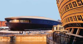
Experience amorphic ambiguity
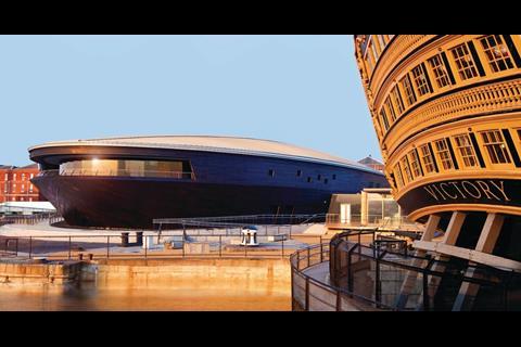
Ike Ijeh on Mary Rose museum, Portsmouth, 2013
“With its blackened skin and stealthy profile, the new museum cuts a seductive and sombre figure on the historic dock that pitches it in sharp contrast to its neighbours. Like a nebulous, ghostly void it lurks with amorphic ambiguity beside the riotous Gulliverian fantasia of old Victory next door.”
Plain English translation by Lee Monks: The new museum is dark and not as exciting as some of the buildings nearby, or this writer, who has clearly read too much JG Ballard.
Ike Ijeh translation: None required, makes perfect sense.
Unintelligibility rating: 0/5
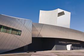
Feel the rigid totalities
Daniel Liebeskind on the Imperial War Museum of the North, Manchester, 2001
“The project develops the realms of the in-between, the inter-est, the realm of democratic openness, plurality and potential. By navigating the course between rigid totalities on the one hand, and the chaos of events on the other, this building reflects an evolving identity open to profound public participation, access and education. The building is therefore a catalyst for focusing energies - both entrepreneurial and spiritual - and moulding them into a creative expression.”
Plain English translation by Lee Monks: The project is a bit meh. You can describe it however you want to, really, as it’s utterly indistinct and so vague as to make a bad description impossible.
Ike Ijeh translation: Despite being commercially successful, Daniel Liebeskind is one of the leading figures in the world of architectural linguistic excess. I suspect the “chaos of events” refers to war, which is fair enough. But “rigid totalities” and “spiritual energies”? No idea. One can only imagine the chair-shuffling, throat-clearing, sketch-doodling bafflement that must have descended when this passage was read out to Manchester council.
Unintelligibility rating: 4/5
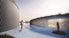
Embracing Juxtaposition
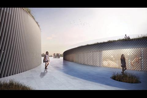
Bjake Ingels of BIG Architects on competition winning proposals for The Museum of the Human Body, Montpellier, France, 2013
“Like the mixture of two incompatible substances - oil and vinegar - the urban pavement and the parks turf flow together in a mutual embrace forming terraced pockets overlooking the park and elevating islands of nature above the city. A series of seemingly singular pavilions that weave together to form a unified institution - like individual fingers united together in a mutual grip.”
Plain English translation by Lee Monks: Like the mixture of two incompatible things - clarity and hubris - this terrible attempt to anthropomorphise clearly unsuitable elements would justifiably prompt singular thoughts in the reader - like individual fingers united together around the author’s neck.
Ike Ijeh translation: What Ingels is saying is that two things which are different (park and pavement) join together. Some may be surprised to learn that this relationship has not been invented for the competition in question but is quite common in several urban scenarios. Architects adore juxtaposition - you merely have to whisper the word within earshot of one before all manner of accelerated hyperbole spews forth. At least Ingels gives his a rather poetic slant; although the heavy anthropomorphic references he closes with are a reminder for the dimmer observers that he’s talking about a museum of the human body.
Unintelligibility rating: 2/5
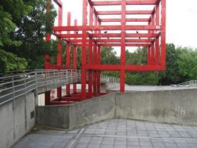
Interpretative infinity for the effect of refusing fixity
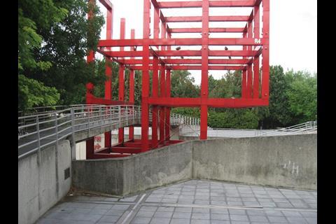
Bernard Tschumi on Parc de la Villette, Paris, 1988
“The park’s architecture refuses to operate as the expression of a preexisting content, whether subjective, formal or functional. Just as it does not answer to the demands of the self (the sovereign or “creative” architect), so it negates the imminent dialectic of the form, since the latter is displaced by superimpositions and transformations of elements that always exceed any given formal configuration. In a Nietzschean manner, La Villette moves towards interpretative infinity, for the effect of refusing fixity is not insignificance but semantic plurality.”
Plain English translation by Lee Monks: Parc de la Villette is a bit different. There are no phallic or weird signature shapes, thankfully, although it is tricky to describe as the architect was a bit mental.
Ike Ijeh translation: Not even Doctor Who could unravel this one. Without doubt, Bernard Tschumi is the Grand Wizard of Obfuscation, the undefeated Master of Miasma. One imagines that he would answer even simple requests for directions with sonnets and soliloquies charged with such withering uber-intellectual ferocity as to transform even the most ardent linguist into a pile of smouldering ash by the time he had finished. Like Eisenman he has spent much of his career tormenting architectural students, but at least Eisenman’s bleating provides unintentional humour; Tschumi is just blow after blow of cerebral haemorrhaging. It is a matter of extreme injustice that while one imagines that his buildings are subject to all manner of health and safety scrutiny, his pen is allowed to proceed unimpeded. Read him at your peril.
Unintelligibility rating: 5*/5
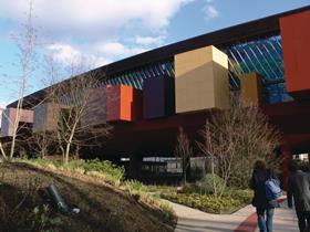
Enter into communion
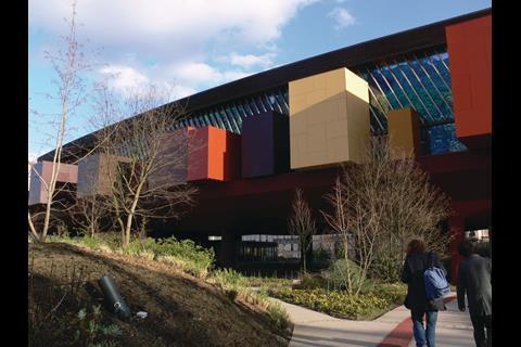
Jean Nouvel on Musée du quai Branly, Paris, 2006
“Everything is designed to evoke an emotional response to the primary object, to protect it from light, but also to capture that rare ray of light indispensable to make it vibrate and awaken its spirituality … Away, then, with the structures, mechanical systems, with curtain walls, with emergency staircases, parapets, false ceilings, projectors, pedestals, showcases. If their functions must be retained, they must disappear from our view and our consciousness, vanish before the sacred objects so we may enter into communion with them.”
Plain English translation by Lee Monks: I am a frustrated Sartre wannabe. Let’s throw everything out so we can enter into communion with it. Everything must disappear to remain. Light is unnecessary, but the light within things is what we must capture. We want to forget all about everything. Like what I was supposed to be on about. I am hoping that vacuous tautological contradictions will pass muster while I try to figure it out.
Ike Ijeh translation: Prince Charles needn’t have bothered trying to discredit Nouvel’s competition design for One New Change. If he’d had the wherewithal to send
a copy of this hilarious missive to Land Securities before the judging, there would have been no chance of the no-nonsense money men behind the UK’s biggest developer letting someone with Nouvel’s apparently fragile grasp of reality anywhere near their showpiece City shopping centre. I suspect Nouvel is trying to demonstrate that his museum is a bit spiritual. But far more interesting are the cultural differences his musings illuminate between Britain and France. This kind of thing is far more acceptable in a country that deifies philosophical discourse. Britain on the other hand has always had a healthy suspicion of overt intellectualism.While sixties European cinema gave us Fellini, Bergman and Bresson, we got the Carry On films.
Unintelligibility rating: 5/5
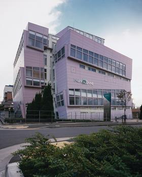
Anthropocentrism or phallocentrism?
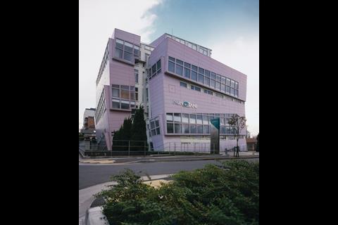
Peter Eisenman on Nunotami Corporation Headquarters, Tokyo, Japan, 1992
“Our project represents an attempt to rethink the symbolism of the vertical office building. Traditionally, the vertical building had two metaphoric connotations, one as a metaphor for anthropocentrism (the human vertebrae as upright, symmetrical and skeletal) and the other as a symbol of power and dominance, in particular, phallocentrism. Our building symbolically seeks to undermine these two centrisms, first by producing a building that is not metaphorically skeletal or striated … and second, by producing an image somewhere between an erect and a ‘limp’ condition.”
Plain English translation by Lee Monks: Horizontal is good, no? Well, I like it, and I’m cooler than you. I’m also baffling, so feel free to interpret my waffle as inspired genius. I’ve got an inferiority complex and this is my unwitting confession.
Ike Ijeh translation: You do not mess with Peter Eisenman. If Churchill said that the Soviet Union was a “riddle wrapped in a mystery inside an enigma”, then Eisenman is the Siberian snowstorm that obscures all three. Since the eighties thousands of architecture students across the world have been plunged into varying stages of bafflement and distress when trying to grapple with Eisenman’s unintelligible prose - one of the few immediate benefits of graduation is the realisation that he is not under any circumstances to be taken seriously.
Here, Eisenman is doing no favours for those who contend that modern architectural output has nothing to do with male appendages by reminding everybody that that’s exactly what his concept involves. Despite his best efforts, the message couldn’t have been clearer had this bizarre building been wrapped in latex and given zips for windows.
Unintelligibility rating: 5/5

Dive into the quasi-urban fields
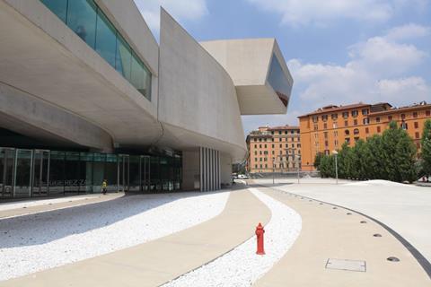
Zaha Hadid on MAXXI, Rome, 2010
“Our proposal offers a quasi-urban field, a ‘world’ to dive into rather than a building as signature object. The campus is organised and navigated on the basis of directional drifts and distribution of densities rather than key points. This is indicative of the character of the MAXXI as a whole: porous, immersive, a field space. An inferred mass is subverted by vectors of circulation. The external as well as internal circulation follows the overall drift of the geometry. Vertical and oblique circulation elements are located at areas of confluence, interference and turbulence.”
Plain English translation by Lee Monks: We are a pretty ordinary big building so I’ve got to talk us up a bit, bear with me. You can move inside it, and outside it. It’s a building. It’s big. There are holes in it, and it’s easy to get lost. It’s roomy. Like the inside of my head.
Ike Ijeh translation: Hadid straddles the divide between intellectualism and commercial success. Nonetheless, she still has form for pretentious indulgences, as this description of the MAXXI shows. Chinks of legibility manage to shine through: basically, the MAXXI is about lots of fluid-like forms, with lifts or stairs placed where the forms meet. Why didn’t the passage just say this? Therein lies the riddle of architectural texts.
Unintelligibility rating: 3/5
Mind your language!
Lee Monks of the Plain English Campaign wants to make a few things clear …
The pieces in question are, alas, typical of a prevalent trend that simply won’t go away. First, there is great liberty in having the opportunity to write about something that has not been definitively covered, cannot be definitively covered. With things like architecture, films, books, art and so on, there is the opportunity to interpret them in countless ways. This is very freeing, of course: but with that comes a huge responsibility and most commentators are too busy exercising their vocabulary to fulfil their obligations to comprehensibility.
Secondly, the over-reliance on knotty polysyllables may also indicate a poverty of original comment. You see the zealous infatuation with such terms as evidence of an individual’s weak intellect: they don’t need to use their brains any more - they can borrow perceived gravitas.
So the problem can be boiled down to this: when there is an opportunity to interpret something, and it’s either open-ended enough to accommodate anything, or it has been corroded by a viral language of vacuous, meaningless terms that opportunists and unoriginal minds can recycle forever. There is no need any more to make any sense.
Social media will only make this problem worse - people are now bigger, in their own perpetuated minds, than any subject. So, going forward … we need to go backwards. We need to stop showing off. Language is bigger than us, and communication - not self-promotion - is what it should be for.











2 Readers' comments