Following Feilden Clegg Bradley’s recent Stirling prize victory, we take a look at www.fcbstudios.com to see if its website design matches its Accordia project
Webmaster’s verdict
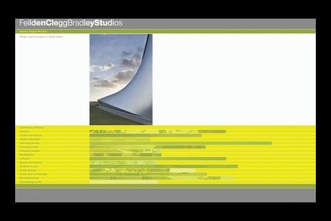
This website has a innovative, quirky navigation system based on expanding tabs. The concept is clever but initially confusing. I didn’t find it too offensive however, as you quickly get used to it and it’s quite a slick way to browse. Navigation breadcrumbs bring an essential familiarity for this sort ofnon-standard site design.
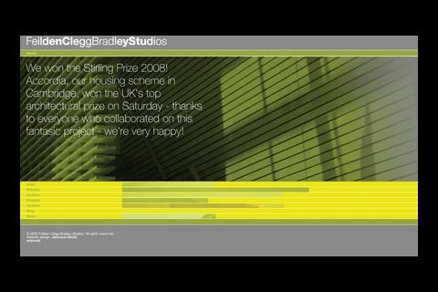
The colours could do with some improvements – the yellow-on-yellow look is not good for accessibility, as it hinders some colour-blind users. The site is set up ideal for Google indexation because dynamic HTML was chosen over Flash, but identical titles on every single page will stop it from climbing to page one for the architect’s own projects.
Vital statistics
3,278,690th most popular site on the internet globally, as ranked by web information company Alexa
Google ranking 5/10
This ranking indicates how important it is to other sites that link to it
Inbound links Yahoo 1,291
This shows how many pages Yahoo says link to the site
Indexed pages
Google 1,770
Yahoo 1,183
This shows how many pages on the site have been recorded by Google and Yahoo.
Postscript
Greg Morris is an online supervisor at www.building.co.uk


No comments yet