Another veteran First Impression panellist, this time from Nottingham University, returns to comment on recent images of new projects on the Building website
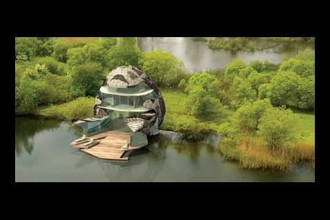
The Orchid House designed by Sarah Featherstone for the Lower Mill Estate in Gloucestershire
Owen's verdict: The form is bizarre and it looks like it would be impossible to live in. Looking at some of the other houses in the development this looks weak. Sarah Featherstone has enjoyed a lot of praise for her housing projects in recent years but what she does is similar to the work of Dutch architects about ten years ago. I don’t like this, it looks too odd; like a half unwrapped Easter egg.
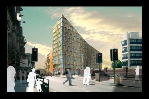
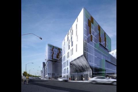
Make Architects’ Meadow Gateway Scheme in Nottingham
Owen's verdict: Make are taking over Nottingham! They have this development and the new campus at the University. This building has an interesting form and would be a welcome intervention in a less salubrious part of the city. Make have a habit of choosing foul façade materials though; I can’t make out what this one is but it looks a dubious choice.
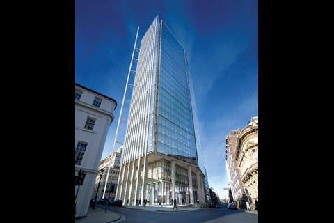
Hamilton Architects 35 storey tower for the centre of Birmingham
Owen's verdict: It’s hard to have an opinion on this, it’s a bit bland.
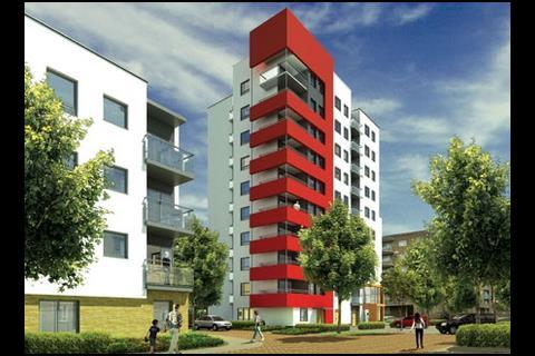
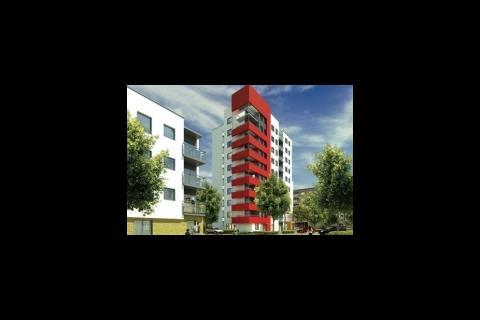
PRP’s design for redevelopment of the South Acton Estate
Owen's verdict: Painting it red doesn’t make it interesting.
Sheppard Robson’s Love Lane development for Tesco in Woolwich
Owen's verdict: This has echoes of Rem Koolhaus. It looks like a really good attempt too. The asymmetry on the façade and the quirky form make it quite interesting and hard to read… Maybe Hamilton Architects should take a look at this.
Postscript
Owen Pritchard is currently studying for his Dip(arch) at Nottingham University. If you're an architecture student and would like to give your opinions on some recent projects please contact NShahmanesh@cmpi.biz
Past First Impressions:
Typical Alsop - not sure how suited it is to the old English institution of cricket...









No comments yet