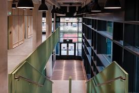
Phase One allows the industry’s latest recruits to make contacts, learn about its most exciting projects and, in the case of this one at Bristol, consider the building as enormous artwork.

Bristol could make a strong claim to be the public art capital of Britain. This is Banksy’s home city, where council graffiti cleaners turn a blind eye to his increasingly valuable works, where Turner prize-nominated artists design park benches and fashion designers paint the walls of car parks.

It would be nice to think this was all a spontaneous outpouring of creativity, but with the possible exception of Banksy, Bristol’s many public artworks are the result of a concerted strategy on the part of its city council and a dedicated team that encourages developers to embed art in their schemes.

This means that anyone involved in buildings in the city also has to get involved with art. So when Building held the latest of its Phase One networking events in Bristol two weeks ago, we planned the evening along artistic lines. Nearly 70 new professionals from across the industry joined us upstairs at The Pavilion, a newly built “urban village hall” for Bristol, to network and hear talks by the people behind the project, including Nick Childs, co-founder of Childs + Sulzmann Architects.

The Pavilion and Nick Childs

The Pavilion is but a £1m fragment of Crest Nicholson’s £400m Harbourside development, a mix of new homes, big corporate offices and leisure facilities. Childs, who was involved in developing the masterplan of the area, explains how each of the buildings has some kind of art associated with it – although some of it was what he called “plop art”, where architects build the plinth and the artist puts something on it. He decided to take the integration of artworks one step further to make the whole building a work of art.

This is where Dail Behennah came in. To call Behennah a basket weaver is like calling Banksy a mere tagger – her crafts have been shown in the V&A and in exhibitions worldwide – but the intricate balustrade and curved staircase she designed for The Pavilion do indeed look much like wickerwork. Childs says the design was all about the shadows – and although the result is spectacular, for Behennah it must at times have been a frustrating experience. “Every time she wanted to talk about the balustrade, we had to talk about Building Regulations, the size of a baby’s head, turning circles and whether you could put a pint of beer on the handrail … ”

Childs took the integration of artworks and construction one step further by making the whole building a work of art.

If the demands of safety were an eye-opener for Behennah, Childs found he learned as much from her. “She would always see a more refined solution. The result is that our simple little building became something quite beautiful.”

But what was it like having another creative perspective on board? “You just have to swallow your ego.” In fact, there were advantages, especially in negotiations with the design-and-build contractor. “They were much happier to listen to the artist than me. If Dail said it had to be a certain way, then it had to be; if I said it, they couldn’t afford it.”

One QS asks about the financial implications of the collaboration. Actually, it was an advantage, replies Childs – it meant the dedicated art budget for the building could be put towards the build – something developers were only slowly wising up to.

Public art trail

After his talk at The Pavilion, Childs sticks around to join Aldo Rinaldi, Bristol’s senior public art officer, in leading a tour around some of Harbourside’s other landmarks.

First stop is the grassy area beside the new HBOS building – no doubt a site of much quiet contemplation of late. As we assemble in the dark around a circular stone bench inscribed with mysterious letters, there are uneasy jokes about cults and human sacrifice. “Domain” is in fact a fairly innocuous seating area, albeit designed by Turner Prize-nominated husband and wife team Langlands & Bell. It represents the international history of this trading city by means of the dot.com domain names of countries. But public art is a mysterious thing, says Rinaldi.

If Dail told the contractor that it had to be a certain way, then it had to be; if I said it, they couldn’t afford it.

Nick Childs

“A lot of you are probably thinking ‘it’s just a bench’ and ‘how much did it cost’,” he says, to a few smirks. But others just want more explanation with their art: “I know what it means now, but I didn’t have a clue before. Couldn’t you just have a little stand here to explain or something?”

The problem is that artists don’t really like explaining themselves. “They say: we don’t want to give too much away, we want people to respond to the works themselves,” offers Childs.

Nearby, on Cathedral Walk, red neon ropes lace back and forth above our heads, an installation by Richard Box. There’s an obvious reference to the ships’ rigging, but Rinaldi is reluctant to offer more. “I don’t want to explain it away; you need to read into it yourselves.”

Despite the ropes’ eerie beauty, there was much prosaic wrangling behind the scenes, adds Childs. “We ran into all sorts of health and safety issues. You come across that all the time in public art, whether it’s a horse on a plinth children might climb on or neon lights.”

At the entrance to the car park, there are painted enamel panels by Julie Verhoeven, an “achingly hip” fashion illustrator more commonly found daubing on Mulberry bags or Primal Scream album covers than car park walls. “I don’t know that much about this work,” admits Rinaldi. “Some of the panels are a bit naughty though …” The audience studies them more closely. Childs helpfully makes the connection between the artwork and the graffiti so often seen in car parks. “Can it be graffiti if it’s commissioned?” wonders someone.

Disappointingly, the Lightwall created by lighting architects Speirs and Major Associates in Millennium Square hasn’t been working for a while. If it had been, our movements would have been replicated in lights on a mesh strung from the front of the building. It did work for a year or so, but Childs says the software powering it is “too clever for its own good”. It’s a charge levelled at much modern art and, in this case it’s actually true.

‘I don’t know that much about this work,’ admits Rinaldi. ‘Some of the panels are a bit naughty though’

There is more to see, but time is getting on, so Childs and Rinaldi lead a thoughtful but slightly chilly crowd back to the Pavilion.

White design

Craig White and Till Scherer from Bristolian architect White Design are chomping at the bit to begin their presentation, so as soon as coats are off and drinks back in hand the group is hushed for the final time.

If Britain needs an answer to Al Gore, we may have found one in Craig White. Engaging, erudite and in possession of an exhaustive supply of statistics, within the first 10 minutes he has demystified a number of much-quoted but often hazily understood eco-concepts such as One Planet Living, the Vostok ice cores and peak oil.

Our decadent European lifestyles are consuming three times our fair share of the planet’s resources, he says – the only upside is that at least we’re not as bad as the Americans, who must each reduce their consumption by 80% to live sustainably.

Buildings are a big part of the problem but engineering alone cannot find a solution. In fact, the structure of a building and the systems within it are entirely at the mercy of the occupants – whom White claims can halve or double a building’s emissions by the way they choose to use it.

A worrying message, perhaps, but then not everyone can hold an audience of 70 people for three quarters of an hour.

Move over Al …