The LSE’s brief for the latest addition to its collection of buildings within the tightly knit complex of streets that make up its estate called for sports and arts facilities, teaching space and research accommodation. It was a lot to fit in but inspired a highly innovative response. Thomas Lane reports. Photographs by Oliver Lane
For a rollcall of some of the world’s best architects, look no further than those on a shortlist for a London School of Economics and Political Science project. The LSE has a strong reputation as an enlightened client willing to invest in high-quality architecture and to take risks by sometimes engaging smaller, less well-known practices that go on to join that list.
The LSE has been busily upgrading its estate from a rundown, random collection of buildings dotted around the streets off Kingsway in central London to fulfil its aspiration to create a new university quarter with buildings reflecting its status as a world-class academic institution.
It has gradually created an amazing collection of buildings which started with the radical reworking of an Edwardian office by Grimshaw back in 2008. The Saw Swee Hock student centre completed six years later and is a dramatic exercise in interlocking triangular and rectangular shapes softened by beautifully crafted red brick anchoring it back to more prosaic neighbours. Designed by Dublin-based practice O’Donnell+Tuomey, the building was shortlisted for the Stirling Prize in 2014 with O’Donnell+Tuomey going on to win the Gold Medal in 2015.
The Rogers Stirk Harbour + Partners-designed Centre Building completed in 2019 and is very different: typically RSHP with expressed structural elements and splashes of vivid colour; the 13-storey rectangular block is animated by a huge staircase clearly expressed through the glazing and enlivened by stepped red soffits. It has proved hugely popular with students as a socialising and work hub.
And now there is the latest addition to the collection, the Marshall Building, designed by another Dublin-based practice, Grafton, recipient of the 2020 RIBA Gold Medal. Grafton received the highest architectural honour, the Pritzker Prize, last year and most recently won the Stirling Prize for another academic building, the Townhouse at Kingston University.
The £145m Marshall Building is very different from its illustrious forebears. Unlike the others, it faces onto the generous, formal space of Lincoln’s Inn Fields whereas the side and rear elevations address the tight network of intimate streets making up the LSE estate. It also has Saw Swee Hock as a near neighbour to the west.
Who is Paul Marshall?
Sir Paul Marshall founded the Marshall Institute at the LSE with fellow financier Sir Thomas Hughes-Hallett with a donation of £30m in 2015. The institute was founded to improve the impact and effectiveness of private action for public benefit with a focus on research.
Marshall’s wealth came from hedge fund Marshall Wace which today manages over $50bn of assets. Marshall donated a further £50m to the institute last November which will help the world’s most promising social ventures scale up to tackle global challenges such as climate change, social inequality and public policy.
Marshall’s son is Winston Marshall, former Mumford & Sons banjoist; his daughter, Giovanna Marshall, is a singer and songwriter.
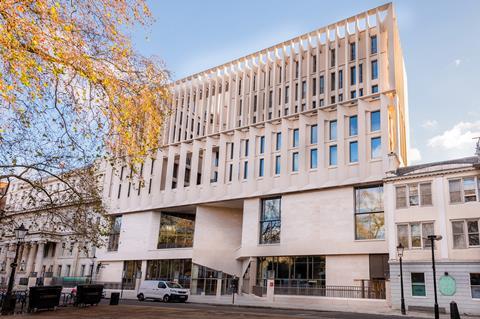
The Lincoln’s Inn Fields elevation has a more formal facade which follows the building line of this street. The lower two storeys feature an ashlar Portland stone facade interspersed with generous, punched windows at first-floor level with larger areas of glazing on the ground floor. A triangular inset breaks up the classical symmetry, clearly demarcating the building’s main entrance.
The classical theme continues above with a row of angled fins separated by glazing. This is topped by a colonnade of square, regular columns. These elements disguise the triangular inset which continues to roof level.
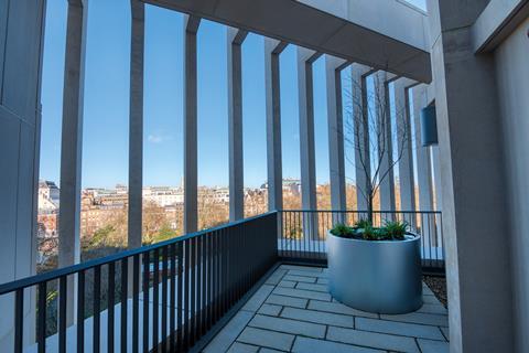
The highest point on the building is the Paul Marshall Institute, a research centre for philanthropy and social entrepreneurship. This is expressed as a belvedere which is set back from the front of the facade, preserving the orthogonal quality of this elevation.
The rear and side elevations continue this theme of orthogonal and rotated elements but overtly to soften the building’s mass to help it better relate to the narrow streets on these sides of the building. The mix of Portland stone and matching precast concrete used above first-floor level also helps to soften the building’s presence and provides a visual link to the neighbouring Royal College of Surgeons.
The interior belies this distinctive yet respectful exterior. The ground floor is a huge, dramatic space occupying most of the available area, providing an uninterrupted link between Lincoln’s Inn Fields and the tightly knit spaces of Portugal and Portsmouth Streets to the rear and side respectively.
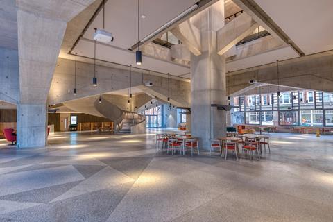
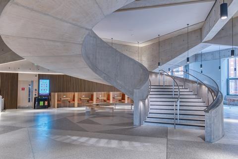
Drama is provided by the muscular structure; large columns are connected by beams that start low on the columns and taper upwards towards the mid-point. Named the Great Hall, this structural symmetry is interrupted by a huge, helical central stair that draws you upwards.
Above, the ground floor expanse is replaced by smaller but still generous spaces for informal socialising and work, with lecture theatres located off this central space. The structural elements follow the same style as the ground floor but are scaled down on the first floor. This arrangement continues on the second floor but with less pronounced structure.
The structural drama of the ground floor links directly to the first and second floors via giant tree columns that punch through first-floor openings with branches that splay out to support the first and second floors.
LSE estate strategy and why Grafton won the job
The London School of Economics and Political Science occupies a disparate collection of buildings in an intimate huddle of streets off London’s Kingsway. Most of these were not built for academic use and were in poor condition, so the university has been pursuing a strategy of improving and in some cases redeveloping these buildings to better fit its needs.
Additionally, LSE wants to expand its estate northwards towards Lincoln’s Inn Fields because King’s College London occupies all the space to the south. “The estate strategy is to create a world-class estate commensurate with our world-class academic standing and to create a university quarter,” explains Julian Robinson, the LSE’s director of estates.
When Cancer Research UK’s laboratories on Lincoln’s Inn Fields came up for sale, due to the charity moving into the Francis Crick Institute, the LSE jumped at the opportunity. However, the proximity to one of London’s most prestigious legal centres meant there was stiff competition for the site.
“When we were bidding for the site, the main opposition was the Candy brothers for very high‑end residential,” explains Robinson. “This would have been strategically disastrous for us because we have got the students union opposite, we are trying to create a university quarter and the two might not have gone together well.”
Fortunately for the LSE, it won the site although Robinson concedes he had to “bid hard” to secure it. A £30m contribution from financier and alumni Sir Paul Marshall helped with the costs.
A key part of the brief was to accommodate a sports hall. “We had one badminton court; that was it. That’s not a sports hall but just a badminton court,” says Robinson.
Six architects were shortlisted, including Niall McLaughlin with Scott Brownrigg, AL_A, Herzog & de Meuron, David Chipperfield and Diller Scofidio + Renfro with Penoyre & Prasad.
Robinson explains why Grafton won the commission. “They had created a permeable, transparent floor plane, their research was excellent, we liked the materiality that was proposed, and they got everything we wanted into it and created the concept of the Great Hall which wasn’t a prime focus of the brief.”
In common with all the LSE’s architectural competitions, staff and students got to vote for their favourite project. “In all of our design competitions either the number one or runner-up in the student/staff plebiscite has been the winner selected by the jury panel,” says Robinson. ”I like to think our students are pretty savvy when it comes to world-class architecture.”
And what about the divergent nature of the buildings the LSE has commissioned over the past 15 years? “We like that individualism,” says Robinson. “It is quite reflective of LSE: we are not a monolithic institution; we are the home of Hayek and also the home of Ralph Miliband – Marxists and free-marketeers, which shows the plurality of the institution. I like to think our buildings reflect that.”
This structural drama is a complex, highly innovative response driven by the demanding brief. “It was a very complicated brief because we wanted a sports facility, arts facilities, teaching space and research accommodation. It was a lot to fit into the site,” says Julian Robinson, the LSE’s director of estates.
With one badminton court serving the entire university, Robinson understandably wanted something more substantial: a four-court sports hall built to Sports England standards, which call for a space 34.5m long, 20m wide and 7.5m high.
The building formerly occupying the site, Cancer Research UK’s London Research Institute, benefited from a triple-height basement. It made sense to slot the sports hall into this space given its scale and the fact that these are usually artificially lit.
The lecture theatres were to be on the first and second floors, making them easily accessible for students, with the floors above reserved for offices and meeting rooms. Logical as this might sound, the decreasing size of the structural grid going up the building meant that large transfer structures would have been necessary to get the loads down to the foundations.
Grafton started thinking about how this could be done after a site visit. “The engineer [AKTII] said we were going to need a really big truss and it would be a challenge to put something so big in the lower ground of such a big building,” says Shelley McNamara, co-founder of Grafton. “We started to think about how we could make the ground floor the transfer structure. We are always interested in structure being the friend of the architect – it is one of the key elements in our thinking.”
Grafton threw itself into finding a solution, including looking for suitable references locally. A tiny nearby chapel off Lincoln’s Inn Fields provided inspiration and, crucially, a potential structural solution too.
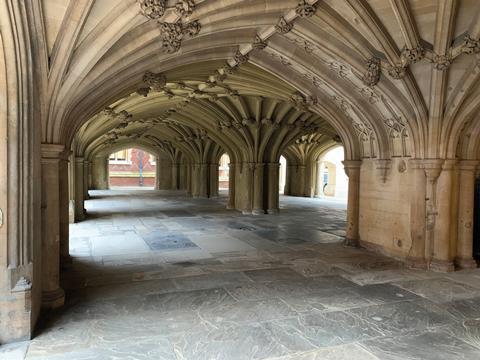
“It is completely open underneath with a beautiful stone vaulted structure without any doors,” explains McNamara. “It has a sad history; unmarried mothers used to leave their unwanted babies in that space as they would be taken in and looked after.
“What we found extraordinary was finding a completely open space in the city; the way into the chapel was up stairs with the door at the top. For us that was a magic experience: that you could make a world which is about one thing, you come through that world and discover a whole other world above.
“That space under Lincoln’s Inn Chapel became the project, it became the Great Hall of the ground floor, and it was triggered by the question of how are we going to make the transfer from the large to the small.”
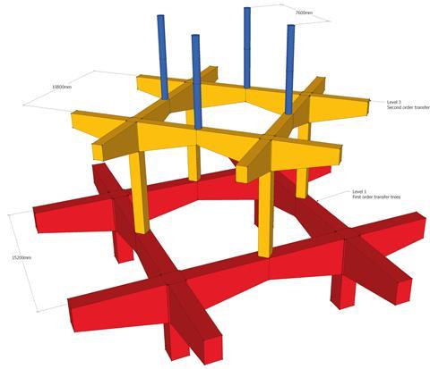
The ground floor structure is a 15m grid, which switches to a 10.8m grid for the lecture theatres on the first and second floors and a 7.6m one for the offices above. Engineer AKTII, which entered the competition with Grafton, came up with a neat, original solution to the question of how this could be done without filling the building with dedicated structural zones.
This was done by the apparently simple expedient of rotating the 10.8m grid by 45 degrees so that the columns of the 10.8m grid are supported in the centre of the ground floor beams. The 7.6m grid rotates another 45 degrees so it is supported by the first-floor beams.
“It’s quite a complex piece of engineering made simple by a rotation on plan, says Marta Galinanes Garcia, design director at AKTII. “If you had done it traditionally, you would have had a great big transfer structure across the whole floorplate, which wouldn’t have been so efficient.”
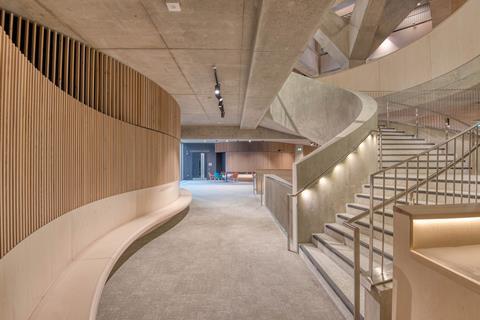
But supporting the structure above each structural zone on the middle of a beam was a challenge, particularly when the design called for a beam that replicates the vaulted arch structure of the chapel – the beams needed to be deep where these met the columns and shallow in the middle at the point where the columns above are supported and the loads are the greatest.
The answer was to conceive the structure supporting the columns above as cantilevers rather than beams. McNamara says Grafton was concerned about the size of these. “One of the things we were worried about when we started to develop the detail was how big the beams were and how low the springing point was, because we couldn’t go up much for planning reasons.”
AKTII worked out that the cantilevers would be 3.75m deep from where these meet the column to the top of the floor slab. Although this could be accommodated within the planning envelope, a “colossal” amount of reinforcement would be needed, making the structure very complex to build.
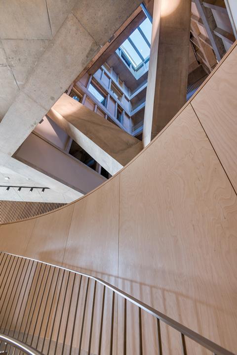
This led to the second innovation on this project: to post-tension the cantilevers, which reduced the volume and complexity of the reinforcement. The floor slabs are also post-tensioned to reduce their depth.
Project director Jeremy Eavis of main contractor Mace says it was particularly challenging doing the cantilevers due to the amount of reinforcement and the fact that it was combined with the strands needed for the post-tensioning, which had to be threaded through the rebar.
A full-size prototype column and cantilever was built in Greenwich a year before starting on site to work out how these were going to be built once the project started. Eavis describes this as a “massive learning curve”.
“We worked out how we were going to deliver the rebar, how we were going to thread the PT through, what mixes of concrete we were going to use to achieve both the finish and the strength and then formwork arrangements to achieve the detailing the architect was looking for. Just that one element took a massive amount of planning,” he says.
“To have done that for the first time on site without that would have meant we had a lot of issues, whereas we had issues with the prototype which we were able to iron out and get right.”
Another challenge was the fact that the site slopes down from the Lincoln’s Inn Fields side to the rear of the building. Stairs would have ruined the seamless connection between these two sides of the building, and so the floor has a 1:60 slope.
“That was hell to make work at all the door thresholds,” says McNamara. “We had one architect working on that for weeks, if not longer. It was interrogated to the nth degree.”
The huge helical stair is intended to recreate the quality of the space at the Lincoln’s Inn Chapel. “We wanted to have a staircase which would feel like Lincoln’s Inn Chapel, a rhythm of space that brings you up to a whole other world above,” says McNamara.
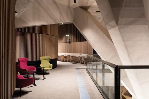
“We didn’t want the worlds to be completely separate, because in universities it is very important when you come out of whatever room you are in that you can somehow engage with the life of the university. You can see if the ground floor is busy. If there is something happening, you can hear it, but not have it interfere with your own work and need to concentrate.”
She adds that stairs are an important part of the social life of the university. “People use stairs because they are social channels. You meet someone on a staircase – it is a very different experience from meeting them in a lift.”
McNamara and Robinson hope the spaces arranged around the stairs on the first and second floors replicate the success of the social learning spaces in the Centre Building. The furniture provides splashes of colour and was selected, and in some cases designed, by Grafton who wanted the furniture to feel integrated into the building rather than floating in space.
The key dramatic acts are the feature tree columns punching through the slabs. These are actually steel but concrete clad so they match the rest of the structure.
The John Soane Museum is on the other side of Lincoln’s Inn Fields. McNamara says that, while there are not any direct references to Soane’s work, Grafton has embraced Soane’s ability to channel natural light deep into buildings – the tree columns are one device to help achieve this.
Acoustics
For Grafton, good acoustics were central to achieving that sense of university life going on around people without it intruding. McNamara says a lot of contemporary spaces that she visited in London looked great but were noisy – so a lot of effort went into ensuring that this was not an issue in the Marshall Building.
“What a building sounds like is as important as fresh air and sunlight; whether it feels intrusive and hard or soft and calm,” she says.
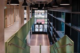
Vertical wooden strips fixed to the walls help to soften the space visually and hide sound-deadening material. Sound-deadening panels are also used on the ground-floor soffits to help control reverberations. The upper floors are further softened visually and audibly with grey carpet.
This attention to detail also extends outside – McNamara says a lot of time was spent on ensuring the north elevation overlooking Lincoln’s Inn Fields did not feel cold. This has been achieved by the use of Portland stone and animating the facade with the fins and colonnade. “That is why we left the frame open at the top, so sometimes the light will feel like it is flowing down from above in the facade, and that is the reason for twisting the fins, that somehow we will catch the light.”
What a building sounds like is as important as fresh air and sunlight; whether it feels intrusive and hard or soft and calm
Shelley McNamara, Grafton
There was not much evidence of this when Building visited, which is not surprising given that this was close to the shortest day of the year, but photographs taken earlier in 2021 show the sun capturing the open colonnade in a blaze of warm light. The structural shenanigans meant that getting the interface between the facade and structure right was a challenge because the ends of the cantilevers deflect more than a standard slab, with the effect being magnified by two due to two levels of cantilevers.
For Robinson a major coup was getting Westminster council to pedestrianise Portsmouth Street. This will emphasise that this is a university quarter rather than a traffic rat-run.
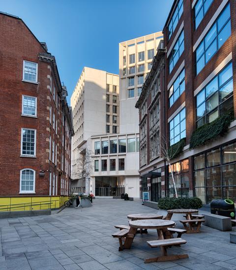
This side of the building faces the Saw Swee Hock student centre and two pubs. A stone bench runs the full length of the building on this side to further emphasise that this is a social space.
The battle to get students to come onto campus has never been more challenging, given covid-19 and the rise of online learning. Places need to be special to tempt students out of their home studies. The Marshall Building manages to provide uplifting, dramatic spaces that rise above the ordinary yet promises congenial and functional learning and socialising spaces. Given the thought and care put into it by the whole project team, it deserves to succeed.
Project team
Client London School of Economics and Political Science
Architect Grafton Architects
Structural engineer AKTII
MEP engineer ChapmanBDSP
Cost consultant Gardiner & Theobald
Project manager 3PM
Planning consultant Turley
Main contractor Mace
Concrete specialist Getjar
Steelwork specialist Bourne Steel
Precast cladding Techcrete
Stonework specialist Putney & Wood
Demolition specialist McGee







No comments yet