The National Maritime Museum’s £35m extension reconciles the rich architectural heritage of its Greenwich home with the need to provide thoroughly modern facilities. Building celebrates a building firmly anchored to its surroundings
There can be few more intimidating places to insert contemporary architecture in London than Greenwich. The Queen’s House was the first classical building ever built in the British Isles. The Old Royal Naval College is considered by many architectural historians to be Wren’s greatest work. It forms the centrepiece of a spectacular classical ensemble referred to by renowned critic Nikolaus Pevsner as “one of the finest baroque set-pieces in Europe”.
As well as Wren and Inigo Jones, some of the most influential figures in English architecture also left their mark here, including Hawksmoor and Vanbrugh. And to top it all, Greenwich is one of only four Unesco World Heritage Sites in London.
None of this, however, fazed architects Purcell Miller Tritton and CF Møller which have just completed a £35m extension to the National Maritime Museum: the Sammy Ofer Wing. “Obviously we were conscious of the world class location and heritage,” explains PMT project architect Elizabeth Smith, “but we remained committed to our core concepts, which were to present the museum with a new facade onto Greenwich Park, to provide a clearer link between the main museum and the Royal Observatory, to deliver contemporary architecture that was sensitive to its historic surroundings and to provide up-to-date facilities that allow visitors to experience the full breadth of what the museum can offer.”
This has been achieved against the backdrop of a period of unprecedented notoriety and publicity for the south London borough. Greenwich Park is the controversial venue for the equestrian events during next year’s Olympic Games. The Queen is set to elevate the borough to “royal” status next year as part of her Diamond Jubilee. And work is proceeding apace on Grimshaw Architects’ restoration of the Cutty Sark tea clipper, also set to re-open next year.
The core concepts that drive the new museum - nature, connectivity and modernity - are all realised through simplicity and understatement
“This is an exciting time for the area,” says Kevin Fewster, director of the National Maritime Museum. “Our buildings will house Locog (London 2012 Organising Committee) officials during the Games. The new wing is our contribution to this activity.”
The museum is housed in several long ranges of neo-Palladian blocks located on either side of the Queen’s House. They were designed by Daniel Asher Alexander in 1807 and extended by Philip Hardwick and others in the 1860s and 1870s but the museum has only occupied the buildings since 1937; it was built as the Royal Naval Asylum before being converted into the Royal Hospital School in the mid-19th century.
Grade I-listed by virtue of its neighbours and location rather than its own architectural merits, the museum’s cream and pink stucco facades have a mawkishly synthetic quality to them, with the exception of its triumphal Doric entrance screen. The last major work to the museum was completed in 2000 when Rick Mather’s Neptune Court, a glass-covered courtyard gallery in the heart of the complex, opened.
The Sammy Ofer Wing is located at what was formerly the rear facade of the museum, on the north-western edge of Greenwich Park. It overlooks the test area being constructed for London 2012, which will in all likelihood afford the building the salacious prospect of global TV exposure next year.
The relationship with Greenwich Park was crucial to the new wing’s design. This building forms the new main entrance to the entire museum while the current entrance through the Victorian Doric screen will become a group entrance. “By having a new entrance facing on to the park it will be easier for visitors to make the connection between the Royal Observatory and the museum,” says Fewster. The new wing is consciously designed to shift the museum’s contextual focus onto the park.
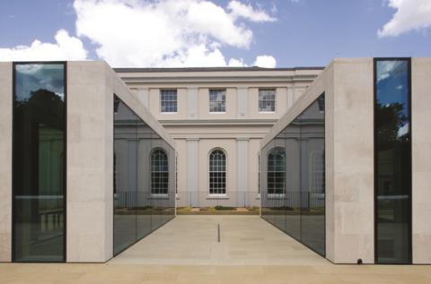
Externally, the Sammy Ofer Wing comprises a long, low, 3m single-storey pavilion situated in a narrow strip between the museum’s south-west wing and a path that runs along the edge of the park. The roof of the new wing is occupied by a public roof terrace and is also intermittently punctuated by three full-height rectangular “lanterns”.
Two of these act as giant roof-lights to the entrance lobby below and the third - the largest - contains a public brassiere. Two broad, processional ramped walkways on either side of the new wing provide access to the roof terrace while a water cascade beside the entrance also negotiates the level change.
The lower-storey features full-height glazed panels set within a narrow Portland stone frame, which provides a strong, horizontal emphasis. The proportions shift to the vertical for the upper lanterns; each one is clad with vertical strips of stone set flush beside narrow glazed openings.
Several of these openings are aligned to the sash windows of the south-west block behind them and the setting-out of the lanterns themselves was determined by the grid of the museum’s classical bays beyond. As Smith explains: “We wanted to pick up the proportions of the historic facades but reinterpret them in a contemporary way.”
The new wing certainly manages to combine historic deference with a bold, contemporary spirit. The massing of the block is simple but determined with strong, clean lines that merge seamlessly into both the park landscape and the classical proportions of the original museum. Even with the sprouting lanterns, the wing is low enough not to obscure the facades but manages to more than hold its own against its higher, older neighbour.
However, its weakest element is visible towards the top of the glazed panels on the lower storey. In an effort to minimise the vertical depth of the stone band that runs along the roof of the facade and thereby safeguard the horizontality of the elevation, the top of the glazing is set forward from a parapet wall that acts as an up-stand for the roof terrace. This leaves the thick vertical face of an exposed concrete bulkhead clearly visible behind the top of the glazing, a curious, messy detail that contradicts the crisp efficiency evident elsewhere.
The landscaping around the entrance front however is superb. The new block is set lower than that of the park and with the additional rooftop terrace level above, the landscaping forms a dynamic sequence of merging ramps, levels and gradients that groove the building into its surrounding natural terrain. It also reinforces the strong horizontal emphasis evoked by the lower entrance facade.
As well as a cascading water feature, a water channel set just above the ground runs the full length of the path adjacent to the entrance. The ground is paved with Crosland Hill stone slabs, their rich, yellowy texture contrasting with the grass beside it and complementing the paler Portland stone of the museum. And with the rooftop terrace, the contribution to public realm is generous. Smith points out that the quality of the landscaping was key to gaining the support of English Heritage and the local authority. “Anchoring the scheme so strongly to its surroundings enabled us to lock the design into the landscape and satisfy their conservation requirements.”
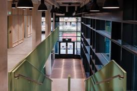
Internally, the Sammy Ofer Wing offers several spaces and facilities that breathe new life into the museum. Although its exposed, fair-faced concrete finishes aren’t great, the entrance foyer is a broad, spacious lobby again defined by clean lines and flooded with natural daylight admitted via the vertical glazing and soaring lanterns above. Internally, the historic south-west block has been gutted and refurbished with an airy, full-length reading room and two levels of archives above, painstakingly configured to comply with the archive storage requirements of BS 5454 (recommendations for the storage and exhibition of archival documents). Smith identifies this as one of the hardest challenges of the scheme.
In many public areas, such as the brassiere and foyer, fixtures and furnishings cheerily evoke a maritime theme. Several light fittings are finished in bronze or brass and the svelte, silver shimmer of several undulating, perforated metal ceiling panels recalls the motion of the sea. And of course, most spaces provide luscious views out onto the rolling lawns of Greenwich Park outside.
However, most importantly from a curatorial perspective are the new technical innovations that enable the museum to mount the kind of interactive audio-visual displays that would have been impossible previously. This is most evident in the Voyagers’ Gallery where sound and images are projected onto a vast canvas, exploring themes of navigation and discovery.
Throughout the museum, UV controlled glazing and acoustic attenuation provide the purpose-built flexibility that the museum - a converted school - has never enjoyed before. Neptune Court, formerly the museum’s principal exhibition space, is permanently naturally lit and presents fixed acoustic and lighting conditions that cannot be controlled. Fewster points out that “for the first time we have an exhibitions gallery designed to stage major exhibitions in best practice facilities.”
Arguably the two highlights of the museum’s interiors are two very different spaces. The first is ordinarily the most banal of all back of house apparatus: a goods lift. But this isn’t any goods lift; it’s a gargantuan 6m x 4m x 4m monster that enables the museum to transport virtually any exhibit it likes without dismantling it first.
The second is deep in the bowels of the building in its basement. During the construction of the wing 800m2 of earth was excavated, a process that also yielded the unexpected booty of 20 scurvy-ridden sailors’ corpses and several lead coffins, standard fare in Greenwich. The latter remain in place due to their tendency to explode upon touch. The purpose of the excavation was for a cavernous, 7m high hall, again allowing the museum to mount rolling programmes of new interactive exhibitions.
It is the journey down to the hall itself that resonates. A gaping hole is cut into the entrance lobby through which either a staircase or a glass lift descends into a stark, white atrium. However, despite the sensation of descending into earth, daylight is surreally present, pouring through the lanterns and glazing above, which allow glimpsed views of the sky and trees outside. It is an experience that encapsulates the core concepts that drive the new museum - nature, connectivity and modernity - all of which are realised through simplicity and understatement.
Fewster however probably sums up the Sammy Ofer Wing’s aspirations best. “If you live in the British Isles then even if you don’t know it, there’s a strong chance that you or someone you know has some sort of connection to the sea. And that’s basically what we’re here to show as best we can.”
PROJECT TEAM
client National Maritime Museum
funding Sammy Ofer / Heritage Lottery Fund / National Maritime Museum
concept architect C F Møller
executive architect Purcell Miller Tritton
main contractor Lend Lease
structural/civil engineer Adams Kara Taylor
services engineer Mott MacDonald Fulcrum
cost consultant Turner & Townsend
landscape architect Churchman







2 Readers' comments