Rather than following the traditional quad layout, London-based architect Gort Scott has made the most of the scenic location to open up St Hilda’s and use the River Cherwell for passive cooling. Even the new buildings’ brickwork appears to dissolve in the tranquil surroundings, Richard Gatti reports
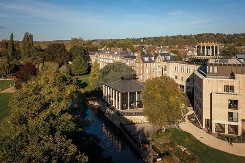
Gort Scott’s interventions at St Hilda’s College, Oxford, can be described in three parts: the pavilion, the Anniversary Building and the landscape.
The pavilion is the showpiece: a 275m2 event space that sits at the fulcrum of the site, a bend in the river and on-axis with the college entrance. In plan it is pentagonal, and the bulk of the footprint is occupied by a double-height space, also pentagonal and fully glazed to give views down the river (in two directions), across to Christ Church Meadow and back towards the entrance.
While the pavilion is steel in structure (bronzed universal columns are exposed on the inside, while stainless precast tensioning elements are visible in the roof), externally it is defined by bladed precast concrete columns. These increase the depth of the facade, giving a play of light and shadow, and play with the transparency of the building edges – from an oblique view, it appears solid, whereas a more straight-on approach reveals its transparency. As the sides are not parallel, this leads to a perpetual dance of the solid and the permeable.
Gort Scott resisted the temptation to create quads and instead redefined the college as a string of buildings settled on a pleasant meander by the river
The building sits partly on the foundations of Milham Ford, an old school building that had been converted to include teaching accommodation and the chapel. These have been hollowed out to allow space both for the Cherwell to flood, and for the river to provide passive cooling of the pavilion, continuing an interest in natural ventilation evident in the practice’s Hills Road office project in Cambridge.
The Anniversary Building is more complex in programme: at 3,137m2, it includes a new entrance and porters’ lodge, a three-storey block of administrative and teaching spaces and a four-storey block that holds 60 en-suite student rooms. A combination of the sloping site and careful adjustment of the floor-to-ceiling heights enables the latter two elements to share a roofline.
Both are formed from the same pale pink waterstruck brick, with occasional flecks of a darker, almost blueish hue. This is complemented with a colour-matched mortar, struck flush with the brick faces.
Jay Gort told me that there had been plans to wash the brick faces in a loose mortar slurry, (perhaps in reference to Sigurd Lewerentz’s design for St Peter’s, Klippan), but this detail had been lost in design development. In any case, the net effect is lovely: the brickwork dissolves to an almost watercolour paper-like texture, which allows the brick detailing to be purely about form, light and shadow.
These details are borrowed from surrounding buildings. The chimneys of the adjacent Hall Building include bricks set at 45 degrees to the plane of the breast, which form a series of vertical ribs emphasising the verticality of the element and creating an angular chevron pattern in plan. This detail has been added to window headers and spandrel panels, cleverly giving alignment across the three- and four-storey elements.
The upper storey is defined by a repeating scalloped element, formed from precast concrete column and cornice (again matched to the tone of the brick), and a gentle concave brick curve. Again, this makes reference to the Hall Building, where stone aedicules flank the entrance, but it could equally refer to Caruso St John’s art centre, Nottingham Contemporary.
This animates the college-facing facade, and is particularly effective in the afternoon sun. The street facade is less ornate, as is traditional for Oxford colleges, and here the flatness of the brick does not help it, accentuating both the stretcher bond and the expansion joints between them.
The entrance to the college is signified by a tower element. This is set slightly forward from the main facade of the building, and uses the curve of Cowley Place to increase its prominence.
The tower is layered vertically: the lower two floors are quite plain, with a bronze door to the electrical intake cupboard playfully centred on the street-facing facade. This is surmounted by two further storeys of the diagonally ribbed brickwork, divided into three by the same precast columns that define the pavilion building.
Above this those same columns are rotated through 90 degrees in plan, and eccentrically located on the columns below. The spaces between are glazed – divided vertically by further pilaster-like elements in dark bronze, and horizontally at the floorplate of the tower room.
The tower is “crowned” by a wreath of oak leaves in a gold-toned metal. This is inspired by both Humphrey Sibthorp, a noted botanist, the original owner of Cowley House (now the Hall Building) and Rachel Whiteread’s gold leaf adornment to the Whitechapel Gallery. These leaves are less delicate, and simply cut from flat sheet metal, but their purpose is to be viewed from a greater distance. One fellow described the moment in which she had seen the tower catching the evening light from across the far side of the university as the moment she felt the college had “arrived”.
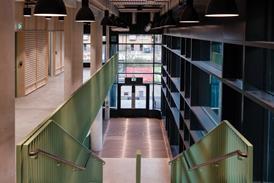
Internally, the tower comprises the main vertical circulation to the teaching spaces, with the lower glazed element providing a clerestory window to all four facades. The upper floor – the highest in the college – consists of a loosely programmed room with full-height glazing giving views in all directions.
As it sits above the main stair, vertical access has been shifted to an external bronze-toned stair, which limits the obstruction to the views to a single handrail. The spiral of this handrail whimsically addresses the curve of the road below. An admirable commitment to accessibility means this room is also wheelchair accessible. Sadly, the sheer bulk of the lift prevents the room from being a perfect glazed cube, and disrupts the 360-degree view.
That commitment to equality of access is reflected elsewhere – every room in the new building is wheelchair accessible, including all the student rooms, rather than just those designed for wheelchair users only. The site as a whole has level access – no small ask, given the significant slopes in two directions. The rooms themselves are generous, with large windows (two on the uppermost level), and like the rest of the project are finished in a restrained material palette: white plasterboard walls, dark grey carpets and a painted concrete ceiling.
The building is a concrete frame, chosen for its thermal mass but also its expressive qualities: fair-faced cylindrical columns appear in most student rooms. These are not set on the wall lines but a small distance apart – giving interest and a natural subdivision of the rooms. The ceilings, here and elsewhere within the block, were due to be exposed concrete, but the design and build contractor opted to paint them instead – so now they are concrete, painted to look like concrete. It is one of the few moments you realise it is a design and build scheme – a testament to the contractor and client team as well the architect.
The brick and concrete building is crowned with a roof terrace. Given the college is slightly removed from the rest of the university, this gives perhaps the best view of Oxford in all of Oxford. Set in the roof garden are two further multifunction or event spaces which consciously echo the pavilion in the mature landscape below. Like the pavilion, these are fully glazed to maximise the views and, in keeping with the overall economy of material, are fitted with bronzed frames and bronze metalwork detailing. They are set back from the college side, and so almost invisible from within the college grounds, avoiding the trap of competing with the scalloped edge, and giving the building two “tops”.
It is the landscape, though, that defines this scheme. Gort Scott resisted the temptation to create quads, and instead redefined the college as a string of buildings settled on a pleasant meander by the river. This leans heavily on the existing landscape – the college is blessed with mature trees and a tranquil riverside setting – and the borrowed landscape of Christ Church Meadow and the city beyond.
This was achieved by removing Milham Ford – a well-loved building that included the chapel, but which (combined with such practicalities as the car park) effectively divided the site into north and south campuses. Removing Milham Ford opened up a visual link between these two portions of the site, and relocating the cars to a tennis court at the rear enabled the creation of a sinuous, landscape route.
As a nod to the previous occupant of Cowley House, this route is lavishly planted, a triumph designed with Jonathan Cook of JCLA and Walter Sawyer, who was once superintendent of the university parks and who took a key role in both selecting and carrying out the planting.
Project team
Client St Hilda’s College, Oxford
Architect Gort Scott Architects
Main contractor Beard Construction
Civil/structural engineer Solid Structures & Infrastructure
M&E and acoustics/lighting Skelly & Couch
Project manager/QS Austin Newport Group
Planning consultant JPPC
Heritage consultant Marcus Beale Architects
CDM co-ordinator Andrew Alder Associates
Approved inspector Aedis Group
Project details
Procurement Design and build
Construction value £18.5m
Start on site December 2018
Completion August 2021
CAD software used Vectorworks, Allplan
No comments yet