Stanton Williams’ serene Sainsbury Laboratory combines classicism with modernism while remaining anchored to its natural surroundings
In the architectural glamour stakes, research laboratories probably rank only slightly higher than nuclear power stations. Although Louis Kahn’s 1966 Salk Institute in California occupies an iconic status within architectural circles, many within the profession - and most outside it - would struggle to identify a laboratory that has captured the public imagination or made a dazzling contribution to urban life. But Stanton Williams’ stately Sainsbury Laboratory may well change all that.
Nestling on the edge of Cambridge university’s 180-year-old botanic garden, the £82m laboratory provides high-end plant science research facilities for up to 150 scientists. The gardens themselves were conceived by Charles Darwin’s mentor, Professor Henslow, and the university herbarium, located in the new laboratory’s basement, contains precious plant specimens collected by Darwin himself. Understandably the design of the new building has drawn heavily from the rich heritage of naturalist science its use and location offers.
We paved the courtyard and kept the building low so as to not overshadow the terraces. We wanted to root the building into its landscape
Gavin Henderson, Stanton Williams
But what gives the Sainsbury Laboratory’s architecture such potency is not just its response to its function but its relationship with its site. The building faces out on to two very distinct worlds: the expansive, verdant dreamscapes of the gardens to one side and the constricted, angular urbanity of the town to the other.
Consequently the architecture forges a sumptuous sequence of unfolding facades, spaces and views; where everything from materials to proportion progressively transforms as the building mutates from one context to another. It is a captivating narrative and its evolutionary nature is not only a fitting tribute to Darwinian doctrine but also the seed from which the building’s remarkable architectural identity is sown.
Innocuously sheltered from public view behind a school and a row of terraced houses, the drama begins the moment the entrance gate is passed. A long gravelled drive extends behind the terraces but the laboratory itself is still not yet in view. The subsequent approach provides an acute sense of anticipation and displacement, evoking the palpable sense of moving from one world into another. The crunching gravel underfoot also evokes the spirit of the isolated 18th century country mansion severed from its wider surroundings by promontories of long, landscaped vistas.
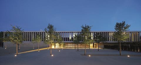
When the laboratory finally comes into view the visitor is faced with what is arguably its greatest feature: its magnificent entrance elevation. A long, low, double-storey frontage is set behind a broad entrance courtyard exquisitely paved with fine York stone flags.
The first floor is wrapped in a continuous colonnade of stone pillars, with a deep cantilevered ground floor recess to one end of the elevation marking the entrance. The pillars are set slightly forward from full-height glazed screens and run between two slabs of pre-cast concrete. The slabs provide a subtle colour contrast with the stone and relieve the rigorous verticality of the colonnade with a dominant horizontal thrust.
The facade, which also wraps round the sides of the laboratory, is a stunning panorama of subtlety and power. Its structured linearity is a familiar feature of all Stanton William’s work, but it has been enlivened here with a solidity of form and crispness of surface that enables it to achieve a rousingly monumental impact. Yet its strength ultimately lies in its simplicity: it is essentially a meticulous geometric diagram of clean horizontal and vertical lines sculpted into a serene stone veil. As such it brilliantly combines the orchestrated precision of classicism with the minimalist clarity of modernity.
The stonework itself is exemplary. A vibrant, sand-coloured limestone creates a texture of astonishing warmth and richness. The stone is also cleverly used to anchor the building into the entrance forecourt with the latter’s York paving running right into the laboratory and much of the forecourt finished in sandy pebbles matching the colour of its stone walls and columns.
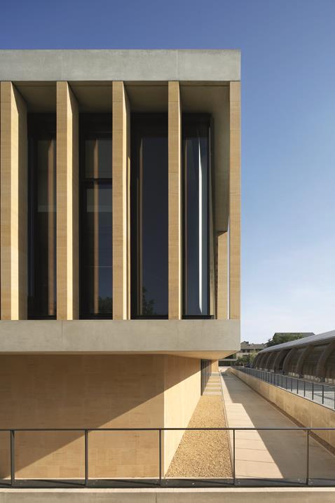
Project director Gavin Henderson identifies the laboratory’s relationship with its landscape as a key driver in its design, particularly with the elevations. “This side of the building is much more enclosed so we wanted to create a monolithic, geological character with solid materials like stone and concrete. Also, this is a much more urban space than the gardens to the other side of the building so we paved the courtyard and kept the building low so as to not overshadow the terraces opposite. We wanted to root the building into its landscape.”
The use of stone and the narrow vertical openings in the colonnade certainly achieves this desired sense of solidity and permanence. Even the glazing behind the columns falls into three varying stages of transparency; clear, semi-fritted and obscured. This intermittently enables the glazing to assume the same appearance of impenetrability as the stone.
Additionally, the forecourt is laid on a gradual decline so visitors step down into the laboratory. Not only does this keep the building low but it forcefully emphasises the notion that it has been “dug” out of the ground. Again, in contrast to the gardens to the rear, even the trees located in the forecourt - a deliberately manicured species - fall on a formal grid pattern, recalling the subjugation of nature to man prevalent in French baroque landscaping, the antithesis of the English natural garden beyond.
But from the moment you enter the building there is a sense that things are about to change. Despite the foyer’s stone walls and shaded aspect, the eye is immediately drawn through the building to tantalising framed views of a courtyard and the gardens beyond. As this courtyard is approached, levels of natural light increase dramatically and the solidity of the building gradually seems to fall away. Sure enough, by the time the courtyard is reached, we discover it is encased within a linear, double-height “cloister” flooded with daylight.
The courtyard is at the heart of the new laboratory and is the key protagonist in the unfolding spatial sequence that navigates between the entrance and garden fronts. Fittingly, it resonates with the character of collegiate quadrangles found across Cambridge. But it also shows how the solidity of the entrance elevations has now been replaced with clarity and openness in order to relate to the more natural landscape prevalent in the gardens.
This concept is most evident on one side of the four-sided courtyard that has been left open to allow the soaring trees of Henslow’s garden to act as a natural fourth facade. Another side is kept as a single-storey pavilion which separates the laboratory from the main gardens and also houses a public, glass-fronted cafe. Steps link the courtyard to a broad private roof terrace above. The cafe therefore acts a critical mediator between the private laboratory and the public realm, establishing an important visual connection between the two and enabling lush panoramic views of the garden landscape to plunge right into the courtyard and the laboratory itself.
The remaining two facades of the courtyard, as well the laboratory’s rear elevation that faces directly onto the gardens assume a much more open and porous character than the sculpted severity of the entrance frontage. The stone and the narrow vertical proportions of the latter are replaced with the lighter materials of steel, timber and finely honed concrete with broad expanses of glazing once again anchoring the interiors to their natural surroundings.
Although these facades lack the rhythmic purity of the entrance frontage and the variety of elevational materials and components used creates a more disparate visual composition, they still exhibit the same clean lines, confident massing and expressive form that so enriches the remainder of the laboratory.
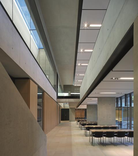
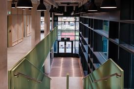
Conceptually, they also represent the building in its fully mutated state where it has shed the weight of its masonry skin and is finally at one with the natural landscape that surrounds it. This is particularly evident when glimpsing the building from deep within the gardens. From here it dissolves into a pavilion of swooping horizontal planes, dramatic overhangs and folding surfaces all of which merge it with force and eloquence into its surrounding landscape. These same vigorous elements characterise the laboratory’s interiors. A double-height circulatory foyer is wrapped around the courtyard, dynamically punctuated overhead with glass-fronted bridges that connect the first floor laboratories to the upper foyer. It also permits tantalising, snatched views into distant internal areas of the building, enriching the space with a visual complexity and unfolding aspect that transforms movement through the building into a processional journey alternating between revelation and concealment.
The lofty height also enables even more daylight to flood the interior, allowing much of it, appropriately, to feel like an external space. This is a sensation compounded by the ubiquitous views of the gardens outside that colonise every inch of the interior. Columns and selected walls and ceilings are finished in the same exquisitely honed concrete visible on the rear and courtyard facades with surfaces occasionally relieved by stretches of timber panelling. Both provide a cool, expansive quality to the interiors that once again replicates the spatial characteristics of natural landscape.
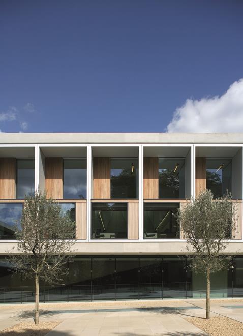
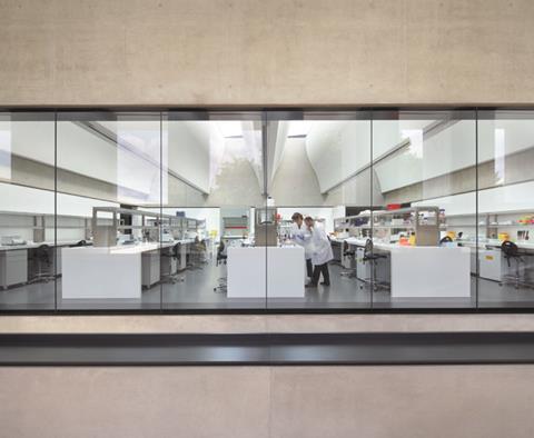
The first-floor laboratories themselves are compact and efficient with glass walls to eventually enable direct views of the scientists busily at work. Henderson maintains that the building was designed “from the inside out” with the functional requirements of the scientists identified as key drivers from the very start of the design process. As part of this strategy, the architects found themselves in the rare and fortuitous position of being able to design much of the furniture located not only in the labs but also in the meeting rooms dotted around the building.
But despite their obvious functional role, these upper laboratories have one final surprise that once again anchors the entire building to its natural surroundings: their roof-lights. In stark contrast to the angular geometry unilaterally imposed elsewhere, these openings are deep, curved, top-lit GRG profile lanterns that swerve decadently up to the sky. Technically they provide uniform concealed accommodation for the extensive mechanical and electrical apparatus essential for a building as highly serviced as this. They also recall the coffered concrete ceiling in the ground floor lecture theatre.
But within the overriding natural narrative of this building, they are a poignant indication that the skin of the Sainsbury Laboratory, whether vertical or horizontal, has been configured as a dynamic architectural veil through which the natural landscape outside is filtered and celebrated. The result is an unfolding sequence of spaces, forms and materials that are all determined by their natural surroundings and therefore rooted, with exceptional eloquence and clarity, to their context.
Pictures by Hufton+Crow
THE STRUCTURE
The angular aesthetics of the Sainsbury Laboratory may imply design simplicity but, according to AKT structural engineer Steve Toons, this conceals all manner of “structural gymnastics within.” For both functional and aesthetic reasons, long spans (up to 13.5m) and ambitious cantilevers (up to 7.5m) were required on the garden elevations, laboratory and entrance areas. To achieve these, void formers were built into exposed or encased ribbed concrete slabs, with the flat soffits acting as compression flanges on the latter.
A key aesthetic requirement for the twin continuous 600mm deep concrete nosings that run the full perimeter of entrance and side elevations was that no movement joints were visible - despite the nosings stretching for almost 80m. Hence, in-situ concrete was used, tied back into the floor-plate and with insulation applied to the floor and soffit, creating a “thermal gradient.” This is one consequence of the large amount of exposed structural concrete employed on the building.
Toons maintains that the exceptional standard of the finished concrete throughout was a result of the same push for high quality that drove the whole design and client team. “It impregnated the whole process through design, procurement and construction, ” he says. As part of this strategy, 3m mock-up samples were created enabling the design team to debate colour and surface. Additional time for propping of precamber elements was built into the programme from the start.
NATURE WALK
Project director Gavin Henderson reveals that the internal circulation space around the courtyard (left) is based on Darwin’s “thinking-path”, his own version of continuous walking route through nature that stimulated thought, observation and reflection. “We envisaged this as an internal street,” says Henderson, “a social space or cloister that allows for interaction, contemplation, informal discussion and debate. It was important to us to ensure that the functional challenges of this very technical building did not overwhelm its social brief.” Accordingly the “thinking-path” is broad and spacious and embellished with a 20m long, ceremonial single-flight staircase, complete with pause inducing treads of around 600mm.
PROJECT TEAM
client The University of Cambridge
funder The Gatsby Charitable Foundation
architect Stanton Williams
main contractor Kier Regional
project manager Stuart A. Johnson Consulting
contract administrator Hannah-Reed
structural/civil engineer Adams Kara Taylor
services engineer Arup
cost consultant Gardiner & Theobold
landscape architects Christopher Bradley-Hole Landscape / Schoenaich Landscape Architects







1 Readers' comment