Two big hitters have emerged on the streets of the City: Ropemaker in the red corner (above left), Watermark Place in the blue (above right). But which will take the sustainability title and be crowned ultimate speculative office champ?

So who are the heavyweight contenders?

It’s hard not to feel a twinge of sympathy for the developers of two recently completed speculative office buildings in the City of London. Conceived in better times, now is not a great time to be letting a new speculative office, particularly when there’s another one up the road. The buildings are so similar that many potential tenants have visited both. They are almost identical in size, both have trading space and are aimed at the bank-corporate-lawyer type market. In an attempt to appeal to such well-heeled lodgers, each has a glamorous reception, as well as roof terraces to allow workers the odd moment’s respite from their high-octane jobs.

The two buildings are Watermark Place, next to the Thames by Cannon Street station, and Ropemaker, in the heart of the City between Moorgate and the Barbican. They may have a lot in common, but ultimately tenants are going to have to choose between them, so Building thought it would help them out. In particular, we looked at how they approach the big green question – after all, sustainability will be at the forefront of occupiers’ minds when it comes to their corporate social responsibility report. And it was here that some interesting differences started to emerge …

Watermark Place

Watermark Place layout

Five-storey block featuring huge oak beams on the left, a four-storey block with vertically mounted, swivelling timber blinds on the right, and a 12-storey deep-plan block to the north (background)

What it looks like

Watermark Place has been developed by a consortium consisting of Oxford Properties, UBS and Core and has the edge on location, being next to the Thames by Cannon Street station.

It’s also unlike any other building in London. It consists of three linked buildings: the two next to the river are four and five storeys high to maintain unobstructed views to nearby St Paul’s cathedral; the main building sits behind these two and is deep plan and 12 storeys high.

Approach it by walking along the river and it’s a striking sight. You are greeted by a block clad with huge oak columns angled outwards, which support horizontal brise-soleils shading each floor. The next block is glass-fronted but you can see mysterious wooden louvres arranged vertically lurking behind the glass. “We wanted to avoid a standard ‘glass box in the City’ look,” says its architect, Ed Williams, a partner at Fletcher Priest.

He says boats used to be built here using scaffolding that looked very similar to the big oak columns. “We were trying to link the building with its context and also provide something very functional that gives you an idea of how the building works.”

Project aspirations

  • A BREEAM “excellent” rating and an energy performance certificate (EPC) rating of “B”

“It’s common sense to go for a high-performance facade that is well insulated and controls solar gain,“ says Mark Terndrup, regional director at Waterman Group, who was responsible for the structural and services engineering. Minimising energy use was important so Terndrup looked at naturally ventilating the building and using the river to cool it.

Five-storey block

Five-storey block featuring huge oak beams supporting oversized brise-soleil

Cladding

The facade has been driven by the riverside location. Naturally the brief called for the best views over the river but as this faces south, the challenge was to maximise the view while minimising solar gain. The solution comes in the form of a double-skinned facade. The idea is that air enters at the bottom of the facade and vents at the top, keeping the building cool.

But solar shading was also needed to protect against the summer sun and this is where the team has really gone to town, with three very different solutions. The five-storey building on the south-west corner is kept relatively simple and uses fixed brise-soleils that gradually step out towards the top of the building.

Its low-rise neighbour on the south-east corner goes high-tech with wooden slats much longer than they are wide fixed to a vertically mounted, motorised column. These rotate with the sun, so the slats provide maximum shading, but when the sun goes in, the narrow side of the slats faces the river to maximise views. The 12-storey block has a double-skinned facade from the sixth floor up – as it is shaded by the two low-rise blocks in front – with motorised blinds that rise and fall with the sun. Having blown most of the cladding budget on these three facades, the team had to keep the rest of the cladding on the main building simple. These floors have a conventional double-glazed facade with fritted glass.

Ventilation and cooling

The quiet riverside location meant the south-eastern building could be naturally ventilated. Ground source cooling was ruled out for the scheme, as the 2m thick foundation from the previous building was reused and the team feared that punching through it would run the risk of the river bubbling up through the penetrations. Instead, they opted for conventional fancoil units throughout, as a shell and core solution wasn’t considered acceptable for a deep-plan building.

Although fancoils aren’t regarded as particularly energy efficient, Terndrup says that options were limited. A more efficient displacement system was ruled out because it increases the floor-to-ceiling height, which was restricted by the proximity to St Paul’s. Chilled beams were also discounted. “At the time the market demanded fancoils, and chilled beams were perceived to be too risky,” says Terndrup. “Now, we may have made a different decision.”

Materials

The project team has really gone the extra mile here. Eighty per cent of the substructure of the previous building was reused, and 98% of the demolition waste and 83% of general construction waste was recycled. Of the aggregates in the concrete mix, 55% were recycled and hollow concrete blocks were used where possible to reduce material use. Timber was responsibly sourced. The building got a BREEAM score of 71.9%, equivalent to an “excellent” rating.

Watermark Place overlooks the Thames

Both buildings have roof terraces, but Watermark Place overlooks the Thames, which was said to have swung the decision for its new occupier

Green energy

The London Plan in force at the time that these buildings were designed required each to find 10% of energy needs from on-site renewables. For Watermark Place, the solution was a massive 850m2 array of PV panels providing up to 52kW of electricity. Fortunately the building’s roof was big enough to fit it on. This output, combined with the natural ventilation of the building in the south-east corner, means that, depending on how sunny it is. this part of the scheme has the potential to be carbon neutral.

Ropemaker

Ropemaker has super-efficient cladding including these angled lights which are intended to reflect the heat of the sun

Ropemaker has super-efficient cladding including these angled lights which are intended to reflect the heat of the sun

What it looks like

Ropemaker, which has been developed by British Land, is very different in form from Watermark Place, being 20 storeys high. The building makes four distinct steps back towards the top along two sides, so the floor area of the uppermost section is a quarter of the size of the lowest section.

This is a traditional glass city slicker – everything, in other words, that the designers of Watermark Place wanted to avoid. Architect Mike Beaven, principal at Arup Associates, is at pains to explain he didn’t want this building to shout “green”. “We wanted a crisp modern building that presents glass as a sustainable material; it’s not nuts and berries for this market,” he says.

But Ropemaker isn’t a standard glass box. Its full 20-storey height is mitigated on the north and west elevations by those steps back, and it has glazed areas that protrude from the facade in rows rather like a line of windows that have been left slightly open. Strangely, these don’t all face the same way – some are angled horizontally but others vertically.

Project aspirations

  • No energy performance certificate target, but 15% better than Part L
  • A BREEAM target of “very good”, “excellent” or “outstanding”

According to Beaven, the strategy was to “keep it simple by making it as passive as possible”. The energy reduction strategy focused on an airtight, thermally efficient envelope. Heat demand has been minimised by recovering heat where it isn’t needed and using it in other areas.

Free cooling means the building can be cooled using outside air when the temperatures are right. The “keep it simple” philosophy means using standard chillers for cooling, so no borehole or ground source heat pump systems here.

Cladding

The all-glass look is an illusion, as solid panels lurk behind 60% of the facade to maximise the insulation value and minimise solar gain. Beaven could have opted for a double-skinned facade to control solar gain and keep the views but this contradicted the “keep it simple” philosophy. “It adds significantly to the cost, needs a lot of maintenance and takes up space,” he says. It would also have needed a decent-sized gap between the two skins for maintenance, which would have gobbled up a large chunk of Ropemaker’s small footprint.

Likewise, natural ventilation was ruled out on grounds of noise, even at high level. The proximity of medium-rise neighbour Citypoint meant noise would bounce off the two buildings all the way to the top.

Despite its apparent simplicity there is some neat trickery at work in this facade. Those protruding areas of glazing might seem odd but they are carefully positioned so the glass is at an angle of 5Þ or less to the sun – the reason why they vary around the building is to maintain the angle. According to Beaven this system reflects most of the sun’s heat away from the facade. A brise-soleil on the south elevation shades the building conventionally. Beaven says the facade cuts energy use by up to 25%.

Ventilation and cooling

This is conventional. Ground source cooling and combined heat and power were investigated and rejected. “These didn’t suit the building as it’s implicitly energy efficient with a low base load so it didn’t make sense,” says Beaven.

The building is marketed as shell and core so each tenant can fit its preferred ventilation and cooling system.

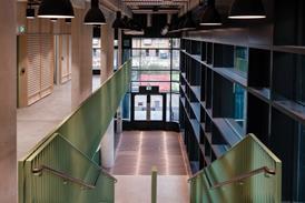
Ropemaker reception

Ropemaker (pictured) and Watermark both have lofty, minimal receptions warmed up by large areas of timber

Green energy

A few yards can make a big difference. Biomass boilers don’t count towards the London Plan’s 10% rule in the City, but Ropemaker happens to be on the other side of the border, in Islington, where biomass is allowed.

Ropemaker’s 1200kW biomass boiler is sized to heat the building’s hot water and the building itself on cold winter mornings. It needs two 18-tonne deliveries of wood pellets in the winter and one every two weeks in the summer.

On the roof sit 75m2 of photovoltaics and 75m2 of solar thermal panels. It’s just as well the building is in Islington, because its small footprint means there wouldn’t be room for any more solar panels.

Materials

The buttress foundations on the site perimeter from the previous building were reused; this adds up to 20% of the site footprint. Eighty-six per cent of materials from the site clearance were reused. Contractor Mace used WRAP’s NetWaste tool, which showed the new building has 24% recycled content. Timber was responsibly sourced. The building got a BREEAM score of 72.7%, equivalent to an “excellent” rating, and virtually identical to Watermark Place.

So which building is better?

This is the million dollar question. Both teams wanted to construct an appealing, sustainable building within commercial financial constraints but, despite first appearances, both came up with very different approaches. The team behind Watermark Place has tried to maximise its premium site by the river, which led it to go for a double-skinned facade. The Ropemaker team rejected this as too complex, but the building’s small footprint would have been a major factor in this decision. Instead it upped the amount of solid facade in the building and went for innovative angled windows in a bid to reduce solar gain.

In terms of energy efficiency, working out which building is better should be easy, as three different ways of measuring energy use were used for each. However, in practice, the results raise as many questions as they do answers.

Both buildings are fairly airtight: Ropemaker has an air infiltration rate of 5m3 of air per hour per m2 of facade at a pressure of 50Pa; Watermark Place is a bit more leaky with a rating of 6m3, but both compare well with the Part L requirement of 10.

Watermark Place betters the requirements of 2006 Part L by 18%. Terndrup says this was a very conservative calculation because he assumed the insulating argon gas used in the double-glazing units would leak out over time. If the full benefits of the argon are included, Watermark Place betters Part L by 20%.

Watermark reception

Ropemaker and Watermark (pictured) both have lofty, minimal receptions warmed up by large areas of timber

Either way, Ropemaker trounces it with a 32.7% improvement on Part L. Terndrup puts Watermark Place’s relatively poor showing down to the building form – efficient cladding has a much bigger impact on the performance of a tall building with a small footprint than a low-rise with a large footprint. Plus, shallow-plan buildings need less artificial lighting.

Another way of comparing the two buildings is to look at their energy use. Watermark Place weighs in with a figure of 28kgCO2/m2 per year but Ropemaker just pips it with 24.6kgCO2/m2 per year. To get this in perspective a standard air-conditioned, 2006 Part L-compliant office would use about double the amount.

Perhaps the EPC rating can settle the argument – after all, this is supposed to be the definitive way of comparing the performance of buildings. Unfortunately, this only makes things more confusing. Both buildings have a B rating but closer scrutiny reveals Ropemaker to be near the bottom of the band with 46 points whereas Watermark tops it with 33 points. How can this be? Terndrup reckons the whole EPC calculation methodology is very rudimentary. “The software is crude and it’s unfair to compare buildings,” he says – a damning indictment of the very point of the certificates.

So what’s the answer? The BREEAM rating is the best indicator of overall sustainability, as it takes into account a broad range of factors, including energy and water use, materials and waste management. The buildings are so close it is ultimately going to be down to the end users to make the most of what they have got.

So who are these end users and has the sustainability of the two buildings been a major draw? At Ropemaker, the Bank of Tokyo-Mitsubishi UFJ and Mitsubishi UFJ Securities International has signed up to taking 38% of the building on a 20-year lease. Sarah Cary, British Land’s sustainable developments executive, says: “Sustainability is very high on the corporate agenda so I think it’s helped. You can’t charge more but it puts us in a much better position in the market compared to other buildings.”

As for Watermark, Japanese bank Nomura has taken the whole building on a 20-year lease. “It’s the biggest speculative letting in the UK ever,” says Fletcher Priest’s Williams. But it’s hard to say how much the eco credentials of the building added to this success. The stunning views over the Thames seem to have been the decisive factor. “The story going round is that Nomura’s top guy stood on the edge of the terrace and made his decision …”

Both schemes have been nominated as Large Project of the Year at this year’s Sustainability Awards. Find out more at www.building.co.uk/awards