RSHP’s World Conservation and Exhibitions Centre at the British Museum strives both to harmonise with its neoclassical context and set itself in contrast to it. But does it succeed?
Harmony or contrast? This may seem an innocuous or even simplistic question but it touches on one of the most contentious and disputed arguments in modern architectural debate. Should new buildings seek to harmonise with their historic environments or react against them?
This is the challenge we see being addressed at Rogers Stirk Harbour & Partners’ £135m World Conservation and Exhibitions Centre (WCEC) at the British Museum where this most radically and vociferously modernist of architectural practices intervenes in one of London’s most historic neighbourhoods.
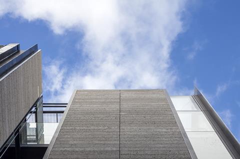
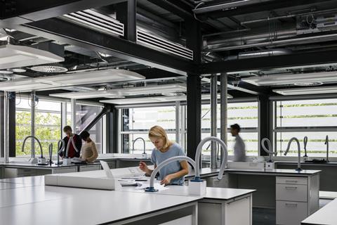
The WCEC incorporates 18,000m² of new principally back-of-house accommodation containing state-of-the-art laboratories, studios and stores for much of the museum’s priceless collection of artefacts.
The building occupies a 4,000m² site to the north-west corner of the British Museum estate. Despite the modest scale of its new public facade, this is a building of impressive engineering ambition. It is divided into five pavilions and includes 10 storeys, half of those storeys and an entire pavilion are located underground. The above-ground buildings are steel frame, while below ground accommodation is housed within a vast concrete box that required piling up to 30m deep.
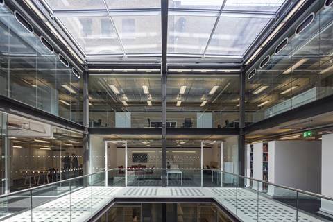
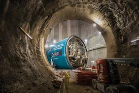
In an operation of extraordinary logistical complexity where vibration monitoring was paramount, more than 34,000m³ tonnes of earth were excavated from the ground on a tight site completely surrounded by Grade I listed buildings and often working within two or three metres of priceless, fragile artefacts such as the Elgin Marbles.
Internally, the building reveals much of the trademark features we have come to associate with RSHP architecture. The interiors are marked by a strong sense of legibility, accessibility and efficiency with no raised floors or suspended ceilings and services consistently on display within a neat structural truss arrangement clearly visible underneath concrete soffits.
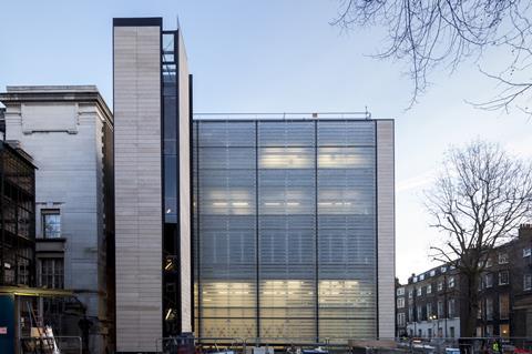
It is externally where the building tries to address the classical context that surrounds it. The new facade employs Portland stone panels and its strongly rectilinear proportions are influenced by that of the monumental Graeco-Baroque museum facade beside it.
As RSHP director Graham Stirk explains: “We had no wish to spoil the special historic character of the location but we wanted to create an architectural vocabulary that was new. We had a very formal classical composition on one side and the more residential character of Bedford Square to the other. We wanted to relate to both but not by merely extending the colouration of context for instance you see in the local brickwork. We wanted to create a strong street presence but something that also feels part of the museum.
“It’s not just a case of harmony or contrast; we wanted a more subtle balance between modernity and context than that. It’s perhaps more a case of creating high contrast out of harmony, creating a contextual modernity that can still resonate within a complex historic environment.”
Is this what has been achieved? To a degree, yes. RSHP have perhaps displayed unprecedented sensitivity in such an important historic location and the WCEC is probably the practice’s most passive and restrained work to date. But is it too restrained?
In many ways, the exterior of the WCEC feels like an assortment of highly polished, sculpted surfaces rather than a complete building with soul and identity. In its lightweight, articulated panel construction, its elevations draw attention to the components rather than the whole and, combined with the mundane whiff of the commercial office block or business park, they lack the assuredness, solidity and gravitas both its role and location demand.
This is certainly not a call for the architects to have resorted to the compendium of bright red steel cross-bracing or overtly expressionist glazed structure that is characteristic of their work. But in the building’s somewhat tepid aftertaste we see architects daunted rather than inspired by context. The attempt to find a new modern architectural language that sympathetically yet purposefully relates to an historic environment is laudable and in so doing we see the WCEC trying to crack the age-old conundrum of old vs new by striving for both harmony and contrast. But what it ends up achieving is a rather stifled echo of both.






No comments yet