Kengo Kuma’s V&A Dundee, inspired by the cliffs of the north-east Scotland coast, is the museum’s first venue outside of London and its client, Dundee council, is banking on the building powering the transformation of the city
Ever since Frank Gehry’s Guggenheim Museum Bilbao opened in 1997, cities across the world have been scrambling to realise their very own “Bilbao effect”. The process essentially involves the creation of a showpiece cultural venue, typically expensive, usually on re-appropriated post-industrial land and preferably designed by a stellar international architect. The said venue is hopefully effective as a catalyst for wider urban and economic regeneration and ideally becomes a trigger for enhancing the city’s international profile.
This celebrity version of culture-led regeneration accelerated after the extraordinary success of London’s Tate Modern in 2000. Dozens of projects have tried to replicate the formula and scores of arts venues from Herzog & de Meuron’s Elbphilharmonie concert hall in Hamburg to Foster + Partners’ Sage Gateshead in Newcastle owe some small debt to Bilbao.
Alas, degrees of success in replicating the Bilbao effect vary sharply, with many cities lurching lazily towards shallow architectural exhibitionism but misunderstanding the winning combination of visual statement and municipal strategy that made Bilbao such a success. Now, one project promises to rewrite the architectural landscape for cultural buildings in the same way Bilbao did 21 years ago.
The new £80m V&A Dundee has been almost a decade in the making. As well as being Scotland’s largest museum dedicated to design, it is also the world’s first V&A outside London. South Kensington’s 166-year-old V&A is the largest design and decorative arts museum in the world – the Dundee venue will house the institution’s Scottish Design Galleries permanent collection.
The new museum occupies a dramatic waterfront setting on the north shore of the Firth of Tay. The majestic sweep of river was historically the traditional entry point to Scotland for shipping from Northern Europe and Dundee’s seafaring and jute trade brought it prodigious wealth in the nineteenth century, as still evidenced by the city’s fine stock of Victorian public buildings.
But the city suffered the crippling economic decline experienced by several Scottish industrial cities in the second half of the twentieth century. The dereliction of the once-flourishing waterside on which the V&A now sits was exacerbated by the construction of a major road that further severed it from the rest of the city. By the 1990s, the crumbling riverfront had become emblematic of the of the decline of the city at large. The V&A is determined to help reverse this process. The museum is the centrepiece of a massive £1bn Dundee Waterfront regeneration plan, which stretches 8km along the River Tay and hopes to complete by the early 2030s.
Unusually, the client for the new V&A is the city rather than the museum, a clear indication that this project is framed by civic as well as curatorial ambitions. Accordingly, V&A director Tristram Hunt is keen to emphasise that it is an “institution in its own right” and is not an “outpost” of the London attraction.
The building is celebrated Japanese architect Kengo Kuma’s first project in the UK. Kuma, who is designing the New National Stadium for the Tokyo 2020 Olympic Games, is renowned for his use of natural materials and his humanistic combination of traditional Japanese architectural principles with ultra-modern technologies. These are elements he has brought powerfully to Dundee.
Kuma speaks of being instantly inspired by the setting and its wider Scottish context when he first visited the site. “I was struck by Scottish culture and the beauty of Scotland’s nature and I wanted the building to reflect this. More specifically, I wanted to create a new type of facade that was directly inspired by the cliff edges of the nearby north-east Scotland coast,” he says.
This is immediately evident when viewing the building. It takes the form of two squat, inverted concrete pyramids, their invisible peaks pummelled deep into the earth on the city side of building and directly into the Tay on the river side. As the pyramids surge downwards they gently twist and gyrate, creating a series of dramatic helix-like surfaces that improbably curve both horizontally and vertically. Where the pyramids join an arch is also formed, which offers a direct visual link between the city and the sea.
The cliff-edge analogy is memorably delivered in the building’s cladding. Reams of horizontal precast concrete ribs snake across the building’s skin like swirls around a vortex, whipping around the entirety of the museum’s envelope and only breaking at selected points to reveal momentary expanses of glass within.
The visual effect is spectacular. With its grooved, rugged, and rocky shell, the cliff-face allusion is unmistakable and grounds this urban building firmly within the Scottish natural landscape. But a cynic might say that giving a concrete building a geological aspect is not especially taxing – many multi-storey car parks do the same, albeit with significantly less flair.
However, this composition is electrified by the intensity of movement along the building’s twisting surface and the sheer sculptural melodrama of the finished form. Much of this is achieved through extraordinary engineering ingenuity, with the twisting reinforced concrete external walls forming a continuous interconnected structure that acts like a rigid structural shell.
The resulting brilliantly contorted form invites other analogies – the hull of an ocean liner, the waves of the sea or, as Hunt puts it, “an amphibious, semi-nautical creature”. But arguably the most important metaphor the building provides is the most subtly framed, found in the arch formed between the conjoined pyramids.
The current museum was once the site of the now-demolished Royal Arch, an ornamental triumphal gateway built to celebrate a visit by Queen Victoria and Prince Albert that formed the entrance to the docks and was demolished in the 1960s. For Kuma, re-establishing the idea of a gateway was a core theme of his design and one that, for him, straddled local and Japanese culture.
“For me, the architecture was always about creating a gate between the river and the city,” he says. “The cantilevered sections where the pyramids join create a semi-covered space that provides a visual link between the two. But it also provides welcome, protection and enclosure –themes that are central to the architectural tradition of Japanese temples and shrines.”
The arch also provides an opportunity for Kuma to display his deftness with human scale. This is a large building and the aggressively stratified exterior hardly provides invitation or warmth, nor does it intend to do so, externally at least. But the gateway – barely a single storey high – tactfully gives the building a more intimate scale as it meets the ground.
In doing so it also recalls work of another celebrated Japanese architect, Minoru Yamasaki, in the gothic arches he placed on the base of New York’s World Trade Centre. Here in Dundee, the intimacy of the arch is further enhanced by the curving path that leads up to it and the two pools of water that lap gently against its edges.
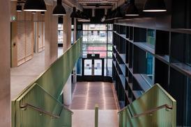
While the arch forms the museum’s entrance to the sea, the entrance to the building itself is discreetly cut into the folded corner of the exterior shell, which parts demurely like a pleat in a skirt. Kuma frequently refers to the museum as “a living room for the city”. Those puzzled by how the craggy exterior invokes this homely image have their questions answered once inside. To all intents and purposes the foyer is expressed as a gigantic hearth, an oversized, split-level den that replaces the projecting concrete razors of the exterior with timber, limestone and daylight.
The volumetric contortions of the exterior are still very much on display, with the walls maintaining their angular pirouettes and the language of hung horizontal panels maintained. But now the panels have morphed from concrete to oak veneer, setting the tone for a warmer, softer space that feels almost as domestic as it does institutional.
There are still monumental flourishes. A sweeping flight of limestone stairs hugs an outer wall and leads to a vast upper balcony from which adjacent galleries are reached. The theme of linear striations is still etched into the walls and ceilings as if to recall the art deco lobbies of ocean liners echoed by the exterior. And the lobby has a sense of spatial drama throughout, born from its impressive scale and the dynamic distribution of stairs, balconies and voids.
But a warmer agenda has now unmistakably taken hold, as hinted by the external sheltered gateway. Even the rigid shaft steel lift cage swoops down from the ceiling like a suspended fireplace hearth.
The biggest surprise is the amount of daylight admitted into the space, a remarkable achievement for an exterior that appears so solid and impermeable. The momentary breaks of glazing visible outside pour light into the foyer and offer spectacular views over the Tay, representing another of Kuma’s treasured links between city and nature.
The curatorial requirements of modern museums mean that the gallery spaces themselves are largely interchangeable rectilinear voids, capable of being morphed into whatever colour and configuration an exhibition or display demands. Consequently, the most memorable gallery belongs not to Kuma but to Scottish design hero Charles Rennie Mackintosh, whose Oak Room interior has been meticulously reconstructed here and to whom Kuma attests a debt of inspirational gratitude.
The Dundee V&A is an exceptional work of architecture, a building of sculpted beauty and raw visual power, whose every twist and turn seeks to forcefully project the notion of the sea and the landscape back into the city. The irony is that in doing so, despite its avowed contemporary expression, it forms a thrilling theatrical expression of local urban heritage. This is a contextual anchor that others, who sought and failed to emulate Bilbao, are unable to grasp. Context – even a considered rejection of it – always trumps concept.
Kuma is keen to point out the differences between the V&A Dundee and the Bilbao Guggenheim. “Frank Gehry’s Bilbao Guggenheim is a shining monument that invites admiration from afar. In doing so it has been incredibly successful. But I’ve taken an opposite approach – I’ve cut a small hole in my building designed to invite the city and its river and draw people in,” he says.
Kuma may not appreciate the comparison, and he and Dundee council can rightly claim that Bilbao and the V&A Dundee are completely architecturally distinct and respond to wildly different urban, economic, social and cultural conditions. But in this extraordinary, poetic fusion of ocean liner, cliff and temple, and in its visually powerful immersion into the grain of local heritage and landscape, in terms of cultural impact at least, the Dundee V&A has given the 21st century its Bilbao.
Project Team
Architect: Kengo Kuma & Associates
Client: Dundee city council
Main contractor: Bam Construct UK
Structural/M&E engineer: Arup
Cost consultant: CBA
Landscape architect: Optimised Environments (OPEN)
Project manager: Turner & Townsend
No comments yet